In today’s competitive business landscape, companies prioritize employee happiness to boost productivity, reduce turnover, and foster a positive culture. Consequently, the Employee Satisfaction Dashboard in Excel offers a powerful yet cost-effective way to visualize and analyze survey results. Moreover, by leveraging familiar Excel functionality—such as slicers, pivot tables, and dynamic charts—you can gain real-time insights that drive data-backed decisions.
Click to Purchases Employee Satisfaction Dashboard in Excel
What Is an Employee Satisfaction Dashboard in Excel?
An Employee Satisfaction Dashboard consolidates survey responses into interactive charts and summary cards. Instead of sifting through rows of raw data, you can instantly spot trends, compare departments, and monitor progress over time. Furthermore, since Excel comes preinstalled in most offices, you won’t need to invest in expensive Business Intelligence platforms.
Specifically, our ready-to-use Employee Satisfaction Dashboard template brings together:
-
Interactive slicers to filter by department, role, gender, location, month, and year.
-
Pivot charts to visualize key metrics—such as Work-Life Balance, Growth Opportunities, and Management Scores—across multiple views.
-
Cards that highlight vital KPIs at a glance (e.g., Average Satisfaction Score, Total Surveys).
By the end of this guide, you’ll know how to set up each page, interpret the insights, and follow best practices to keep your dashboard clean, accurate, and actionable.
Key Features of the Dashboard
Page Navigator
Firstly, the Page Navigator sits at the top of every worksheet. It lets users jump between five analytical pages and two support sheets with a single click. Consequently, stakeholders can move seamlessly from an overview to detailed breakdowns without hunting through tabs.
Overview Page

On the Overview Page, you’ll find:
-
Slicers on the left and right that filter data by Department, Job Role, Gender, Location, Month, and Year.
Five cards displaying:
- Total Surveys Conducted
- Average Satisfaction Score
- Highest Department Score
- Lowest Department Score
- Month-to-Date Satisfaction Trend
Four pivot charts:
- Work-Life Balance Score by Gender
- Growth Opportunities Score by Location
- Work Environment Score by Department
- Number of Surveys by Month
These visuals give a high-level snapshot. Moreover, they help you answer questions such as:
-
“Which gender reports better work-life balance?”
-
“Where do employees see the greatest growth potential?”
-
“Which department provides the best environment?”
Click to Purchases Employee Satisfaction Dashboard in Excel
Department Level Insights

Next, the Department Level Insights page zooms in on each team. Here, you’ll see:
-
Slicers for Department, Month, and Year.
Three charts:
- Overall Satisfaction Score by Department
- Number of Surveys by Department
- Growth Opportunities Score by Department
Furthermore, you can quickly compare performance across departments. For instance, the “Overall Satisfaction” chart may show that Marketing outpaces Sales, prompting targeted initiatives.
Role Based Satisfaction

Moving on, the Role Based Satisfaction page breaks down scores by job role. It includes:
-
Slicers for Role, Department, Month, and Year.
Three charts:
- Overall Satisfaction Score by Job Role
- Number of Surveys by Role
- Work-Life Balance Score by Job Role
By using this view, you can identify whether entry-level staff feel less engaged than senior leaders. Consequently, you might launch career development programs or mentorships.
Gender and Diversity View

On the Gender and Diversity View page, you’ll analyze equity and inclusion metrics:
-
Slicers for Gender, Department, Role, Month, and Year.
Three charts:
- Number of Surveys by Gender
- Overall Satisfaction Score by Gender
- Growth Opportunities Score by Gender
Moreover, this page helps you spot disparities. For example, if female employees report lower growth scores, you can investigate barriers and adjust policies.
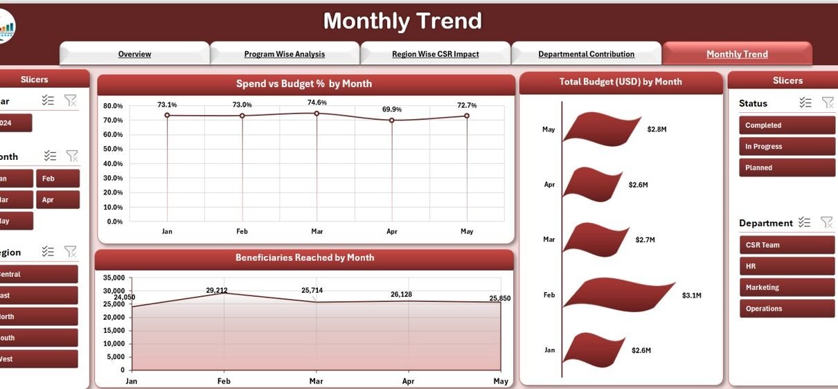
Survey Trend Over Time

Lastly, the Survey Trend Over Time page highlights how satisfaction evolves:
-
Slicers for Month, Year, Department, and Role.
Three time series charts:
- Overall Satisfaction Score by Month
- Management Score by Month
- Growth Opportunities Score by Month
In addition, you can detect seasonal patterns. Therefore, you might discover that scores dip every quarter-end, suggesting workload imbalances.
Data Sheet & Support Sheet
Data Sheet:

Contains raw survey entries with columns:
- Employee ID
- Department
- Job Role
- Gender
- Location
- Survey Date
- Work Environment
- Compensation
- Management
- Work-Life Balance
- Growth Opportunities
- Average Satisfaction Score
- Month
- Year
Support Sheet:

- Houses lookup tables, formulas, and named ranges. For instance, it defines month-year pairs and score thresholds.
By segregating raw data from support tables, you maintain clarity and simplify updates.
Advantages of an Employee Satisfaction Dashboard
Click to Purchases Employee Satisfaction Dashboard in Excel
Implementing this Excel dashboard delivers numerous benefits:
Real-Time Insights
- You refresh your pivot tables to see up-to-date responses immediately.
- Therefore, you react faster to emerging issues.
Cost-Effective Solution
- You leverage existing Excel licenses without investing in premium BI tools.
- Furthermore, you avoid lengthy IT deployments.
User-Friendly Interface
- Most staff know Excel basics, so training remains minimal.
- Moreover, intuitive slicers and buttons speed up adoption.
Customizable Views
- You tailor slicers, chart types, and KPIs to match organizational needs.
- Consequently, you maintain relevance as your company evolves.
Actionable Data
- You pinpoint low-scoring areas—such as poor management or weak growth paths—and take corrective action.
- Likewise, you celebrate high-performing departments to reinforce positive culture.
Enhanced Engagement
- By sharing dashboard snapshots with teams, you demonstrate that you value employee feedback.
- Thus, you build trust and encourage participation in future surveys.
Trend Analysis
- Tracking scores over time reveals improvements or declines.
- For example, you can tie policy changes to subsequent satisfaction gains.
Best Practices for the Employee Satisfaction Dashboard
To maximize impact, follow these proven practices:
Keep Data Clean
- First, validate survey responses to avoid typos or missing values.
- Next, enforce drop-down lists for fields like Department and Role.
Define Clear KPIs
- Decide which metrics matter most—e.g., Overall Satisfaction, Work-Life Balance, or Compensation.
- Then, ensure your cards display these key numbers prominently.
Use Descriptive Labels
- Annotate charts with clear titles, axis labels, and data call-outs.
- Moreover, add brief notes explaining unusual data spikes.
Maintain Consistent Formatting
- Stick to a unified color scheme and font set.
- Furthermore, align chart sizes and positions across pages for a professional look.
Leverage Pivot Tables & Slicers
- Pivot tables power all charts, reducing manual updates.
- Meanwhile, slicers let users filter data dynamically without changing formulas.
Document Your Dashboard
- On the Support Sheet, explain data sources, named ranges, and update steps.
- Consequently, successors can maintain the dashboard with ease.
Automate Data Refresh
- Use Power Query or simple VBA macros to pull new survey data regularly.
- Therefore, you minimize manual copy-paste, reducing errors.
Schedule Regular Reviews
- Plan monthly or quarterly check-ins to discuss dashboard findings.
- Then, assign action items to address low-scoring areas.
Protect Sensitive Data
- Lock sheets or cells containing formulas and raw data.
- Moreover, store the file on a secure network drive with limited access.
Gather Stakeholder Feedback
- Ask HR, managers, and executives which additional views they need.
- Accordingly, refine slicers, charts, and KPI cards.
By following these guidelines, you ensure your dashboard remains accurate, secure, and aligned with organizational goals.
Conclusion
An Employee Satisfaction Dashboard in Excel transforms static survey spreadsheets into a dynamic decision-support tool. With interactive slicers, pivot charts, and clear KPI cards, you rapidly uncover insights about work-life balance, growth opportunities, management effectiveness, and more. Furthermore, you achieve all this without expensive software, thanks to Excel’s built-in features.
Moving forward, adopt the best practices outlined above—such as data validation, consistent formatting, and regular reviews—to keep your dashboard reliable and relevant. Ultimately, by shining a light on employee perceptions, you create a culture of transparency, continuous improvement, and mutual trust.
Frequently Asked Questions
1. What metrics should I include in my Employee Satisfaction Dashboard?
Focus on core drivers of satisfaction, such as:
-
Overall Satisfaction Score
-
Work-Life Balance
-
Growth Opportunities
-
Management Effectiveness
-
Work Environment
-
Compensation Satisfaction
2. How often should I update the dashboard?
Update it whenever you collect new survey data. Ideally, schedule a monthly refresh to keep insights fresh and actionable.
3. Can I automate survey data imports into Excel?
Yes. You can use Power Query to connect to online survey platforms or a shared CSV file. Alternatively, implement a simple VBA macro that imports and appends new data automatically.
4. Should I share the dashboard with all employees?
You can share high-level summary charts (e.g., Overview Page) publicly to promote transparency. However, restrict detailed departmental or role-based insights to HR and managers to respect privacy.
5. How do I handle low survey response rates?
First, encourage participation by communicating dashboard improvements and action plans. Next, consider incentives or shorter surveys. Finally, monitor response rates on the dashboard itself to detect declines early.
6. Can I extend this dashboard to mobile devices?
While Excel Mobile supports basic functionality, consider migrating to Power BI or an online dashboard platform for a fully responsive, mobile-friendly experience.
7. How do I protect sensitive employee data in Excel?
Lock the Data and Support sheets with a password. Then, grant view or edit permissions at the file level via your network or SharePoint. Always follow your organization’s data security policies.
Visit our YouTube channel to learn step-by-step video tutorials
Click to Purchases Employee Satisfaction Dashboard in Excel


