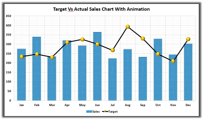
Are you looking to make your PowerPoint presentations more engaging and impactful? In this article, we will explain you Microsoft PowerPoint Charts and Visualization. We will explain an Animated Target Vs Actual Sales Chart. This data-driven chart will not only visualize your sales performance but also add a touch of professionalism to your slides through smooth animations.
Why Use an Animated Target Vs Actual Sales Chart?
Before we jump into the creation process, it’s essential to understand why this chart can be a game-changer for your presentations.
- Visualizing Data Clearly – Instead of overwhelming your audience with numbers, you can quickly highlight the differences between your target and actual sales.
- Engaging Animation – The chart’s animation draws attention, ensuring that your audience stays focused on your message.
- Professional Impact – An animated chart not only conveys information but does so in a sleek and modern way, leaving a lasting impression.
Below is the snapshot of this chart. You can use it with your existing slide pack of PowerPoint.
Creating the Animated Target Vs Actual Sales Chart
The process of creating this chart is simpler than you might think. By using PowerPoint’s built-in chart tools, you can create a dynamic, data-driven chart in a few easy steps.
Watch the step by step video tutorial:
Download the Animated Target Vs Actual Sales Chart
To make things even easier, we’ve provided a downloadable file that you can start using right away. Simply click the link below to get the Animated Target Vs Actual Sales Chart template for PowerPoint.
Click here to download the file-
Final Thoughts
By incorporating an Animated Target Vs Actual Sales Chart into your PowerPoint presentations, you not only present your data in a visually appealing way but also engage your audience effectively. The combination of clear visualization and smooth animation is a powerful tool for conveying important sales data.
We encourage you to try this chart with your own data and explore other chart options in PowerPoint to elevate your presentations to the next level.
Visit our YouTube channel to learn step-by-step video tutorials