The floriculture industry operates in a highly dynamic environment where demand patterns change quickly, perishability remains high, and margins depend heavily on efficiency and timing. Therefore, floriculture businesses must track performance continuously and make fast, data-driven decisions. However, when teams rely on scattered spreadsheets and manual reports, visibility drops and decision-making slows down.
That is exactly where a Floriculture KPI Dashboard in Power BI becomes a powerful and practical solution.
This detailed article explains what a Floriculture KPI Dashboard in Power BI is, why it matters, how it works, its page-wise structure, key features, advantages, best practices, and frequently asked questions. Moreover, the language remains simple, practical, and business-focused so that growers, exporters, wholesalers, and managers can easily understand and implement it.
Click to buy Floriculture KPI Dashboard in Power BI
What Is a Floriculture KPI Dashboard in Power BI?
A Floriculture KPI Dashboard in Power BI is a centralized, interactive reporting tool designed to monitor, analyze, and visualize key performance indicators related to flower cultivation, processing, sales, and distribution.
Instead of reviewing multiple Excel files and static reports, this dashboard consolidates actuals, targets, and historical data into a single Power BI report. As a result, floriculture businesses gain clear visibility into performance at both Month-to-Date (MTD) and Year-to-Date (YTD) levels.
Moreover, because the dashboard uses Excel as a data source, teams can easily update data without technical complexity. Power BI then transforms that raw data into meaningful visuals, comparisons, and trends.
Why Do Floriculture Businesses Need a KPI Dashboard?
Floriculture operations involve multiple moving parts such as cultivation cycles, yield quality, labor productivity, logistics, and seasonal demand. Therefore, businesses must track performance from multiple angles at the same time.
A Floriculture KPI Dashboard in Power BI helps because it:
- Provides real-time visibility into operational and financial KPIs
- Highlights target achievement and gaps clearly
- Enables MTD, YTD, and previous-year comparisons
- Supports quick corrective actions
- Reduces dependency on manual reporting
As a result, management can focus on improvement instead of data preparation.
How Does a Floriculture KPI Dashboard in Power BI Work?
The dashboard works through a simple yet powerful flow:
- Data Entry in Excel
Users enter actual values, target values, and KPI definitions in structured Excel sheets. - Data Modeling in Power BI
Power BI connects to the Excel file and creates relationships between tables. - KPI Calculations
The dashboard calculates MTD, YTD, target vs actual, and year-over-year comparisons automatically. - Interactive Visualization
Slicers, cards, tables, and charts allow users to filter and analyze performance instantly.
Because of this approach, even non-technical users can maintain and use the dashboard effectively.
What Is the Overall Structure of the Floriculture KPI Dashboard?
The Floriculture KPI Dashboard in Power BI contains three well-structured pages, each designed for a specific analytical purpose.
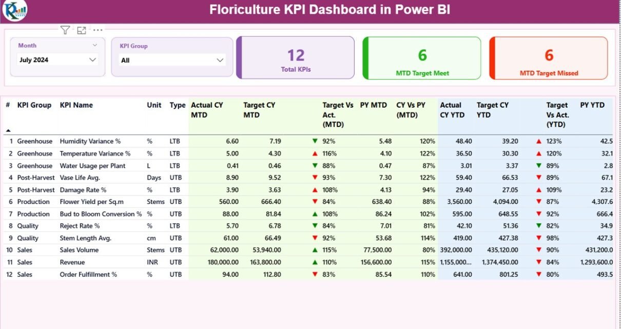
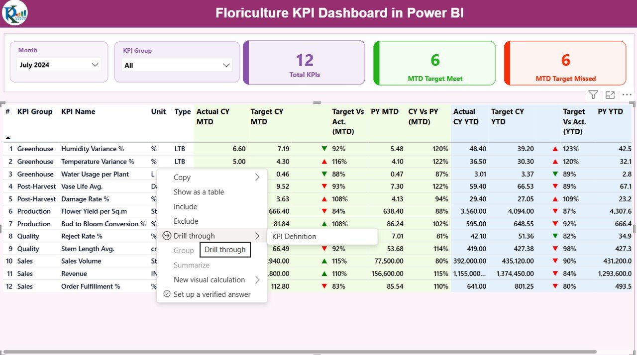
the Summary Page
The Summary Page acts as the main landing page of the dashboard. Therefore, it provides a high-level overview of all KPIs at a glance.
Key Elements on the Summary Page
- Slicers for Easy Filtering
- Month slicer to select reporting period
- KPI Group slicer to filter KPIs by category
These slicers ensure quick and flexible analysis.
KPI Cards for Instant Status
At the top of the page, three KPI cards display:
- Total KPIs Count
- MTD Target Met Count
- MTD Target Missed Count
As a result, decision-makers can immediately understand overall performance.
Detailed KPI Performance Table
Below the cards, a detailed table shows complete KPI-level information.
Columns Available in the Summary Table
- KPI Number – Unique sequence number for each KPI
- KPI Group – Category of KPI such as Production, Sales, Quality, or Logistics
- KPI Name – Name of the KPI
- Unit – Measurement unit (Kg, Stems, %, INR, USD, etc.)
- Type – KPI type such as LTB (Lower the Better) or UTB (Upper the Better)
MTD Performance Columns
- Actual CY MTD – Current year actual MTD value
- Target CY MTD – Current year target MTD value
- MTD Icon – Green ▲ or red ▼ to indicate performance
- Target vs Actual (MTD) – Actual ÷ Target
- PY MTD – Previous year MTD value
- CY vs PY (MTD) – Current year MTD ÷ Previous year MTD
YTD Performance Columns
- Actual CY YTD – Current year actual YTD value
- Target CY YTD – Current year target YTD value
- YTD Icon – Green ▲ or red ▼ for YTD status
- Target vs Actual (YTD) – Actual ÷ Target
- PY YTD – Previous year YTD value
- CY vs PY (YTD) – Current year YTD ÷ Previous year YTD
Because of this structured design, users can analyze both short-term and long-term performance easily.
Click to buy Floriculture KPI Dashboard in Power BI
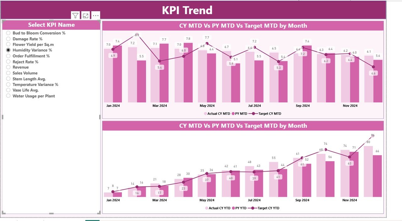
the KPI Trend
The KPI Trend Page focuses on trend analysis over time. Therefore, it helps users understand how performance evolves rather than looking only at static numbers.
Key Features of the KPI Trend Page
- Two combo charts for:
MTD performance trend
YTD performance trend
Each chart displays:
- Current year actuals
- Previous year actuals
- Target values
Additionally, a KPI Name slicer on the left allows users to select a specific KPI for detailed trend analysis.
As a result, managers can identify seasonality, growth patterns, and performance gaps quickly.
Click to buy Floriculture KPI Dashboard in Power BI
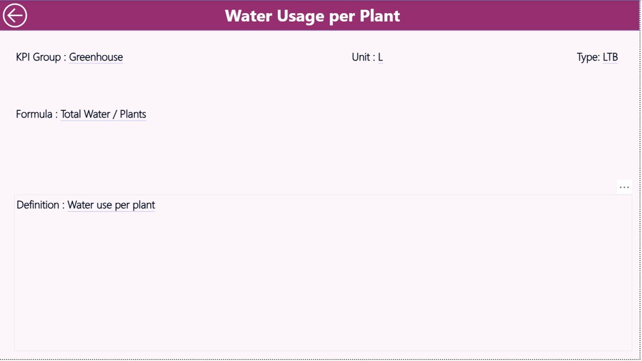
KPI Definition Page
The KPI Definition Page acts as a drill-through reference page. Although hidden by default, users can access it directly from the Summary Page.
What Information Does the KPI Definition Page Show?
- KPI Number
- KPI Group
- KPI Name
- Unit of measurement
- KPI Formula
- KPI Definition
- KPI Type (LTB or UTB)
This page ensures clarity and consistency across the organization. Therefore, every stakeholder interprets KPIs the same way.
A simple Back button allows users to return to the Summary Page instantly.
Click to buy Floriculture KPI Dashboard in Power BI
What Excel Data Is Required for the Floriculture KPI Dashboard?
The dashboard uses an Excel file as its data source, which makes maintenance simple and flexible.
Required Excel Worksheets
Input_Actual Sheet
In this sheet, users enter:
- KPI Name
- Month (first date of the month)
- MTD Actual value
- YTD Actual value
Input_Target Sheet
In this sheet, users enter:
- KPI Name
- Month (first date of the month)
- MTD Target value
- YTD Target value
Click to buy Floriculture KPI Dashboard in Power BI
KPI Definition Sheet
This sheet contains:
- KPI Number
- KPI Group
- KPI Name
- Unit
- Formula
- Definition
- Type (LTB or UTB)
Because of this structure, data updates remain simple and controlled.
What KPIs Can Be Tracked in a Floriculture Dashboard?
A Floriculture KPI Dashboard can track KPIs such as:
- Flower yield per hectare
- Production cost per stem
- Harvest loss percentage
- Order fulfillment rate
- Export shipment success rate
- Revenue per variety
- Quality rejection percentage
- Labor productivity
- Inventory wastage
Therefore, the dashboard supports both operational and financial monitoring.
Advantages of Floriculture KPI Dashboard in Power BI
A Floriculture KPI Dashboard in Power BI delivers several strong advantages:
- Centralized KPI monitoring in one place
- Clear visibility of MTD and YTD performance
- Easy comparison with targets and previous year
- Faster decision-making with visual indicators
- Reduced manual reporting effort
- Scalable and customizable design
- Easy Excel-based data maintenance
As a result, floriculture businesses gain control, clarity, and confidence.
Best Practices for the Floriculture KPI Dashboard in Power BI
To get maximum value, businesses should follow these best practices:
- Define KPIs clearly before implementation
- Keep KPI units consistent across reports
- Update Excel data on a fixed schedule
- Review target logic periodically
- Use meaningful KPI groups
- Train users on slicers and drill-through
- Validate data accuracy regularly
When teams follow these practices, dashboard adoption and impact improve significantly.
Who Should Use a Floriculture KPI Dashboard?
This dashboard suits:
- Flower growers and farm managers
- Floriculture exporters and wholesalers
- Operations and supply chain teams
- Finance and planning teams
- Business owners and leadership
Therefore, anyone responsible for floriculture performance can benefit.
Conclusion
A Floriculture KPI Dashboard in Power BI transforms raw operational data into actionable business insights. Instead of relying on fragmented reports, floriculture businesses gain a structured, visual, and dynamic performance monitoring system.
Because the dashboard supports MTD, YTD, target, and previous-year comparisons, decision-makers can act quickly and confidently. Moreover, the Excel-based data model ensures simplicity and flexibility.
In today’s competitive floriculture market, such a dashboard does not remain optional—it becomes essential.
Frequently Asked Questions (FAQs)
What is a Floriculture KPI Dashboard in Power BI?
It is an interactive Power BI report that tracks and analyzes key performance indicators related to floriculture operations.
Does this dashboard require advanced Power BI skills?
No. Users only need to update Excel data. Power BI handles calculations and visuals automatically.
Can I customize KPIs in the dashboard?
Yes. You can add, remove, or modify KPIs easily through the Excel KPI Definition sheet.
Does the dashboard support year-over-year comparison?
Yes. It compares current year performance with previous year for both MTD and YTD.
Can this dashboard scale for large floriculture operations?
Yes. The structure supports multiple KPI groups, large datasets, and future expansion.
Visit our YouTube channel to learn step-by-step video tutorials
Watch the step-by-step video tutorial:
Click to buy Floriculture KPI Dashboard in Power BI

