Food truck businesses often manage revenue, orders, operating cost, menu mix, event demand, service windows, cities, regions, payment methods, and customer ratings from separate files. When those records stay scattered, a weekly review can take hours before the owner sees which truck, cuisine, or location is really driving profit.
The Food Trucks Dashboard in Power BI is built to reduce that reporting work. It gives food truck owners, mobile food vendors, event catering teams, and fleet managers 5 ready Power BI pages for Overview, Sales Trend, Truck Analysis, Menu Insights, and Location Mix. The report tracks Total Revenue, Total Orders, Total Operating Cost, Average Ticket, and Average Customer Rating in one interactive file.
Click here to get the Food Trucks Dashboard in Power BI.
Food Trucks Dashboard in Power BI
Key Features of Food Trucks Dashboard in Power BI
- 5 Power BI report pages for Overview, Sales Trend, Truck Analysis, Menu Insights, and Location Mix.
- 5 high-level KPI cards for Total Revenue, Total Orders, Total Operating Cost, Average Ticket, and Average Customer Rating.
- Multiple slicers to filter the dashboard quickly by available fields such as truck, month, region, cuisine, city, event type, and payment method.
- Profit and cost analysis by region, event type, month, cuisine type, service window, and truck name.
- Menu and customer experience views covering menu category orders, payment method revenue, and cuisine-level customer rating.
- Power BI Desktop compatibility so users can customize measures, visuals, formatting, and data model relationships.
Dashboard Pages Explanation
1. Overview Page
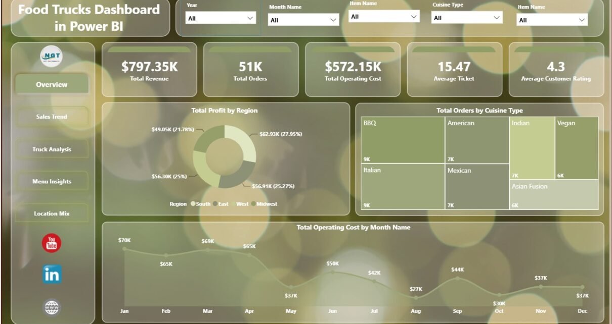
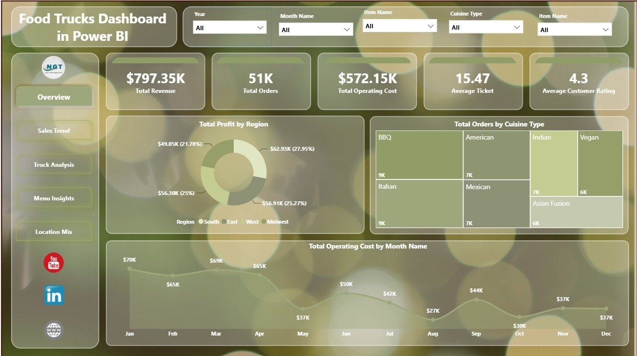
The Overview page gives the main business summary. The top cards show Total Revenue, Total Orders, Total Operating Cost, Average Ticket, and Average Customer Rating. These cards help owners review sales volume, cost pressure, average order value, and customer experience before drilling into the detail pages.
Total Profit by Region: This chart compares profit across operating regions. It helps users understand where local demand, route selection, and event mix are creating stronger returns.
Total Orders by Cuisine Type: This chart shows which cuisine types produce the most orders. It supports menu planning, ingredient preparation, and demand review across food concepts.
Total Operating Cost by Month Name: This chart tracks cost movement by month. It helps owners identify high-cost periods and investigate staffing, ingredients, fuel, permits, or event expenses.
Overview Page
2. Sales Trend
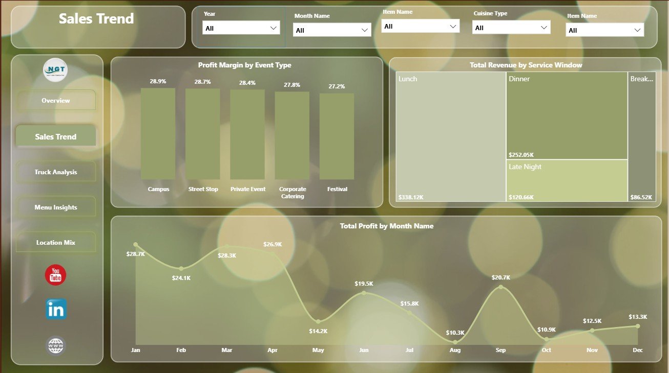
The Sales Trend page focuses on margin, service timing, and monthly profit movement. It helps users move beyond total revenue and see which event types and service windows are more valuable.
Profit Margin by Event Type: This chart compares margin across event formats such as festivals, private events, markets, or corporate bookings. It helps owners prioritize events that protect profit, not only events that create sales volume.
Total Revenue by Service Window: This chart compares revenue by service window. It helps teams understand whether lunch, dinner, late-night, or event-based windows produce stronger sales.
Total Profit by Month Name: This chart shows monthly profit movement. It supports seasonal planning, staffing decisions, and monthly business review meetings.
Sales Trend
3. Truck Analysis
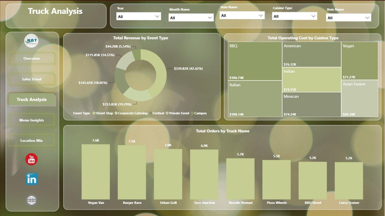
The Truck Analysis page compares performance across trucks, cuisines, and event categories. This is useful when a business operates more than one truck or wants to understand why one truck performs better than another.
Total Revenue by Event Type: This chart shows which event categories bring the most revenue. It helps fleet owners decide where to focus booking and promotion efforts.
Total Operating Cost by Cuisine Type: This chart compares cost by cuisine. It helps users identify cuisine lines that may need pricing, purchasing, or waste control review.
Total Orders by Truck Name: This chart ranks trucks by order volume. It supports staffing, maintenance planning, truck assignment, and route allocation decisions.
Truck Analysis
4. Menu Insights
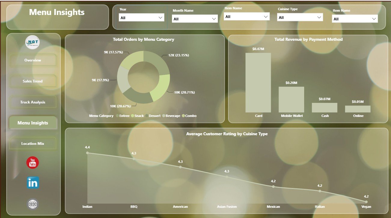
The Menu Insights page focuses on customer demand, payment behavior, and rating patterns. It helps teams understand what customers buy and how satisfied they are by cuisine type.
Total Orders by Menu Category: This chart shows which menu categories drive the most orders. It helps owners simplify menus, prepare inventory, and promote high-demand items.
Total Revenue by Payment Method: This chart compares revenue by payment method. It helps users understand cash, card, online, or other payment behavior across transactions.
Average Customer Rating by Cuisine Type: This chart compares satisfaction by cuisine type. It helps teams protect quality and identify cuisines that may need recipe, speed, or service improvements.
Menu Insights
5. Location Mix
The Location Mix page turns city and regional data into route decisions. It helps owners compare demand, average ticket, and revenue movement across locations and months.
Average Ticket by Region: This chart compares order value by region. It helps identify locations where customers spend more per order and where premium menu options may work better.
Total Orders by City: This chart compares demand by city. It supports weekly route planning, event selection, and local marketing decisions.
Total Revenue by Month Name: This chart shows monthly revenue trends. It helps users identify seasonality and compare recent performance with prior months.
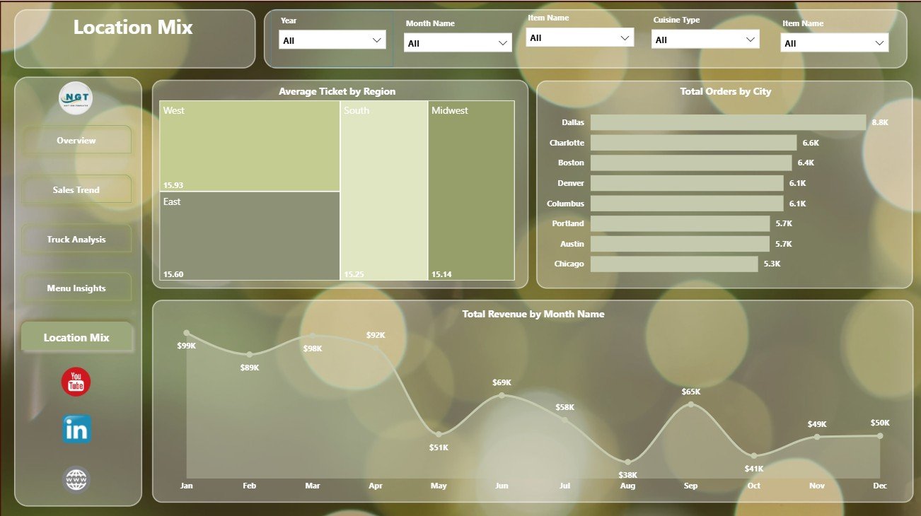
Location Mix
Food Trucks Dashboard in Power BI vs. Tableau vs. Paid Restaurant SaaS – Feature Comparison
| Feature | This Power BI Dashboard | Tableau Alternative | Paid Restaurant SaaS |
|---|---|---|---|
| Cost | $17.99 one-time template purchase | License cost plus report build time | Monthly or annual subscription |
| Platform | Power BI Desktop / Power BI Service | Tableau Desktop / Tableau Cloud | Vendor-hosted cloud platform |
| Setup time | Open PBIX and replace or connect data | Build dashboards or hire BI support | Implementation and configuration |
| Real-time team collaboration | Available through Power BI Service if configured | Available through Tableau Cloud | Usually included by role |
| Mobile access | Power BI mobile app or browser | Tableau mobile app or browser | Vendor app or browser |
| Customizable fields | High for Power BI users | High for Tableau users | Limited by plan and permissions |
| Share with link | Possible with Power BI publishing and permissions | Possible with Tableau Cloud | Usually login controlled |
| Food truck route analysis | Built around trucks, cities, regions, events, cuisines, and service windows | Requires equivalent build | Depends on vendor configuration |
| Year-1 cost at 5 users | Template cost plus any Microsoft licensing | License cost plus dashboard development | Often hundreds or thousands of dollars |
Who Should Use This Template
This dashboard is useful for food truck owners, mobile food vendors, food truck fleet managers, street food businesses, event catering operators, hospitality analysts, and Power BI consultants supporting restaurant or food service clients. It is especially useful when users already have order-level or summarized records and need a repeatable reporting layer.
It is not designed to replace a POS system, accounting tool, route optimizer, live inventory application, payroll tool, or staff scheduling platform. For those needs, this Power BI dashboard works best as the analytics layer after data is exported or connected from the operational system.
Real-World Use Cases
Weekly owner review: A food truck owner checks Total Revenue, Total Operating Cost, Average Ticket, and Profit by Region before deciding next week’s route schedule.
Fleet allocation: A fleet manager reviews Total Orders by Truck Name and Total Revenue by Event Type before assigning trucks to festivals, markets, and private events.
Menu and rating review: An operations analyst compares Total Orders by Menu Category with Average Customer Rating by Cuisine Type to identify menu areas that need more attention.
Advantages of Food Trucks Dashboard in Power BI
- Faster reporting start: Users begin with ready report pages instead of designing every visual from scratch.
- Clear executive summary: The Overview page brings revenue, orders, operating cost, average ticket, and customer rating into one view.
- Useful food truck dimensions: The report covers truck name, city, region, cuisine type, event type, menu category, payment method, and service window.
- Interactive analysis: Slicers help users answer questions during review meetings without rebuilding visuals.
- Editable Power BI structure: Experienced users can adjust fields, measures, visuals, relationships, and formatting.
Microsoft provides official guidance for Power BI report design, data modeling, and publishing in the Microsoft Learn Power BI documentation.
Opportunities for Improvement
The dashboard depends on clean source data. Truck names, city names, cuisine types, event types, service windows, payment methods, and month fields should be consistent before users rely on the visuals.
Advanced teams can extend the report by adding inventory usage, labor hours, weather data, event fees, route distance, marketing campaign fields, or target margins. Teams using Power BI Service can also publish the report and manage access for decision makers.
Best Practices
- Keep truck, city, region, cuisine, event type, and menu category names consistent.
- Review operating cost and profit together, not revenue alone.
- Use Average Ticket by Region to test pricing, bundles, and premium menu options.
- Compare customer rating with order volume before changing menu strategy.
- Refresh and validate the report before sharing it with owners, investors, or managers.
Explore Relevant Templates
- Food Trucks Dashboard in Power BI
- Food Trucks Dashboard in Excel
- Food Truck Dashboard in Power BI
- Power BI Dashboard Templates
Frequently Asked Questions
What is the Food Trucks Dashboard in Power BI?
It is a Power BI report template for analyzing food truck revenue, orders, operating cost, average ticket, customer rating, menu performance, truck performance, event demand, and location mix.
What pages are included?
The dashboard includes Overview, Sales Trend, Truck Analysis, Menu Insights, and Location Mix pages.
Can I use my own food truck data?
Yes. Replace or connect the sample data with your own structured food truck records and refresh the Power BI report.
Do I need Power BI Desktop?
Yes. Open and edit the PBIX file in Power BI Desktop. Publishing online requires Power BI Service access.
Can the dashboard be customized?
Yes. You can edit visuals, add fields, change colors, adjust calculations, and connect different data sources.
Is this a full POS or restaurant management system?
No. It is a reporting dashboard. It does not process payments, schedule staff, manage inventory, or optimize routes.
About the Author
Built by PK – Microsoft Certified Professional with 15+ years of Excel, Google Sheets, and Power BI experience. Founder of NextGenTemplates, reaching 300K+ subscribers across YouTube channels. Every template is hand-built and tested before release.
Conclusion
The Food Trucks Dashboard in Power BI helps mobile food businesses move from scattered reports to clear, interactive analytics. With pages for overview, sales trend, truck analysis, menu insights, and location mix, users can review financial performance, operational cost, customer ratings, and route-level demand in one report.
Click here to purchase Food Trucks Dashboard in Power BI.
Visit our YouTube channel to learn step-by-step Excel and Power BI tutorials.