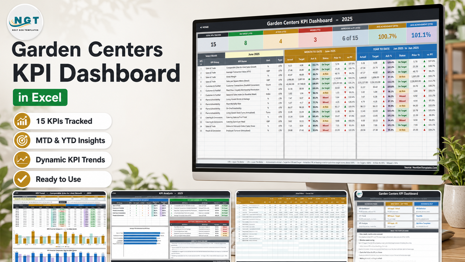
A garden centre is four businesses sharing one car park: a retail shop, a living-goods nursery, a coffee shop and an online click-and-collect counter. Each throws off numbers in a different shape – trading density per square metre, plant mortality per unit held, spend per head, share of turnover fulfilled online – and most operators end up reading them in four different reports, a month apart, with no shared idea of what “good” was supposed to be.
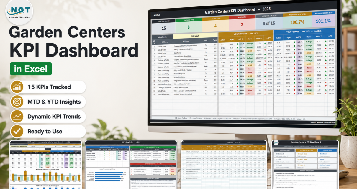
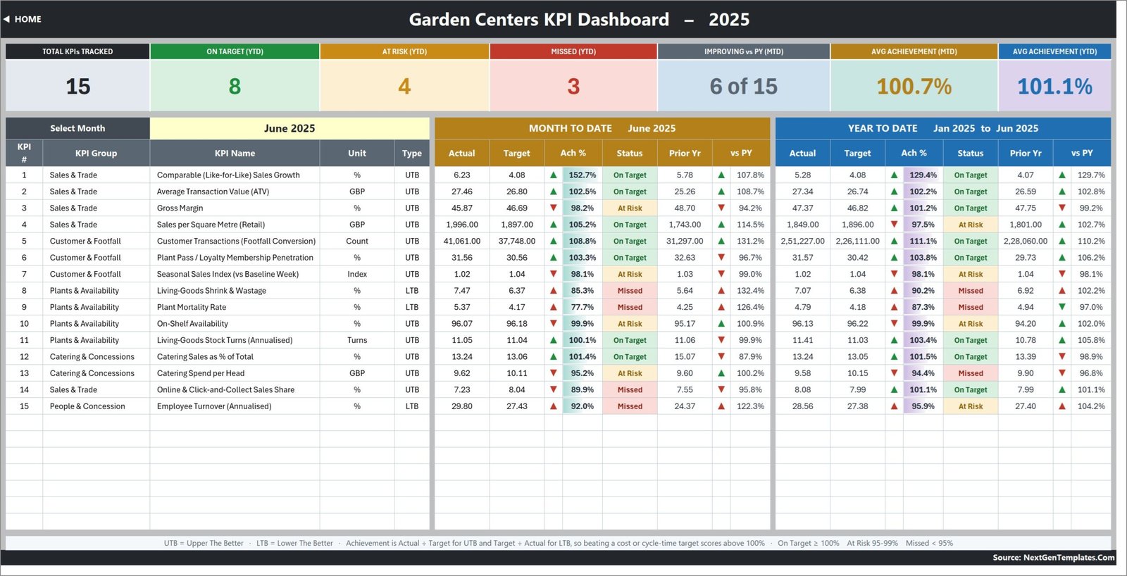
The Garden Centers KPI Dashboard in Excel puts all fifteen of those measures on one page and scores each of them against its own target. Pick a month from a dropdown and you get MTD and YTD actual, target, achievement percentage, a traffic light, last year’s figure and the year-on-year movement for every KPI at once. In the sample data – June 2025 of a British four-site chain – the summary cards read 15 KPIs tracked, 8 On Target, 4 At Risk, 3 Missed, 6 of 15 improving on last year, average achievement 100.7% for the month and 101.1% for the year.
Every number in it is a plain worksheet formula. No Power Query, no data model, no macro, no add-in. It opens in Excel 2013 and later and in Excel for the web, and it never asks you to enable anything.
Key Features of the Garden Centers KPI Dashboard in Excel
One dropdown drives everything
Cell D6 on the KPI Dashboard sheet lists the twelve months of your reporting year. Change it and the entire scorecard, all seven summary cards and the whole KPI Analysis page follow. There is no refresh, no query and no pivot cache to worry about.
Direction-aware scoring (UTB and LTB)
Each KPI is flagged UTB – upper the better – or LTB – lower the better – on the KPI Definition sheet. Achievement is Actual / Target for a UTB KPI and Target / Actual for an LTB one. That is why Plant Mortality Rate at 5.37% against a 4.17% target scores 77.7% and shows Missed, instead of the misleading 129% a naive divide would give you. Beating a shrink, wastage or turnover target scores above 100%, exactly the way beating a sales target does.
Traffic lights with thresholds you own
On Target from 100%, At Risk from 95% to 99%, Missed below 95%. The thresholds live in the formulas in columns L and U on KPI Dashboard, so a group that runs a tighter governance standard can move them in two edits.
A trend page per KPI
Cell B4 on KPI Trend is a dropdown of every KPI name. Choose one and its attribute strip, formula, definition, twelve-month table and both combo charts – actual and prior-year columns with a target line running across them – all redraw. It answers the question the scorecard cannot: is this a bad month or a bad year?
Add or rename KPIs without touching a formula
The sheets are wired for 22 KPI rows and 15 are filled, so seven live empty rows are already waiting. Type a new KPI on KPI Definition – number, group, name, unit, formula, definition, type, owner, priority, frequency – and it appears immediately on the three input sheets, the scorecard, the trend dropdown and the analysis roll-up.
Dashboard Pages Explanation
Home
A navigation page split into three columns: Dashboard Pages, Input Sheets – Edit These, and Reference & Help. It is the fastest way to explain the workbook to a colleague who has never opened it.
KPI Dashboard
The scorecard. Seven summary cards along the top, then one row per KPI: number, group, name, unit and type, followed by a Month To Date block (actual, target, achievement, status, prior year, vs PY) and a Year To Date block with the same six columns. The footer restates the rules – UTB, LTB, and the three status bands – so nobody has to remember them.
KPI Trend
One KPI, twelve months. A table of MTD and YTD actual, target, prior year, achievement and status for every month, then an MTD combo chart and a YTD combo chart underneath.
KPI Analysis
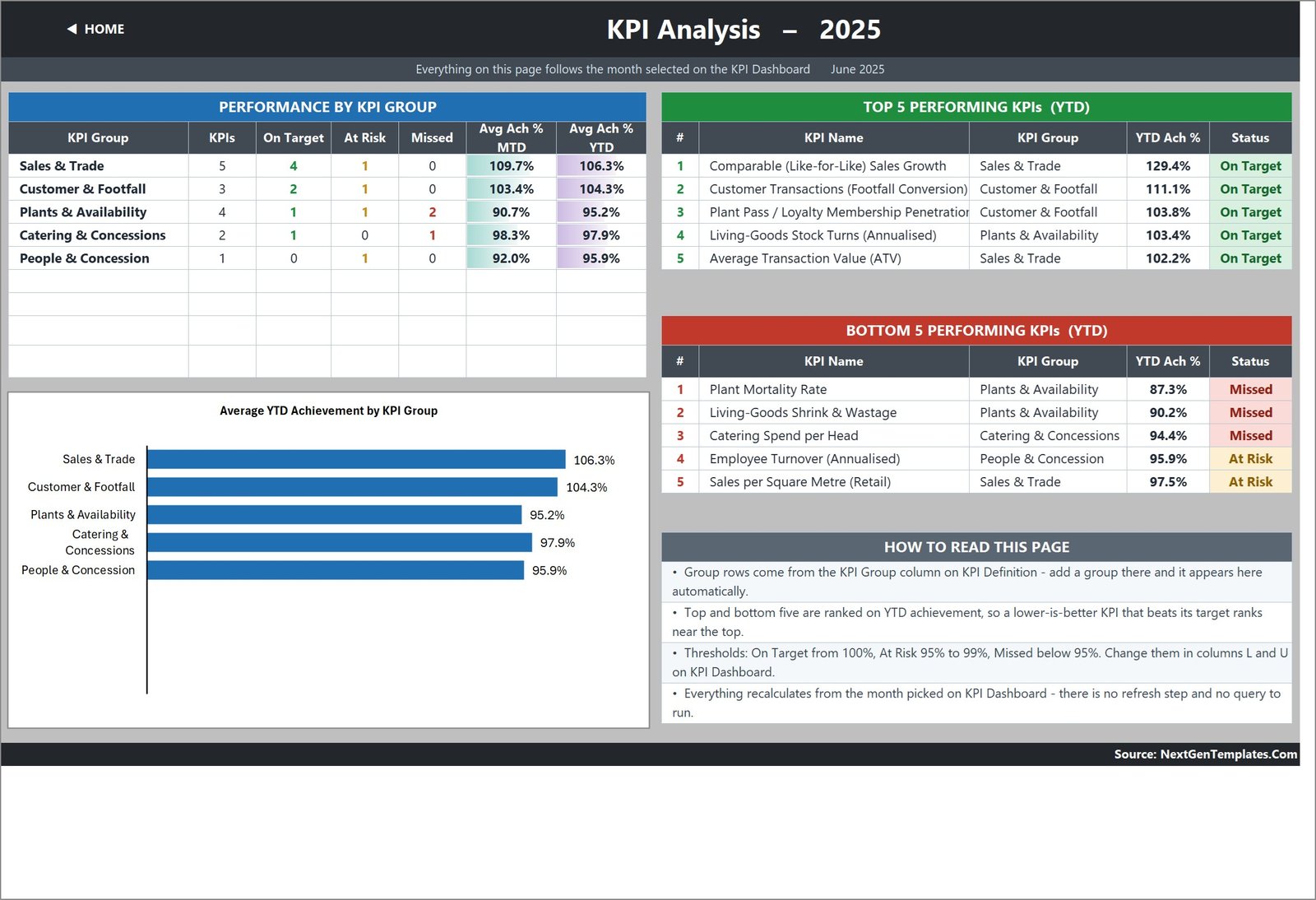
Performance by KPI group – how many KPIs each group owns, how many are On Target, At Risk and Missed, and its average MTD and YTD achievement – plus an Average YTD Achievement by KPI Group bar chart and the Top 5 and Bottom 5 Performing KPIs for the year to date. In the sample month, Plants & Availability is the group carrying both Missed KPIs, at 95.2% average YTD achievement.
KPI Input – Actual, Target and PY
Three identical grids: this year’s result, this year’s target and last year’s result. Each holds an MTD and a YTD column for every month, and the KPI rows on all three are driven by KPI Definition so they can never drift out of step. Cell E3 on the Actual sheet is the first month of the reporting year – change it and everything else re-bases.
KPI Definition, Read Me and Get More Templates
KPI Definition is the master list every other sheet follows, and it carries each KPI’s formula, plain-English definition, owner, priority and frequency. Read Me explains the wiring in a single page. Get More Templates links back to the catalogue. A hidden-in-plain-sight Support sheet holds the helper calculations – the selected month, the arrow glyphs, the dropdown lists and the ranking helpers – and needs no editing.
The 15 KPIs it ships with
Sales & Trade: Comparable (Like-for-Like) Sales Growth, Average Transaction Value (ATV), Gross Margin, Sales per Square Metre (Retail), Online & Click-and-Collect Sales Share.
Customer & Footfall: Customer Transactions (Footfall Conversion), Plant Pass / Loyalty Membership Penetration, Seasonal Sales Index (vs Baseline Week).
Plants & Availability: Living-Goods Shrink & Wastage, Plant Mortality Rate, On-Shelf Availability, Living-Goods Stock Turns (Annualised).
Catering & Concessions: Catering Sales as % of Total, Catering Spend per Head.
People & Concession: Employee Turnover (Annualised).
Four of those are the ones a general retail template never has: the Seasonal Sales Index measures trading against a weather-adjusted baseline week rather than against last month, and Living-Goods Shrink, Plant Mortality and Living-Goods Stock Turns treat plants as the perishable, dying, re-orderable stock they actually are.
Garden Centers KPI Dashboard vs. Google Sheets vs. Retail BI Software – Feature Comparison
| This Excel KPI Dashboard | A Google Sheets KPI build | Retail BI / ERP analytics | |
|---|---|---|---|
| Cost | 19.99 one-off (12.99 on offer) | Free tool, your build time | Roughly 80-200 per user per month |
| Platform | Excel 2013+ and Excel for the web | Browser | Vendor cloud |
| Setup time | Minutes – replace the sample numbers | Days to rebuild the same logic | Weeks, usually with a partner |
| Real-time collaboration | OneDrive / SharePoint co-authoring | Yes, natively | Yes |
| Mobile access | Excel mobile app | Browser and app | Vendor app |
| Customisable KPIs | 22 rows wired, 15 filled, no formula edits | Fully, if you build it | Within the vendor’s data model |
| Share with a link | Via OneDrive share | Yes | Per licensed user |
| Year-1 cost at 5 users | 19.99 total | Your build time | Roughly 4,800-12,000 |
| Direction-aware (UTB / LTB) scoring | Built in per KPI | You write it yourself | Usually configurable |
| Works offline, file is yours | Yes – nothing locked or hidden | Lives in the account | Access ends with the licence |
Who Should Use This Template
Independent garden centres and small multi-site groups that already extract monthly figures from a till system, a stock system and a payroll report, and want one page that scores them consistently. It fits a commercial director assembling a board pack, a plant area manager judged on shrink and mortality, a catering manager reporting spend per head, and an owner-operator who wants the month closed in ten minutes rather than a morning.
It is the wrong tool if you expect the numbers to arrive by themselves. There is no EPOS connector and no refresh button – you type or paste the monthly figures. It is also not a transaction database: there is no SKU, product or customer table in it, so basket analysis and line-item stock reporting need an analytical dashboard instead. If charting sales by category, region and month is what you actually want, the Garden Center Dashboard in Excel is a different template built for exactly that.
Real-World Use Cases
Closing the month across four sites. Ruth, a commercial director, pastes till and stock figures into the three input sheets on the third working day, sets the month dropdown to the closed month, and screenshots the scorecard. Like-for-like growth at 152.7% of the monthly target, gross margin At Risk at 98.2%, and Sales per Square Metre slipping to 97.5% for the year to date – three talking points, no slide deck.
Defending a seasonal spike. Marcus, a plant area manager, owns two LTB KPIs. When Plant Mortality Rate shows Missed for June, he opens KPI Trend, picks that KPI, and the twelve-month chart shows the same shape in the prior-year series – a summer effect, not a handling failure.
Cutting the pack down to what one site measures. Priya runs a single centre with a coffee shop. She clears the four KPIs she cannot source, adds covers served and average dwell time in the empty rows on KPI Definition, and the scorecard, the trend dropdown and the group roll-up all follow without a formula being edited.
Advantages of the Garden Centers KPI Dashboard in Excel
- It opens anywhere. No macros to enable, no add-in to install, no data model to refresh – which also means it works in Excel for the web and on a locked-down corporate machine.
- The scoring is honest for cost KPIs. UTB / LTB handling is the single most common thing home-built KPI packs get wrong.
- It is genuinely editable. Nothing is protected or hidden; the formulas are VLOOKUP, MATCH, INDEX and COUNTIF, so you can trace any number back to its source with Excel’s formula auditing tools.
- Sample data is included, so the whole thing works the moment you open it and you can see what “good” looks like before you commit your own numbers.
- You keep the file. One payment, no seat licence, no renewal.
Opportunities for Improvement
Three things are worth knowing before you buy, because they are design decisions rather than bugs.
YTD is typed, not derived. Both MTD and YTD are stored on the input sheets. That is deliberate – a count accumulates through the year while a rate, ratio or index is a running average, and the workbook lets you decide per KPI rather than guessing. It does mean two figures per KPI per month instead of one.
Two labels are stale. The Home page caption and one line in Read Me still say 14 KPIs from an earlier revision of this template family. Everything that calculates – the scorecard, the summary cards, KPI Definition and the analysis page – carries 15. It is text, not logic, and it takes a second to correct.
The sample data is British. Currency KPIs are formatted in GBP, the names use British spelling (Metre, Annualised), and the larger figures carry an Indian digit-grouping number format inherited from the build – 2,51,227.00 where you would expect 251,227.00. All three are cell formats and labels; re-format and rename in a minute, and no formula changes.
Best Practices
- Fix the KPI list before you type any numbers. Editing KPI Definition first means the input grids are already the right shape.
- Set the UTB / LTB flag deliberately. Anything you want to go down – shrink, mortality, turnover, cost per unit – must be LTB or its score will read backwards.
- Decide your YTD convention once and write it down. Counts accumulate, rates average. A compliance percentage that reaches 1,100% by December is the classic symptom of getting this wrong.
- Keep the targets seasonal. A garden centre’s April and its November are different businesses; a flat twelve-month target will paint half the year red for no reason.
- Name an owner for every KPI. The owner column on KPI Definition flows through to the trend page, so every chart has a name against it.
- Work the Bottom 5, not the whole grid. The ranking on KPI Analysis exists so a monthly review can be five conversations instead of fifteen.
Explore Relevant Templates
- Garden Centers KPI Dashboard in Excel – the template covered in this post.
- Garden Center Dashboard in Excel – the analytical companion, for slicing sales rather than scoring KPIs.
- Garden Center Dashboard in Power BI – the same analysis as a .pbix report.
- Plant Nurseries Dashboard in Excel – for the growing side of the operation.
- Harvest Record Data Entry System in Excel – a VBA form for capturing the underlying records.
- DIY Home Improvement Stores KPI Dashboard in Excel – the same scorecard engine for an adjacent retail sector.
- Browse the full KPI Dashboard catalogue.
Frequently Asked Questions
Does it connect to my EPOS or stock system?
No. You enter the monthly MTD and YTD figures for each KPI on the three input sheets and the workbook handles the comparison, the scoring, the ranking and the charts. There is no query, connector or refresh step – which is exactly why it opens on any machine with Excel.
How many KPIs does it actually include?
Fifteen, across five groups, with capacity wired for 22. The Home page caption and one Read Me line still say 14 from an earlier revision; nothing that calculates depends on that text.
Can I add my own KPIs?
Yes – fill the next empty row on KPI Definition and it flows through the three input sheets, the scorecard, the trend dropdown and the analysis page automatically. Beyond 22, select the last data row on each sheet and fill down, then widen the ranges in the summary cards.
Will it work in Excel for the web or on a Mac?
Yes. It uses only VLOOKUP, MATCH, INDEX and COUNTIF – no dynamic arrays, no LET, no add-ins, no macros – so it behaves the same on Excel 2013 and later, on Mac, and in the browser.
How do I change the currency and the number formats?
Select the cells and apply your own format. The sample chain trades in GBP and the larger figures use an Indian digit-grouping format; both are cosmetic and no formula depends on them.
What is in the download?
A ZIP containing the .xlsx workbook with twelve months of sample data plus the Excel KPI Dashboard user manual as a PDF. Instant download, lifetime access.
How is this different from the Garden Center Dashboard in Excel?
Different template, different job. This one is a month-picker scorecard: KPIs against targets, traffic lights, achievement percentages and rankings. The other is an analytical dashboard: sales sliced by category, region and period. Plenty of centres run both.
About the Author
Built by PK – Microsoft Certified Professional with 15+ years of Excel, Google Sheets, and Power BI experience. Founder of NextGenTemplates, reaching 300K+ subscribers across YouTube channels. Every template is hand-built and tested before release.
Conclusion
Most garden centres do not have a measurement problem; they have a comparison problem. The figures exist – in the till export, the stock report, the payroll summary – but nothing puts them beside a target and says whether the month was good. The Garden Centers KPI Dashboard in Excel does exactly that for fifteen measures at once, scores each one in its own correct direction, and shows the year behind every number in a chart you reach from a dropdown.
It takes minutes to make it yours: set the reporting year, edit the KPI list, paste your figures, pick a month. Get the Garden Centers KPI Dashboard in Excel for 12.99 (regular 19.99) – instant download, sample data included, nothing locked or hidden.
For step-by-step Excel dashboard tutorials, subscribe at youtube.com/@PKAnExcelExpert.