Green Building Certification Dashboard in Power BI is a ready-to-use Power BI dashboard template for sustainability managers, green building consultants, ESG teams, construction project managers, facility leaders, and real estate portfolio analysts who need to track certification progress in one visual report. The International Energy Agency reports that buildings account for around 30% of global final energy consumption and 26% of global energy-related emissions, which makes energy, waste, area, cost, and certification performance a serious management topic.
This Power BI report turns project-level green building certification data into five interactive pages: Overview, Certification, Energy View, Waste View, and Project Cost. You can open the PBIX file in Power BI Desktop, connect or replace the sample data with your own project records, refresh the model, and use slicers to review results by region, certification level, certification body, status, building type, consultant, phase, city, month, quarter, and year. Microsoft provides official guidance for Power BI Desktop here: Get started with Power BI Desktop.
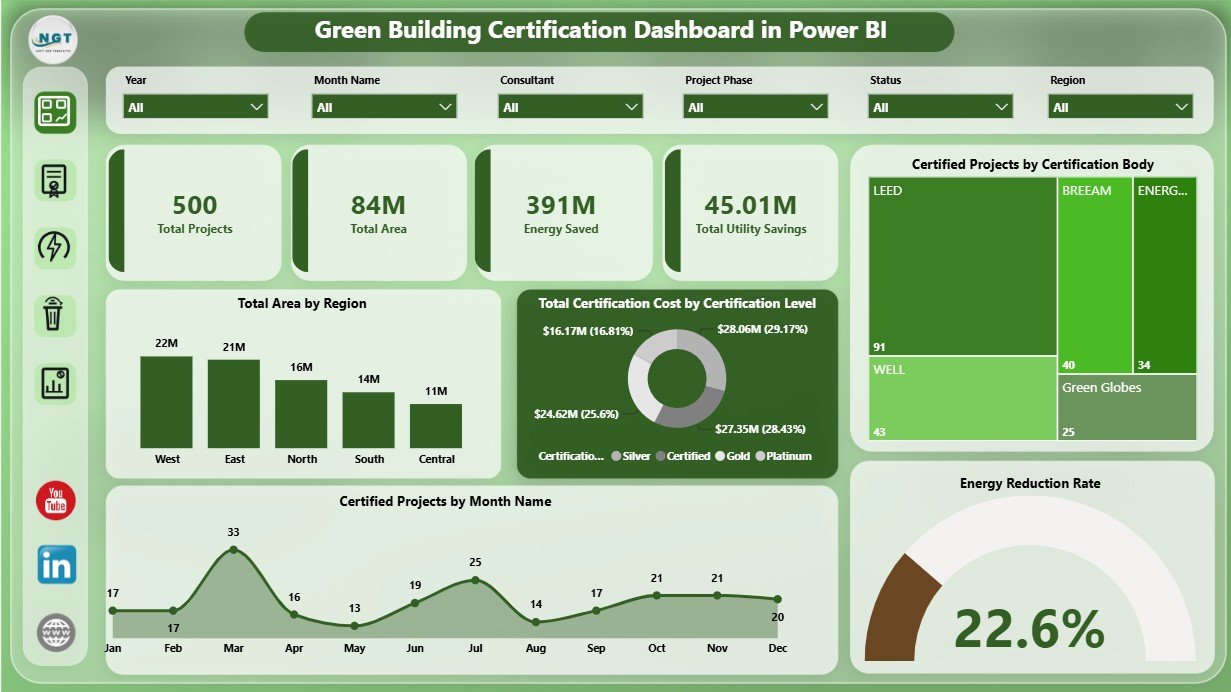
Green Building Certification Dashboard in Power BI
Key Features of Green Building Certification Dashboard in Power BI
- Five Power BI report pages for certification, energy, waste, cost, and portfolio-level analysis.
- High-level KPI cards for Total Projects, Total Area, Energy Saved, and Total Utility Savings.
- Interactive slicers to filter the report quickly and review focused dashboard views.
- Certification analysis by certification level, project status, certification body, month, region, building type, and project phase.
- Energy and utility savings views by region, certification level, consultant, and building type.
- Waste diversion tracking by region, consultant, certification body, and building type.
- Project cost and audit score insights by city, quarter, year, and consultant.
- Editable PBIX file for users who want to customize visuals, fields, measures, slicers, colors, or report layout.
Dashboard Pages Explanation
1. Overview Page
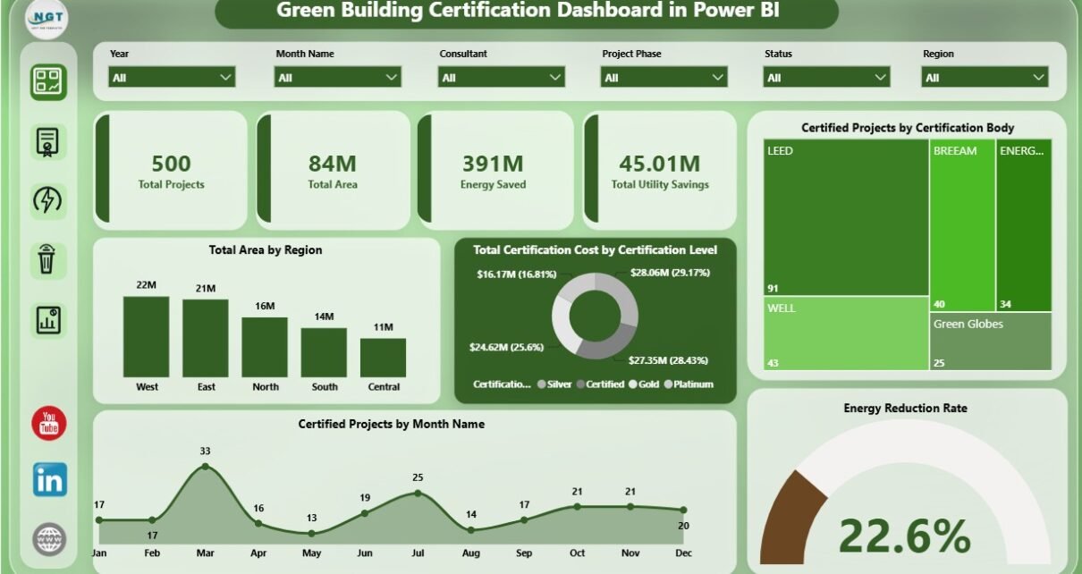
The Overview page gives the first snapshot of the certification portfolio. The top cards show Total Projects, Total Area, Energy Saved, and Total Utility Savings, so users can quickly understand scale, environmental impact, and financial benefit before moving into detailed analysis.
Total Area by Region compares certified or tracked building area across regions. This helps portfolio managers see where the largest certified footprint exists and where certification work may need more attention.
Total Certification Cost by Certification Level shows how certification spend changes across levels. It helps teams compare whether higher certification levels are also carrying higher budget pressure.
Certified Projects by Certification Body shows the distribution of projects across certification programs or governing bodies. This is useful when a portfolio includes LEED, BREEAM, WELL, Green Globes, or other frameworks.
Certified Projects by Month Name reveals certification timing trends. Teams can use it to understand reporting peaks, project completion timing, and seasonal activity.
Energy Reduction Rate gives a direct view of energy performance. It helps users see whether certification work is producing measurable efficiency improvement.
Overview Page
2. Certification Page
The Certification page focuses on certification progress, area, status, building type, and project phase. It helps users understand not only how many projects exist, but where they are in the certification pipeline and which categories are driving portfolio performance.
Total Area by Certification Level shows the amount of building area assigned to each certification level. This view is useful for reporting how much floor area has reached a higher sustainability tier.
Certified Projects by Status separates projects by completion or workflow stage. It helps teams quickly identify completed, in-progress, pending, or delayed projects.
Energy Saved by Building Type compares energy savings across asset types. This can reveal whether offices, campuses, industrial sites, residential buildings, or other groups are producing the strongest energy impact.
Total Certification Cost by Project Phase shows where money is being spent across phases such as planning, design, audit, construction, documentation, or closeout. This is useful for budget review and project management discussions.
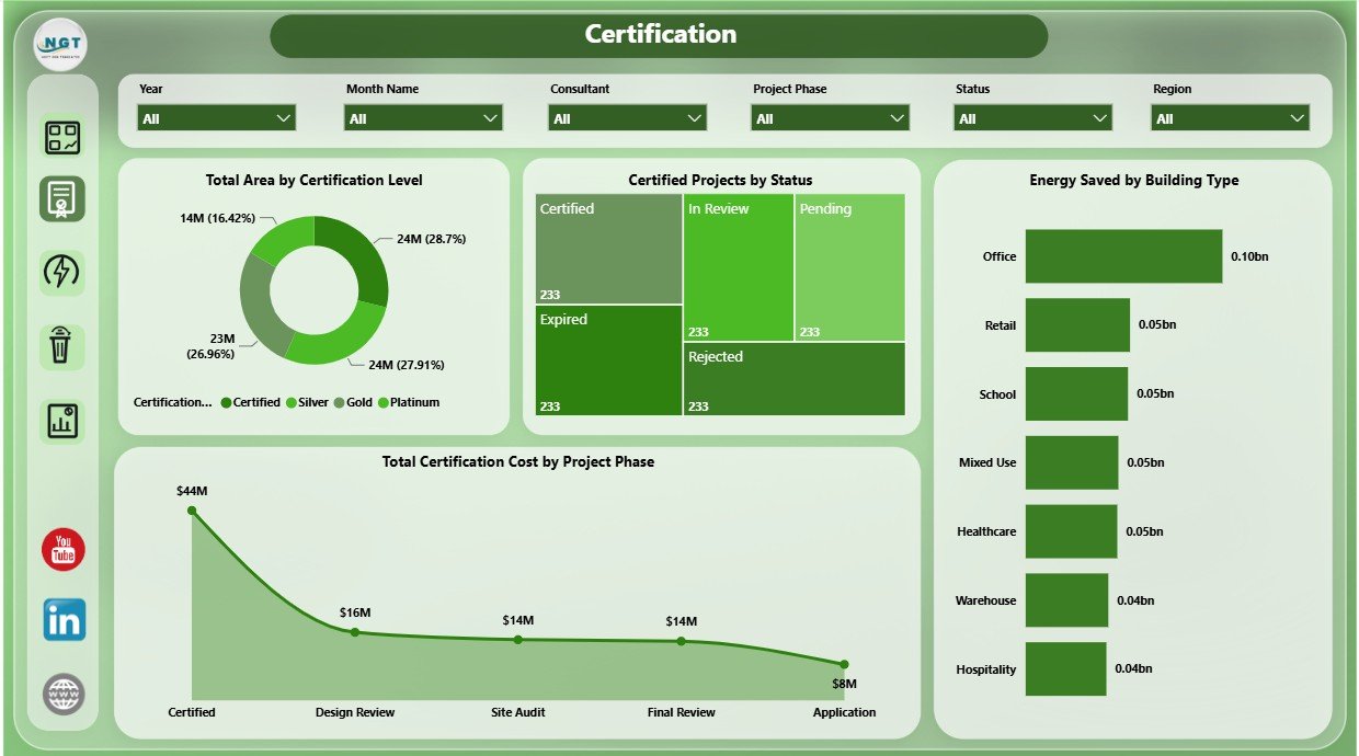
Certification
3. Energy View Page
The Energy View page helps sustainability and facility teams evaluate energy savings and utility cost outcomes. It is especially useful when leadership wants to see whether certification work is connected to measurable efficiency gains.
Energy Saved by Region compares energy savings across locations. This helps teams identify high-impact territories and regions that may require more efficiency focus.
Energy Reduction Rate by Certification Level shows whether higher certification levels are associated with stronger reductions. It can support discussions about investment, certification targets, and expected sustainability impact.
Waste Diversion Rate by Building Type compares diversion performance across asset groups. Although it appears on the Energy View page, it helps connect energy work with wider environmental outcomes.
Total Utility Savings by Consultant compares consultant contribution to savings outcomes. This is useful when multiple consultants, engineering firms, or project teams support different certification projects.
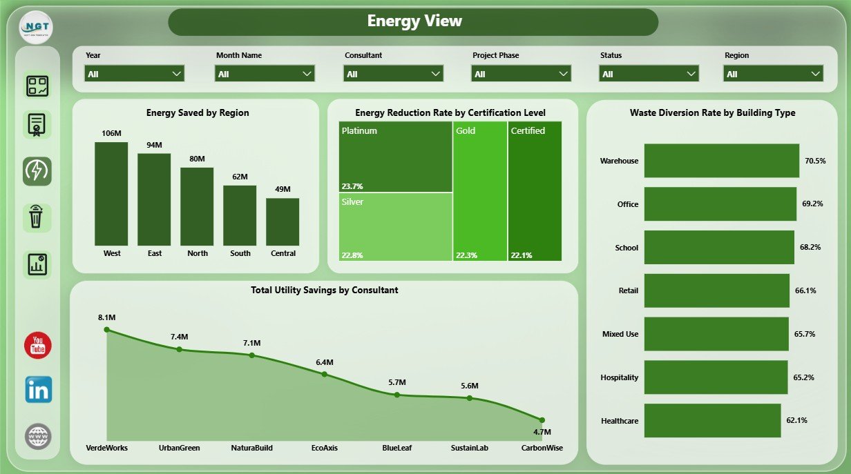
Energy View
4. Waste View Page
The Waste View page supports waste diversion, recycling, audit score, and consultant performance review. It helps ESG teams go beyond energy and evaluate how building projects perform on waste-related outcomes.
Waste Diversion Rate by Region compares diversion performance by location. This can help sustainability managers identify regional teams with strong practices and regions that need corrective action.
Certified Projects by Building Type shows certification activity by asset category. It helps users understand which building groups are most represented in the certification program.
Average Audit Score by Certification Body compares audit quality outcomes by certification framework or body. This helps teams review consistency and quality across different certification paths.
Waste Diversion Rate by Consultant highlights consultant-level performance. Teams can use this view to identify strong partners and coaching opportunities.
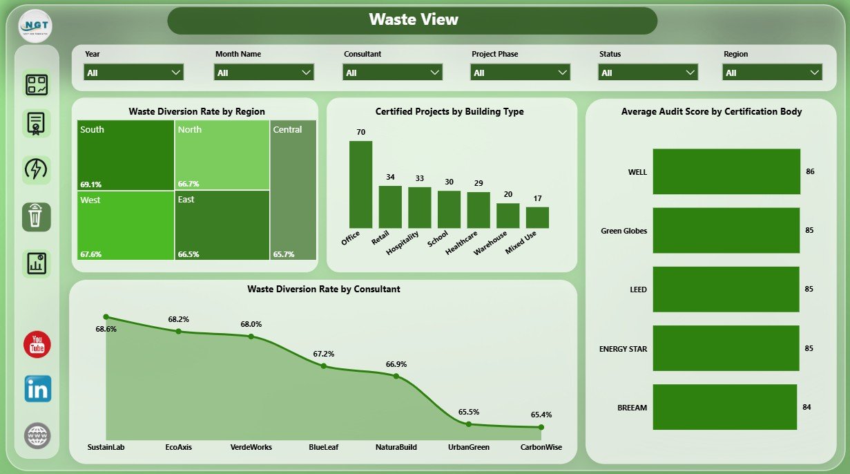
Waste View
5. Project Cost Page
The Project Cost page is built for financial, savings, and quality review. It helps teams explain when certification costs occur, where savings are appearing, and which consultants or cities need attention.
Total Certification Cost by Quarter shows how spend changes across the year. This helps finance and project teams prepare quarterly explanations and forecast future certification budgets.
Total Utility Savings by Year shows whether green building work is generating ongoing financial benefits. It connects sustainability activity with business value.
Average Audit Score by Consultant compares consultant quality outcomes. This can support vendor reviews, renewal decisions, and internal project governance.
Total Certification Cost by City identifies high-cost locations. It helps analysts compare city-level spend and investigate local drivers such as building size, certification complexity, or consultant mix.
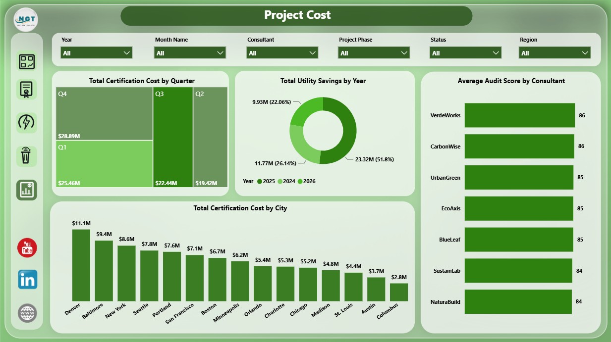
Project Cost
Green Building Certification Dashboard in Power BI vs. Tableau vs. Paid ESG SaaS – Feature Comparison
| Feature | Green Building Certification Dashboard in Power BI | Tableau Alternative | Paid ESG SaaS |
|---|---|---|---|
| Cost | $17.99 one-time template purchase | Requires Tableau licensing and dashboard build time | Monthly or annual subscription |
| Platform | Power BI Desktop / Power BI Service | Tableau Desktop or Tableau Cloud | Vendor cloud platform |
| Setup time | Open PBIX, connect or replace data, refresh | Usually requires model and visual design | May require onboarding and configuration |
| Real-time team collaboration | Available if published through Power BI Service | Available through Tableau Cloud | Usually included by plan |
| Mobile access | Available if published to Power BI Service | Available after publishing | Usually included |
| Customizable fields | Editable fields, visuals, measures, and slicers | Editable with Tableau skills | Depends on vendor permissions |
| Share with link | Possible through Power BI permissions | Possible through Tableau permissions | Usually login controlled |
| Year-1 cost at 5 users | $17.99 plus any Microsoft licensing you choose | Often much higher | Often hundreds or thousands of dollars |
| Certification-specific pages | Included across 5 report pages | Must be built or customized | Depends on module and plan |
Who Should Use This Template
This dashboard is a strong fit for green building consultants, sustainability managers, ESG reporting teams, construction project managers, facility managers, real estate portfolio analysts, architects, engineering consultants, and Power BI freelancers who need a reusable certification reporting model.
It is not a full carbon accounting system, building automation platform, IoT sensor database, or certification submission portal. If your organization needs automated utility feeds, live meter integrations, or formal certification submission workflows, this dashboard can still work as a reporting layer, but it is not a replacement for those systems.
Real-World Use Cases
Asha, Sustainability Manager: Asha uses the Overview page before monthly ESG meetings to review total projects, certified area, energy saved, and utility savings.
Daniel, Green Building Consultant: Daniel filters Energy View and Waste View by consultant to compare savings, audit score, and waste diversion performance across project teams.
Maria, Real Estate Portfolio Analyst: Maria reviews Project Cost by city and quarter to explain certification spend and savings trends to leadership.
Advantages of Green Building Certification Dashboard in Power BI
The main advantage is speed. The report structure is already built, so users do not need to decide which pages, cards, charts, and slicers to create before getting insight from the data.
Power BI also gives flexibility. Users can adjust visuals, edit measures, change themes, publish to Power BI Service, connect to different data sources, or expand the model when their reporting process becomes more mature.
The dashboard is also easier to reuse than a static presentation. Once the data source is updated and refreshed, the same report can support monthly certification reviews, consultant meetings, financial summaries, and ESG updates.
Opportunities for Improvement
The dashboard depends on clean source data. Teams should standardize project names, certification levels, region names, consultant names, and date fields before connecting data to the report.
Advanced organizations may want to add carbon emissions, water reduction, embodied carbon, indoor air quality, or automatic data refresh. Those enhancements can be added in Power BI, but they may require additional fields, DAX measures, and source-system connections.
Online sharing may require Power BI Service and Microsoft licensing. Users should review their internal sharing rules before publishing reports to a workspace.
Best Practices
- Keep source columns consistent so visuals and measures continue working after refresh.
- Use clear naming for certification levels, bodies, consultants, and project phases.
- Refresh the report on a monthly or quarterly cadence depending on project activity.
- Review energy saved and utility savings together so efficiency impact and financial impact stay connected.
- Use slicers during meetings instead of creating separate report copies for every region or consultant.
- Save a backup copy before changing relationships, measures, or page layouts.
Explore Relevant Templates
You may also like the Green Building Certification Dashboard in Excel, Green Building KPI Dashboard in Power BI, and Office Sustainability Dashboard in Power BI. Browse more Power BI Dashboard templates.
Frequently Asked Questions
What is the Green Building Certification Dashboard in Power BI?
It is a ready-to-use PBIX dashboard template for tracking certification projects, area, certification cost, energy saved, utility savings, waste diversion, audit score, certification level, body, status, region, city, building type, consultant, and project phase.
How many report pages are included?
The dashboard includes 5 pages: Overview, Certification, Energy View, Waste View, and Project Cost.
Can I use my own certification data?
Yes. Replace or connect your own project records using the same data structure, then refresh the Power BI report.
Do I need Power BI Pro?
You can open and edit the PBIX file in Power BI Desktop. Power BI Pro may be needed if you want to publish and share the report online through Power BI Service.
Can I use this dashboard for LEED, BREEAM, or WELL?
Yes. The dashboard can be used for LEED, BREEAM, WELL, Green Globes, and similar green building certification programs when the source data includes the needed fields.
Can I customize the visuals?
Yes. The report is editable in Power BI Desktop, so users can change visuals, colors, slicers, fields, pages, and measures.
About the Author
Built by PK – Microsoft Certified Professional with 15+ years of Excel, Google Sheets, and Power BI experience. Founder of NextGenTemplates, reaching 300K+ subscribers across YouTube channels. Every template is hand-built and tested before release.
Conclusion
The Green Building Certification Dashboard in Power BI gives sustainability and project teams a practical way to monitor certification progress, total area, energy saved, utility savings, waste diversion, audit score, certification cost, project phase, consultant results, and city-level performance in one interactive report. It is especially useful for teams that want clear Power BI reporting without building a dashboard from scratch.
Download the Green Building Certification Dashboard in Power BI from NextGenTemplates and start turning certification data into clear business insight.
Visit our YouTube channel for step-by-step Power BI and dashboard tutorials.