The health insurance industry runs on numbers — policies, premiums, claims, costs, and payouts. Every transaction impacts profitability and customer satisfaction. To stay competitive and compliant, insurance companies must monitor key performance indicators (KPIs) across all business functions.
The Health Insurance KPI Dashboard in Excel makes this process simple and data-driven. It helps insurers analyze claim processing speed, policy growth, customer retention, and premium collections — all in one place. This ready-to-use Excel dashboard template transforms complex data into easy-to-understand visuals, empowering management teams to make faster and smarter decisions.
In this article, we’ll explore everything you need to know about this Excel-based solution: its structure, features, advantages, and best practices. You’ll also find answers to frequently asked questions (FAQs) at the end.
Click to Purchases Health Insurance KPI Dashboard in Excel
🩺 What Is a Health Insurance KPI Dashboard in Excel?
A Health Insurance KPI Dashboard in Excel is a centralized performance-monitoring system designed to track essential insurance metrics. It converts raw operational data into visual charts, trend analyses, and comparison reports.
Using Excel as the foundation, this dashboard eliminates the need for expensive software systems. It’s simple, cost-effective, and completely customizable — perfect for insurance analysts, managers, and executives.
With this dashboard, you can:
-
Monitor key metrics such as claims ratio, premium revenue, and renewal rate.
-
Compare Actual vs Target performance on both Month-to-Date (MTD) and Year-to-Date (YTD) levels.
-
Analyze trends and identify inefficiencies in claims management, underwriting, or policy renewals.
🧩 Key Features of the Health Insurance KPI Dashboard
This template includes seven fully functional worksheets. Each one plays a specific role in ensuring your KPIs are tracked efficiently.
1️⃣ Home Sheet
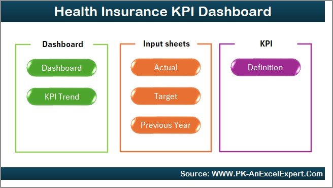
The Home Sheet serves as the main index of the dashboard.
It includes quick navigation buttons that take you to the Dashboard, Trend, Input, Target, and Definition sheets.
Key highlights:
-
Interactive Buttons: Jump to any sheet with a single click.
-
User-Friendly Layout: Simple, professional design suitable for all users.
-
Custom Branding: Add your company’s logo and color theme to personalize the dashboard.
2️⃣ Dashboard Sheet
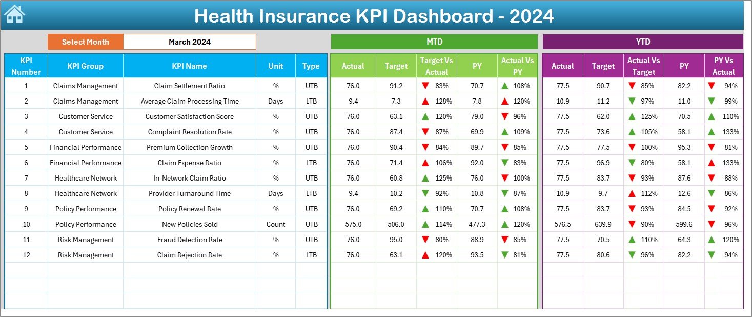
The Dashboard Sheet is the core of this tool. It consolidates all KPIs and visuals in one central view.
Features:
-
Dynamic Month Selection: Use the dropdown in cell D3 to choose a specific month.
-
MTD & YTD Tracking: Compare Actual, Target, and Previous Year (PY) results.
-
Visual Indicators: Conditional formatting arrows (▲▼) show improvement or decline instantly.
-
KPI Comparison: See Target vs Actual and PY vs Actual side-by-side.
This sheet provides decision-makers with an immediate snapshot of business health.
3️⃣ KPI Trend Sheet
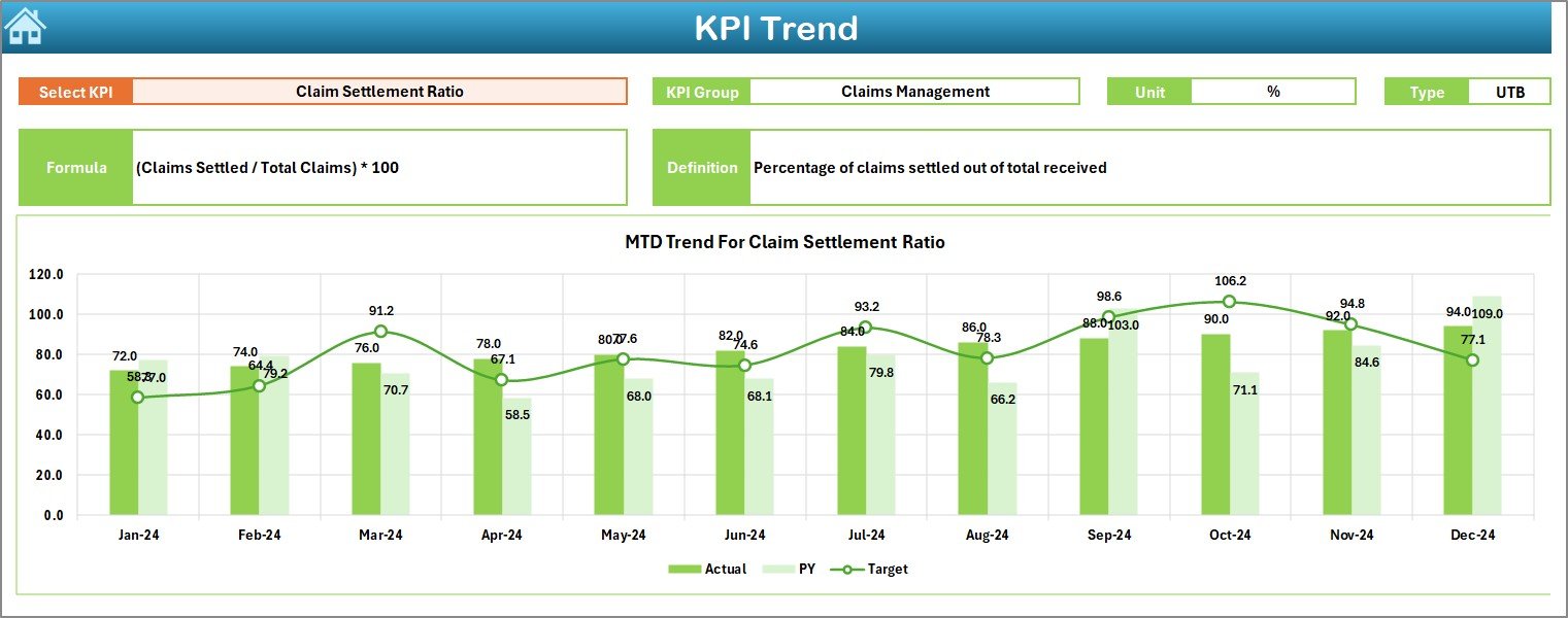
The KPI Trend Sheet gives deeper insights into individual KPI performance over time.
What you’ll find:
-
Dropdown Selection (Cell C3): Pick any KPI to review.
-
KPI Details: Shows KPI Group, Unit, Type (LTB or UTB), Formula, and Definition.
-
Trend Charts: Displays MTD and YTD charts for Actual, Target, and PY data.
This section helps managers pinpoint trends in claims ratios, policy growth, or financial metrics.
4️⃣ Actual Numbers Input Sheet
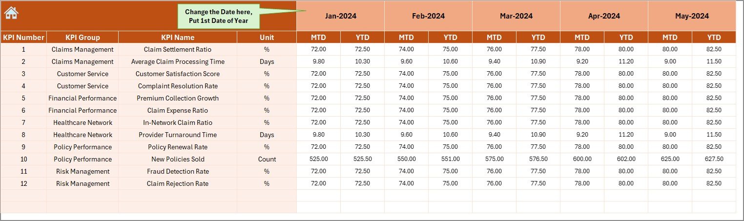
This sheet is where you input all real performance data.
Functionality:
-
Data Entry: Record MTD and YTD actual values for each KPI.
-
Month Setup (Cell E1): Define the first month of your fiscal year to automate period tracking.
-
Auto-Refresh: Dashboard updates automatically once new data is entered.
This ensures your analysis remains current and accurate.
5️⃣ Target Sheet
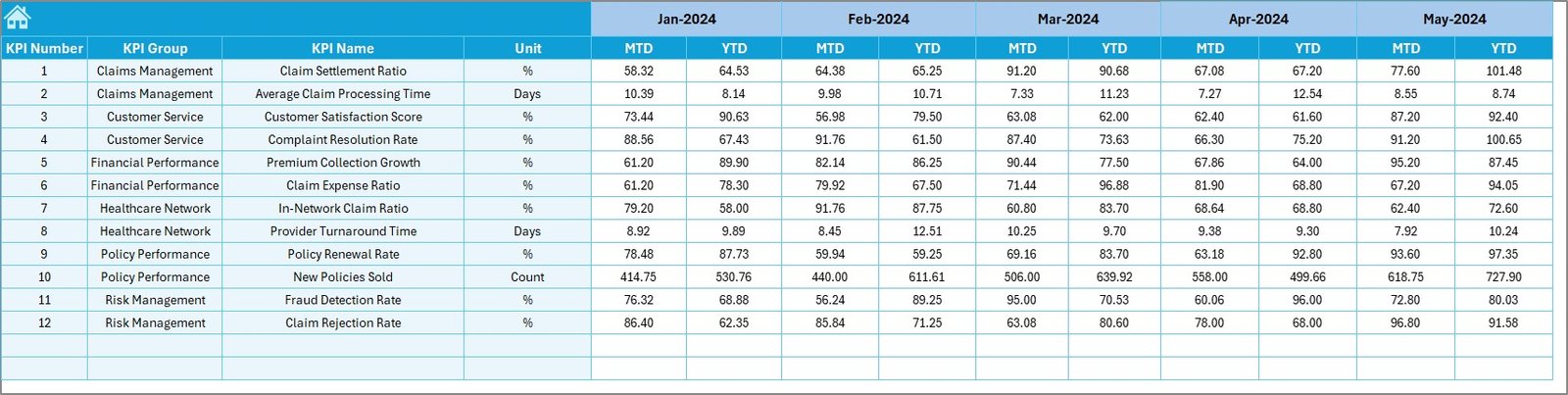
The Target Sheet defines your monthly and yearly business goals.
You can:
-
Enter target values for each KPI across all months.
-
Track both MTD and YTD targets.
-
Align objectives across departments — underwriting, claims, sales, and operations.
This sheet forms the foundation for performance evaluation and strategic alignment.
6️⃣ Previous Year Numbers Sheet
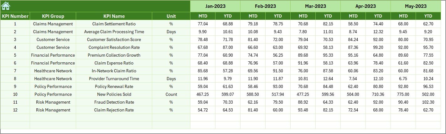
This sheet holds data for the previous year’s KPIs, enabling year-over-year analysis.
Benefits:
-
Compare current results with last year’s performance.
-
Identify long-term growth patterns.
-
Evaluate consistency in customer acquisition, claims processing, and profitability.
7️⃣ KPI Definition Sheet
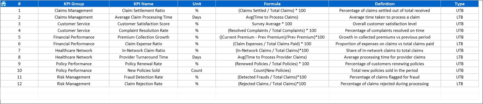
The KPI Definition Sheet is your internal dictionary of metrics.
It includes:
-
KPI Name and Group
-
Unit of Measure
-
Formula
-
Short Definition
This documentation ensures clarity and consistency across departments, avoiding confusion in performance interpretation.
Click to Purchases Health Insurance KPI Dashboard in Excel
📊 Importance of KPI Tracking in Health Insurance
Insurance companies handle millions of data points — from policy premiums to hospital claims. Without systematic tracking, valuable insights go unnoticed.
The Health Insurance KPI Dashboard provides a structured approach to evaluate performance in critical areas such as claims settlement, underwriting, and policy servicing.
Why It Matters
-
Improves Efficiency: Reduces manual reporting time by automating KPI calculations.
-
Enhances Transparency: All departments can access unified data.
-
Promotes Accountability: Clear ownership of performance metrics.
-
Supports Data-Driven Decisions: Managers can act quickly based on accurate insights.
-
Ensures Compliance: Tracks operational and regulatory KPIs crucial for audit and reporting.
🧮 Common KPIs for Health Insurance Dashboard
Below are some of the most useful KPIs included in this Excel template:
1. Claims Performance KPIs
-
Claim Settlement Ratio (%)
-
Average Claim Processing Time (Days)
-
Claim Rejection Rate (%)
-
Pending Claims (%)
-
Average Claim Amount (USD)
2. Policy and Sales KPIs
-
New Policies Issued (#)
-
Policy Renewal Rate (%)
-
Policy Lapse Rate (%)
-
Average Premium per Policy (USD)
-
Policy Growth Rate (%)
3. Financial KPIs
-
Total Premium Collected (USD)
-
Loss Ratio (%)
-
Expense Ratio (%)
-
Profit Margin (%)
-
Investment Income (USD)
4. Customer Service KPIs
-
Customer Satisfaction Score (CSAT %)
-
Complaint Resolution Time (Hours)
-
Net Promoter Score (NPS)
-
Policyholder Retention Rate (%)
5. Operational KPIs
-
Claims per Employee (#)
-
Digital Claim Submission Rate (%)
-
Fraud Detection Rate (%)
-
Turnaround Time for Policy Issuance (Days)
These KPIs collectively provide a 360-degree view of your business performance.
🧠 How to Use the Health Insurance KPI Dashboard in Excel
Follow these simple steps to make the most out of the dashboard:
-
Define KPIs: List your KPIs with clear formulas in the KPI Definition Sheet.
-
Set Targets: Populate target values in the Target Sheet for each month.
-
Enter Actual Data: Record MTD and YTD actual performance in the Input Sheet.
-
Select Month: Use the dropdown in the Dashboard Sheet to view monthly summaries.
-
Analyze Trends: Review the KPI Trend Sheet to identify performance improvements or drops.
-
Take Action: Adjust operations, sales strategies, or claim processes based on insights.
This step-by-step process helps transform static data into meaningful business intelligence.
💡 Advantages of the Health Insurance KPI Dashboard in Excel
✅ 1. Real-Time Visibility
Quickly understand your insurance company’s performance using interactive visuals and dropdown filters.
✅ 2. Data Accuracy
Automated formulas ensure reliable results with minimal manual calculations.
✅ 3. Easy Customization
Modify KPIs, visuals, and formulas to match your organization’s specific requirements.
✅ 4. Cost-Effective Solution
No expensive software or coding knowledge needed — everything runs in Excel.
✅ 5. Improved Decision-Making
Helps leaders identify profit-leak areas and efficiency gaps instantly.
✅ 6. Better Collaboration
Share the workbook through OneDrive or Google Drive for multi-user access and updates.
🔍 Opportunities for Improvement
While the Excel dashboard is powerful, there’s always room to enhance its functionality:
-
⚙️ Add Automation: Integrate macros or Power Query for automatic data refresh.
-
📊 Use Power BI Integration: Connect the Excel data to Power BI for more advanced visualization.
-
💻 Add Real-Time APIs: Link claims management or CRM systems for live updates.
-
🧾 Include Validation Rules: Prevent incorrect or missing data entries.
-
📈 Expand Historical Data: Include multi-year tracking for long-term trend analysis.
🏆 Best Practices for Using the Health Insurance KPI Dashboard
To make the dashboard even more effective, follow these best practices:
🩺 1. Define SMART KPIs
Make sure your KPIs are Specific, Measurable, Achievable, Relevant, and Time-bound.
🩺 2. Standardize Data Collection
Use consistent units, formats, and definitions across all teams.
🩺 3. Review Monthly
Hold monthly review meetings to analyze the dashboard results and set new goals.
🩺 4. Leverage Conditional Formatting
Use colors or icons to highlight performance trends visually.
🩺 5. Secure Data
Apply password protection and limit access to sensitive financial data.
🩺 6. Encourage Cross-Functional Collaboration
Let claims, underwriting, and finance teams work together to interpret results.
🩺 7. Document Changes
Update the KPI Definition Sheet whenever formulas or metrics change.
💬 Example: Real-World Dashboard Application
Consider an insurance company tracking Claim Settlement Ratio (%) and Policy Renewal Rate (%).
In one quarter, the dashboard shows the Claim Settlement Ratio dropped from 95% to 89%, while pending claims increased by 10%.
By analyzing the KPI Trend Sheet, managers found that processing delays were due to incomplete document submissions.
After implementing a digital claims submission system and staff training, the next quarter’s dashboard showed an improvement — settlement ratio increased to 96% and pending claims fell by 12%.
This example demonstrates how data-driven dashboards help pinpoint operational issues and deliver measurable results.
Click to Purchases Health Insurance KPI Dashboard in Excel
🩸 Conclusion
The Health Insurance KPI Dashboard in Excel is more than just a spreadsheet — it’s a strategic tool that transforms complex insurance data into meaningful insights. It empowers companies to monitor claims performance, policy growth, and financial stability with accuracy and confidence.
By using this dashboard, insurance providers can move from reactive management to proactive decision-making. It helps you achieve transparency, efficiency, and profitability while maintaining regulatory compliance.
Whether you manage a small insurance brokerage or a large corporate insurer, this dashboard is a must-have for efficient performance tracking and reporting.
🧾 Frequently Asked Questions (FAQs)
1. What is a Health Insurance KPI Dashboard?
It’s an Excel-based tool used to track key metrics like claim settlement, policy growth, and revenue.
2. Can it be customized?
Yes, you can modify KPIs, visuals, and formulas according to your business needs.
3. Does it require advanced Excel skills?
No. The template is beginner-friendly and uses simple dropdowns and charts.
4. How often should I update it?
You can update it monthly, weekly, or quarterly depending on reporting needs.
5. What are the top KPIs for insurance?
Claim Settlement Ratio, Loss Ratio, Policy Renewal Rate, and Expense Ratio are the most critical.
6. Can multiple users work on the same dashboard?
Yes. Store it on OneDrive or Google Drive for collaborative updates.
7. Does it include trend analysis?
Yes, the KPI Trend Sheet provides detailed MTD and YTD trend charts.
8. How does it help in compliance?
It helps track regulatory KPIs and audit metrics like claim turnaround time and rejection rates.
9. Can it track multiple insurance products?
Yes, you can group KPIs by product lines such as health, motor, or life insurance.
10. Is this dashboard suitable for startups?
Absolutely. It’s scalable, simple, and cost-effective for insurance startups and established firms alike.
Click to Purchases Health Insurance KPI Dashboard in Excel
Visit our YouTube channel to learn step-by-step video tutorials