Hospitals manage expensive equipment portfolios across departments, vendors, locations, and lease contracts. A single MRI machine, ventilator fleet, surgical unit, diagnostic device, or patient monitoring system can affect revenue, service availability, maintenance cost, and patient-care capacity. However, many teams still review lease cost, maintenance cost, utilization, vendor records, and equipment status in separate spreadsheets.
The Hospital Equipment Leasing Dashboard in Excel solves that reporting gap with a ready-to-use workbook. It brings lease performance, cost control, vendor comparison, equipment mix, and risk review into one Excel dashboard template. Users can replace the sample records, refresh the workbook, and analyze 5 dashboard pages with KPI cards, charts, and slicers.
Click here to view the Hospital Equipment Leasing Dashboard in Excel.
Key Features of Hospital Equipment Leasing Dashboard in Excel
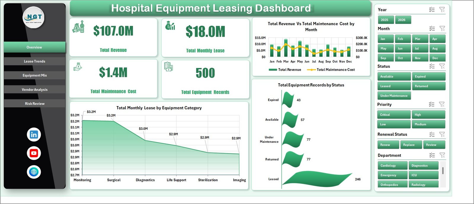
This dashboard is designed for hospital finance, procurement, biomedical engineering, operations, and administration teams that need fast visibility into leased medical equipment performance. The workbook includes KPI cards for Total Revenue, Total Monthly Lease Cost, Total Maintenance Cost, Leased Equipment Count, and Average Revenue Per Record.
It also includes interactive slicers, pivot-based charts, 5 analytical pages, a structured Data sheet, and a Support sheet that stores the pivot tables behind the dashboard. Because it is built in Excel, users can customize fields, update records, and adjust visuals without buying a new SaaS tool.
Dashboard Pages Explanation
1. Overview Page
The Overview Page gives leaders a high-level view of the hospital equipment leasing portfolio. At the top, KPI cards show Total Revenue, Total Monthly Lease Cost, Total Maintenance Cost, Leased Equipment Count, and Average Revenue Per Record.
Total Revenue by Month Name: This chart shows monthly revenue movement across the reporting period. It helps finance teams identify stronger and weaker months before reviewing lease cost pressure.
Utilization Rate by Overall Equipment Portfolio: This view shows how effectively leased equipment is being used. Low utilization may signal over-leasing, scheduling issues, or equipment that should be reviewed before renewal.
Leased Equipment Count by Status: This chart splits equipment records by status. It helps teams see active, pending, completed, or issue-based records in one quick visual.
Total Monthly Lease Cost by Equipment Category: This chart shows which equipment categories create the highest recurring lease cost. It supports budget planning and category-level contract review.
2. Lease Trends
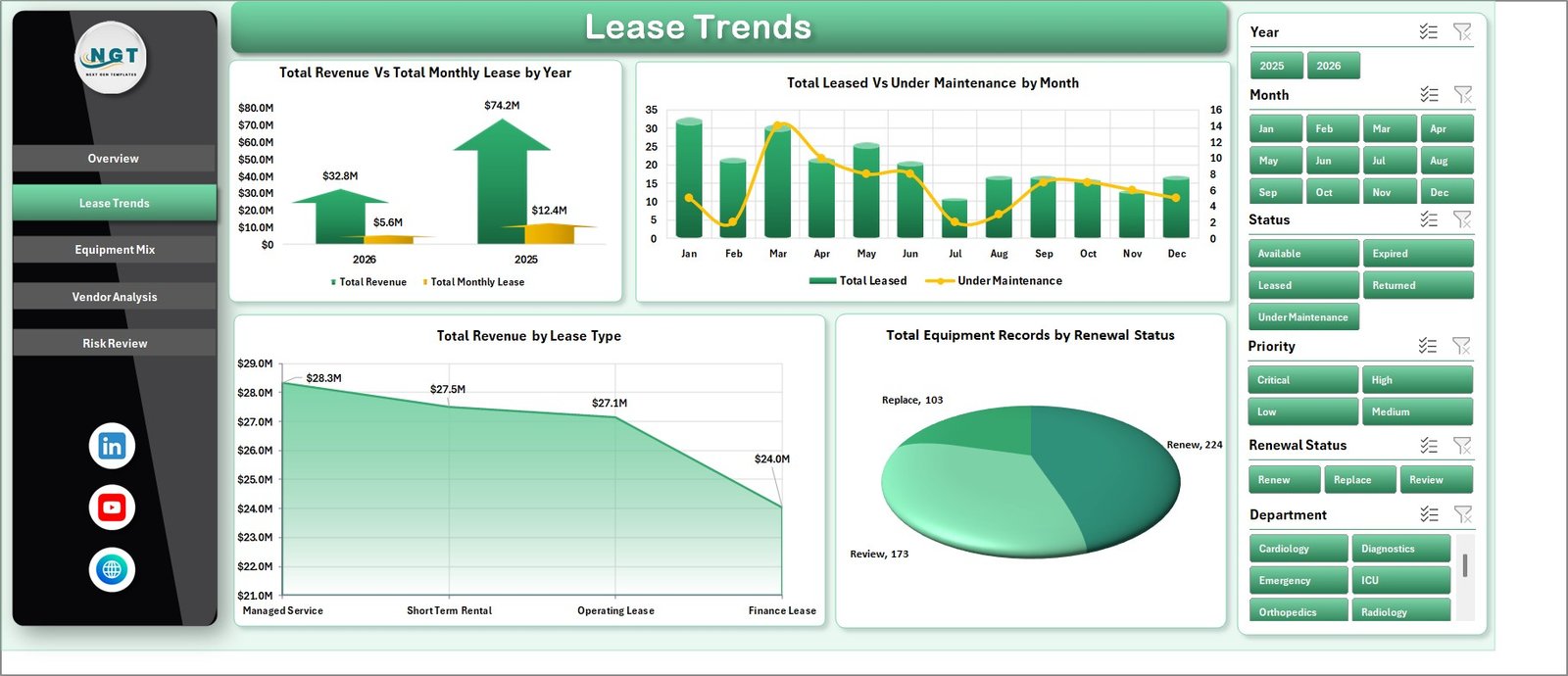
The Lease Trends page focuses on leasing structure and time-based movement. Leased Equipment Count by Lease Type helps teams compare short-term, long-term, rental, or other lease structures. Total Revenue by Year gives a multi-year view, while Total Revenue by Lease Type shows which lease arrangements contribute most to revenue.
Total Monthly Lease Cost by Month Name completes the page by showing how recurring lease cost changes across months. This is useful when finance managers need to compare seasonal equipment needs or contract renewal timing.
3. Equipment Mix
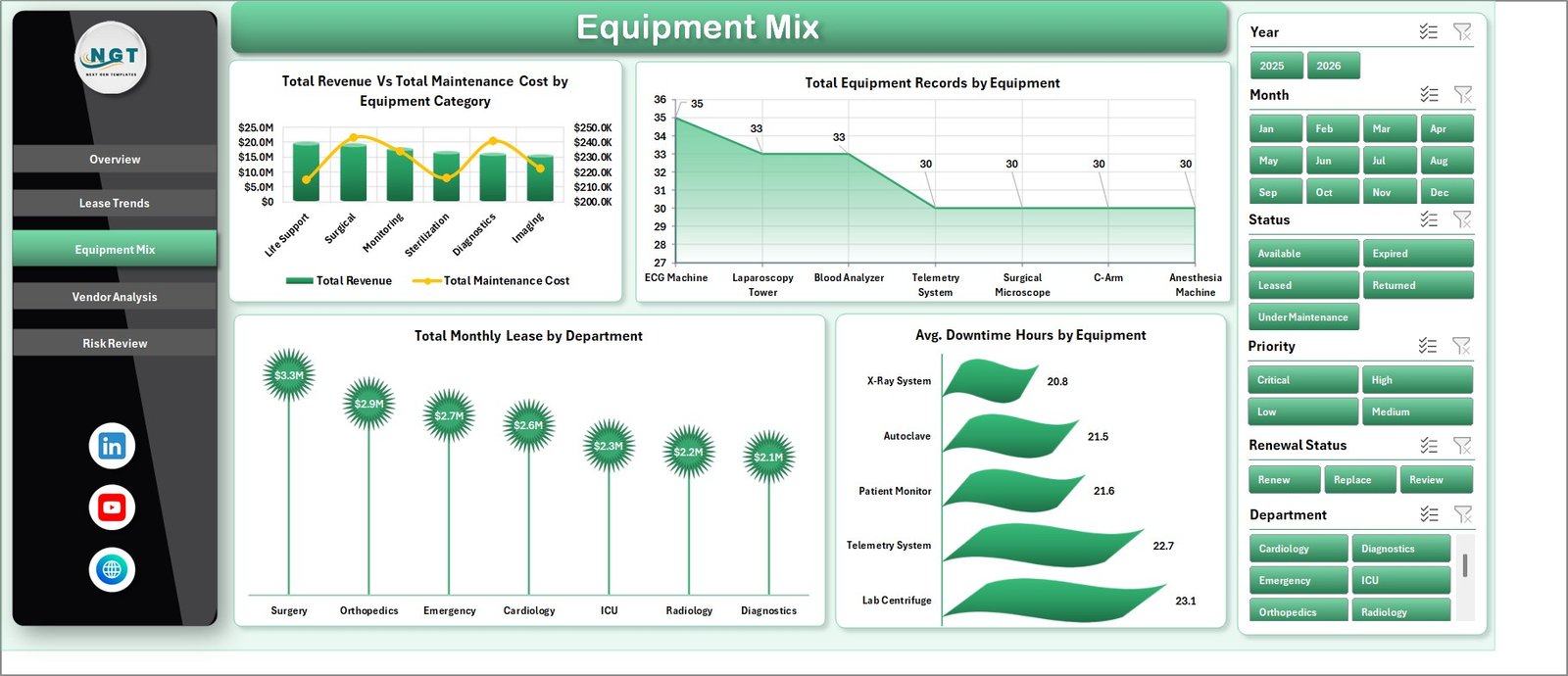
The Equipment Mix page explains the composition of the leased equipment portfolio. Total Revenue by Month Name helps users compare monthly performance, while Total Maintenance Cost by Department shows which hospital departments create the highest maintenance burden.
Average Revenue Per Record by Equipment helps managers compare individual equipment performance. Total Maintenance Cost by Equipment Category gives a category-level cost view, which can support replacement planning, vendor discussions, or internal utilization reviews.
4. Vendor Analysis
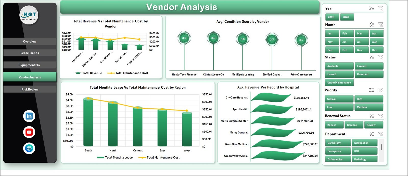
The Vendor Analysis tab is built for procurement and vendor management. Average Revenue Per Record by Hospital shows hospital-level financial contribution, while Total Maintenance Cost by Region highlights regions that may need closer review.
Average Revenue Per Record by Vendor helps compare vendor-level value. Total Equipment Records by Vendor shows concentration risk and vendor dependency, which is useful before contract renewal or negotiation meetings.
5. Risk Review
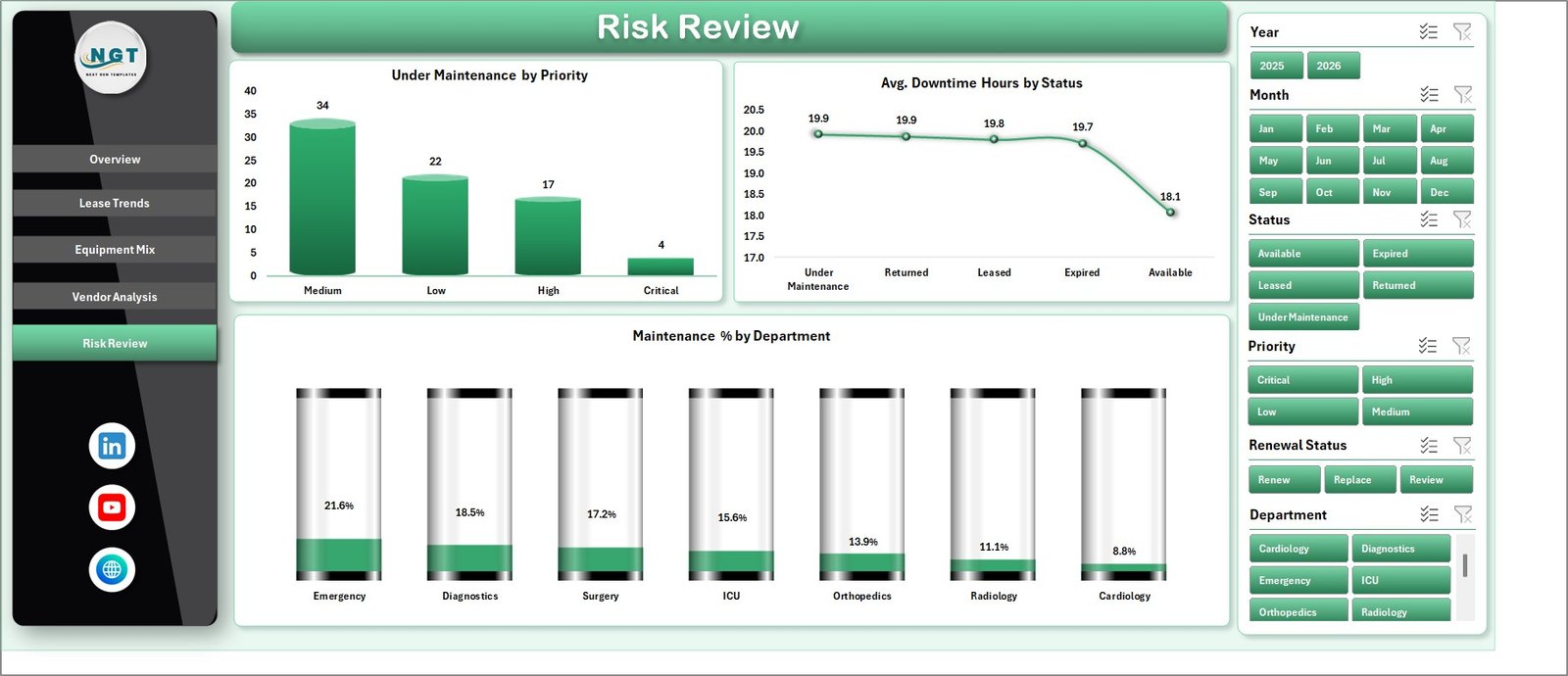
The Risk Review page connects status, priority, utilization, and department cost into one risk-focused view. Leased Equipment Count by Month Name shows record volume over time, and Utilization Rate by Priority helps teams see whether high-priority equipment is being used effectively.
Average Revenue Per Record by Status can reveal which statuses are linked with stronger or weaker financial outcomes. Total Monthly Lease Cost by Department shows departments that may require cost control, better scheduling, or equipment consolidation.
6. Data Sheet Tab
The Data sheet is the input layer. Users add or replace equipment leasing records in the same format as the sample data. Consistent names for vendor, department, region, category, status, priority, and lease type are important because the dashboard uses pivot tables.

7. Support Sheet Tab
The Support sheet contains the pivot tables used to build the dashboard visuals. After updating the Data sheet, go to the Data tab in the Excel Ribbon and click Refresh All. The pivots and charts refresh together, and the Support sheet can remain hidden during normal use.

Hospital Equipment Leasing Dashboard in Excel vs. Google Sheets vs. Paid Healthcare SaaS – Feature Comparison
| Feature | Excel dashboard | Google Sheets alternative | Paid healthcare SaaS |
|---|---|---|---|
| Cost | $17.99 one-time | Low cost, usually self-built | Monthly or annual subscription |
| Platform | Microsoft Excel | Browser-based spreadsheet | Vendor-hosted platform |
| Setup time | Under 10 minutes after data replacement | Depends on formulas and sharing | Often requires onboarding |
| Real-time team collaboration | Limited unless used with OneDrive or SharePoint | Strong | Strong |
| Mobile access | Limited for heavy dashboard work | Good for viewing | Usually good |
| Customizable fields | Fully editable workbook | Editable with permissions | Often limited by vendor schema |
| Lease cost and vendor analysis | Built in | Custom setup required | Depends on module and plan |
| Year-1 cost at 5 users | $17.99 plus Excel already used | Low if self-managed | Can reach hundreds or thousands |
Who Should Use This Template
This template is useful for hospital finance managers, biomedical equipment managers, procurement teams, operations analysts, facility administrators, and healthcare consultants. It is also helpful for multi-location hospital groups that want a simple Excel reporting layer before investing in a heavier system.
Real-World Use Cases
Anita, hospital finance manager: She reviews monthly lease cost by equipment category before each budget meeting and checks whether revenue is keeping pace with lease commitments.
Rohan, biomedical equipment lead: He uses utilization and maintenance-cost views to identify leased assets that may need replacement, better scheduling, or contract renegotiation.
Meera, procurement consultant: She compares vendors, hospitals, and regions to prepare a practical contract-review pack for senior management.
Advantages of Hospital Equipment Leasing Dashboard in Excel
It keeps leasing analytics in a familiar tool. Most hospital teams already use Excel, so the dashboard can be reviewed without learning a new platform.
It connects cost, revenue, utilization, and risk. The workbook does not only show lease cost. It also gives revenue, maintenance, utilization, vendor, and status views.
It is easy to refresh. Replace the Data sheet records, click Refresh All, and use slicers to focus each review.
Opportunities for Improvement
This is an Excel reporting template, not a live equipment management system. It does not track live device telemetry, create maintenance work orders, post lease accounting journal entries, or enforce user permissions. Hospitals that need these workflows should use this dashboard alongside their CMMS, ERP, or lease accounting system.
Best Practices
Keep vendor names, department names, equipment categories, lease types, statuses, and priorities consistent in the Data sheet. Small spelling differences can split pivot results into separate values.
Refresh the workbook after every major data update. Review the Support sheet if a visual does not look correct, then hide it again for everyday use.
Use slicers during review meetings instead of creating many duplicate reports. This keeps the workbook easier to maintain.
Explore Relevant Templates
- Hospital Equipment Leasing Dashboard in Excel – the template discussed in this article.
- Equipment Leasing Dashboard in Excel – broader equipment leasing analytics.
- Equipment Leasing KPI Dashboard in Excel – KPI-focused lease performance tracking.
- Home Healthcare KPI Dashboard in Excel – healthcare KPI reporting.
- Browse Excel dashboard templates.
Frequently Asked Questions
What does the Hospital Equipment Leasing Dashboard in Excel track?
It tracks revenue, monthly lease cost, maintenance cost, leased equipment count, average revenue per record, utilization, vendor, hospital, department, region, category, lease type, status, and priority.
Can I replace the sample data?
Yes. Replace the records in the Data sheet, then refresh the workbook so pivot tables, charts, slicers, and KPI cards update.
Does this workbook require macros?
No macro workflow is required for normal dashboard use. It is built around Excel tables, slicers, pivot tables, and pivot charts.
Can I customize the pages?
Yes. You can edit fields, charts, pivots, formulas, colors, and page layouts inside Excel.
Is this a hospital asset management system?
No. It is a reporting dashboard for exported or manually maintained data. It does not replace a CMMS, ERP, or live asset management platform.
Is this a one-time purchase?
Yes. The template is sold as a one-time download from NextGenTemplates.
About the Author
Built by PK – Microsoft Certified Professional with 15+ years of Excel, Google Sheets, and Power BI experience. Founder of NextGenTemplates, reaching 300K+ subscribers across YouTube channels. Every template is hand-built and tested before release.
Conclusion
The Hospital Equipment Leasing Dashboard in Excel gives healthcare teams a practical way to review lease cost, maintenance cost, revenue, utilization, status, priority, department cost, and vendor mix without building a reporting model from scratch.
For hospitals that already manage equipment leasing records in spreadsheets or exports, this workbook can save setup time and make recurring reviews clearer. Visit YouTube.com/@PKAnExcelExpert for step-by-step Excel tutorials.