Intercity bus services operate in a highly competitive and cost-sensitive environment. Operators must manage fuel expenses, toll costs, route profitability, customer satisfaction, and booking channels while maintaining service reliability. However, when data remains scattered across spreadsheets and manual reports, decision-making becomes slow and reactive.
That is exactly where an Intercity Bus Services Dashboard in Power BI delivers real value.
In this detailed article, you will learn what an Intercity Bus Services Dashboard in Power BI is, why bus operators need it, how it works, its page-wise structure, key features, advantages, best practices, and frequently asked questions. Moreover, the article uses clear language, strong transitions, and practical explanations to ensure clarity and SEO effectiveness.
Click to Purchases Intercity Bus Services Dashboard in Power BI
What Is an Intercity Bus Services Dashboard in Power BI?
An Intercity Bus Services Dashboard in Power BI is an interactive analytics solution designed to monitor and analyze key performance indicators (KPIs) for intercity bus operations.
Instead of relying on static Excel reports, this dashboard consolidates financial, operational, route-level, and customer-experience data into one centralized Power BI report. As a result, operators gain instant visibility into revenue, costs, profitability, cancellations, and service quality.
Additionally, Power BI visuals allow users to filter data dynamically and identify trends across routes, destinations, booking channels, and months.
Why Do Intercity Bus Operators Need a KPI Dashboard?
Intercity bus operations involve high fixed costs, fluctuating demand, and multiple booking channels. Therefore, operators must track performance continuously to remain profitable.
Here is why a KPI dashboard becomes essential:
-
First, operators must control fuel, toll, and operational costs.
-
Second, management teams need route-wise and city-wise profitability insights.
-
Third, customer satisfaction and cancellation rates directly impact revenue.
-
Finally, trend analysis supports better pricing, scheduling, and marketing decisions.
Because of these reasons, an Intercity Bus Services Dashboard in Power BI becomes a strategic necessity rather than a reporting tool.
Click to Purchases Intercity Bus Services Dashboard in Power BI
How Does an Intercity Bus Services Dashboard in Power BI Work?
The dashboard follows a simple and efficient workflow.
First, operational and financial data is captured in the data source.
Next, Power BI processes and models the data.
Then, visuals, KPIs, and charts update dynamically based on slicer selections.
Finally, decision-makers explore insights across routes, cities, channels, and time periods.
Because of this approach, the dashboard delivers real-time insights without complex system integrations.
What Are the Key Features of the Intercity Bus Services Dashboard in Power BI?
This dashboard includes several carefully designed features that support fast and accurate decision-making.
Key Highlights
-
Interactive Power BI visuals
-
Dynamic slicers on every page
-
Revenue, cost, and profit tracking
-
Customer rating and cancellation analysis
-
Route-wise and city-wise performance
-
Booking channel profitability insights
-
Monthly trend analysis
Together, these features convert raw bus service data into actionable insights.
Click to Purchases Intercity Bus Services Dashboard in Power BI
Page-Wise Structure of the Intercity Bus Services Dashboard in Power BI
The dashboard consists of five well-structured pages, each focused on a specific analytical area.
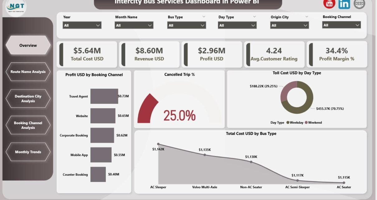
1. What Does the Overview Page Show?
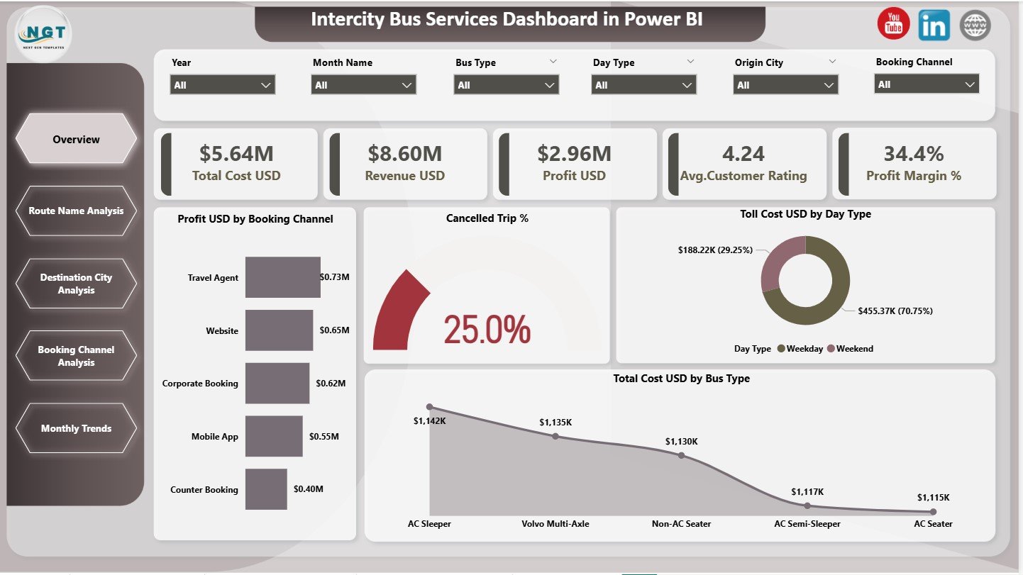
The Overview Page acts as the main performance summary of the dashboard.
KPI Cards for Quick Insights
This page displays five KPI cards:
-
Total Cost (USD)
-
Revenue (USD)
-
Profit (USD)
-
Average Customer Rating
-
Profit Margin (%)
Because of these cards, managers can instantly assess overall business health.
Charts on the Overview Page
The Overview Page also includes four important charts:
-
Profit (USD) by Booking Channel
-
Cancelled Trip (%)
-
Toll Cost (USD) by Day Type
-
Total Cost by Bus Type
These visuals highlight profitability drivers, operational inefficiencies, and cost structures.
Click to Purchases Intercity Bus Services Dashboard in Power BI
2. How Does the Route Name Analysis Page Help?
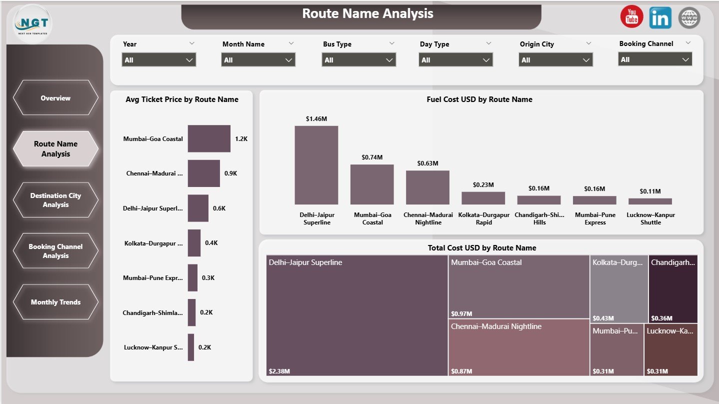
The Route Name Analysis Page focuses on route-level performance.
Key Charts on This Page
-
Average Ticket Price by Route Name
-
Fuel Cost by Route Name
-
Total Cost by Route Name
This analysis helps operators identify high-cost routes and optimize pricing strategies.
3. What Insights Does the Destination City Analysis Page Provide?
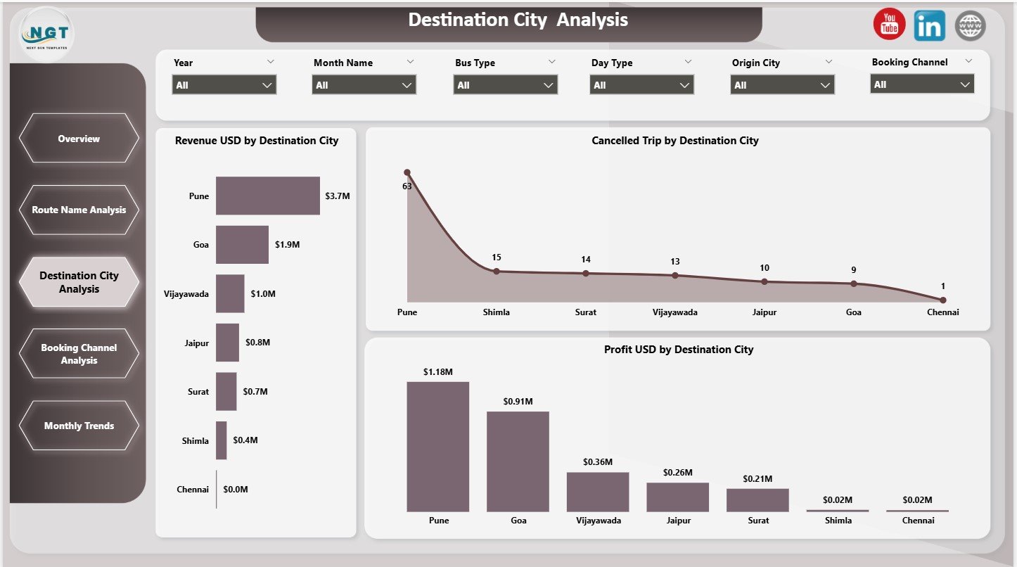
The Destination City Analysis Page highlights performance across destination cities.
Charts Included
-
Revenue (USD) by Destination City
-
Cancelled Trips by Destination City
-
Profit (USD) by Destination City
Because of these insights, operators can identify profitable cities and address high cancellation areas.
4. Why Is Booking Channel Analysis Important?
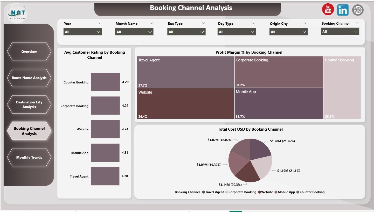
The Booking Channel Analysis Page evaluates performance across different booking platforms.
Key Charts
-
Average Customer Rating by Booking Channel
-
Profit Margin (%) by Booking Channel
-
Total Cost (USD) by Booking Channel
This page helps teams optimize channel mix and improve customer experience.
Click to Purchases Intercity Bus Services Dashboard in Power BI
5. How Does the Monthly Trends Page Support Planning?
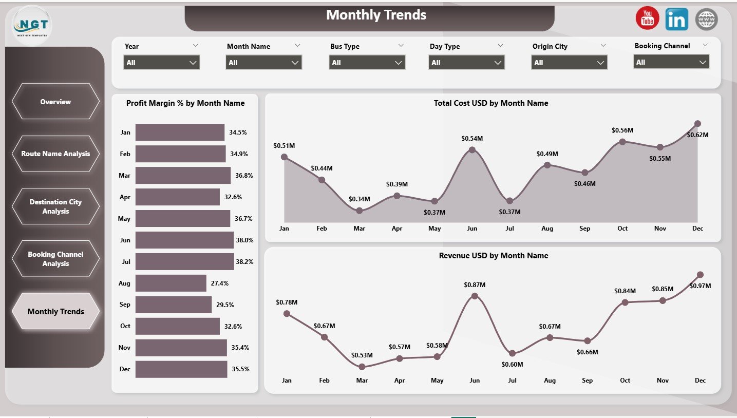
The Monthly Trends Page focuses on time-based performance analysis.
Trend Charts
-
Profit Margin (%) by Month
-
Total Cost (USD) by Month
-
Revenue (USD) by Month
These charts help identify seasonal demand patterns and cost fluctuations.
Advantages of Intercity Bus Services Dashboard in Power BI
Implementing this dashboard delivers clear operational and strategic benefits.
Key Advantages
-
✔ Centralized performance tracking
-
✔ Improved cost control
-
✔ Route and city-wise profitability insights
-
✔ Better booking channel optimization
-
✔ Clear customer satisfaction visibility
-
✔ Data-driven decision-making
Because of these advantages, bus operators gain better control over operations and profitability.
How Does This Dashboard Improve Business Decisions?
This dashboard helps operators:
-
Optimize routes and schedules
-
Reduce cancellations
-
Improve customer ratings
-
Control fuel and toll expenses
-
Focus on high-profit booking channels
As a result, decisions become proactive instead of reactive.
Click to Purchases Intercity Bus Services Dashboard in Power BI
Best Practices for the Intercity Bus Services Dashboard in Power BI
Follow these best practices to maximize dashboard value.
1. Maintain Clean Data
Ensure accurate cost, revenue, and rating inputs.
2. Review Route Performance Regularly
Analyze route-wise costs and profits monthly.
3. Monitor Cancellations Closely
Address high cancellation cities and routes quickly.
4. Track Customer Ratings
Use ratings to improve service quality.
5. Use Monthly Trends for Planning
Plan pricing and capacity using seasonal insights.
Conclusion
An Intercity Bus Services Dashboard in Power BI transforms complex operational data into clear, actionable insights. By combining revenue, cost, route, city, and booking channel analytics, this dashboard empowers bus operators to improve profitability, optimize routes, and enhance customer satisfaction.
In an industry driven by margins and service quality, this dashboard becomes an essential tool for sustainable growth.
Click to Purchases Intercity Bus Services Dashboard in Power BI
Frequently Asked Questions (FAQs)
What is an Intercity Bus Services Dashboard in Power BI?
It is an interactive Power BI dashboard that tracks financial, operational, and customer KPIs for intercity bus services.
Can this dashboard analyze route-wise performance?
Yes, it includes detailed route-level cost and pricing analysis.
Does the dashboard track customer ratings?
Yes, average customer ratings appear across booking channels.
Can I analyze cancellations by city?
Yes, the dashboard includes cancelled trip analysis by destination city.
Is this dashboard suitable for large bus operators?
Yes, it scales for both small and large intercity bus networks.
Does it support monthly trend analysis?
Yes, it includes revenue, cost, and profit margin trends by month.
Click to Purchases Intercity Bus Services Dashboard in Power BI
Visit our YouTube channel to learn step-by-step video tutorials