Internal communication shapes how employees connect, collaborate, and stay aligned with business goals. However, without proper measurement, even the strongest communication strategies lose direction. That is exactly why an Internal Communications KPI Dashboard in Power BI becomes essential for modern organizations.
This detailed guide explains what an Internal Communications KPI Dashboard in Power BI is, why it matters, how it works, and how teams can use it effectively. Moreover, this article expands your already written information with practical explanations, best practices, advantages, and real-world usage. As a result, communication leaders, HR teams, and management professionals gain a clear roadmap to measure and improve internal communication performance.
Click to Purchases Internal Communications KPI Dashboard in Power BI
What Is an Internal Communications KPI Dashboard in Power BI?
An Internal Communications KPI Dashboard in Power BI is a ready-to-use analytical solution that tracks, measures, and visualizes internal communication performance using structured KPIs.
Instead of reviewing scattered Excel sheets or manual reports, this dashboard converts communication data into interactive visuals. Consequently, decision-makers quickly understand how internal messages perform across departments, time periods, and KPI groups.
Moreover, the dashboard uses Excel as a data source, which makes data entry simple while Power BI handles visualization, calculations, and analysis. Therefore, organizations gain both flexibility and accuracy.
Why Do Organizations Need an Internal Communications KPI Dashboard?
Internal communication impacts employee engagement, productivity, and alignment. However, many teams rely on assumptions rather than data. That approach creates blind spots.
An Internal Communications KPI Dashboard in Power BI solves this challenge because:
-
It provides real-time visibility into communication effectiveness
-
It compares targets vs actual performance clearly
-
It highlights gaps, trends, and improvements instantly
-
It supports data-driven decision-making
As a result, leadership teams stop guessing and start improving communication strategies with confidence.
How Does the Internal Communications KPI Dashboard in Power BI Work?
This dashboard works by combining Excel-based input sheets with Power BI interactive visuals. Therefore, users only update Excel data, while Power BI automatically refreshes insights.
Let us now explore the structure and features of this dashboard in detail.
Key Features of Internal Communications KPI Dashboard in Power BI
The dashboard includes three powerful pages, each designed for a specific analytical purpose. Together, they deliver a complete internal communication performance overview.
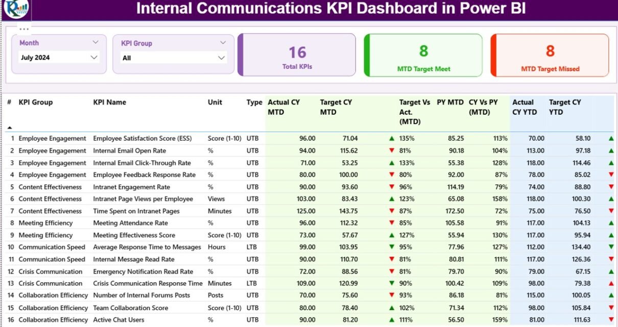
1. What Does the Summary Page Show?
The Summary Page serves as the main landing page of the dashboard. It provides a high-level view of all KPIs while allowing quick filtering and comparison.
Top-Level Slicers
At the top of the page, you can find:
-
Month Slicer – Select any month to update all KPIs instantly
-
KPI Group Slicer – Filter KPIs by communication category
Because of these slicers, users analyze specific periods or KPI groups without manual effort.
KPI Cards for Quick Insights
The Summary Page displays three important KPI cards:
-
Total KPIs Count
-
MTD Target Met Count
-
MTD Target Missed Count
As a result, managers immediately understand overall performance status.
Detailed KPI Table Explained
Below the KPI cards, the dashboard shows a detailed KPI performance table with the following columns:
-
KPI Number – Sequence number of each KPI
-
KPI Group – Category or group of the KPI
-
KPI Name – Name of the communication KPI
-
Unit – Unit of measurement
-
Type – KPI type such as:
-
UTB (Upper the Better)
-
LTB (Lower the Better)
-
MTD (Month-to-Date) Performance Metrics
The dashboard tracks Month-to-Date performance using multiple indicators:
-
Actual CY MTD – Current year actual MTD value
-
Target CY MTD – Target value for current year MTD
-
MTD Icon –
-
▲ Green icon for target met
-
▼ Red icon for target missed
-
-
Target vs Actual (MTD) –
-
Formula:
Actual MTD / Target MTD
-
-
PY MTD – Previous year MTD value
-
CY vs PY (MTD) –
-
Formula:
Current Year MTD / Previous Year MTD
-
Because of these metrics, users clearly see short-term communication performance.
YTD (Year-to-Date) Performance Metrics
In addition, the dashboard tracks long-term performance using YTD metrics:
-
Actual CY YTD – Current year actual YTD value
-
Target CY YTD – Current year target YTD value
-
YTD Icon – Visual indicator for YTD performance
-
Target vs Actual (YTD) –
-
Formula:
Actual YTD / Target YTD
-
-
PY YTD – Previous year YTD value
-
CY vs PY (YTD) –
-
Formula:
Current Year YTD / Previous Year YTD
-
Therefore, leadership teams track both short-term and long-term communication effectiveness in one place.
2. How Does the KPI Trend Page Help?
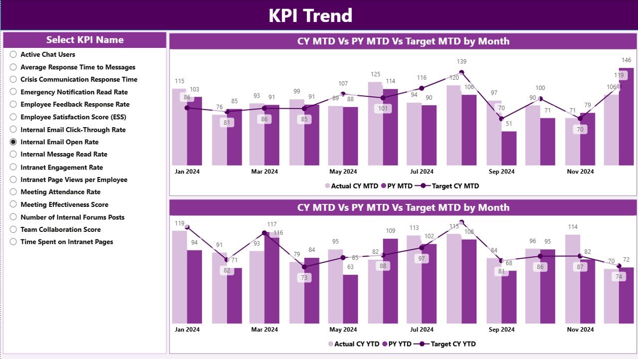
The KPI Trend Page focuses on historical analysis and trend comparison.
Combo Charts for Deep Insights
This page includes two combo charts that display:
-
Current Year Actuals
-
Previous Year Actuals
-
Target values
These charts appear separately for:
-
MTD trends
-
YTD trends
Because of combo charts, users compare performance across time with clarity.
KPI Selection Slicer
On the left side, a KPI Name slicer allows users to select any KPI. As soon as they select a KPI, all charts update automatically.
As a result, analysts can investigate performance patterns and identify communication gaps quickly.
Click to Purchases Internal Communications KPI Dashboard in Power BI
3. What Is the KPI Definition Page?
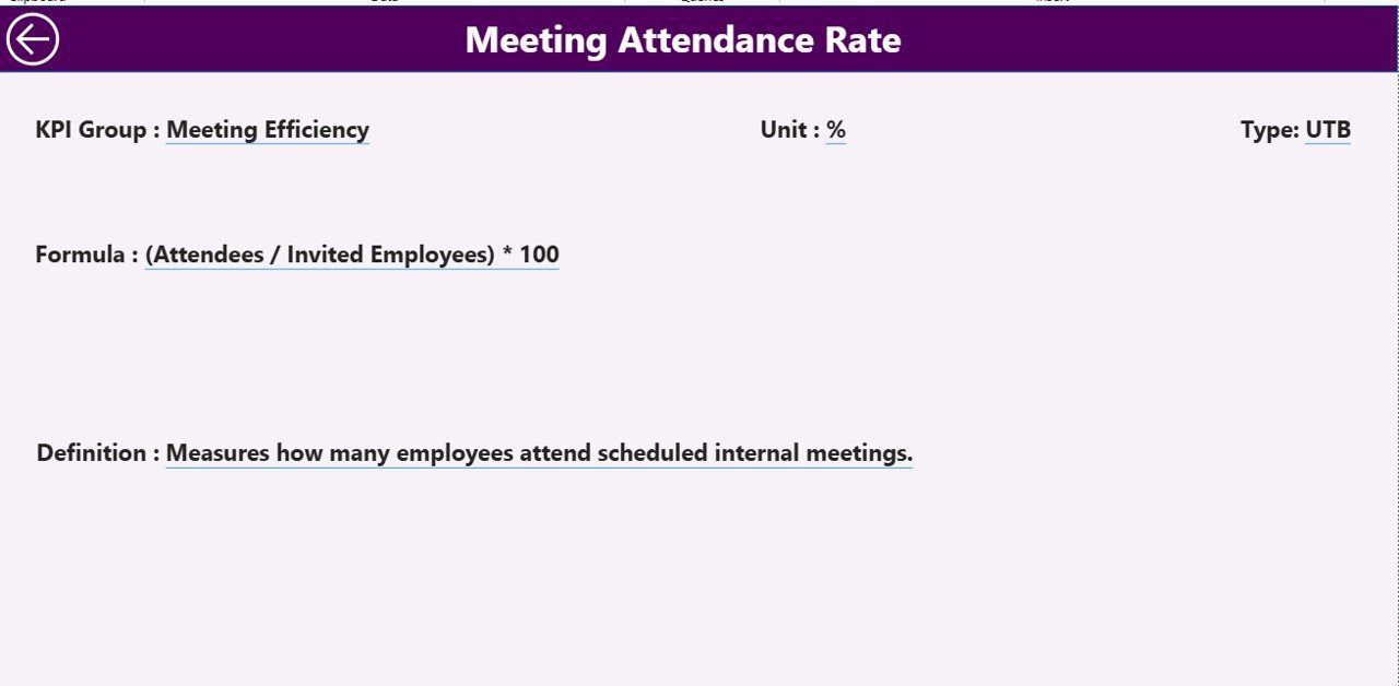
The KPI Definition Page acts as a reference and learning layer.
Drill-Through Functionality
This page stays hidden by default. However, users can drill through from the Summary Page to view KPI details.
It displays:
-
KPI Formula
-
KPI Definition
-
KPI Unit
-
KPI Type (UTB or LTB)
Because of this design, stakeholders understand what each KPI measures and how calculations work.
A Back button on the top-left corner allows easy navigation back to the Summary Page.
Excel Data Structure Used in the Dashboard
The dashboard uses Excel as the data source, which makes maintenance simple and flexible.
Users need to update only three Excel worksheets.
1. Input_Actual Sheet
This sheet captures actual performance data:
-
KPI Name
-
Month (use first date of the month)
-
MTD Actual Value
-
YTD Actual Value
Once users update this sheet, Power BI refreshes automatically.
2. Input_Target Sheet
This sheet stores target values:
-
KPI Name
-
Month (first date of the month)
-
MTD Target Value
-
YTD Target Value
As a result, the dashboard compares actual performance against targets accurately.
3. KPI Definition Sheet
This sheet defines KPI metadata:
-
KPI Number
-
KPI Group
-
KPI Name
-
Unit
-
Formula
-
Definition
-
Type (LTB or UTB)
Because of this structure, KPI governance remains consistent.
Click to Purchases Internal Communications KPI Dashboard in Power BI
Advantages of Internal Communications KPI Dashboard in Power BI
Using an Internal Communications KPI Dashboard in Power BI delivers several strong advantages.
Key Benefits
-
📊 Centralized Performance View – Track all communication KPIs in one dashboard
-
⚡ Real-Time Insights – Refresh data instantly with Excel updates
-
🎯 Target Tracking – Identify target met and missed KPIs quickly
-
📈 Trend Analysis – Compare current year, previous year, and targets
-
👥 Better Alignment – Improve transparency across departments
-
💡 Data-Driven Decisions – Replace assumptions with insights
Therefore, organizations strengthen communication strategies with clarity.
Opportunities for Improvement in Internal Communications Measurement
Although this dashboard provides strong insights, teams can always improve further.
-
Add employee engagement survey scores
-
Integrate email open rates or intranet usage
-
Include department-wise communication KPIs
-
Track message reach and acknowledgment rates
By expanding KPIs, organizations gain deeper communication intelligence.
Best Practices for the Internal Communications KPI Dashboard in Power BI
To get maximum value, teams should follow these best practices.
1. Define Clear KPIs
Always define KPIs clearly with formulas and ownership. As a result, confusion reduces.
2. Maintain Data Discipline
Update Excel input sheets regularly. Therefore, insights remain accurate.
3. Use UTB and LTB Logic Correctly
Apply UTB and LTB consistently to ensure correct performance evaluation.
4. Review Trends Monthly
Analyze MTD and YTD trends every month to catch issues early.
5. Educate Stakeholders
Use the KPI Definition page to explain metrics to leadership and teams.
Real-World Use Cases of Internal Communications KPI Dashboard
This dashboard supports multiple business scenarios:
-
HR teams tracking internal announcements
-
Corporate communication teams measuring message effectiveness
-
Leadership monitoring engagement alignment
-
Change management teams tracking communication impact
As a result, communication strategies become measurable and scalable.
Conclusion: Why This Dashboard Matters
An Internal Communications KPI Dashboard in Power BI transforms internal communication from intuition-driven to data-driven. Because it combines Excel simplicity with Power BI intelligence, teams gain powerful insights without complexity.
Moreover, this dashboard tracks MTD and YTD performance, compares targets, analyzes trends, and clarifies KPI definitions. Therefore, organizations improve transparency, accountability, and communication effectiveness across all levels.
Frequently Asked Questions (FAQs)
What is an Internal Communications KPI Dashboard in Power BI?
It is a Power BI dashboard that tracks and visualizes internal communication KPIs using Excel data.
Why should internal communications be measured?
Because measurement helps organizations improve engagement, clarity, and alignment.
What data source does this dashboard use?
The dashboard uses Excel as the primary data source.
Can non-technical users maintain this dashboard?
Yes, users only need to update Excel sheets.
What are UTB and LTB KPIs?
UTB means Upper the Better, while LTB means Lower the Better.
Can this dashboard support trend analysis?
Yes, it includes MTD and YTD combo charts for trend analysis.
Is the KPI Definition page mandatory?
Yes, it ensures KPI clarity and governance.
How often should data be updated?
Teams should update data monthly for accurate insights.
Visit our YouTube channel to learn step-by-step video tutorials

