In today’s knowledge-driven economy, organizations thrive on how well they manage information. From capturing best practices to sharing critical insights across teams, Knowledge Management (KM) has become essential for performance and innovation. However, managing knowledge isn’t enough—you need to measure it effectively. That’s where the Knowledge Management KPI Dashboard in Power BI comes in.
In this article, we’ll explore everything you need to know about this powerful tool—from its design and data structure to the advantages and best practices. Whether you’re a project manager, a KM leader, or a business analyst, this guide will help you understand how to track, visualize, and improve knowledge processes in your organization.
Click to Purchases Knowledge Management KPI Dashboard in Power BI
What Is a Knowledge Management KPI Dashboard?
A Knowledge Management KPI Dashboard is a visual tool that tracks key performance indicators (KPIs) related to how knowledge is created, shared, retained, and applied across your business.
Built using Microsoft Power BI, this dashboard provides a real-time, interactive view of your KM performance. It connects to an Excel file as the data source, offering a user-friendly and flexible reporting environment.
Why Use Power BI for Knowledge Management?
Power BI transforms static data into dynamic, interactive visuals. When it comes to knowledge management, Power BI enables organizations to:
-
Monitor knowledge usage and sharing trends
-
Identify underperforming areas
-
Compare actual performance with targets
-
Make informed, data-driven decisions
Unlike spreadsheets or manual reports, Power BI dashboards are real-time, visually intuitive, and highly scalable.
Key Features of the Knowledge Management KPI Dashboard
This dashboard consists of three core pages, each designed to serve a specific function. Let’s break them down one by one.
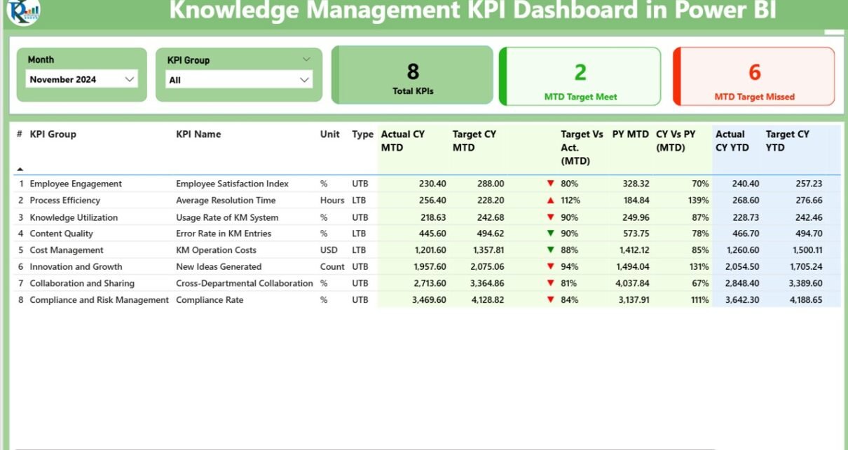
Summary Page – The Big Picture
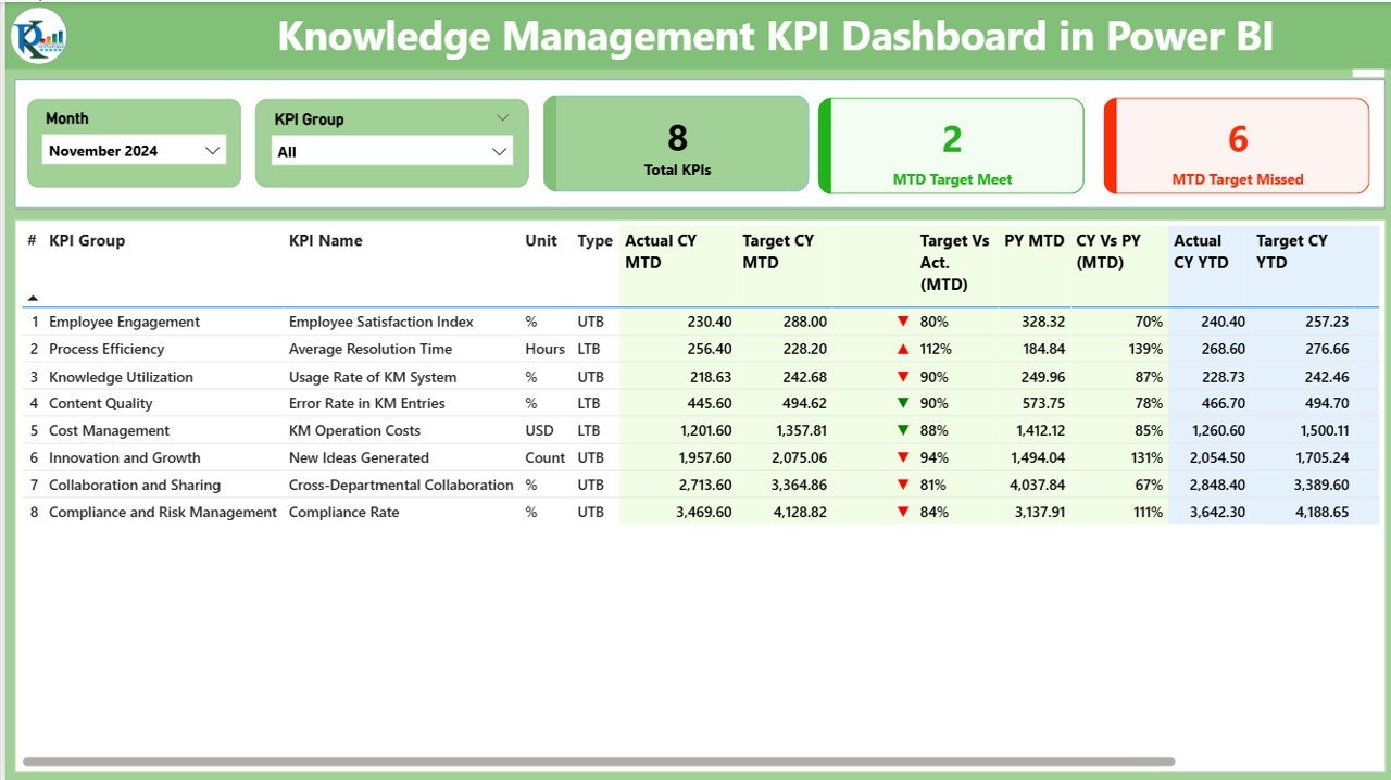
The Summary Page is the front face of your dashboard and serves as the central hub for performance monitoring.
🔹 Top Section
-
Month Slicer – Select the month to view specific time-based performance.
-
KPI Group Slicer – Filter data by different categories of KPIs (e.g., Document Control, Knowledge Transfer, Collaboration).
Cards:
- Total KPIs Count
- MTD Target Met Count
- MTD Target Missed Count
KPI Trend Page – Performance Over Time
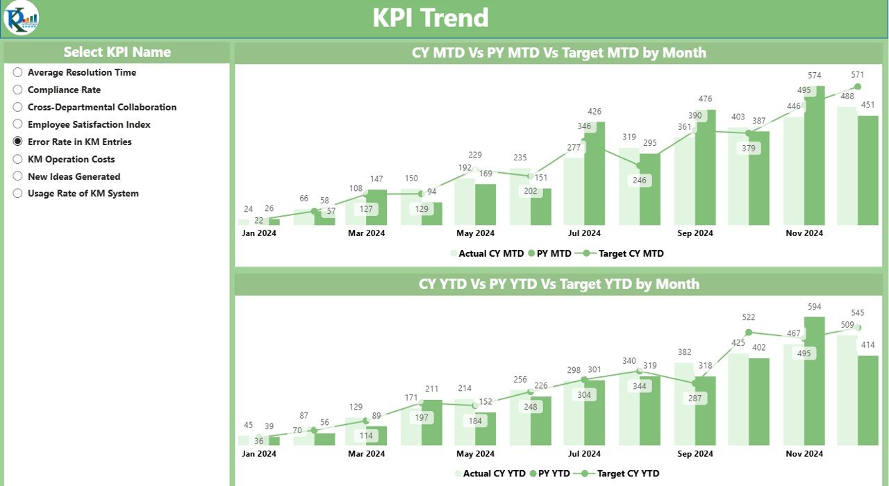
This page provides two combo charts for visual trend analysis.
-
Monthly Trend Chart – Compare MTD actuals, targets, and previous year’s performance.
-
Yearly Trend Chart – View YTD comparisons across time.
-
Slicer – Select any KPI to dynamically update the charts.
These visualizations help in spotting growth patterns, sudden drops, or inconsistencies that need immediate attention.
KPI Definition Page – Know Your Metrics
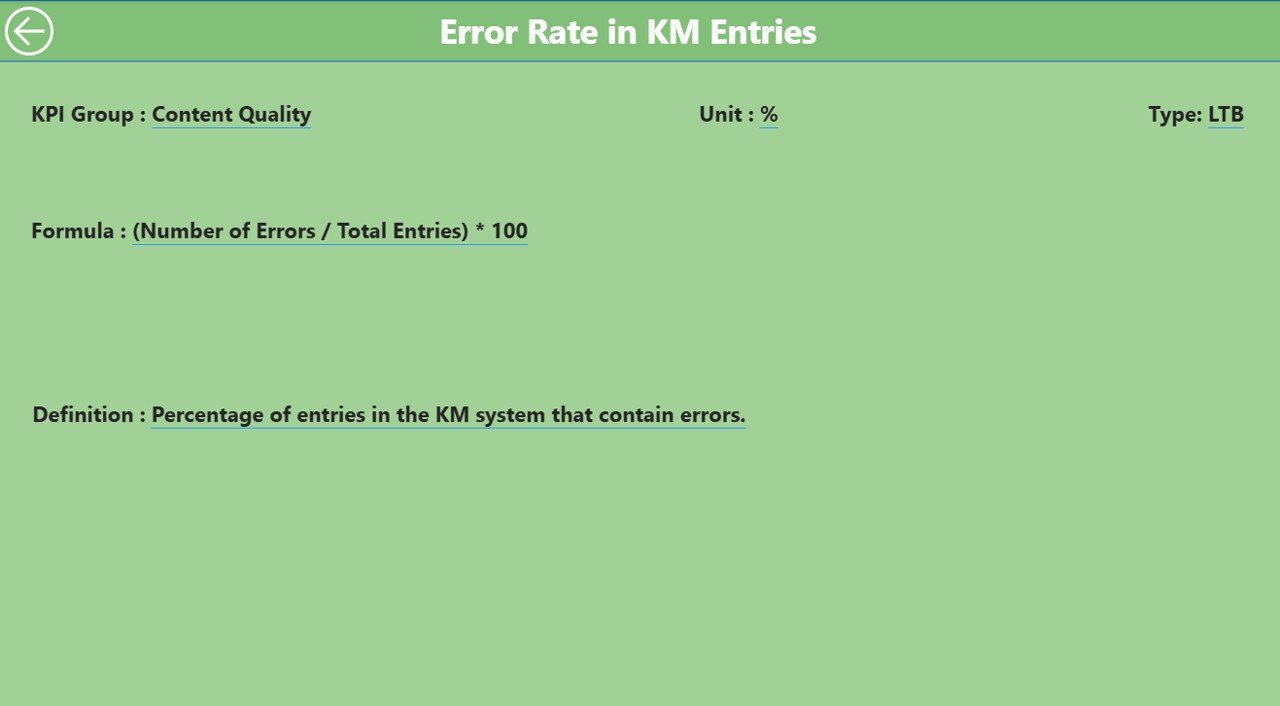
This hidden drill-through page gives clarity on what each KPI measures.
-
View the formula used for calculation.
-
Understand the definition behind each metric.
You can drill into this page from the Summary Page and return by clicking the Back button on the top-left corner.
Excel Data Structure for Input
The dashboard pulls real-time data from a structured Excel file with three key sheets:
1. Input_Actual Sheet
Capture the actual KPI values here:
-
KPI Name
-
Month (Use the 1st of the month, e.g., 01-Jan-2024)
-
MTD and YTD actuals
2. Input_Target Sheet
Capture target values:
-
Same fields as the Actual Sheet
-
Used to compare actual performance against set goals
3. KPI Definition Sheet
Define the KPI metadata:
-
KPI Number
-
KPI Group
-
KPI Name
-
Unit
-
Formula
-
Definition
-
Type (UTB or LTB)
Advantages of the Knowledge Management KPI Dashboard
Click to Purchases Knowledge Management KPI Dashboard in Power BI
Implementing this dashboard brings numerous benefits:
🔸 Real-Time Insights
Power BI fetches the latest data from Excel, ensuring up-to-date reporting every time you open the dashboard.
🔸 Performance Clarity
With icons and percentage comparisons, it becomes easier to identify:
-
Which KPIs are exceeding targets
-
Which KPIs need immediate attention
🔸 Drill-Down Capability
Clicking through to the KPI Definition page enables stakeholders to understand every metric deeply.
🔸 Trend Identification
Combo charts provide quick visualization of performance history and help forecast future results.
🔸 User-Friendly Navigation
Slicers, back buttons, and categorized views make the dashboard easy to use—even for non-technical users.
Best Practices for Using the KM KPI Dashboard
To make the most of this dashboard, follow these best practices:
1. Keep Your Data Clean
-
Avoid duplicate KPI names
-
Maintain consistent date formats
-
Double-check actual vs. target alignment
2. Review KPIs Regularly
-
Revisit KPI definitions quarterly
-
Add new KPIs as business needs evolve
-
Retire outdated or irrelevant KPIs
3. Train Your Team
-
Conduct walkthroughs to ensure all stakeholders understand how to navigate and interpret the dashboard
4. Use Conditional Formatting Wisely
-
Green for good performance (UTB or LTB based)
-
Red for underperformance
-
Arrows or flags help draw instant attention
5. Update Source File Securely
-
Use version control or cloud storage to avoid overwriting
-
Always back up your Excel file before editing
How to Update the Dashboard?
Updating the dashboard is easy:
-
Open the Excel source file.
-
Add or edit data in the respective sheet.
-
Save the file.
-
Refresh your Power BI report.
Power BI will pull updated data and automatically update visuals.
Common Use Cases of Knowledge Management KPIs
-
IT Knowledge Bases – Measure the number of articles created, updated, or accessed
-
Internal Communication – Track training materials shared across teams
-
Process Documentation – Evaluate version control and access frequency
-
Learning & Development – Analyze how knowledge is being transferred via workshops or LMS
-
R&D Efficiency – Measure the use of research documents and shared reports
Conclusion: Make Knowledge Count
In the modern workplace, knowledge is power—but only when it’s measured and managed effectively. The Knowledge Management KPI Dashboard in Power BI offers a centralized, real-time solution for tracking the performance of your KM initiatives. With its intuitive visuals, deep drill-down capabilities, and structured data source, this dashboard turns complex insights into simple, actionable information.
Whether you want to improve training programs, optimize your document repository, or monitor knowledge sharing among departments, this tool helps you stay in control.
Frequently Asked Questions (FAQs)
Q1. What is the purpose of a Knowledge Management KPI Dashboard?
The purpose is to track and visualize key performance indicators related to knowledge sharing, retention, and application within an organization. It helps identify areas for improvement and ensures accountability.
Q2. What is the data source used in this dashboard?
The dashboard uses an Excel file with three sheets: Input_Actual, Input_Target, and KPI Definition.
Q3. Can I add more KPIs to the dashboard?
Yes. You can add new KPIs by updating the Excel file—make sure to include corresponding actual, target, and definition entries.
Q4. What types of KPIs can be tracked?
You can track both UTB (Upper the Better) and LTB (Lower the Better) KPIs such as:
-
Knowledge Articles Created
-
Article Usage Rate
-
Document Access Frequency
-
Learning Session Participation
-
Time to Resolve Knowledge Gaps
Q5. Is Power BI required to use this dashboard?
Yes. You need Power BI Desktop (free) to open, view, and interact with the dashboard. You can also publish it to Power BI Service for online sharing.
Q6. How often should I update the Excel source file?
Monthly updates are common, but you can update it as frequently as needed based on your reporting cycle.
Q7. Can I share this dashboard with my team?
Yes. Once published to Power BI Service, you can share it with others in your organization. Make sure they have appropriate access rights.
Visit our YouTube channel to learn step-by-step video tutorials