In today’s data-driven world, organizations are increasingly relying on data analytics to gain insights, track performance, and make informed decisions. One powerful tool that helps businesses monitor and visualize key metrics is the KPI Dashboard in Power BI. Specifically, the Data Analytics KPI Dashboard in Power BI is designed to capture, visualize, and track key performance indicators (KPIs) for efficient decision-making.
This article provides a detailed exploration of the Data Analytics KPI Dashboard in Power BI, outlining its features, advantages, and best practices. Whether you’re an analyst, manager, or business owner, this guide will help you understand how to leverage Power BI dashboards to track business performance and optimize operations.
Table of Contents
ToggleClick to Purchases Data Analytics KPI Dashboard in Power BI
What is a Data Analytics KPI Dashboard in Power BI?
A Data Analytics KPI Dashboard in Power BI is a dynamic, interactive tool used for tracking the performance of various business processes through KPIs. These indicators help businesses evaluate the success of their operations, projects, and strategies by displaying important metrics and trends. With a user-friendly interface, Power BI allows users to interact with data, filter specific KPIs, and analyze performance over time.
The Data Analytics KPI Dashboard in Power BI can be customized to suit any business needs. It’s particularly useful for tracking metrics such as sales performance, financial health, customer satisfaction, and operational efficiency.
Key Features of the Data Analytics KPI Dashboard in Power BI
The Data Analytics KPI Dashboard in Power BI comes with several key features that make it an essential tool for tracking business performance. Here’s an overview of its core components:
Summary Page:
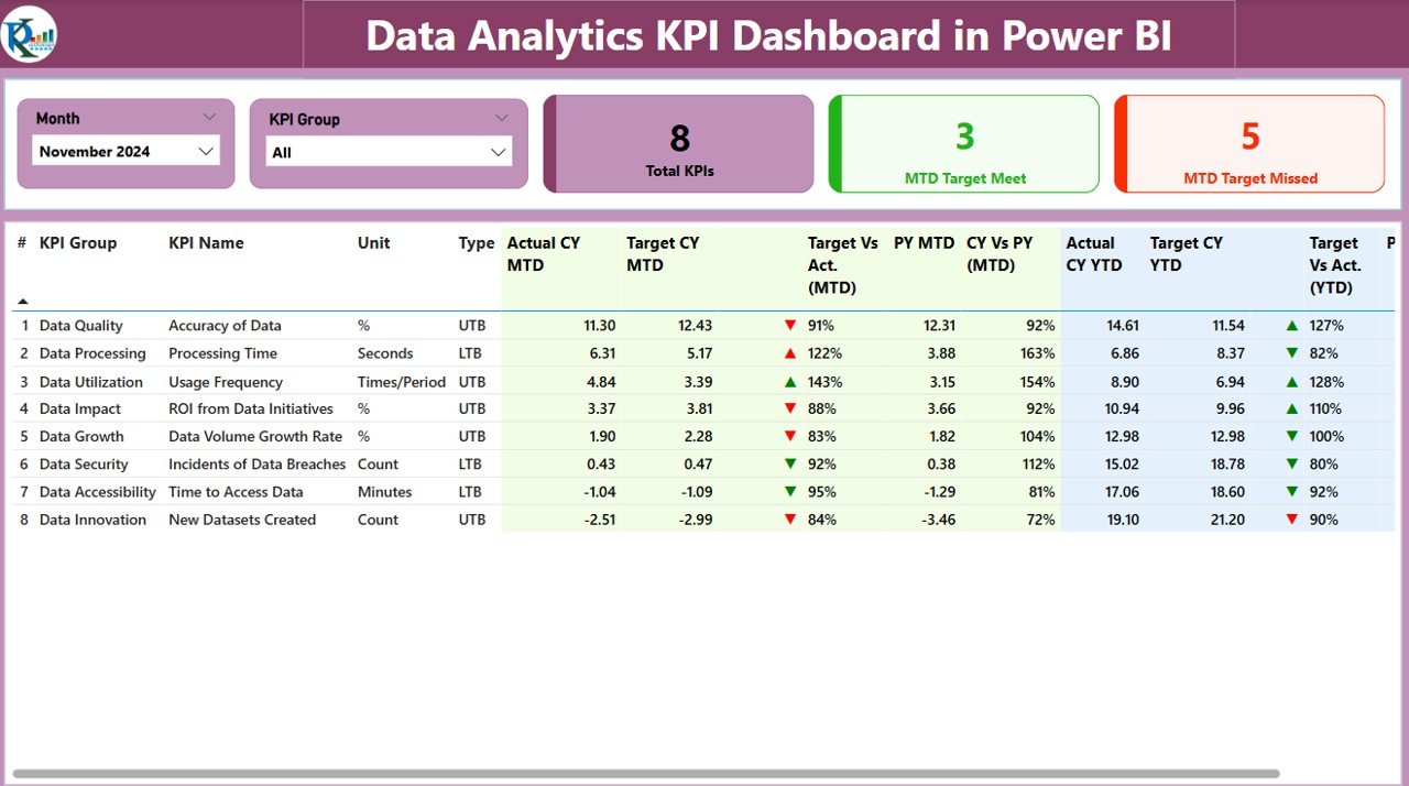
The Summary Page is the main page of the dashboard and provides a high-level view of the performance. Key features include:
-
Month and KPI Group Slicer: Filters the data by month and KPI group.
-
KPIs Overview Cards: Displays total KPIs count, MTD (Month-To-Date) Target Met, and MTD Target Missed counts.
Detailed KPI Table: Includes essential columns such as:
- KPI Number: Sequence number of the KPI.
- KPI Group: The category of the KPI (e.g., Financial, Sales, Operations).
- KPI Name: The name of the specific KPI being tracked.
- Unit: The unit of measurement (e.g., dollars, percentage).
- Type (LTB or UTB): Whether the KPI aims to lower or increase the value.
- Actual CY MTD: Current year’s Month-to-Date value.
- Target CY MTD: Current year’s Month-to-Date target.
- Target vs Actual (MTD): A percentage comparison between the actual and target values.
- PY MTD: Previous year’s Month-to-Date value for comparison.
- CY vs PY (MTD): Percentage comparison between this year’s MTD and the previous year’s MTD.
- Actual CY YTD: Current year’s Year-to-Date value.
- Target CY YTD: Current year’s Year-to-Date target.
- Target vs Actual (YTD): A percentage comparison between the actual and target values for YTD.
These features provide a comprehensive snapshot of KPI performance, helping stakeholders quickly understand how each KPI is performing.
KPI Trend Page:
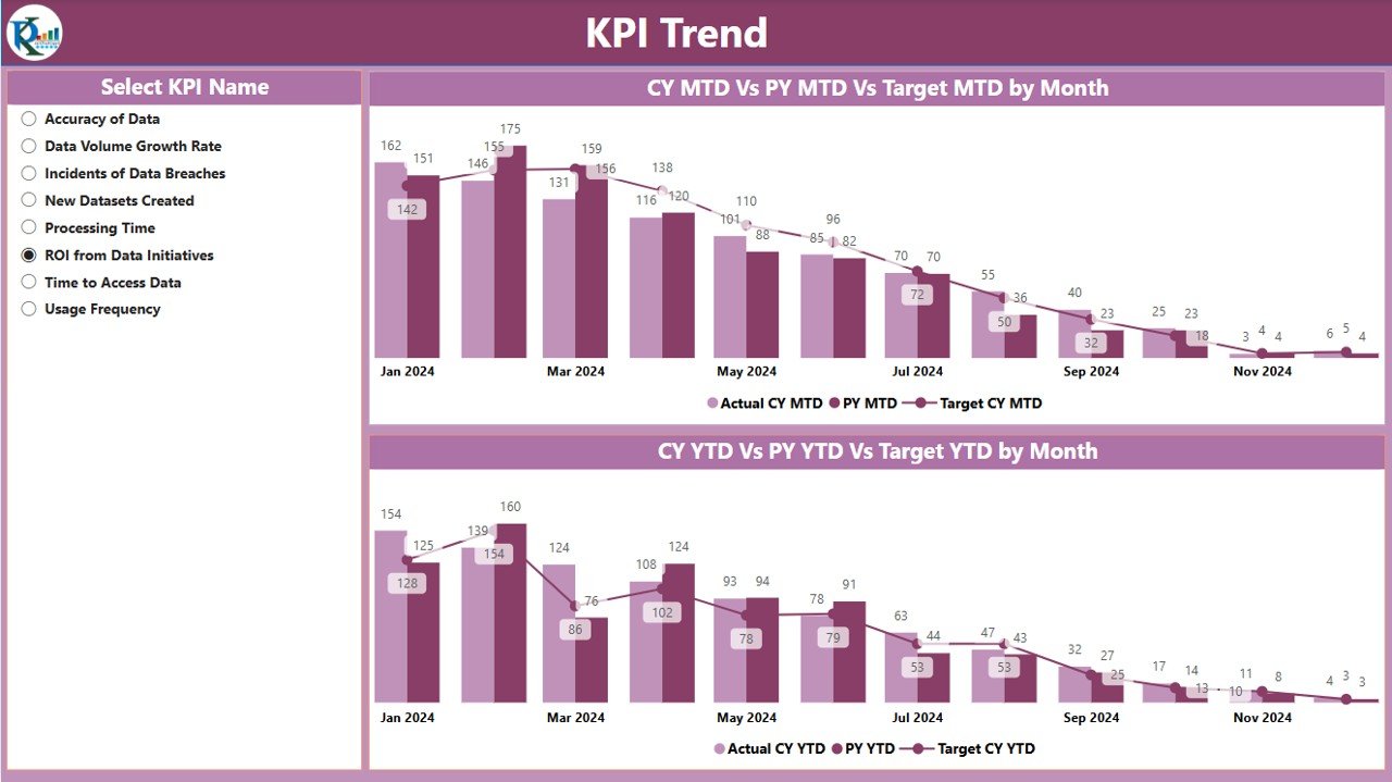
The KPI Trend Page displays trend charts that showcase the actual performance of KPIs for both the current year and the previous year. Key elements include:
-
Combo Charts: These charts display MTD and YTD figures, comparing the actual numbers, targets, and previous year’s values.
-
KPI Selector Slicer: Allows users to select the specific KPI they wish to analyze further.
-
This page provides a visual representation of trends, allowing users to identify patterns, deviations, and areas for improvement.
KPI Definition Page:
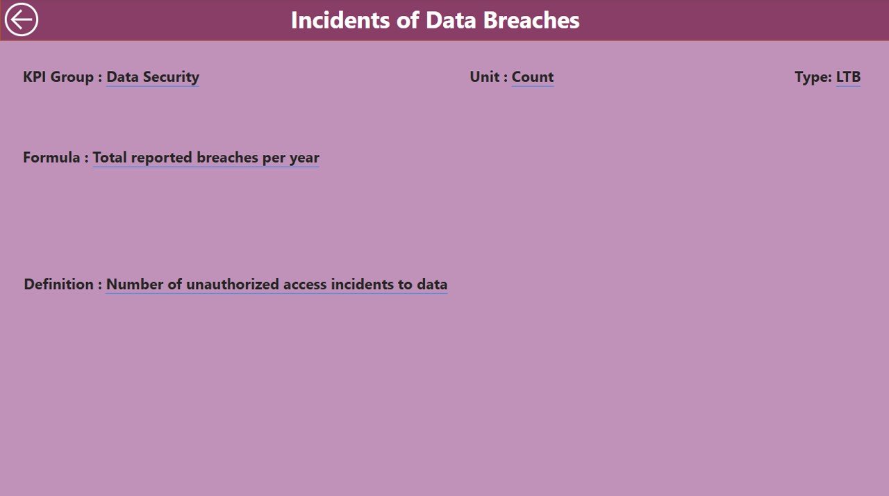
The KPI Definition Page offers detailed information about each KPI, including its formula, unit of measurement, and definition. This page is hidden by default and can be accessed by drilling down from the Summary Page.
-
Formula and Definition: Users can view the calculation method and description of each KPI.
-
Drill-Through Navigation: Users can navigate from the Summary Page to the KPI Definition Page for deeper insights.
Excel Data Input:
The dashboard is powered by data entered into an Excel file, which is connected to Power BI. The Excel file contains three key worksheets:
-
Input_Actual: This sheet contains the actual performance data for each KPI, including MTD and YTD figures.
-
Input_Target: This sheet contains the target values for each KPI, used for comparison against the actual data.
-
KPI Definition: This sheet contains metadata for each KPI, including the number, group, name, unit, formula, and type.
Click to Purchases Data Analytics KPI Dashboard in Power BI
Advantages of Using a Data Analytics KPI Dashboard in Power BI
Using a Data Analytics KPI Dashboard in Power BI offers numerous advantages for businesses:
1. Real-Time Data Tracking:
With Power BI, you can track real-time performance metrics, enabling timely decision-making. This allows businesses to respond quickly to any issues or opportunities.
2. Data Visualization:
Power BI’s advanced visualization capabilities help transform raw data into meaningful charts, graphs, and tables. These visualizations make complex data easier to understand and interpret.
3. Centralized Data:
Power BI centralizes data from various sources, including Excel files, databases, and cloud services, providing a single platform for monitoring KPIs.
4. Enhanced Decision-Making:
The ability to drill down into KPIs and analyze trends over time helps businesses make more informed decisions based on data-driven insights.
5. Customizability:
Power BI dashboards are highly customizable, allowing businesses to tailor the dashboard to their unique needs and specific KPIs.
Best Practices for Creating a Data Analytics KPI Dashboard in Power BI
Creating an effective Data Analytics KPI Dashboard requires careful planning and attention to detail. Here are some best practices to follow:
1. Define Clear KPIs:
Before building the dashboard, ensure that you have a clear understanding of what KPIs you want to track. Each KPI should align with your business objectives and provide actionable insights.
2. Use Data Sources Wisely:
Ensure that your data sources are accurate, clean, and up-to-date. Power BI allows you to integrate multiple data sources, but the quality of your data is crucial for generating meaningful insights.
3. Keep It Simple and Focused:
Avoid cluttering the dashboard with too many KPIs. Focus on the most important metrics that align with your business goals. Too much information can overwhelm users and reduce the dashboard’s effectiveness.
4. Choose the Right Visualizations:
Power BI offers a wide range of visualization options, including bar charts, line graphs, pie charts, and tables. Choose the visualizations that best represent your KPIs and make it easy for users to interpret the data.
5. Set Thresholds and Targets:
Define targets and thresholds for each KPI to make performance evaluation easier. Power BI allows you to use conditional formatting to highlight whether a KPI is on track, underperforming, or exceeding expectations.
Conclusion
The Data Analytics KPI Dashboard in Power BI is an essential tool for businesses seeking to monitor and track their performance across various metrics. It provides a comprehensive, user-friendly interface to visualize data, track progress, and make data-driven decisions. By following best practices and leveraging the features of Power BI, businesses can unlock valuable insights and enhance their decision-making processes.
Frequently Asked Questions (FAQs)
1. What is a KPI in Power BI?
A KPI (Key Performance Indicator) is a measurable value that demonstrates how effectively a business is achieving key objectives. In Power BI, KPIs are visualized through dashboards to track progress over time.
2. How do I set targets for KPIs in Power BI?
You can set targets for KPIs by entering target values into the Input_Target sheet in the Excel data source. These targets are then used to compare against actual values in the dashboard.
3. Can I customize the Data Analytics KPI Dashboard in Power BI?
Yes, Power BI allows full customization of the dashboard, enabling you to tailor the visualizations, KPIs, and filters to suit your business needs.
4. What data sources can I use with Power BI?
Power BI supports various data sources, including Excel, SQL Server, cloud services, and online data sources. You can integrate multiple sources to provide a comprehensive view of your business performance.
5. How do I ensure the accuracy of my data in Power BI?
To ensure accuracy, always use clean, validated, and up-to-date data sources. Regularly refresh your data to keep the KPIs current and reflect the latest performance metrics.