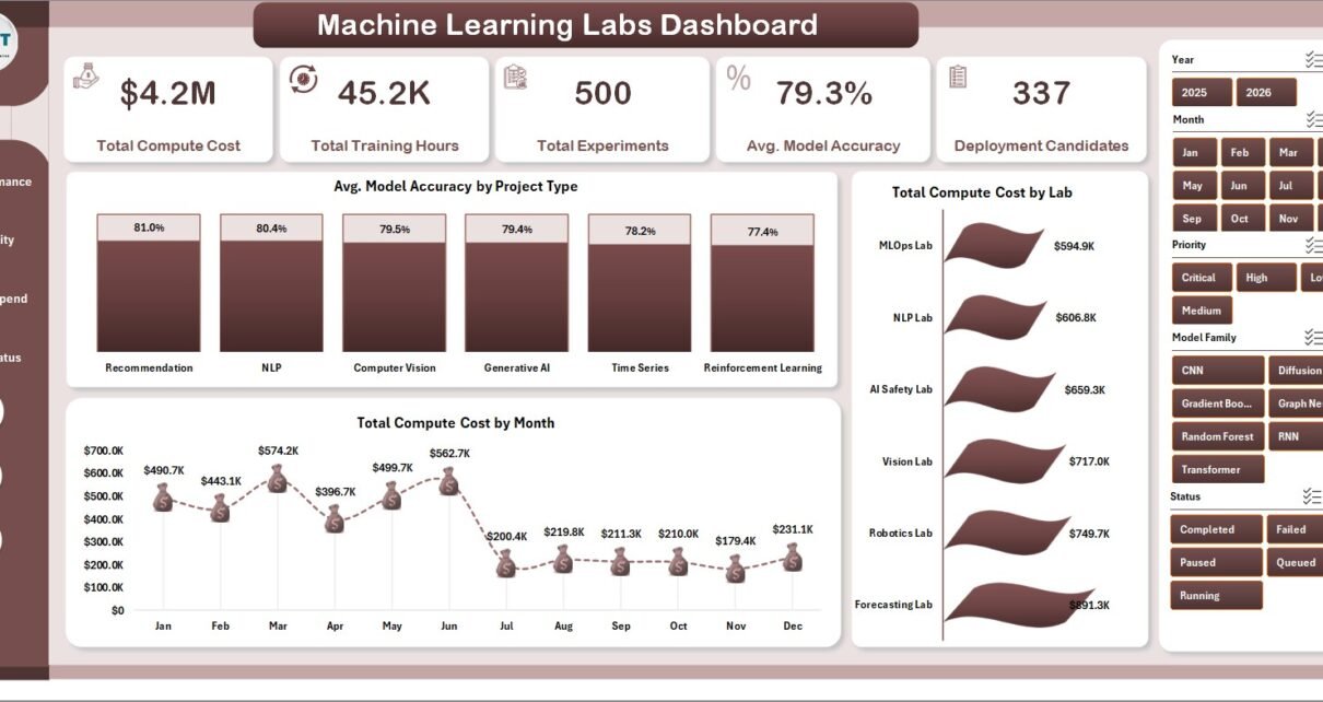
Machine Learning Labs Dashboard in Excel is a ready reporting template for AI research teams, ML operations leads, data science managers, innovation labs, and academic research groups that need one place to review compute cost, training hours, experiments, model accuracy, failed runs, completion rate, lab performance, and deployment candidates. The workbook includes 5 dashboard pages, 5 high-level KPI cards, 17 analysis charts, slicers, a structured Data Sheet, and a pivot-powered Support Sheet.
Machine learning reporting can become messy when experiments live in notebooks, compute bills live in cloud portals, status updates live in trackers, and model quality metrics live in separate files. This Excel dashboard gives teams a practical way to summarize the lab without building every chart from scratch. You can also learn more about Excel tables, pivots, and analysis tools from Microsoft Excel Support.
Click here to buy the Machine Learning Labs Dashboard in Excel.
Machine Learning Labs Dashboard in Excel
Key Features of Machine Learning Labs Dashboard in Excel
- 5 executive KPI cards: Total Compute Cost, Total Training Hours, Total Experiments, Avg. Model Accuracy, and Deployment Candidates.
- 5 analysis pages: Overview, Lab Performance, Model Quality, Compute Spend, and Pipeline Status.
- 17 chart views: Analyze accuracy, cost, hours, experiments, failed runs, completion, satisfaction, teams, labs, platforms, statuses, priorities, project types, months, and model families.
- Interactive slicers: Filter the dashboard quickly and review selected segments without rebuilding visuals.
- Structured Data Sheet: Add your own machine learning lab records in the same format.
- Support Sheet: Pivot tables drive the dashboard dynamically and can be hidden after setup.
- Editable Excel file: Change labels, charts, colors, fields, and calculations to match your internal reporting style.
Dashboard Pages Explanation
1 – Overview Page
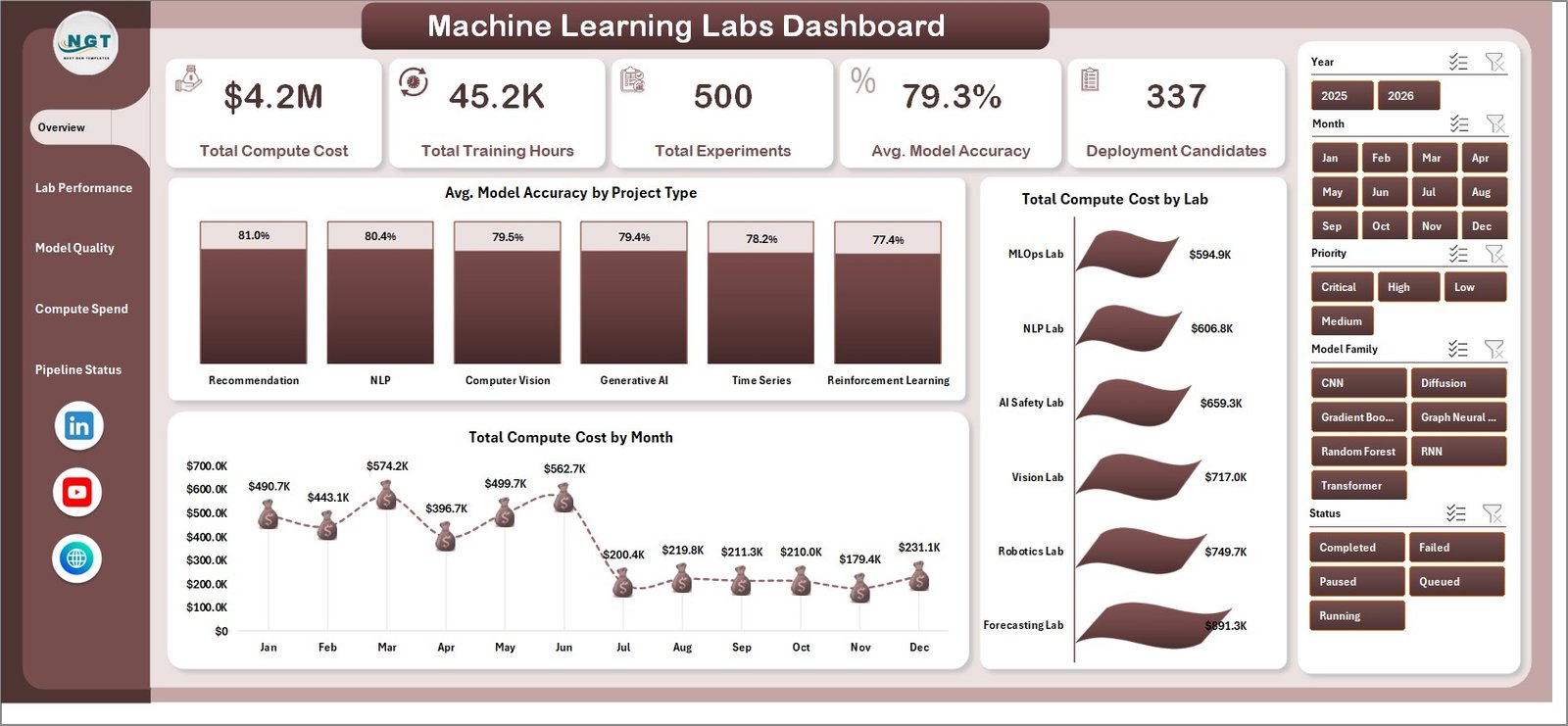
The Overview Page gives managers a high-level view of lab activity and cost. At the top, KPI cards show Total Compute Cost, Total Training Hours, Total Experiments, Avg. Model Accuracy, and Deployment Candidates. These cards help leaders understand spend, effort, output, and deployment readiness before reviewing the details.
Avg. Model Accuracy by Project Type: This chart compares average model accuracy across project categories. It helps teams see which types of ML work are generating stronger model outcomes and which areas may need tuning, data improvement, or architecture review.
Total Compute Cost by Month: This monthly trend shows how infrastructure spend changes across the reporting period. It is useful for identifying GPU-intensive months, high-cost training waves, and periods that need budget review.
Total Compute Cost by Lab: This chart compares compute cost across labs. It helps leaders see whether one lab is consuming a large share of budget and whether that cost is justified by experiment output or deployment candidates.
2 – Lab Performance
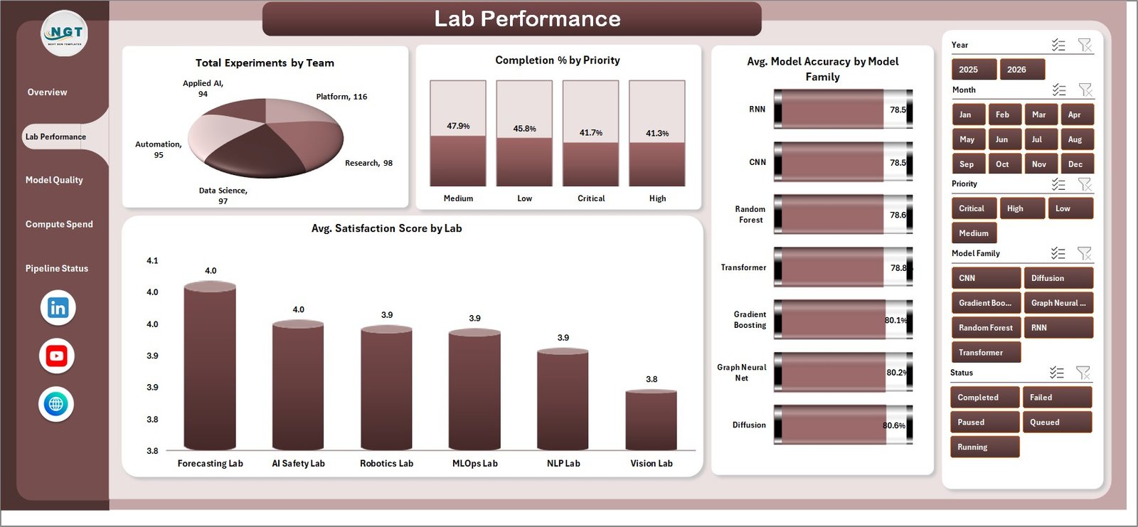
The Lab Performance page focuses on team output, priority progress, satisfaction, and model-family performance. It is useful for lab managers who need to compare workload and delivery quality across groups.
Total Experiments by Team: This chart compares experiment volume by team. It helps identify which teams are running the most work and where capacity or prioritization may need review.
Completion % by Priority: This visual compares completion rate by priority level. It helps leaders confirm whether high-priority ML work is moving faster than lower-priority experiments.
Avg. Satisfaction Score by Lab: This chart compares stakeholder or internal satisfaction by lab. It can highlight labs that need process improvement, clearer communication, or stronger delivery support.
Avg. Model Accuracy by Model Family: This chart compares model quality across model families. It helps teams see whether tree-based models, neural networks, regression models, or other families are producing better accuracy.
Lab Performance
3 – Model Quality
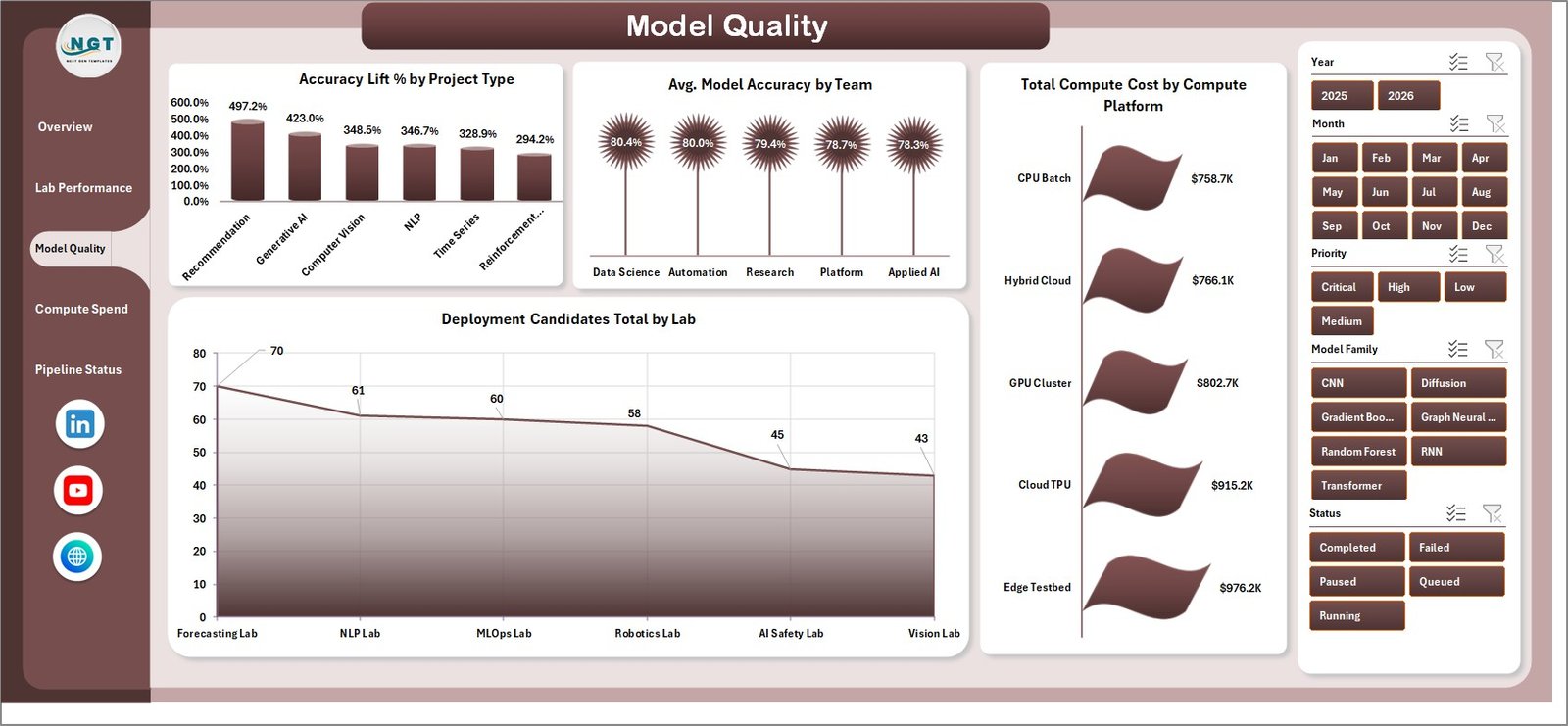
The Model Quality page connects accuracy, deployment readiness, and compute platform usage. It helps data science leaders understand whether the lab is improving models efficiently or only spending more compute.
Accuracy Lift % by Project Type: This chart shows which project types are improving accuracy the most. It helps teams identify where experimentation is creating measurable model gains.
Avg. Model Accuracy by Team: This visual compares model accuracy by team. It helps managers review team-level model quality and identify where coaching, data review, or methodology changes may help.
Deployment Candidates Total by Lab: This chart shows how many models are ready or nearly ready for deployment by lab. It helps leadership move from experiment volume to actual deployable outcomes.
Total Compute Cost by Compute Platform: This chart compares cost across compute platforms. It helps platform teams review whether cloud, GPU, CPU, or internal compute choices are driving the largest expenses.
Model Quality
4 – Compute Spend
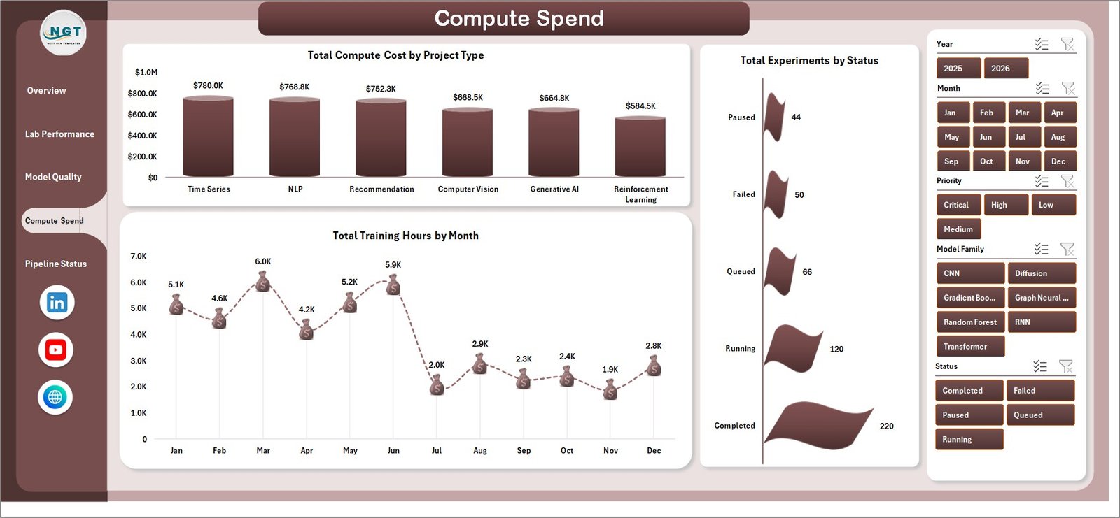
The Compute Spend page is built for finance, ML platform, and operations review. It connects cost, training time, and experiment status so teams can talk about budget and productivity together.
Total Compute Cost by Project Type: This chart compares infrastructure spend by project type. It helps leaders understand whether certain project categories are consistently more expensive.
Total Training Hours by Month: This trend shows training workload over time. It helps teams identify heavy training periods and compare effort against model quality improvements.
Total Experiments by Status: This chart compares experiments by status. It helps managers see how much work is completed, active, delayed, failed, or waiting for review.
Compute Spend
5 – Pipeline Status
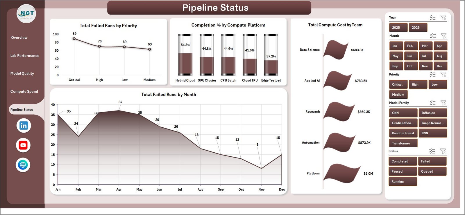
The Pipeline Status page helps teams monitor execution risk. It focuses on failed runs, platform completion rate, failed-run trend, and team-level compute cost.
Total Failed Runs by Priority: This chart shows failed runs by priority level. It helps leaders see whether urgent work is being blocked by pipeline instability.
Completion % by Compute Platform: This visual compares completion performance by compute platform. It helps platform owners identify environments where jobs complete more reliably.
Total Failed Runs by Month: This trend shows whether pipeline failures are increasing or decreasing. It supports root-cause review and monthly engineering retrospectives.
Total Compute Cost by Team: This chart compares team-level compute spend. It helps managers align costs with experiment volume, accuracy improvement, and deployment results.
Pipeline Status
6 – Data Sheet Tab
The Data Sheet is the input area where users add machine learning lab records in the same format as the sample data. After updating this sheet, the dashboard can be refreshed so every card, chart, and slicer reflects the latest information.

Data Sheet tab
7 – Support Sheet
The Support Sheet contains multiple pivot tables used to create the dashboard dynamically. After updating the Data Sheet, go to the Excel Ribbon, open the Data tab, and click Refresh All. All pivots and charts will refresh. You can keep this sheet hidden during normal use.

Support sheet tab
Machine Learning Labs Dashboard in Excel vs. Google Sheets vs. Paid ML Ops SaaS – Feature Comparison
| Feature | This template | Google Sheets alternative | Paid ML Ops SaaS |
|---|---|---|---|
| Cost | $17.99 one-time | Low tool cost, build time required | Monthly or annual subscription |
| Platform | Microsoft Excel | Browser-based spreadsheet | Vendor-hosted cloud app |
| Setup time | Open workbook, replace data, refresh | Build or adapt dashboard | Implementation and onboarding |
| Real-time team collaboration | Available with OneDrive or SharePoint | Native collaboration | Usually included |
| Mobile access | Excel mobile with limits | Google Sheets mobile | Usually included |
| Customizable fields | Editable workbook, charts, pivots, and fields | Editable but formulas may break | Depends on vendor permissions |
| Share with link | Available through OneDrive or SharePoint | Native link sharing | Login controlled |
| Year-1 cost at 5 users | $17.99 total | Low software cost plus build time | Often hundreds or thousands |
| ML lab analysis | Cost, experiments, accuracy, completion, failed runs, and deployment candidates included | Must be designed | Depends on plan and module |
Who Should Use This Template
This dashboard is useful for machine learning lab managers, AI research directors, data science team leads, ML platform owners, innovation labs, academic research teams, analytics consultants, and technology managers who need repeatable reporting in Excel.
It is especially useful when your team already exports experiment, cost, model quality, and pipeline data from different systems and wants to review it in one structured dashboard.
Real-World Use Cases
Anika, ML operations lead: reviews failed runs, compute spend, completion percentage, and platform performance before the weekly reliability meeting.
Rahul, data science manager: compares model accuracy by team, model family, and project type before deciding where to focus the next model improvement sprint.
Maria, research director: checks deployment candidates, training hours, and monthly compute cost before planning lab budget and GPU capacity for the next quarter.
Advantages of Machine Learning Labs Dashboard in Excel
- It brings experiment, cost, quality, and pipeline metrics into one Excel workbook.
- It separates reporting into focused pages instead of crowding all visuals into one sheet.
- It supports slicer-based filtering for faster review meetings.
- It is editable, so teams can adapt fields and charts to their own reporting model.
- It avoids another subscription when the team only needs a practical reporting layer.
Opportunities for Improvement
This template depends on clean source data. If project type names, team names, lab names, statuses, dates, priorities, or platform names are inconsistent, the dashboard should be cleaned before leadership review.
Teams that need live data connections, automated experiment tracking, model lineage, access control, scheduled refresh, or deployment workflow management can use this Excel dashboard alongside dedicated ML Ops tools.
Best Practices
- Keep lab, team, status, priority, project type, platform, and model family names consistent.
- Validate compute cost and training hour totals before presenting to leadership.
- Review failed runs together with compute spend, because repeated failures can waste budget.
- Use slicers during meetings to focus on one lab, team, model family, or priority at a time.
- Keep a backup before modifying pivot source fields or chart layouts.
Explore Relevant Templates
You can download the Machine Learning Labs Dashboard in Excel from NextGenTemplates. You may also like Machine Learning Labs KPI Dashboard in Excel, Machine Learning Labs KPI Dashboard in Power BI, and Data Science and Analytics KPI Dashboard in Excel.
Frequently Asked Questions
What does this dashboard track?
It tracks compute cost, training hours, experiments, average model accuracy, deployment candidates, completion percentage, satisfaction score, accuracy lift, failed runs, labs, teams, project types, platforms, statuses, and priorities.
How many pages are included?
The workbook includes Overview, Lab Performance, Model Quality, Compute Spend, Pipeline Status, Data Sheet, and Support Sheet tabs.
Do I need advanced Excel skills?
No. You mainly update the Data Sheet and click Data > Refresh All. Advanced users can customize charts, pivots, formulas, and layout.
Can I use my own data?
Yes. Replace the sample records in the Data Sheet while keeping the same column format.
Does this replace ML Ops software?
No. It is a reporting dashboard, not an experiment tracker, model registry, deployment tool, or cloud infrastructure platform.
Can I customize the dashboard?
Yes. It is an editable Excel workbook. Keep a backup before changing pivot sources or dashboard formulas.
About the Author
Built by PK – Microsoft Certified Professional with 15+ years of Excel, Google Sheets, and Power BI experience. Founder of NextGenTemplates, reaching 300K+ subscribers across YouTube channels. Every template is hand-built and tested before release.
Conclusion
The Machine Learning Labs Dashboard in Excel gives teams a practical way to monitor experiments, compute cost, model quality, pipeline health, lab performance, and deployment readiness from one workbook. It is best for teams that already have structured lab data and want a flexible Excel dashboard for monthly review, budget control, and operational planning.
For more tutorials, visit PK An Excel Expert on YouTube.