Luxury Handbags Dashboard in Power BI is a ready reporting template for fashion retail, premium handbag brands, boutique chains, and e-commerce teams that need a clear view of revenue, cost, profit, orders, units sold, product mix, channels, returns, and delivery performance. The report includes 5 Power BI pages, 5 high-level KPI cards, and 16 analysis visuals, so managers can move from a top-level sales view to brand, channel, product, and fulfillment detail quickly.
Luxury retail reporting can become messy when teams track revenue in one file, returns in another, delivery in another, and margin in a separate finance sheet. A Power BI report brings those numbers into one interactive view. You can also learn more about the Power BI platform from Microsoft Learn Power BI documentation.
Click here to buy the Luxury Handbags Dashboard in Power BI.
Luxury Handbags Dashboard in Power BI
Key Features of Luxury Handbags Dashboard in Power BI
- 5 report pages: Overview, Brand Analysis, Channel Sales, Product Mix, and Fulfillment.
- 5 KPI cards: Total Revenue, Total Orders, Total Cost, Net Profit, and Units Sold.
- 16 analysis charts: Review profit margin, revenue, cost, units sold, customer segment, sales channel, product category, brand, material, returns, delivered orders, and delivery rate.
- Interactive slicers: Apply filters quickly and review the selected dashboard view without rebuilding reports.
- Editable Power BI file: Change visuals, fields, measures, labels, slicers, colors, and report pages in Power BI Desktop.
- Fashion retail focus: Designed for luxury handbag reporting across sales, margin, product mix, and fulfillment.
Dashboard Pages Explanation
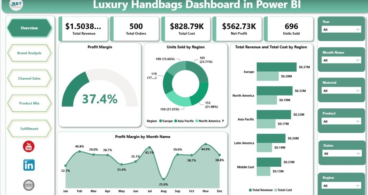
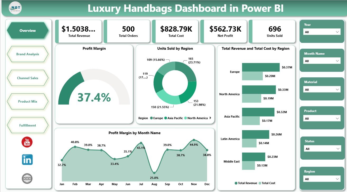
1 – Overview Page
The Overview page gives managers a fast business summary. At the top, cards show Total Revenue, Total Orders, Total Cost, Net Profit, and Units Sold.
Profit Margin: This visual highlights profitability after cost impact. It helps leaders judge whether selected brands, regions, or time periods are producing healthy margin.
Units Sold by Region: This chart compares unit movement across regions. It helps identify strong markets and regions where stock, pricing, or promotions may need attention.
Total Revenue and Total Cost by Region: This visual compares revenue and cost side by side by region. It helps reveal whether high-revenue regions are also carrying high operating or product cost pressure.
Profit Margin by Month Name: This monthly visual tracks margin changes across the year. It supports seasonality review, campaign planning, and quick margin monitoring.
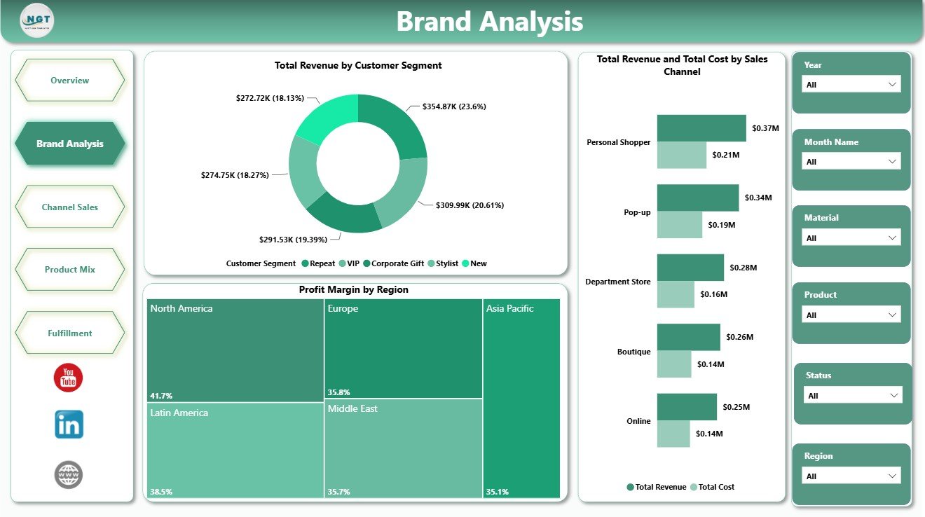
2 – Brand Analysis
The Brand Analysis page focuses on how customer segments, regions, and sales channels affect brand performance.
Total Revenue by Customer Segment: This chart shows which customer groups generate the most revenue. It helps marketing and retail teams target high-value customer groups more clearly.
Profit Margin by Region: This visual compares regional margin performance. It helps identify locations where discounts, logistics, pricing, or product mix may be reducing profitability.
Total Revenue and Total Cost by Sales Channel: This chart compares channel revenue and cost together. It helps teams evaluate whether online, retail, marketplace, wholesale, or other channels are profitable enough.
Brand Analysis
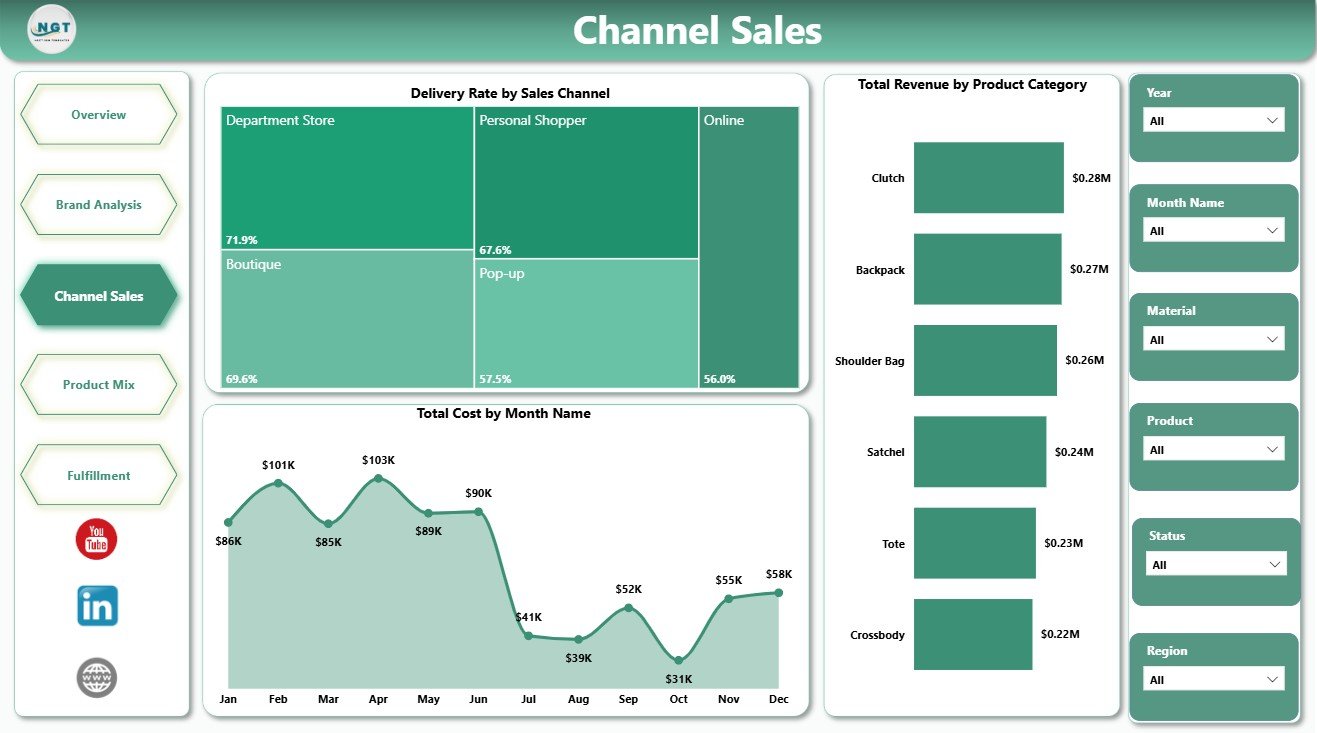
3 – Channel Sales
The Channel Sales page helps sales and operations teams understand channel performance, monthly cost movement, and category revenue.
Delivery Rate by Sales Channel: This chart compares delivery performance by channel. It helps identify where order completion is strong and where fulfillment service may need improvement.
Total Cost by Month Name: This trend shows monthly cost movement. It helps leaders notice cost spikes, seasonal expense changes, and months that need deeper margin review.
Total Revenue by Product Category: This visual compares revenue across handbag categories. It helps merchandising teams see which product categories drive the highest sales value.
Channel Sales
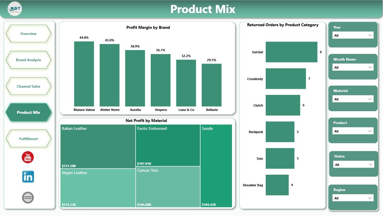
4 – Product Mix
The Product Mix page is useful for product managers, buyers, category managers, and finance teams.
Profit Margin by Brand: This chart compares margin by brand. It helps leaders identify which brands protect profit and which may need pricing or sourcing review.
Net Profit by Material: This visual shows net profit by material type. It helps product teams compare leather, vegan, canvas, suede, and other material groups from a profit point of view.
Returned Orders by Product Category: This chart highlights return volume by category. It helps teams detect quality, sizing, expectation, or fulfillment problems in specific handbag groups.
Product Mix
5 – Fulfillment
The Fulfillment page connects sales reporting with delivery execution.
Delivered Orders by Region: This chart compares delivered orders across regions. It helps operations teams see where fulfillment volume is concentrated.
Delivery Rate by Month Name: This monthly trend tracks delivery performance over time. It helps identify service drops, peak-season pressure, and months that need operational support.
Total Orders by Region: This visual compares order volume across regions. It helps teams plan logistics, inventory, customer service, and regional staffing more effectively.
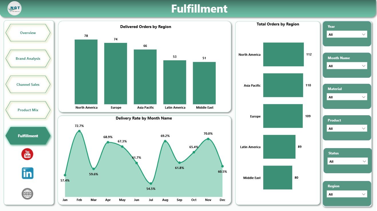
Fulfillment
Luxury Handbags Dashboard in Power BI vs. Tableau vs. Paid Retail SaaS – Feature Comparison
| Feature | This template | Tableau or Qlik alternative | Paid retail SaaS |
|---|---|---|---|
| Cost | One-time template purchase | License plus development time | Subscription or implementation fee |
| Platform | Power BI Desktop / Power BI Service | Tableau, Qlik, or another BI tool | Vendor-hosted platform |
| Setup time | Open PBIX, replace data, refresh | Build or adapt dashboard | Onboarding and configuration |
| Real-time team collaboration | Available after publishing to Power BI Service | Available with cloud plans | Usually included |
| Mobile access | Available through Power BI mobile after publishing | Plan dependent | Usually included |
| Customizable fields | Editable model, measures, visuals, and pages | Editable with BI skills | Depends on vendor permissions |
| Share with link | Available through Power BI Service | Available with cloud publishing | Login controlled |
| Year-1 cost at 5 users | Low one-time template cost plus any Microsoft licensing | License and build cost dependent | Often hundreds or thousands |
| Luxury handbag analysis | Overview, brand, channel, product mix, and fulfillment pages included | Must be designed | Depends on retail module |
Who Should Use This Template
This dashboard is useful for luxury handbag brands, premium fashion retailers, online handbag stores, boutique chains, category managers, retail analysts, finance teams, and operations teams. Consultants can also use it as a starting point for client reporting.
It is not meant to replace your POS, ERP, order management tool, CRM, or live inventory system. It is a Power BI reporting layer for structured sales and operations data.
Real-World Use Cases
Aisha, merchandising manager: reviews revenue by product category, profit margin by brand, and net profit by material before making assortment decisions.
Dev, operations lead: checks delivery rate by channel, delivered orders by region, and returned orders by product category before the weekly fulfillment meeting.
Maria, finance analyst: compares total revenue, total cost, net profit, profit margin, and monthly movement before preparing a leadership summary.
Advantages of Luxury Handbags Dashboard in Power BI
The main advantage is speed. Instead of manually preparing separate reports for brand, channel, product mix, and fulfillment, the team can review all major views in one PBIX file.
It also supports better conversations. Sales can review revenue and units sold, finance can review cost and profit, merchandising can review category and material performance, and operations can review delivery and returns using the same report.
Opportunities for Improvement
Every template still depends on data quality. If source data has missing dates, inconsistent region names, duplicate orders, or unclear category labels, the dashboard should be cleaned before leadership review.
Teams that need automated live connections, row-level security, scheduled refresh, or enterprise governance can extend this PBIX file inside Power BI Service after purchase.
Best Practices
- Keep region, channel, product category, brand, and material names consistent.
- Validate total revenue, total cost, orders, and units sold before sharing.
- Review returns and delivery rate together, because fulfillment issues can affect customer satisfaction.
- Use slicers to compare one focused segment at a time.
- Document any custom measures added to the PBIX file.
Explore Relevant Templates
You may also like Luxury Handbags KPI Dashboard in Power BI, Gift Shops Dashboard in Power BI, and Loyalty Programs Management Dashboard in Power BI. You can also browse more Power BI dashboard templates.
Frequently Asked Questions
What does this dashboard track?
It tracks revenue, orders, cost, net profit, units sold, profit margin, sales channel, product category, brand, material, customer segment, returns, delivery rate, and regional performance.
How many pages are included?
The report includes 5 pages: Overview, Brand Analysis, Channel Sales, Product Mix, and Fulfillment.
Can I customize the dashboard?
Yes. You can edit visuals, fields, slicers, colors, measures, and page names in Power BI Desktop.
Do I need advanced Power BI skills?
Basic Power BI knowledge is enough to open, review, refresh, and make simple changes. Advanced users can extend the model and measures.
Does it connect directly to my store?
No direct live store connector is included. You can replace the sample data or connect Power BI to your own structured source.
Can I use it for other fashion products?
Yes. Although it is designed for luxury handbags, it can be adapted for accessories, fashion retail, and premium product categories.
About the Author
Built by PK – Microsoft Certified Professional with 15+ years of Excel, Google Sheets, and Power BI experience. Founder of NextGenTemplates, reaching 300K+ subscribers across YouTube channels. Every template is hand-built and tested before release.
Conclusion
The Luxury Handbags Dashboard in Power BI gives fashion retail teams a clean way to review sales, profit, channel performance, product mix, returns, and fulfillment in one place. It is practical for monthly reviews, weekly operations meetings, merchandising decisions, and management reporting.
Download the Luxury Handbags Dashboard in Power BI and start reviewing your handbag business with an editable Power BI report.
Visit our YouTube channel to learn step-by-step Excel and Power BI tutorials.