Mental health organizations deal with a large volume of data every day. Therapists, psychologists, and administrators track patient visits, treatment progress, session fees, branch performance, and financial outcomes. However, many centers still depend on manual reports or scattered spreadsheets. This slows down decision-making and hides important trends.
A Mental Health Services Dashboard in Power BI solves these problems. It brings scattered data into one automated, interactive, and visually rich system. Leaders use it to monitor patient satisfaction, track therapy outcomes, analyze financial performance, and identify improvement areas across branches, specialties, and therapy types.
In this comprehensive guide, you will explore what this dashboard is, how each page works, why mental health clinics need it, and how it improves performance. You will also learn the advantages, best practices, and answers to common questions.
Click to Purchases Mental Health Services Dashboard in Power BI
What Is a Mental Health Services Dashboard in Power BI?
A Mental Health Services Dashboard in Power BI is a ready-to-use analytics solution that gives mental health organizations a 360-degree view of operations. It transforms raw data from Excel, EMR systems, CRM tools, or appointment platforms into clear charts, KPI cards, slicers, and trend visuals.
You track:
-
Patient satisfaction
-
Therapy effectiveness
-
Branch-wise performance
-
Financial insights
-
Session fees
-
Profitability
-
Discounts and billing outcomes
-
Monthly trends
-
Visit type performance
-
Specialty-wise therapy insights
Power BI helps decision-makers view performance in real time. You switch months, filter by specialty, or compare branches with just one click. This dashboard removes guesswork and gives every mental health center a reliable view of operations.
Why Do Mental Health Centers Need This Dashboard?
Mental health organizations handle sensitive and complex workflows. Leaders need accurate, fast, and consistent data to improve patient outcomes and operational performance.
A Mental Health Services Dashboard in Power BI helps because it:
-
Brings all data into one place
-
Reduces manual reporting
-
Supports evidence-based decisions
-
Improves patient experience
-
Highlights financial efficiency
-
Reveals operational gaps
-
Saves time in monthly reporting
-
Standardizes KPI tracking
With automated dashboards, mental health teams focus more on care and less on compiling spreadsheets.
How Does the Mental Health Services Dashboard Work?
This dashboard includes five easy-to-navigate pages, each designed to answer a specific question. Let’s explore every page in detail.
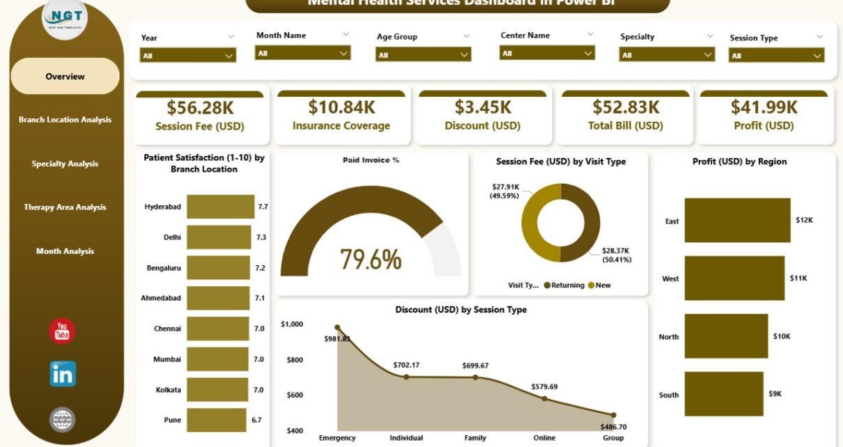
1. Overview Page: What Does the Dashboard Show at a Glance?
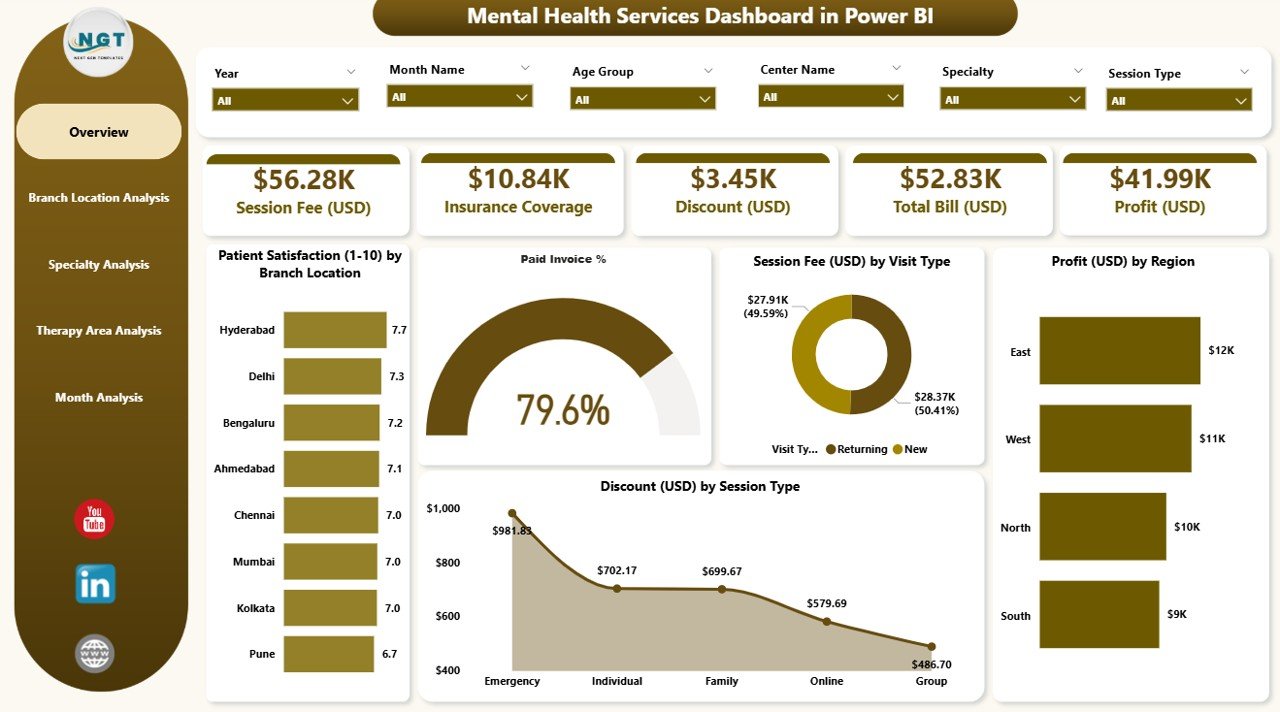
The Overview Page is the main analytical page of the dashboard. It gives a high-level view of performance through KPI cards and detailed charts.
Key Elements of the Overview Page
✔ Four KPI Cards
These cards highlight essential metrics, such as:
-
Total Patients
-
Average Patient Satisfaction
-
Total Profit (USD)
-
Total Session Fees
(You can customize these based on your dataset.)
✔ Five Detailed Charts
The page displays five meaningful visuals:
-
Patient Satisfaction by Branch Location
-
Paid Invoice %
-
Session Fee (USD) by Visit Type
-
Profit (USD) by Region
-
Discount (USD) by Session Type
With these charts, leaders quickly understand how different branches, regions, and visit types perform. The page also includes slicers (filters) that allow users to switch periods and categories instantly.
2. Branch Location Analysis: How Do Different Branches Perform?
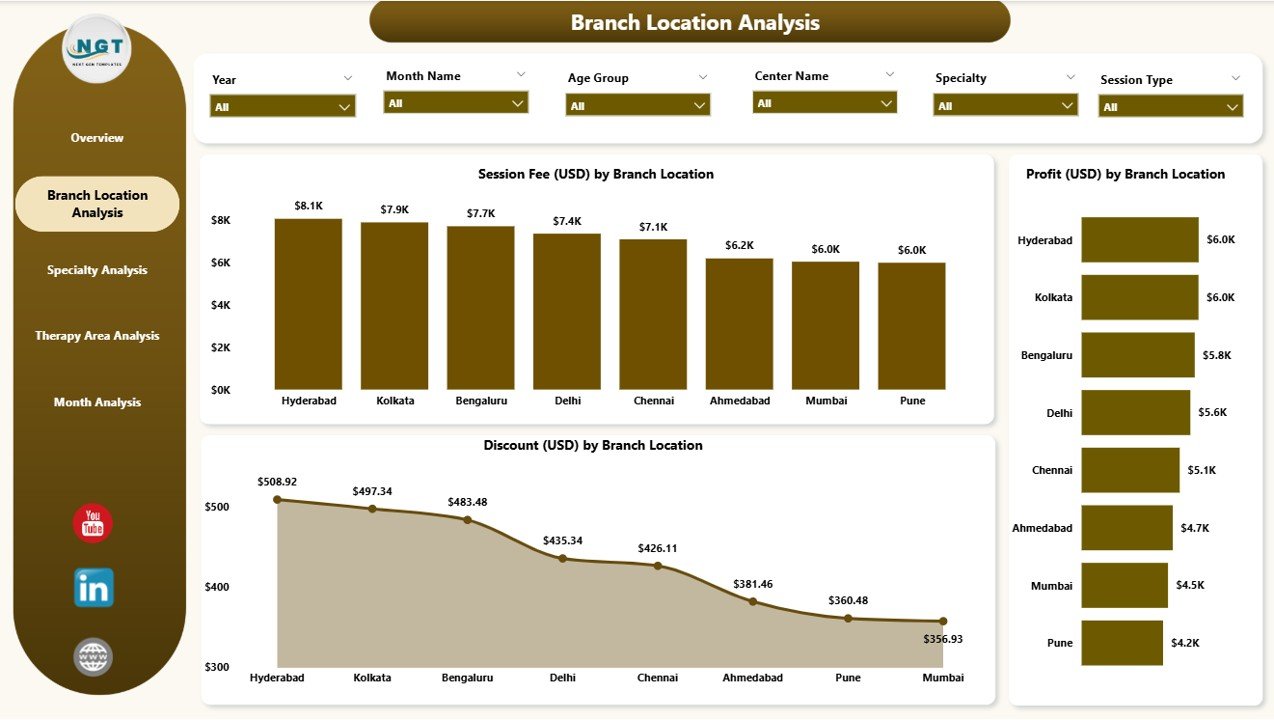
Every mental health center with multiple branches needs a clear comparison to identify what works and what needs improvement. The Branch Location Analysis Page handles this perfectly.
What This Page Shows
This page includes three powerful charts:
-
Session Fee (USD) by Branch Location
-
Profit (USD) by Branch Location
-
Discount (USD) by Branch Location
Why It Helps
-
You compare branch-wise revenue.
-
You track operational efficiency.
-
You identify branches with high discounts or low satisfaction.
-
You measure profitability accurately.
With these insights, administrators make informed decisions about staffing, marketing, and patient service improvement.
3. Specialty Analysis: How Do Different Specialties Contribute to Performance?
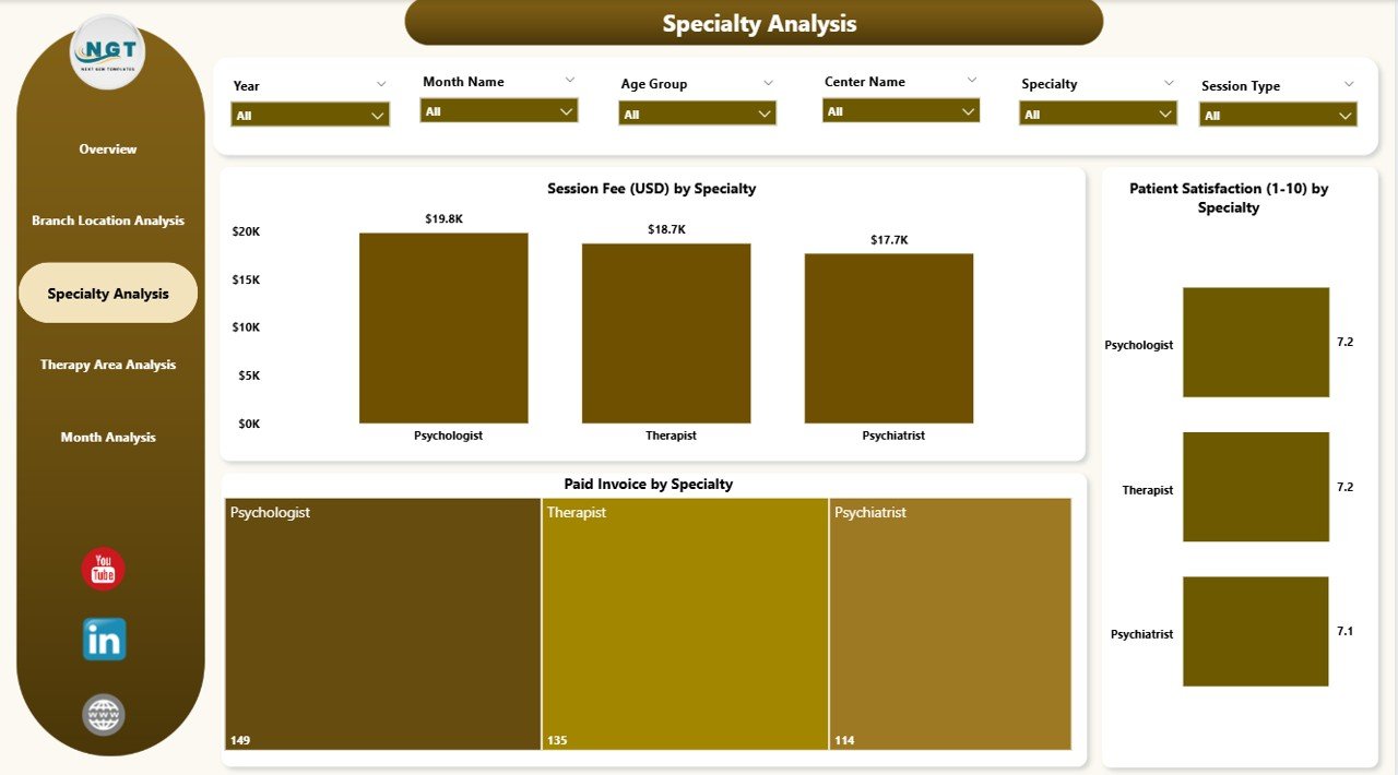
Mental health services include diverse specialties such as psychiatry, psychology, counseling, family therapy, behavioral therapy, and more. Each specialty performs differently based on demand, pricing, and treatment type.
Click to Purchases Mental Health Services Dashboard in Power BI
What the Specialty Analysis Page Includes
You see three charts:
-
Session Fee (USD) by Specialty
-
Profit (USD) by Specialty
-
Patient Satisfaction by Specialty
Why It Matters
-
Leaders see which specialties generate higher revenue.
-
They track patient satisfaction for each specialty.
-
They understand where additional training or resources are needed.
-
They identify specialties with strong patient outcomes.
This page helps optimize workforce planning and service delivery strategies.
4. Therapy Area Analysis: How Do Therapy Areas Perform?
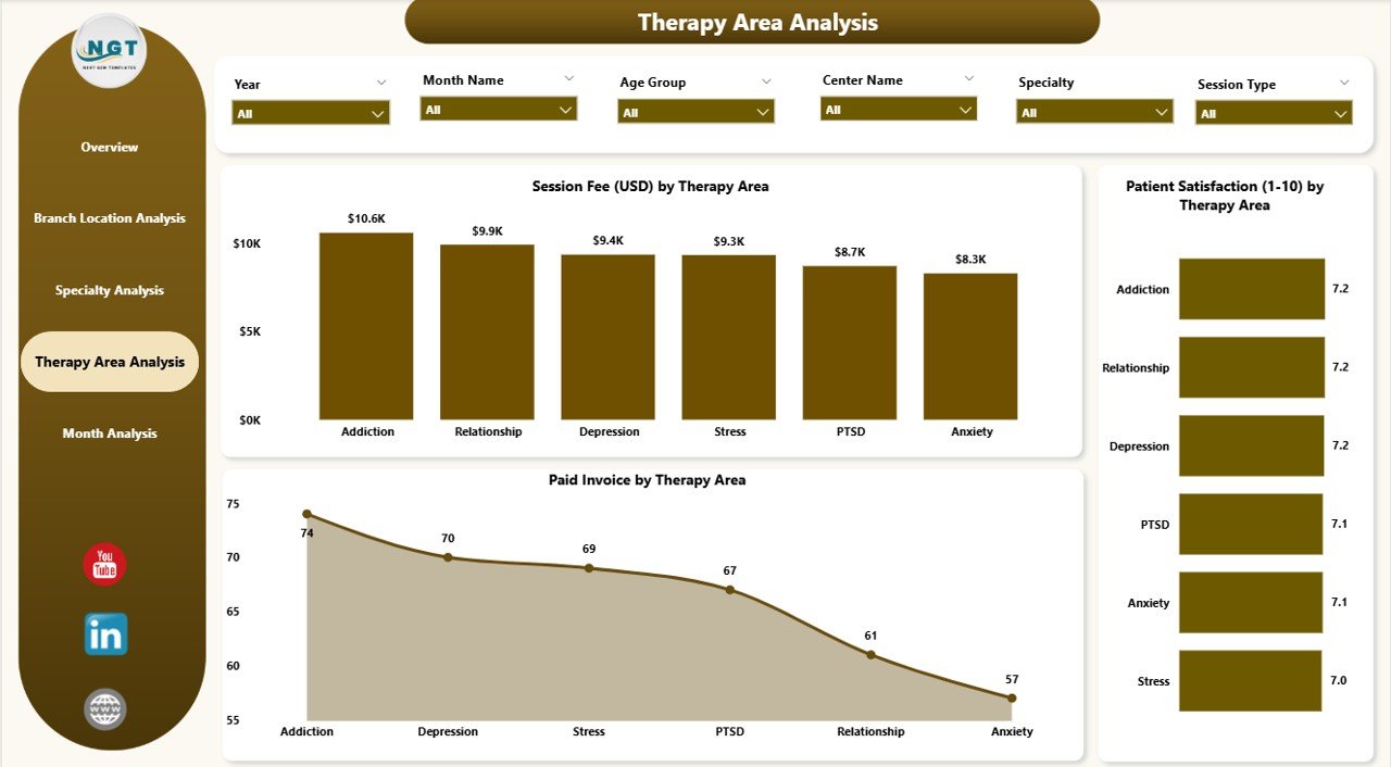
Mental health centers offer multiple therapy areas such as:
-
Cognitive Behavioral Therapy (CBT)
-
Child Counseling
-
Trauma Therapy
-
Group Therapy
-
Stress Management
-
Family Therapy
-
Rehabilitation Programs
Each therapy type contributes differently to patient outcomes and revenue.
What This Page Shows
You see three insightful charts:
-
Session Fee (USD) by Therapy Area
-
Profit (USD) by Therapy Area
-
Patient Satisfaction by Therapy Area
How It Supports Decision-Making
-
You identify therapy areas with high patient demand.
-
You measure profitability across therapy types.
-
You evaluate satisfaction to improve care quality.
-
You optimize appointment slots and pricing.
This analysis helps mental health centers refine their service mix.
5. Monthly Trends: How Do KPIs Change Month by Month?
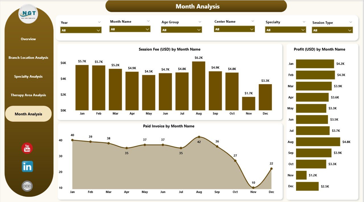
The Monthly Trends Page gives a complete timeline of performance. It helps leaders track seasonal patterns, identify growth, and plan resources better.
This Page Includes Three Key Trend Charts
-
Session Fee (USD) by Month
-
Profit (USD) by Month
-
Patient Satisfaction by Month
Why Monthly Trends Matter
-
Leaders spot peak treatment months.
-
They track growth month-over-month.
-
They identify months with reduced satisfaction.
-
They forecast demand and allocate staff accordingly.
This page offers long-term insights for strategic planning.
Advantages of Mental Health Services Dashboard in Power BI
This dashboard offers several strong advantages that help mental health leaders make better decisions:
⭐ 1. Real-Time Data Visibility
You track performance instantly without waiting for manual reports.
⭐ 2. Accurate and Reliable Insights
Power BI reduces human errors and gives consistent results.
⭐ 3. Clear and Interactive Visuals
Charts, KPI cards, and slicers help users explore data easily.
⭐ 4. Better Financial Control
You track session fees, profit, and discounts in one place.
⭐ 5. Improved Patient Experience
You see satisfaction levels by branch, specialty, and therapy type.
⭐ 6. Faster Decision-Making
You act quickly when trends change or when performance drops.
⭐ 7. Standardized Reporting
Every department follows the same KPIs and structure.
⭐ 8. Easy Integration
Power BI connects with Excel, EMRs, CRMs, and other systems.
Best Practices for the Mental Health Services Dashboard in Power BI
To get the best results, follow these recommended practices:
✔ Keep KPIs Simple and Relevant
Use metrics that directly support clinical and operational decisions.
✔ Refresh Data Daily or Weekly
Frequent refreshes maintain accuracy and trust.
✔ Use Clear Naming Conventions
Labels should stay simple to help non-technical users.
✔ Highlight Important Trends
Use conditional formatting to show increases or decreases.
✔ Provide Role-Based Access
Therapists, finance teams, and administrators should see relevant data only.
✔ Train Staff to Use the Dashboard
Training improves adoption and ensures consistent usage.
✔ Maintain Clean and Structured Data
Data quality directly affects dashboard accuracy.
✔ Review KPIs Regularly
Update KPIs based on changing clinical and business needs.
Conclusion
A Mental Health Services Dashboard in Power BI transforms how mental health centers manage operations. It simplifies data tracking, improves patient experience, boosts financial transparency, and supports evidence-based decisions. With five powerful pages—Overview, Branch Analysis, Specialty Analysis, Therapy Area Analysis, and Monthly Trends—healthcare leaders gain clear insights into every part of the service.
When teams use this dashboard effectively, they improve treatment outcomes, reduce inefficiencies, and enhance overall performance. This tool creates a strong foundation for smarter, faster, and more transparent mental healthcare delivery.
Frequently Asked Questions (FAQs)
1. What is a Mental Health Services Dashboard?
It is a Power BI dashboard that tracks patient satisfaction, therapy performance, financial metrics, session fees, specialty analysis, and monthly trends.
2. Who Can Use This Dashboard?
Therapists, psychologists, administrators, operations managers, financial teams, and healthcare executives use this dashboard.
3. What Data Sources Can Connect to This Dashboard?
You can use Excel, EMR databases, CRM systems, patient appointment tools, and billing software.
4. How Often Should I Update the Dashboard?
You should refresh the data daily or weekly depending on patient volume.
5. Can I Customize the KPIs?
Yes. Power BI allows full customization for KPIs, charts, filters, and drill-through pages.
6. Does This Dashboard Support Multiple Branches?
Yes. It includes branch-wise analysis for session fees, profit, discounts, and satisfaction.
7. Is Power BI Easy for Non-Technical Users?
Yes. The dashboard uses simple visuals, slicers, and user-friendly navigation.
8. Can I Add More Pages to the Dashboard?
Yes. You can add new pages for revenue forecasts, therapist performance, or case management metrics.
9. What Benefits Does It Offer to Mental Healthcare Teams?
It improves decision-making, reduces manual reporting, enhances patient satisfaction, and increases transparency.
10. Does the Dashboard Improve Patient Outcomes?
Yes. With real-time satisfaction and therapy insights, leaders identify gaps early and improve care quality.
Visit our YouTube channel to learn step-by-step video tutorials
Click to Purchases Mental Health Services Dashboard in Power BI