Managing nutrition and dietetics data becomes easy when you use the right tools. Today, dietitians, nutrition clinics, wellness centers, and health coaches work with large volumes of information. They track consultation fees, diet plans, client satisfaction, specialty performance, clinic-level profitability, and month-wise trends. As the client base grows, the data also grows. Because of this, teams struggle to make quick decisions, monitor performance, or understand client behavior.
A Nutrition & Dietetics Dashboard in Power BI solves these problems. It turns complex data into clear visuals, easy-to-read charts, and meaningful insights. You understand your entire nutrition business within minutes and take better decisions every day.
This complete guide explains what the dashboard is, how it works, why every nutrition practice needs it, and what each page shows. You will also learn the advantages, best practices, and common FAQs at the end.
Click to Purchases Nutrition & Dietetics Dashboard in Power BI
What Is a Nutrition & Dietetics Dashboard in Power BI?
A Nutrition & Dietetics Dashboard in Power BI is a ready-to-use analytical solution that helps dietitians, nutritionists, health coaches, and clinic managers track performance across specialties, diet plans, clinics, and months. It displays every KPI in interactive charts, cards, slicers, and graphs. You understand your operations clearly without checking multiple spreadsheets.
This dashboard tracks:
-
Consultation fees
-
Diet duration
-
Total bill value
-
Client satisfaction
-
Clinic performance
-
Specialty-wise outcomes
-
Plan-wise trends
-
Monthly revenue and profit
Because the dashboard updates instantly, you respond fast, deliver better services, and plan improvements with confidence.
Why Do Nutrition & Dietetics Practices Need This Dashboard?
Nutrition clinics handle a mix of operational, financial, and customer data. As the business grows, the data becomes large and difficult to manage. Without a proper dashboard:
-
You miss important trends
-
You struggle to understand client satisfaction
-
You cannot compare specialties or plan types
-
You waste time on manual reports
-
You make slow decisions
This dashboard solves these issues because it combines all your KPIs into one interactive system.
Key Features of the Nutrition & Dietetics Dashboard in Power BI
This dashboard contains five powerful pages, each designed to give you deep insights. Below is a detailed explanation of each page.
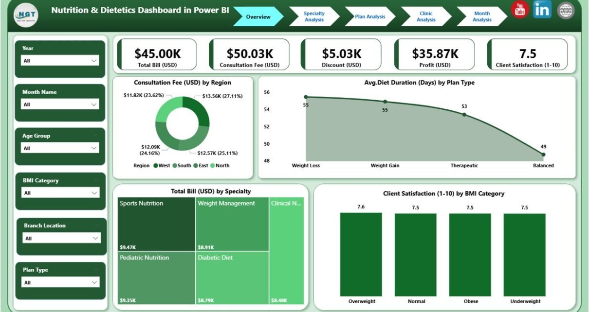
1. Overview Page: What Insights Can You See Here?
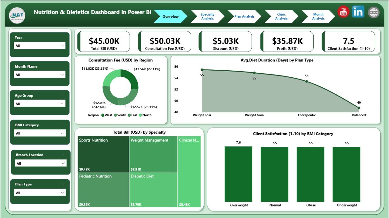
The Overview Page acts as the main control center. You find all important KPIs summarized in one place. Because of this, you understand performance quickly.
What You See on the Overview Page
✔ Slicers
You choose Region, Plan Type, BMI Category, or Date Range to update all visuals instantly.
✔ 4 KPI Cards
-
Consultation Fee (USD)
-
Avg. Diet Duration (Days)
-
Total Bill (USD)
-
Client Satisfaction
✔ 4 Interactive Charts
-
Consultation Fee by Region
-
Avg. Diet Duration by Plan Type
-
Total Bill by Specialty
-
Client Satisfaction by BMI Category
Why This Page Matters
It helps you answer important questions:
-
Which region earns the highest consultation revenue?
-
Which plan type gives longer diet duration?
-
Which specialty generates the most billing?
-
How does BMI affect satisfaction levels?
Because everything updates with one click, you save hours every week.
2. Specialty Analysis Page: What Can You Learn From It?
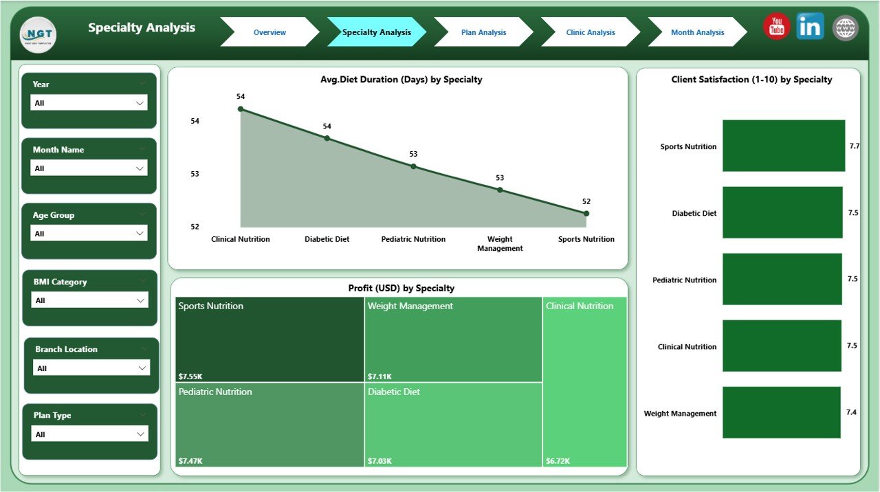
Every nutrition practice includes multiple specialties such as sports nutrition, child nutrition, obesity management, metabolic therapy, and clinical dietetics. This page compares their performance.
What You See on the Specialty Page
✔ Slicers
Choose specialty, date, or branch to filter results.
✔ 3 Detailed Charts
-
Avg. Diet Duration by Specialty
-
Client Satisfaction by Specialty
-
Profit (USD) by Specialty
Why This Page Matters
With this page, you understand:
-
Which specialty delivers long-term diet plans
-
Where clients show higher satisfaction
-
Which category brings the highest profit
-
Where improvement is needed
This analysis helps managers allocate better resources and develop stronger specialty programs.
3. Plan Analysis Page: How Do Plan Types Perform?
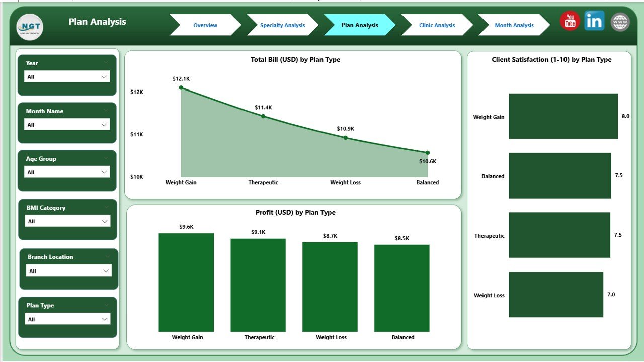
Nutrition clinics offer many types of plans such as weight loss programs, muscle gain diets, diabetic meal plans, detox plans, pregnancy nutrition, and lifestyle management plans. This page compares and analyzes every plan type.
What You See on the Plan Analysis Page
✔ Slicers
Filter data by Plan Type or Month.
✔ 3 Clear Charts
-
Client Satisfaction by Plan Type
-
Profit (USD) by Plan Type
-
Total Bill (USD) by Plan Type
Why This Page Matters
It helps you answer key questions:
-
Which plan gains the highest satisfaction score?
-
Which plan provides the best revenue?
-
Which plan performs poorly?
As a result, you optimize pricing, improve low-performing plans, and promote the best ones.
Click to Purchases Nutrition & Dietetics Dashboard in Power BI
4. Clinic Analysis Page: Which Clinic Performs Best?
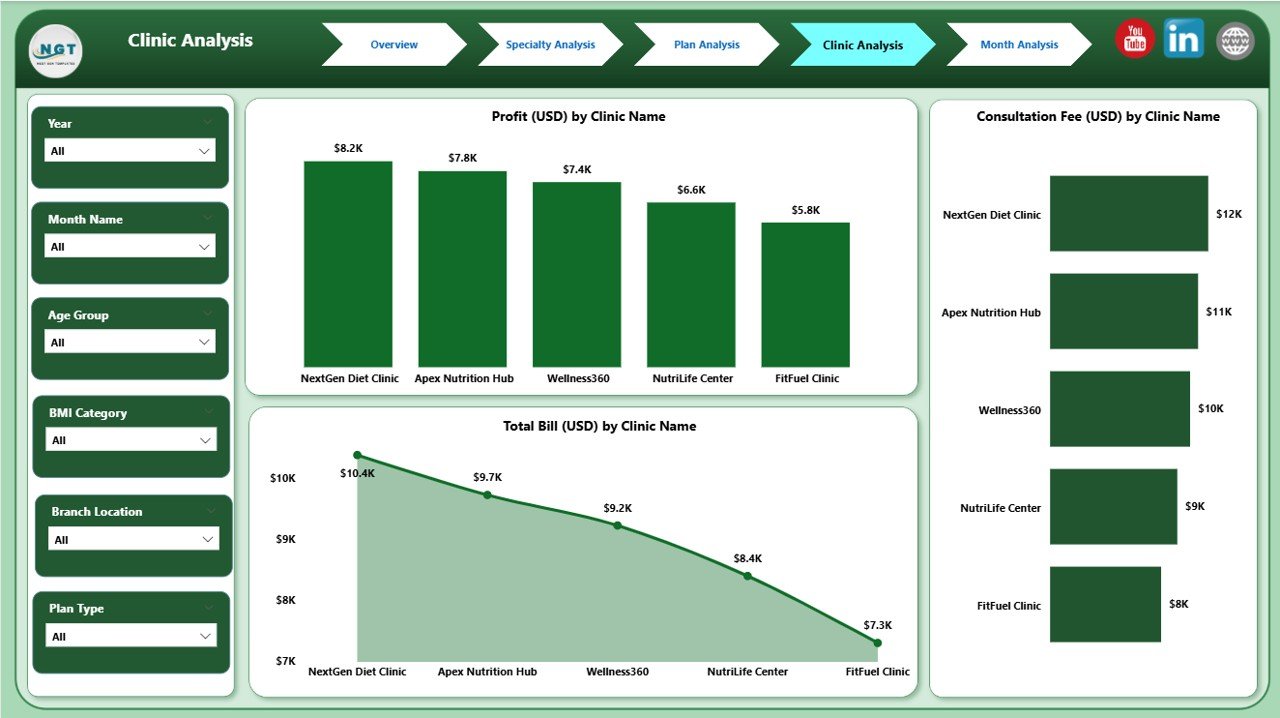
Nutrition chains often operate at multiple locations. Each clinic may have different staff, different specialties, and different client groups. This page helps you compare them clearly.
What You See on the Clinic Analysis Page
✔ Slicers
Choose Clinic Name or Location.
✔ 3 Important Charts
-
Client Satisfaction by Clinic Name
-
Profit (USD) by Clinic Name
-
Total Bill (USD) by Clinic Name
Why This Page Matters
It gives you actionable insights:
-
Which clinic delivers the best client experience?
-
Which location earns the highest profit?
-
Which branch requires support or staff training?
Clinic managers use this page to improve service quality and boost revenue.
5. Monthly Trends Page: How Does Performance Change Over Time?
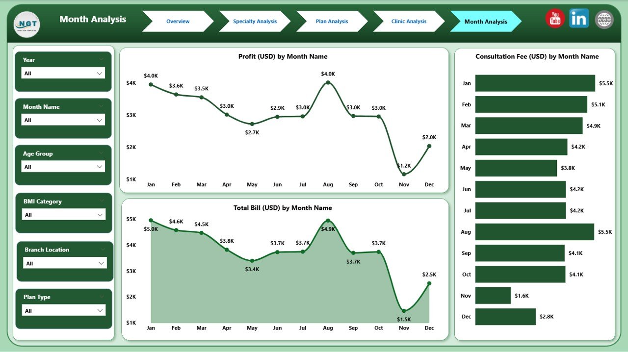
Every nutrition practice needs to understand month-wise trends. This helps managers plan resources, forecast revenue, and track performance cycles.
What You See on the Monthly Trends Page
✔ 3 Time-Series Charts
-
Consultation Fee by Month
-
Profit (USD) by Month
-
Total Bill (USD) by Month
Why This Page Matters
You learn:
-
Which months have higher demand
-
When revenue increases or decreases
-
How client spending changes over time
-
How marketing campaigns influence performance
These insights help you plan growth strategies and seasonal promotions.
Advantages of the Nutrition & Dietetics Dashboard in Power BI
This dashboard offers many benefits that support long-term growth.
1. Faster Decision-Making
You see real-time updates, so you respond fast and improve operations quickly.
2. Clear Visual Insights
Charts, cards, and graphs show complex data in simple visuals.
3. Better Client Understanding
Satisfaction trends help you improve service quality and diet plans.
4. Improved Revenue Management
You track billing, consultation fees, and profit from every angle.
5. Strong Resource Planning
You understand which clinic or specialty needs more support.
6. Easy Comparison Across Plans
Plan-wise insights help you select the most effective programs.
7. Enhanced Clinic Performance
Branch-level trends guide better staffing, training, and management.
8. Month-Wise Trend Tracking
Time-series insights support forecasting and strategic planning.
9. Complete Business Transparency
You avoid confusion because everything stays in one dashboard.
Best Practices for Using the Nutrition & Dietetics Dashboard in Power BI
Click to Purchases Nutrition & Dietetics Dashboard in Power BI
Follow these practices to use the dashboard effectively and get accurate insights.
1. Update Your Data Regularly
Clean and refresh your data to maintain correct results.
2. Use Slicers Smartly
Apply filters to understand different scenarios and client segments.
3. Compare Trends Over Time
Analyze month-wise charts to predict future performance.
4. Focus on Low-Performing Areas
Identify weak clinics, plans, or specialties and work on improvement.
5. Track Client Satisfaction Frequently
Use satisfaction insights to refine diet programs.
6. Review Specialty-Wise Results
Check which specialty brings the best revenue or longest diet duration.
7. Study Plan-Wise Billing Patterns
Analyze billing to make pricing decisions.
8. Share the Dashboard With Teams
Collaborate with clinic managers, dietitians, and analysts.
9. Set Monthly KPIs
Use the dashboard to define clear performance goals.
Conclusion
A Nutrition & Dietetics Dashboard in Power BI gives every nutrition practice a complete view of operations. It brings together consultation fees, diet durations, clinic results, plan performance, and client satisfaction into one powerful tool. Because the dashboard updates instantly, you take fast decisions, improve service quality, and manage growth with confidence.
Whether you run a single clinic or a large chain of nutrition centers, this dashboard makes your operations simple, transparent, and data-driven.
Frequently Asked Questions (FAQs)
1. Why do nutrition clinics need a Power BI dashboard?
Because it organizes all KPIs into clear charts so you understand performance fast.
2. Can this dashboard track client satisfaction?
Yes. It shows satisfaction by BMI category, plan type, clinic, and specialty.
3. Which page is most useful for managers?
The Overview Page helps managers understand everything at a glance.
4. Can clinics compare different diet plans?
Yes. The Plan Analysis page shows satisfaction, billing, and profit for each plan.
5. Does the dashboard help in revenue planning?
Yes. Monthly Trends and Plan Analysis support accurate forecasting.
6. Can I track multiple clinic locations?
Yes. The Clinic Analysis page compares branches clearly.
7. Do specialties perform differently?
Yes. The Specialty Analysis page highlights performance variation across specialties.
8. How often should I update data?
Update and refresh your dataset weekly or monthly for best results.
Visit our YouTube channel to learn step-by-step video tutorials