Managing employee payroll is one of the most critical and recurring tasks for every organization. Payroll data not only impacts financial records but also influences employee satisfaction, productivity, and compliance. Handling this vast amount of information manually often leads to errors, inefficiencies, and a lack of visibility into trends.
That’s where a Payroll Management Dashboard in Excel becomes a game-changer. This powerful, ready-to-use Excel-based dashboard transforms complex payroll data into clean, interactive visuals — helping HR professionals, finance managers, and executives analyze and optimize payroll operations in real time.
In this article, you’ll explore the structure, features, advantages, and best practices for using a Payroll Management Dashboard in Excel, along with answers to frequently asked questions.
Click to Purchases Payroll Management Dashboard in Excel
What Is a Payroll Management Dashboard in Excel?
A Payroll Management Dashboard in Excel is a dynamic visualization tool designed to simplify payroll tracking and analysis. It consolidates employee-wise and department-wise salary details, deductions, bonuses, and allowances into a single, easy-to-navigate interface.
Unlike traditional spreadsheets, this dashboard uses Excel automation, charts, slicers, and formulas to provide real-time insights into pay trends, departmental costs, and employee performance. It allows businesses to identify payroll inefficiencies, ensure pay accuracy, and align payroll budgets with organizational goals.
Why Every Organization Needs a Payroll Dashboard
Payroll processing involves multiple data points—gross pay, deductions, bonuses, overtime, and tax components. Manually tracking and validating each record can lead to errors. A Payroll Dashboard helps you:
✅ Eliminate manual calculations and data duplication.
📊 Visualize payroll distribution across departments, regions, and months.
💼 Monitor salary trends and performance indicators.
🔍 Identify payroll discrepancies quickly.
🕒 Save time on monthly reporting and compliance tasks.
Excel serves as a perfect foundation for this dashboard because of its universal accessibility, flexibility, and ability to integrate with existing HR or accounting systems.
Key Features of the Payroll Management Dashboard in Excel
This dashboard is thoughtfully designed to give a 360° view of your payroll ecosystem. It includes a page navigator for seamless movement between various analytical pages, ensuring a smooth user experience.
Let’s explore each page in detail:
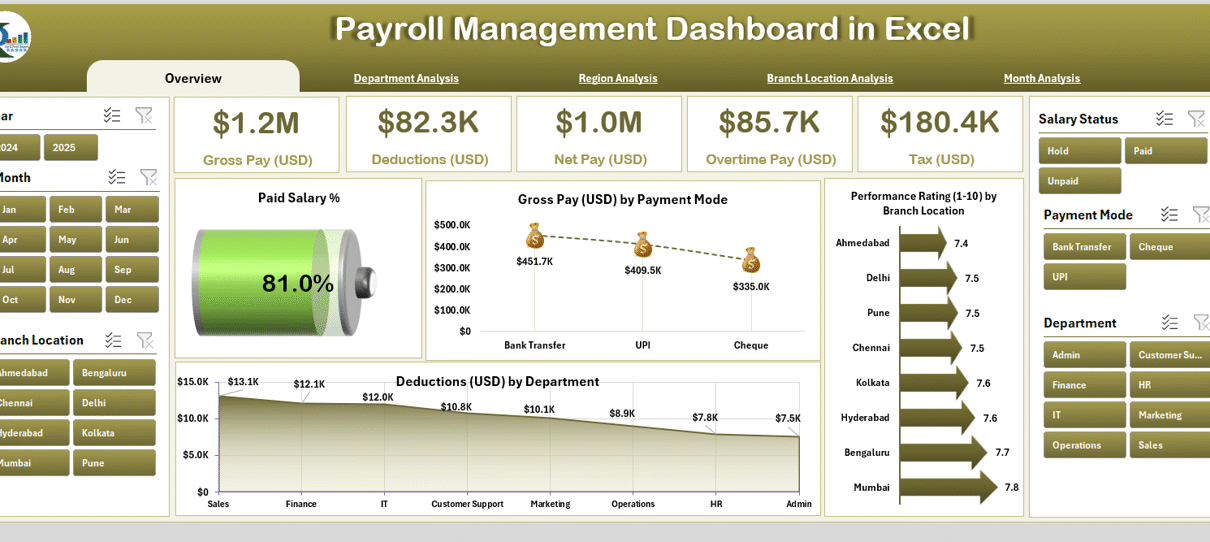
1. Overview Page – The Complete Payroll Snapshot
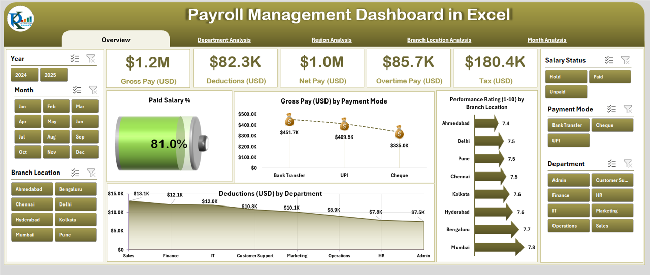
The Overview Page acts as the main control center of the dashboard. On this page, you’ll find an at-a-glance summary of all key payroll metrics for quick decision-making.
Highlights of the Overview Page:
-
Interactive slicer panel on the right side to filter data by month or department.
-
Five KPI cards displaying vital information such as Total Paid Salary, Average Gross Pay, Total Overtime Pay, Deduction Summary, and Performance Rating Average.
-
Four dynamic charts:
-
Paid Salary Trend – Visualizes total payroll cost over time.
-
Gross Pay (USD) by Payment Mode – Compares direct deposits, cash, and cheque payments.
-
Performance Rating (1-10) by Branch Location – Shows employee performance across offices.
-
Duration (USD) by Department – Tracks salary duration or pay periods across departments.
-
This page offers an instant overview of how payroll expenses evolve and where improvements are possible.
2. Department Analysis – Understanding Departmental Payroll Trends
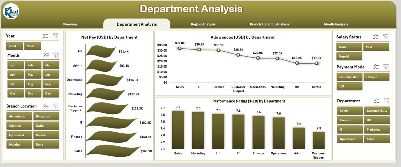
The Department Analysis Page dives deeper into department-wise payroll metrics.
Key Charts Include:
-
Net Pay (USD) by Department: Reveals how much each department contributes to the total payroll expense.
-
Allowance (USD) by Department: Helps you understand extra compensation trends.
-
Performance Rating (1-10) by Department: Links employee performance to pay structure.
This level of insight empowers HR and finance teams to evaluate whether each department’s salary allocation aligns with performance outcomes. For instance, if the marketing team’s performance rating improves while payroll cost remains stable, it signals efficiency.
Click to Purchases Payroll Management Dashboard in Excel
3. Region Analysis – Comparing Regional Payroll Dynamics
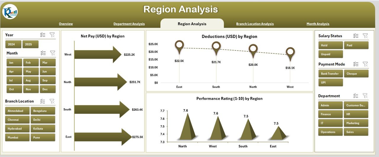
When organizations operate across multiple locations or regions, payroll analysis becomes more complex. The Region Analysis Page simplifies this challenge.
Main Charts on This Page:
-
Net Pay (USD) by Region – Compares salary expenses across geographic regions.
-
Deduction (USD) by Region – Breaks down taxes, provident funds, or other region-specific deductions.
-
Performance Rating (1-10) by Region – Indicates which regions perform better and maintain balanced payroll structures.
By identifying high-cost regions, management can plan workforce restructuring or resource optimization efficiently.
4. Branch Location Analysis – Branch-Level Pay Insights
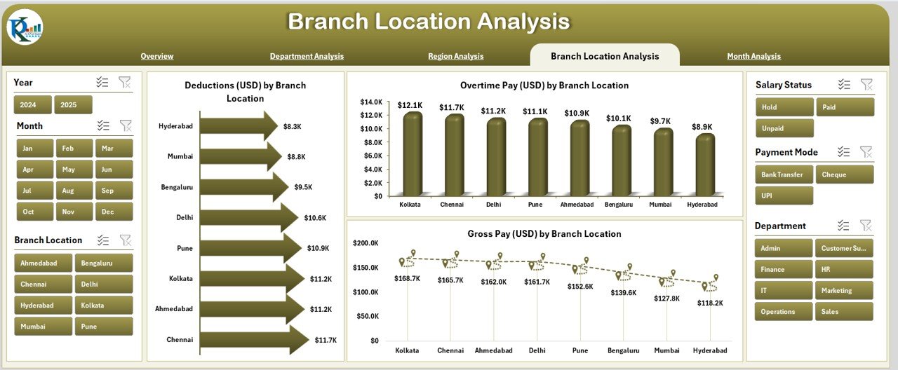
Each branch often operates under slightly different pay structures and performance standards. The Branch Location Analysis Page captures these differences clearly.
Charts and Metrics Covered:
-
Deduction (USD) by Branch Location – Identifies branches with higher deduction ratios.
-
Overtime Pay (USD) by Branch Location – Tracks overtime trends across branches.
-
Gross Pay (USD) by Branch Location – Compares total pay distribution between branches.
This data helps leadership evaluate cost-to-performance efficiency and recognize branches with consistent payroll discipline.
5. Month Analysis – Payroll Trends Over Time
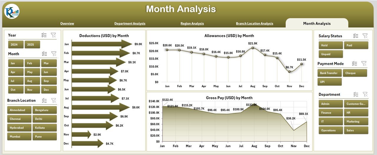
The Month Analysis Page provides a time-series view of payroll metrics, revealing how pay components fluctuate monthly.
Charts on This Page:
-
Deduction (USD) by Month: Tracks deductions and identifies irregularities.
-
Allowance (USD) by Month: Shows additional compensation trends month over month.
-
Gross Pay (USD) by Month: Displays total salary cost evolution through the year.
This temporal analysis allows HR managers to detect seasonal patterns, predict future payroll budgets, and ensure cost consistency.
Support and Data Sheets
Behind these visual pages lies a Data Sheet, which stores all raw payroll data such as employee details, gross pay, allowances, deductions, overtime hours, and ratings. It acts as the backbone of the dashboard, automatically feeding information to all visualization pages through formulas and references.
Advantages of Payroll Management Dashboard in Excel
Let’s explore why organizations across industries are switching to Excel-based Payroll Dashboards:
1. Simplified Data Management
The dashboard centralizes payroll data in one file, eliminating the need for multiple spreadsheets. Users can easily filter, edit, or import data without complex database management systems.
2. Real-Time Visualization
With Excel’s charts and pivot capabilities, you can visualize data instantly. Any change in the data sheet automatically updates all charts and KPIs.
3. Time Efficiency
Automated formulas and dynamic charts save countless hours spent on manual reporting. Monthly payroll reviews that used to take hours now take minutes.
4. Improved Accuracy
Conditional formatting, formula validations, and structured templates ensure that calculation errors are minimized, leading to accurate salary distribution and reporting.
5. Cost-Effective Solution
Excel is widely available and affordable, making this dashboard a low-cost alternative to expensive payroll software systems.
6. Enhanced Decision-Making
By linking payroll trends with performance ratings and departmental data, organizations can make better HR and financial decisions based on facts, not assumptions.
How the Payroll Dashboard Improves HR and Finance Collaboration
The Payroll Dashboard in Excel bridges the gap between HR and Finance teams. HR departments often manage employee details, attendance, and performance data, while Finance focuses on cost analysis and budgeting.
With this integrated dashboard:
-
HR can monitor performance-linked pay.
-
Finance can forecast salary budgets accurately.
-
Both teams can collaborate on compensation strategy, compliance, and workforce planning.
The result? Improved transparency, better coordination, and data-driven payroll strategies.
Best Practices for Using the Payroll Management Dashboard in Excel
To get the most out of your Payroll Dashboard, follow these best practices:
1. Keep Data Updated
Always update the data sheet with the latest payroll records before analyzing. Outdated data can lead to misleading insights.
2. Use Consistent Formats
Maintain a uniform format for dates, employee IDs, and department names. Inconsistent formatting may break chart linkages.
3. Automate Repetitive Tasks
Leverage Excel features like Power Query, dynamic ranges, and VBA macros to automate data imports and calculations.
4. Review Key KPIs Regularly
Focus on metrics like:
-
Gross Pay vs Net Pay Ratio
-
Overtime Pay %
-
Deduction Trends
-
Average Performance Rating
These KPIs highlight both financial and productivity health.
5. Protect Data Integrity
Use password protection or locked cells to prevent unauthorized edits to formulas or charts.
6. Visualize Insights Effectively
Customize chart types and use color coding (e.g., green for improved performance, red for overspending) to make patterns easy to interpret.
7. Back Up Regularly
Maintain backup copies of your dashboard, especially before making structural changes or adding new data columns.
How to Customize the Payroll Management Dashboard
Click to Purchases Payroll Management Dashboard in Excel
One of Excel’s biggest strengths is flexibility. You can personalize the dashboard for your organization’s unique needs.
Ways to Customize:
-
Add department filters for deeper HR analysis.
-
Include bonus and incentive charts to monitor variable pay.
-
Connect to external data sources (like CSV or HRMS exports).
-
Apply conditional formatting to highlight under- or over-performing departments.
-
Integrate with Power BI for advanced visualization.
The more tailored your dashboard is, the more relevant your insights become.
Steps to Create a Payroll Dashboard in Excel
If you want to build or modify your own dashboard, follow these steps:
-
Collect Raw Data: Include columns such as Employee ID, Name, Department, Gross Pay, Deductions, Allowances, Overtime, and Rating.
-
Prepare the Data Sheet: Clean and validate all entries for consistency.
-
Set Up Pivot Tables: Use them to summarize Net Pay, Deductions, and Allowances by various dimensions.
-
Create Charts: Add bar, line, and donut charts to visualize patterns.
-
Design KPI Cards: Use formulas like
=SUM(),=AVERAGE(), or=COUNTIF()for quick metrics. -
Add Slicers: Provide interactivity for filtering by Month, Department, or Region.
-
Format Professionally: Apply color themes and icons for better visual storytelling.
Following these steps ensures your dashboard is both functional and visually appealing.
Advantages of Using Excel Over Other Payroll Tools
Although several payroll software solutions exist, Excel continues to stand out for its adaptability and cost-effectiveness.
1. Flexibility
You can modify, expand, or reformat Excel dashboards easily without needing IT support.
2. Accessibility
Every professional is familiar with Excel, reducing the learning curve.
3. Integration
It integrates well with ERP, accounting, or HR systems through imports and exports.
4. Offline Functionality
Excel dashboards work even without internet access, making them ideal for small and mid-sized firms.
Real-World Example: Payroll Dashboard in Action
Imagine a mid-sized company with 300 employees spread across five regional offices.
Before using the dashboard, their HR team spent hours every month consolidating payslips, verifying overtime, and preparing management reports. After implementing the Payroll Management Dashboard in Excel:
-
Monthly payroll summary time dropped by 70%.
-
Departmental performance correlation reports became automatic.
-
Financial teams could forecast next quarter’s payroll costs instantly.
-
Error rates in salary distribution reduced dramatically.
This transformation shows the real power of turning raw payroll data into visual, actionable insights.
Conclusion
The Payroll Management Dashboard in Excel isn’t just a reporting tool—it’s a strategic asset. By combining payroll data with visual analytics, organizations can uncover inefficiencies, ensure fair pay, and enhance financial transparency.
Whether you are part of HR, Finance, or executive leadership, this dashboard gives you everything you need to manage payroll with precision and confidence. Its multi-page design, intuitive navigation, and KPI-driven insights make it the perfect companion for data-driven payroll management.
Frequently Asked Questions (FAQs)
1. What is a Payroll Management Dashboard in Excel?
It’s an Excel-based tool that visualizes salary, deduction, and allowance data to monitor payroll performance and trends across departments, regions, and time periods.
2. Who should use this dashboard?
HR managers, finance teams, and executives who want quick and accurate insights into payroll costs, employee performance, and compensation trends.
3. Can I use this dashboard for different countries or currencies?
Yes. You can easily customize it for multiple currencies and tax structures by adjusting formulas and currency symbols.
4. How often should the data be updated?
Ideally, update the data sheet monthly or after every payroll run to maintain real-time accuracy.
5. Is Excel powerful enough for large organizations?
Yes, with proper data structuring and optimization, Excel can handle thousands of rows efficiently, especially when enhanced with Power Query or Power Pivot.
6. Can I integrate this dashboard with my HR software?
Absolutely. You can import CSV or Excel exports from most HRMS systems directly into the Data Sheet.
7. What are the most important KPIs to track?
Focus on Gross Pay, Net Pay, Deductions, Allowance %, Overtime Pay, and Performance Ratings for a balanced payroll view.
8. How can I protect my dashboard from unauthorized access?
Use password protection for sensitive sheets and lock formula cells to prevent accidental changes.
9. Can the dashboard generate reports automatically?
Yes, by linking pivot tables and charts, you can generate updated monthly reports instantly without manual intervention.
10. Why is visualization important in payroll management?
Visual dashboards simplify complex data, highlight patterns, and allow decision-makers to identify trends, irregularities, and improvement areas faster.
Visit our YouTube channel to learn step-by-step video tutorials