Managing pension funds demands clarity, accuracy, and quick access to data. Every small financial decision impacts long-term stability. Because of this, organizations and fund managers need simple, interactive, and real-time tools that help them track contributions, fund value, withdrawals, investment risks, and trends. A Pension Funds Dashboard in Power BI offers all these insights in one powerful platform. It turns complex financial data into easy visuals that improve decision-making.
In this detailed guide, you will learn everything about the Pension Funds Dashboard in Power BI, how it works, why it matters, and how each page in the dashboard helps you understand the financial performance of pension funds. You will also explore advantages, best practices, and answers to common questions.
Click to Purchases Pension Funds Dashboard in Power BI
Let’s begin.
What Is a Pension Funds Dashboard in Power BI?
A Pension Funds Dashboard in Power BI is an interactive reporting tool that shows real-time pension fund data. It gives fund managers a complete view of fund growth, employee contributions, withdrawal trends, investment risks, and overall financial health. Power BI makes the dashboard dynamic, so you can switch periods, filter plan types, compare risks, and track fund value changes with a few clicks.
It also helps large organizations, financial institutions, retirement fund agencies, and HR teams handle large volumes of data without errors. Since Power BI supports slicers, charts, KPIs, and automated visuals, the dashboard becomes the perfect tool for financial monitoring.
Why Do Organizations Need a Pension Funds Dashboard?
Organizations deal with thousands of employees and many investment options. Manually tracking monthly contributions, fund value changes, and risk scores becomes difficult. A dashboard brings everything together in one place.
You can compare fund performance, check withdrawal percentages, track plan trends, and evaluate the risk distribution with ease. This helps you take better decisions that support long-term financial planning.
Key Features of the Pension Funds Dashboard in Power BI
You already had important information about the dashboard. I have rewritten and enhanced it with clear explanations, smooth transitions, and easy language.
This dashboard includes five important pages:
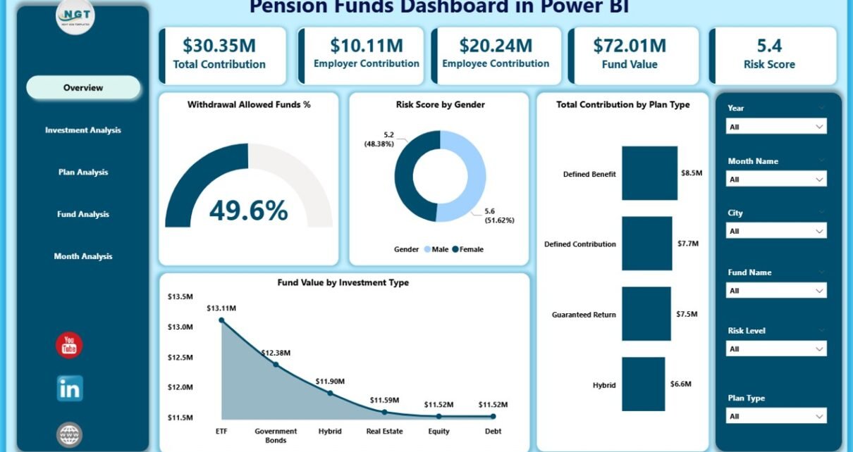
1. Overview Page – How Does It Give a Complete Summary?
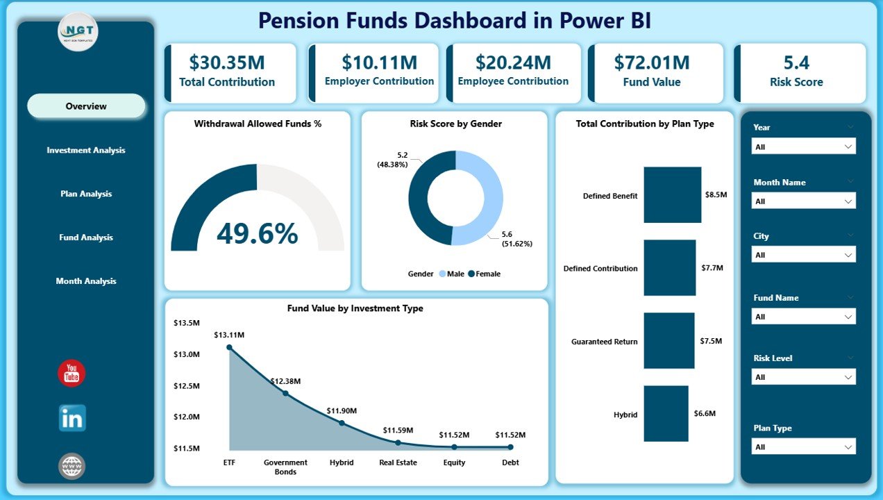
The Overview Page works as the main control center. It includes slicers that help you filter data by year, month, plan type, investment type, gender, or fund name. You can change the view instantly and check fresh insights.
On this page, you see four simple KPIs and four detailed charts:
Key KPI Cards
-
Total Contribution
-
Fund Value
-
Withdrawal Allowed Funds %
-
Risk Score
These cards show the most important information at a glance.
Charts on the Overview Page
-
Withdrawal Allowed Funds %
-
Risk Score by Gender
-
Total Contribution by Plan Type
-
Fund Value by Investment Type
These visuals help you compare performance factors quickly. For example, you can study how risky one gender group invests or how each plan type performs.
This page gives you a fast and clean summary, so you stay updated all the time.
2. Investment Analysis – How Does It Help Improve Investment Planning?
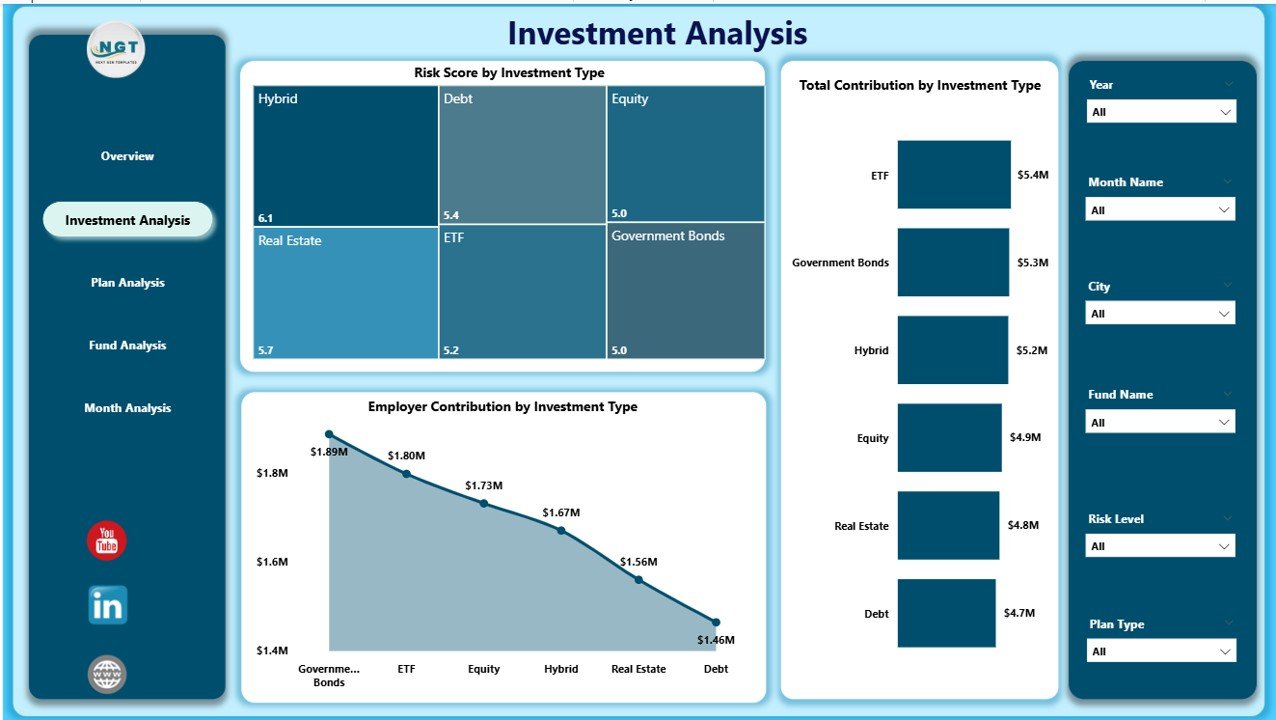
The Investment Analysis page tells you how each investment type performs. You use the slicers to switch between fund names, plans, or time periods.
The page includes three strong visuals that help you understand investment behavior:
Click to Purchases Pension Funds Dashboard in Power BI
Charts on Investment Analysis
-
Risk Score by Investment Type
-
Total Contribution by Investment Type
-
Employee Contribution by Investment
These visuals help you explore how people invest, which investment category receives the most contributions, and which type carries more risk.
You can make better decisions because you see which investment grows fast and which needs more attention.
3. Plan Analysis – Why Is It Important for Understanding Employee Choices?
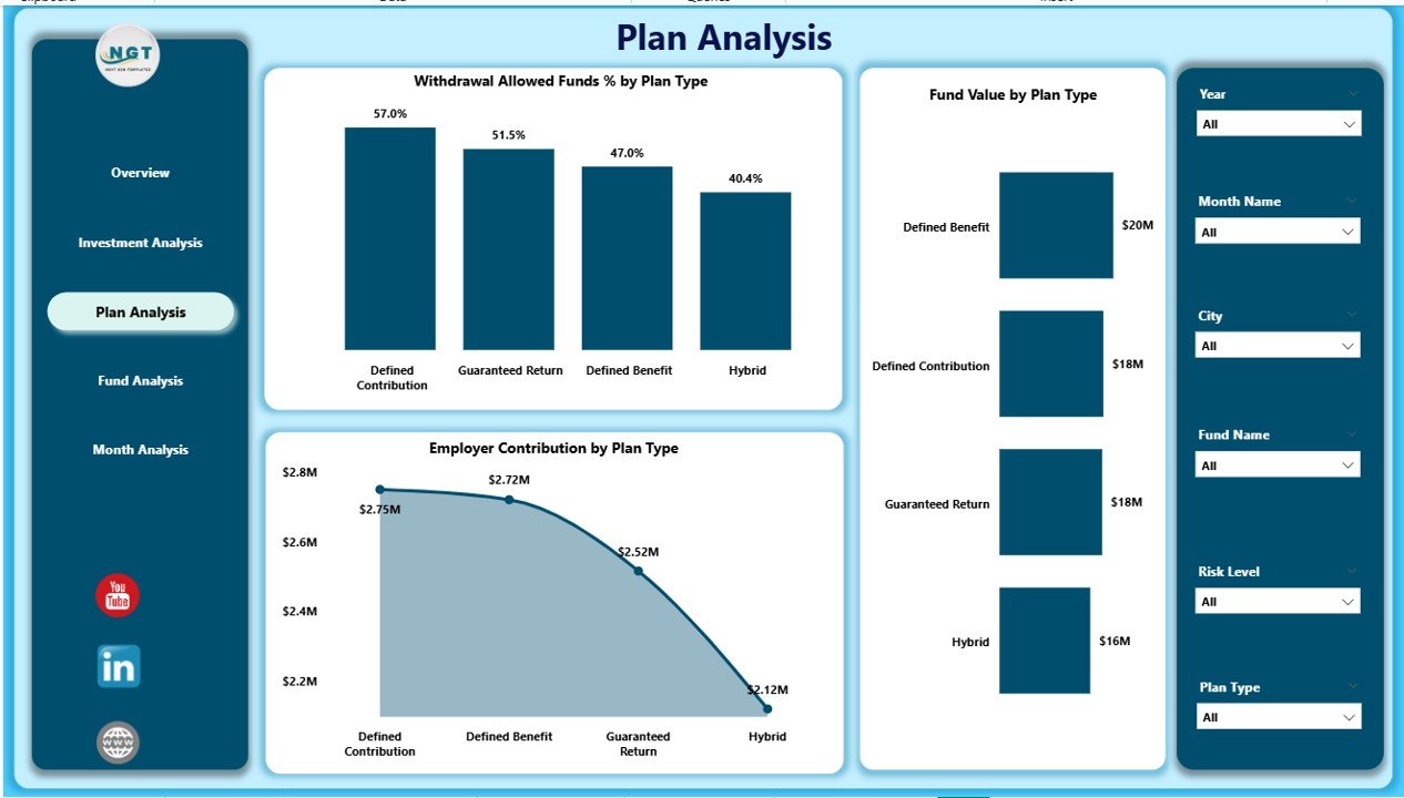
The Plan Analysis page focuses on employee plan types. Every organization offers multiple pension plans, and employees select them based on risk, return, and trust.
This page helps you compare each plan type with clean visuals:
Charts on Plan Analysis
-
Withdrawal Allowed Funds % by Plan Type
-
Fund Value by Plan Type
-
Employee Contribution by Plan Type
You understand which plan attracts the most employees. You also see the fund value distribution and withdrawal patterns. This helps HR teams evaluate plan performance and make better offerings.
4. Fund Analysis – How Does It Support Detailed Fund Evaluation?
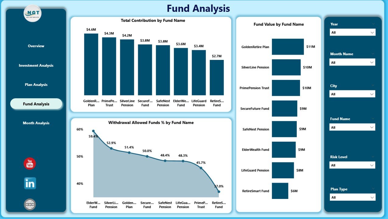
The Fund Analysis page shows fund-level performance.
You may have many funds in a pension system. Each behaves differently. This page helps you evaluate every fund separately so you understand where the strengths and weak points lie.
Charts on Fund Analysis
-
Total Contribution by Fund Name
-
Fund Value by Fund Name
-
Withdrawal Allowed Funds % by Fund Name
These charts help you see which funds grow fast, which funds people trust more, and which funds see higher withdrawal activity.
5. Monthly Trends – Why Does Month-By-Month Tracking Matter?
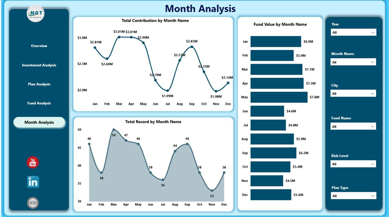
Monthly trends show you the direction of financial performance. This page helps you track changes over time, so you understand the growth pattern of your pension funds.
Charts on Monthly Trends
-
Total Contribution by Month
-
Fund Value by Month
-
Withdrawal Allowed Funds % by Month
These visuals help you compare every month and identify strong and weak periods. You can detect long-term trends and improve your planning decisions.
Why Should You Use a Pension Funds Dashboard?
Click to Purchases Pension Funds Dashboard in Power BI
A Pension Funds Dashboard in Power BI adds strong value to financial teams. Here are some important reasons:
-
You get all pension-related data in one place.
-
You understand trends fast through interactive visuals.
-
You avoid manual calculations.
-
You make quick and confident decisions.
-
You track risks with better clarity.
-
You improve fund planning and investment strategies.
Because the dashboard works in real-time, you never miss important changes.
Advantages of Pension Funds Dashboard in Power BI
Let’s explore the key advantages in simple terms:
1. Clear Visibility
You track all important KPIs in one screen, so you understand fund health immediately.
2. Strong Decision Support
You compare plan types, investment types, funds, and risks with simple visuals.
3. Real-Time Insights
The dashboard updates as soon as you refresh the data, so you always get fresh information.
4. Better Risk Management
Risk charts help you identify high-risk categories, so you make safer financial decisions.
5. Easy Comparisons
You switch between months, years, plans, funds, or genders within seconds.
6. Zero Manual Effort
You do not spend time preparing reports because the dashboard does the work for you.
7. Improved Transparency
Employees and management understand fund performance with clear visuals.
Best Practices for the Pension Funds Dashboard in Power BI
If you want to use the dashboard in the best way, follow these tips:
1. Update Data Regularly
Make sure your data files stay updated every month so your dashboard shows accurate numbers.
2. Use Slicers Smartly
Switch filters to get better insights. Explore plan types, investment types, genders, and fund names.
3. Compare Multiple KPIs Together
Fund value, contribution, and risk score together give a complete financial picture.
4. Track Trends Frequently
Study Month-by-Month visuals to identify early warning signs.
5. Use Color Coding
Highlight risk levels and withdrawal trends for better clarity.
6. Export Insights for Reporting
You can export visuals or snapshots for internal audit or management review.
7. Keep the Dashboard Simple
Too many visuals create confusion. This dashboard already includes the right balance, so keep it clean.
How Does a Pension Funds Dashboard Improve Organizational Planning?
Organizations plan budgets, retirement benefits, long-term fund requirements, and investment strategies. A dashboard supports all these activities because it shows trends and patterns.
You understand how contributions grow, how funds behave, and how employees invest. This helps you plan more accurately and avoid risky decisions.
Conclusion
A Pension Funds Dashboard in Power BI gives organizations the power to track fund performance with complete clarity. It helps fund managers, HR teams, and financial leaders understand contributions, fund value trends, employee behavior, and investment risks.
Because the dashboard offers five powerful pages—Overview, Investment Analysis, Plan Analysis, Fund Analysis, and Monthly Trends—you get a complete picture of your pension fund system. When you follow the right best practices, you improve decision-making, reduce risk, and build strong financial stability.
Power BI makes everything simple, visual, and interactive. This makes pension fund management smarter, faster, and more accurate.
Frequently Asked Questions (FAQs)
1. What is a Pension Funds Dashboard in Power BI?
It is an interactive visual tool that helps you track pension fund contributions, fund value, withdrawals, plan types, investment risks, and monthly trends.
2. Who can use this dashboard?
HR teams, finance departments, pension fund managers, auditors, and investment analysts use this dashboard.
3. Can I customize the dashboard?
Yes, you can add visuals, remove charts, change colors, and modify slicers according to your needs.
4. How often should I update the data?
You should update the data every month or whenever you have new contribution or fund updates.
5. Why should organizations use Power BI for pension funds?
Power BI offers interactive visuals, simple filtering, real-time insights, and automated reporting that help organizations manage pension funds efficiently.
Visit our YouTube channel to learn step-by-step video tutorials