In today’s competitive digital environment, personalization no longer remains optional. Instead, it has become a core business strategy. However, personalization efforts fail when organizations do not measure them correctly. Therefore, businesses need a structured, data-driven way to track performance. That is exactly where a Personalization Strategy KPI Dashboard in Power BI becomes extremely valuable.
This detailed article explains what a Personalization Strategy KPI Dashboard in Power BI is, why it matters, how it works, its page-wise structure, key KPIs, advantages, best practices, and frequently asked questions. Moreover, the language remains simple, clear, and practical so that both technical and non-technical users can easily understand and use it.
Click to Purchases Personalization Strategy KPI Dashboard in Power BI
What Is a Personalization Strategy KPI Dashboard in Power BI?
A Personalization Strategy KPI Dashboard in Power BI is a ready-to-use analytical dashboard designed to measure, monitor, and improve personalization initiatives across digital channels, marketing campaigns, customer journeys, and engagement touchpoints.
Instead of analyzing raw personalization data in scattered spreadsheets, this dashboard centralizes all critical metrics into a single interactive Power BI file. As a result, decision-makers can quickly understand whether personalization strategies are delivering real value or not.
Moreover, since the data source is an Excel file, teams can update numbers easily without complex integrations. Consequently, this dashboard works perfectly for organizations that want powerful insights with minimal technical effort.
Why Do Businesses Need a Personalization Strategy KPI Dashboard?
Personalization directly impacts customer engagement, conversion rates, retention, and revenue. However, many organizations struggle to answer basic questions such as:
-
Are personalization efforts meeting targets?
-
Which KPIs perform better month over month?
-
How does current performance compare with the previous year?
-
Which personalization metrics need immediate action?
Therefore, a Personalization Strategy KPI Dashboard in Power BI becomes essential because it provides:
-
Clear visibility into performance
-
Data-backed decision-making
-
Faster identification of gaps and opportunities
-
Alignment between strategy and execution
As a result, businesses can continuously optimize personalization initiatives instead of guessing outcomes.
What Are the Key Features of the Personalization Strategy KPI Dashboard in Power BI?
This dashboard is designed as a ready-to-use solution with a clean structure and practical analytics. Let us now understand its key features in detail.
How Is the Dashboard Structured in Power BI?
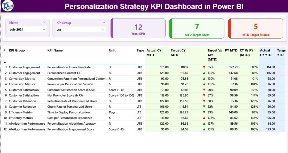
The Personalization Strategy KPI Dashboard in Power BI contains three main pages, each designed for a specific analytical purpose.
1. Summary Page: How Does It Provide a Complete Performance Overview?
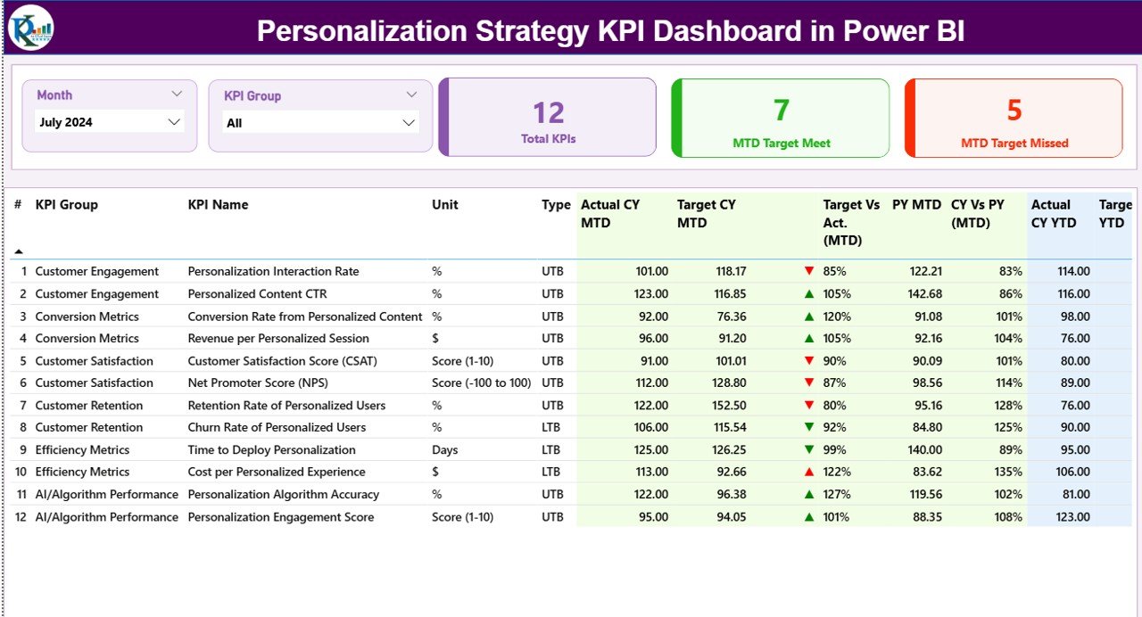
The Summary Page acts as the main landing page of the dashboard. It gives a complete snapshot of personalization performance at a glance.
What Slicers Are Available on the Summary Page?
At the top of the page, you will find:
-
Month Slicer – Allows you to select a specific month
-
KPI Group Slicer – Helps filter KPIs by category or group
Because of these slicers, all visuals update dynamically based on user selection. Therefore, analysis becomes quick and interactive.
What KPI Cards Are Displayed on the Summary Page?
At the top section, the dashboard shows three KPI cards:
-
Total KPIs Count
-
MTD Target Meet Count
-
MTD Target Missed Count
These cards instantly highlight overall performance and help stakeholders understand whether personalization goals are on track.
What Details Are Shown in the Summary Table?
Click to Purchases Personalization Strategy KPI Dashboard in Power BI
Below the KPI cards, a detailed table displays all personalization KPIs with the following fields:
-
KPI Number – Sequential number of the KPI
-
KPI Group – Category or group of the KPI
-
KPI Name – Name of the KPI
-
Unit – Unit of measurement
-
Type – LTB (Lower the Better) or UTB (Upper the Better)
How Are MTD (Month-to-Date) KPIs Tracked?
The Summary table includes detailed MTD performance metrics, such as:
-
Actual CY MTD – Current Year actual MTD value
-
Target CY MTD – Current Year target MTD value
-
MTD Icon –
-
▲ Green arrow for target met
-
▼ Red arrow for target missed
-
-
Target vs Actual (MTD) – Actual / Target percentage
-
PY MTD – Previous Year MTD value
-
CY vs PY (MTD) – Current Year MTD vs Previous Year MTD comparison
Because of these indicators, users can instantly identify strong and weak personalization KPIs.
How Are YTD (Year-to-Date) KPIs Tracked?
Similarly, the dashboard also tracks YTD metrics, including:
-
Actual CY YTD – Current Year actual YTD value
-
Target CY YTD – Current Year target YTD value
-
YTD Icon – Visual indicator of target achievement
-
Target vs Actual (YTD) – Actual / Target percentage
-
PY YTD – Previous Year YTD value
-
CY vs PY (YTD) – Current Year vs Previous Year YTD comparison
Therefore, both short-term and long-term personalization performance becomes visible on one screen.
2. KPI Trend Page: How Can You Analyze Performance Over Time?
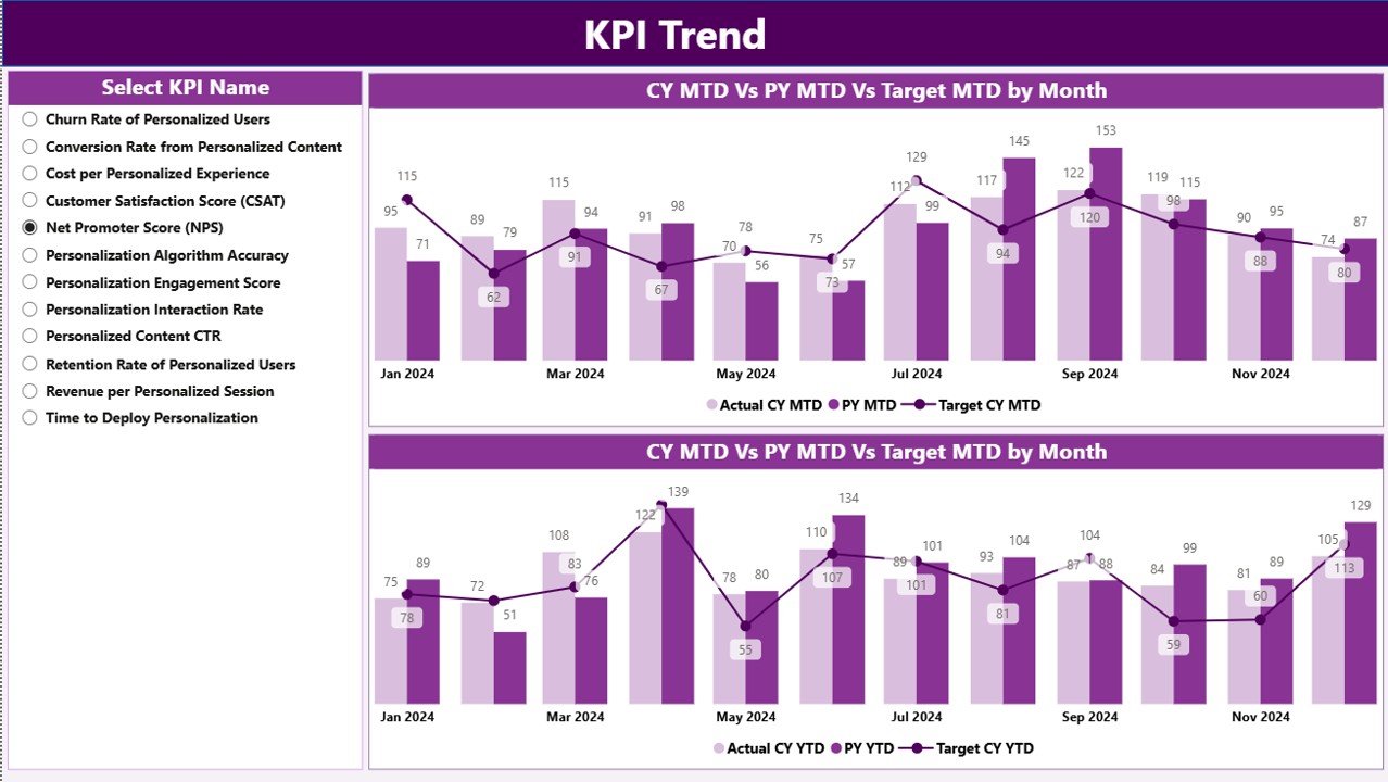
While the Summary page gives an overview, the KPI Trend Page focuses on trend analysis.
What Visuals Are Used on the KPI Trend Page?
This page includes two combo charts, which display:
-
Actual values for Current Year
-
Actual values for Previous Year
-
Target values
These charts help visualize performance trends clearly for both MTD and YTD.
How Can Users Interact with the Trend Page?
On the left side of the page, you will find a KPI Name slicer. Using this slicer, users can:
-
Select a specific KPI
-
Instantly see historical trends
-
Compare performance against targets
-
Analyze seasonality and growth patterns
As a result, teams can identify trends, patterns, and anomalies quickly.
Click to Purchases Personalization Strategy KPI Dashboard in Power BI
3. KPI Definition Page: Why Is It Important?
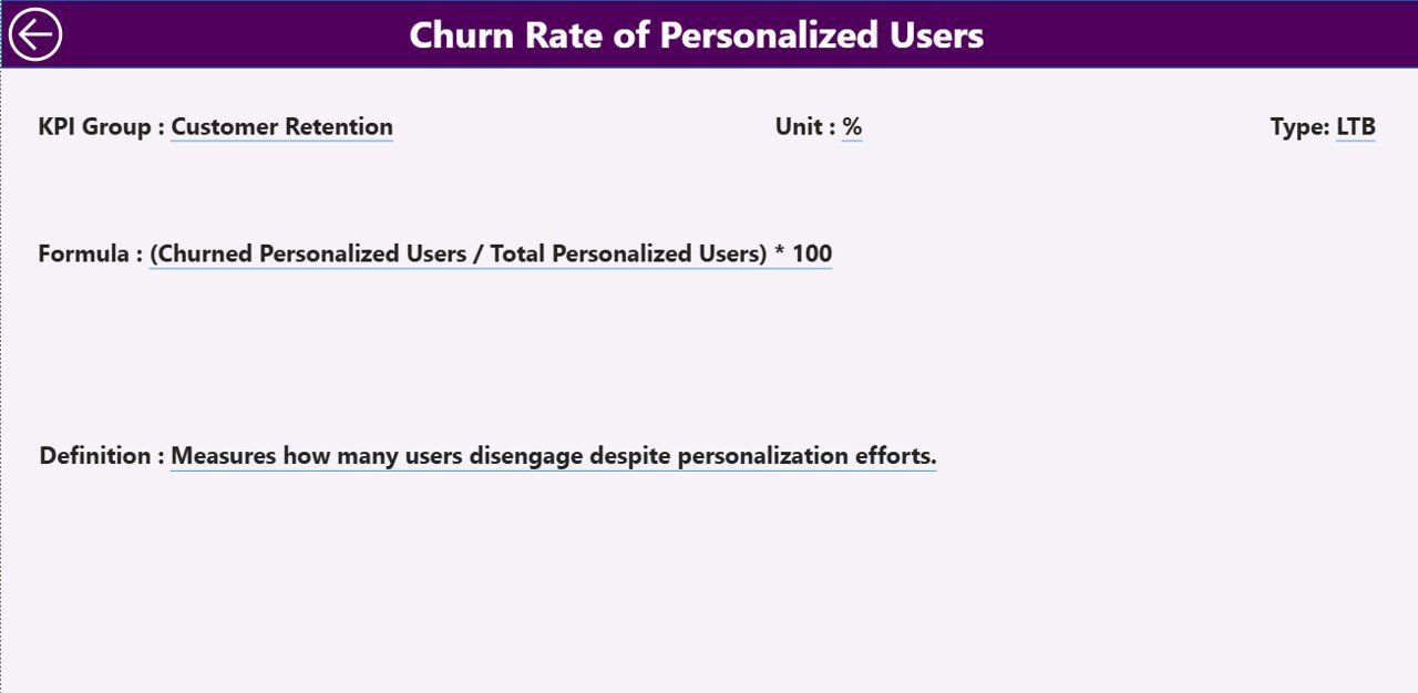
The KPI Definition Page works as a drill-through page and remains hidden by default.
What Information Does the KPI Definition Page Show?
This page displays detailed KPI information, including:
-
KPI Number
-
KPI Group
-
KPI Name
-
Unit
-
Formula
-
Definition
-
KPI Type (LTB or UTB)
Because this page explains how each KPI is calculated, it ensures transparency and consistency across teams.
How Do Users Navigate Back?
To return to the Summary Page, users simply click the Back button available at the top-left corner. Therefore, navigation remains intuitive and user-friendly.
How Does the Excel Data Source Work?
The Personalization Strategy KPI Dashboard in Power BI uses an Excel file as its data source. This approach simplifies data entry and maintenance.
What Are the Excel Sheets Used in the Dashboard?
The Excel file contains three main worksheets:
1. Input_Actual Sheet
In this sheet, users enter:
-
KPI Name
-
Month (first date of the month)
-
MTD Actual values
-
YTD Actual values
This sheet captures real performance data.
2. Input_Target Sheet
In this sheet, users enter:
-
KPI Name
-
Month (first date of the month)
-
MTD Target values
-
YTD Target values
This sheet defines expected performance benchmarks.
3. KPI Definition Sheet
This sheet stores master data such as:
-
KPI Number
-
KPI Group
-
KPI Name
-
Unit
-
Formula
-
Definition
-
KPI Type (LTB or UTB)
Because of this structure, data remains clean, organized, and scalable.
Advantages of Personalization Strategy KPI Dashboard in Power BI
Using a Personalization Strategy KPI Dashboard in Power BI offers several business benefits.
1. Centralized Performance Tracking
All personalization KPIs remain in one place. Therefore, teams avoid confusion caused by multiple reports and spreadsheets.
2. Faster Decision-Making
Since visuals update instantly with slicers, stakeholders can take decisions quickly based on real-time insights.
3. Clear Target vs Actual Visibility
MTD and YTD comparisons clearly show whether personalization goals are being achieved or missed.
4. Improved Accountability
Because each KPI has a definition and formula, teams clearly understand responsibility and performance ownership.
5. Easy Data Management
Since the data source is Excel, non-technical users can update data without external support.
6. Scalable and Flexible
You can easily add new KPIs, groups, or months without redesigning the dashboard.
Best Practices for Personalization Strategy KPI Dashboard in Power BI
To get maximum value from this dashboard, follow these best practices.
1. Define KPIs Clearly
Always use clear definitions and formulas in the KPI Definition sheet. This practice avoids confusion and misinterpretation.
2. Maintain Data Consistency
Ensure that KPI names and units remain consistent across Actual, Target, and Definition sheets.
3. Update Data Regularly
Update MTD and YTD values on a regular schedule. As a result, insights remain accurate and reliable.
4. Focus on Actionable KPIs
Track KPIs that directly influence personalization outcomes, such as engagement rate, conversion rate, or recommendation click-through.
5. Use Trend Analysis Proactively
Do not wait for targets to be missed. Instead, monitor trends early and take corrective action.
6. Train Users on KPI Interpretation
Ensure stakeholders understand KPI types like LTB and UTB. Therefore, decisions remain aligned with business goals.
Conclusion: Why Should You Use a Personalization Strategy KPI Dashboard in Power BI?
A Personalization Strategy KPI Dashboard in Power BI transforms personalization measurement from guesswork into structured analytics. It brings clarity, consistency, and confidence into performance tracking.
Because it combines Excel-based data entry with Power BI visualization, it suits organizations of all sizes. Moreover, it empowers teams to track targets, analyze trends, and continuously improve personalized experiences.
In short, if personalization matters to your business, then measuring it correctly becomes non-negotiable—and this dashboard delivers exactly that.
Frequently Asked Questions (FAQs)
1. What is the main purpose of a Personalization Strategy KPI Dashboard in Power BI?
The main purpose is to track, analyze, and improve personalization performance using structured KPIs, targets, and trends.
2. Can non-technical users maintain this dashboard?
Yes, since the data source is Excel, non-technical users can easily update and maintain data.
3. What types of KPIs can be tracked in this dashboard?
You can track engagement, conversion, recommendation performance, retention, and any other personalization-related KPIs.
4. What does LTB and UTB mean in KPI Type?
LTB means Lower the Better, while UTB means Upper the Better. These types help interpret KPI performance correctly.
5. Can I add more KPIs to the dashboard?
Yes, the dashboard is scalable. You can add more KPIs by updating the Excel sheets.
6. How often should the data be updated?
Ideally, you should update data monthly. However, you can update it more frequently if required.
7. Is this dashboard suitable for all industries?
Yes, any industry that uses personalization strategies can adapt this dashboard with relevant KPIs.
Visit our YouTube channel to learn step-by-step video tutorials