In today’s fast-paced digital publishing world, data is the key to growth. Every article, blog, or eBook contributes to the brand’s reputation, engagement, and revenue — but managing all these metrics manually is time-consuming and error-prone. That’s where a Publishing Dashboard in Excel comes in.
This ready-to-use template allows publishers, editors, and content strategists to visualize performance metrics, track productivity, and make informed business decisions — all within Microsoft Excel. Whether you manage a blog network, online magazine, or internal corporate publication, this dashboard simplifies your workflow by turning raw publishing data into actionable insights.
Click to Purchases Publishing Dashboard in Excel
What Is a Publishing Dashboard in Excel?
A Publishing Dashboard in Excel is a centralized tool that helps track, analyze, and report key performance indicators (KPIs) related to content production and publishing operations. It consolidates information such as article views, publication status, platform performance, author productivity, and category-wise engagement into easy-to-read visuals.
By using Excel’s dynamic features — such as pivot tables, slicers, charts, and formulas — this dashboard eliminates the need for complex BI tools. You can monitor real-time publishing metrics, compare performance trends, and improve decision-making directly in Excel without advanced coding or add-ins.
Structure of the Publishing Dashboard
This dashboard template includes five analytical pages and a support data sheet. Each page is interactive, fully dynamic, and designed for quick insights.
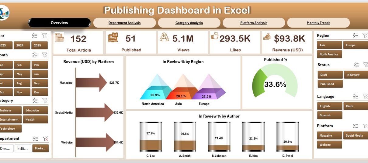
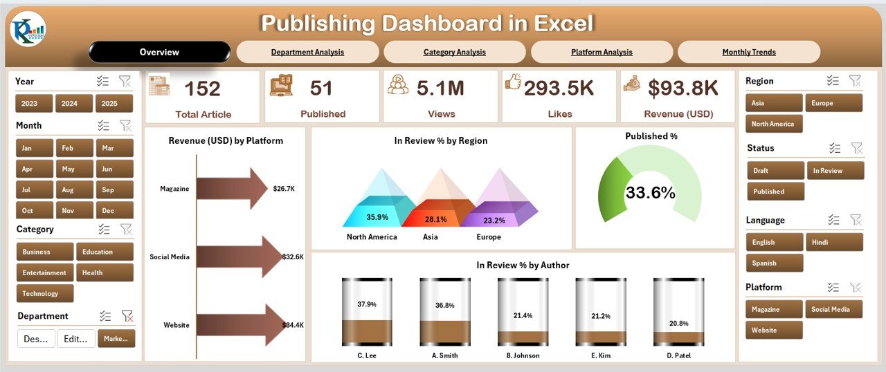
Overview Page
Click to Purchases Publishing Dashboard in Excel
The Overview Page acts as the main interface of the dashboard. On the right-hand side, users can access a slicer panel to filter data by month, region, or platform.
It contains five key metric cards that summarize critical publishing KPIs such as:
-
Total Revenue (USD)
-
Total Views
-
In Review %
-
Published %
-
Average Word Count
Below these summary cards, you’ll find visual charts showing:
-
Revenue (USD) by Platform – to identify top-earning platforms.
-
In Review % by Region – to highlight pending work across geographies.
-
Published % by Author – to evaluate author productivity.
-
Overall Publishing Rate – a clear indicator of monthly output.
The Overview Page gives managers a one-glance understanding of the publishing team’s performance.
Click to Purchases Publishing Dashboard in Excel
Department Analysis Page
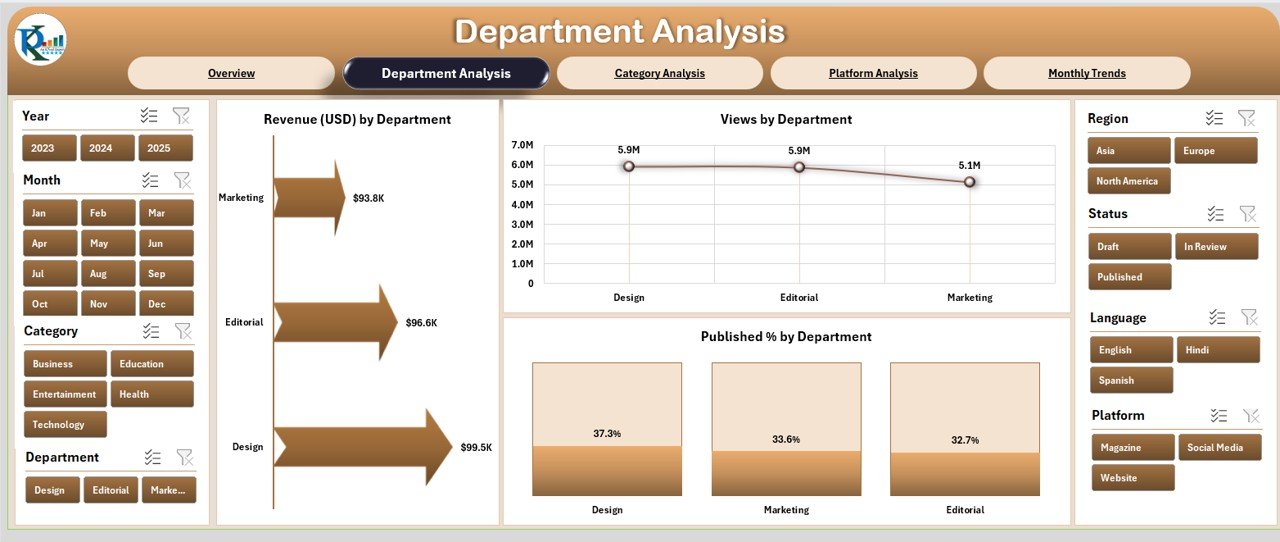
The Department Analysis Page helps track how different departments — such as Editorial, Design, SEO, and Marketing — contribute to the publishing pipeline.
This page features:
-
Revenue (USD) by Department – understanding financial contribution by team.
-
Views by Department – identifying which departments generate higher engagement.
-
Published % by Department – measuring content delivery consistency.
With slicers on the right, users can drill down by time period, content type, or responsible manager. This enables precise accountability and performance tracking across functional teams.
Category Analysis Page
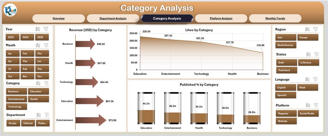
The Category Analysis Page dives into the performance of various content categories such as Technology, Lifestyle, Business, Health, and Education.
It includes:
-
Revenue (USD) by Category – analyzing which content type brings the most revenue.
-
Likes by Category – gauging reader appreciation and interest.
-
Published % by Category – measuring category-wise publishing consistency.
This page helps editors and strategists focus on the most successful content areas while identifying underperforming topics that need improvement.
Platform Analysis Page
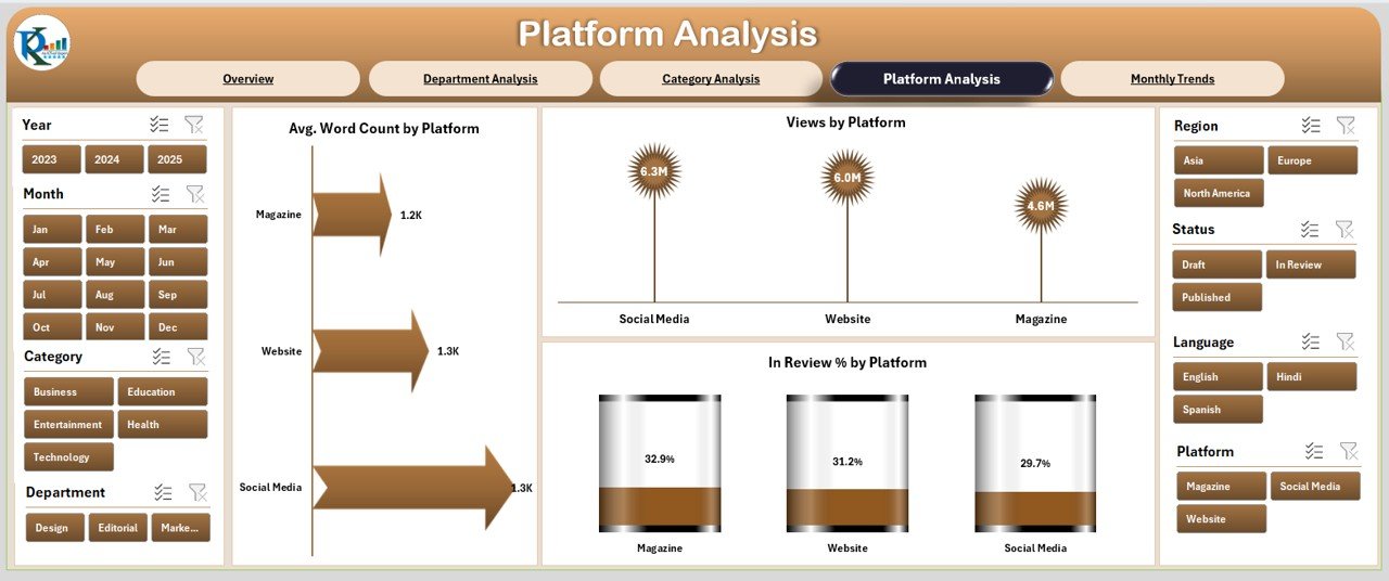
The Platform Analysis Page gives an in-depth look at how each publishing platform (e.g., Website, Medium, LinkedIn, WordPress, Substack, etc.) performs.
It displays:
-
Average Word Count by Platform – comparing content depth across platforms.
-
Views by Platform – showing audience engagement distribution.
-
In Review % by Platform – highlighting pending reviews or unpublished drafts.
This section is particularly helpful for multi-channel publishers who distribute content across different digital platforms and want to allocate resources effectively.
Monthly Trends Page
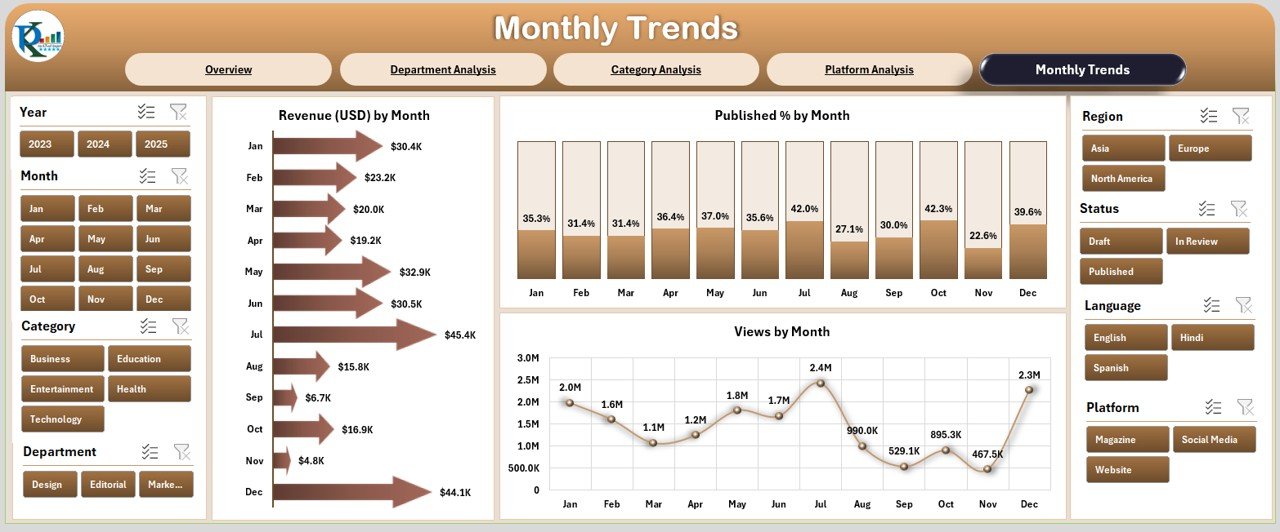
The Monthly Trends Page visualizes how performance evolves over time.
Charts include:
-
Revenue (USD) by Month – tracking income patterns throughout the year.
-
Published % by Month – monitoring output consistency.
-
Views by Month – evaluating reader engagement seasonally.
With this page, users can quickly identify high-performance months, seasonal variations, and the impact of specific campaigns or events.
Support Sheet (Data Sheet)
The Support Sheet acts as the data backbone of the dashboard.
It includes all raw records — such as publication date, author name, department, platform, category, revenue, word count, and view count.
Each chart and KPI on the main pages automatically updates when new data is entered here, making the dashboard dynamic and easy to maintain.
Why Use a Publishing Dashboard in Excel?
A Publishing Dashboard centralizes all publishing metrics in one location, allowing users to make informed and timely decisions.
Key Reasons to Use This Dashboard:
✅ Instant Visibility: Access performance summaries without switching tools.
✅ Simplified Reporting: Eliminate manual tracking through automated visuals.
✅ Cost-Effective Solution: No need for expensive BI software — Excel handles it.
✅ Improved Decision-Making: Analyze content impact in real time.
✅ Data Consistency: Reduce human errors and duplication in performance reporting.
Advantages of Publishing Dashboard in Excel
Here are the major advantages of using this dashboard:
1. Real-Time Tracking
Excel dashboards update automatically with new data, allowing you to monitor live publishing progress and performance metrics.
2. Better Visualization
Through dynamic charts and conditional formatting, complex data becomes easy to interpret, even for non-technical users.
3. Centralized Data Source
All content metrics — from authorship to revenue — are available in one place, promoting transparency and accuracy.
4. Efficient Decision-Making
Visual insights help managers make quick decisions on resource allocation, editorial focus, and platform strategy.
5. Enhanced Collaboration
Different departments can contribute data simultaneously, creating an integrated reporting ecosystem.
6. Historical Trend Analysis
You can compare current data with previous months or years to assess growth patterns and strategic success.
How to Create a Publishing Dashboard in Excel
Creating a dashboard like this involves several structured steps:
Step 1: Collect the Data
Gather all relevant data — article titles, publication dates, authors, categories, platforms, and performance metrics (views, likes, revenue, etc.).
Step 2: Clean and Format
Remove duplicates, fix missing entries, and standardize data types (e.g., dates, text, numbers).
Step 3: Insert Pivot Tables
Create pivot tables for key KPIs such as revenue by category or views by department. These will form the foundation of your charts.
Step 4: Add Slicers
Use slicers for filters like Month, Platform, and Category. This enables easy interactivity and segmentation.
Step 5: Build Visuals
Insert charts such as bar, line, or doughnut charts to visualize your data. Link them to pivot tables for dynamic updates.
Step 6: Design Dashboard Layout
Combine visuals and cards logically. Group KPIs together and use color coding for easy interpretation (green for growth, red for decline).
Step 7: Automate Updates
Link all charts to your Data Sheet so the dashboard refreshes automatically when you add new records.
Best Practices for the Publishing Dashboard in Excel
Here are some tried-and-tested tips to enhance dashboard usability and performance:
1. Keep It Simple
Avoid clutter. Display only essential metrics on each page and use tooltips or drill-downs for deeper insights.
2. Use Consistent Color Schemes
Assign fixed colors to categories, platforms, or departments for easier identification across charts.
3. Update Data Regularly
Maintain your Data Sheet daily or weekly to ensure accurate real-time analysis.
4. Add Conditional Formatting
Highlight underperforming areas using icons or color scales — for example, flag In Review % above 30%.
5. Protect Dashboard Formulas
Lock formulas and pivot structures to prevent accidental modifications by users.
6. Include Clear Legends
Add legends or data labels on charts so users can instantly understand what each visual represents.
7. Create an Interactive Interface
Use buttons or hyperlinks for smooth navigation between pages (Overview → Department → Category → Platform → Monthly Trends).
8. Optimize File Size
Use Excel’s “Remove Duplicates” and “Data Model” features to keep the workbook lightweight and fast.
Use Cases of a Publishing Dashboard
Click to Purchases Publishing Dashboard in Excel
This dashboard suits a wide variety of organizations, including:
📰 Digital Publishers: Track article performance, reader engagement, and monetization.
🏢 Corporate Communications Teams: Manage newsletters and internal content campaigns.
✍️ Freelance Content Agencies: Evaluate author productivity and client deliverables.
🎓 Educational Publishers: Monitor category-wise performance of academic content.
📈 Marketing Departments: Measure campaign impact via content engagement and reach.
How a Publishing Dashboard Supports Decision-Making
An Excel-based publishing dashboard empowers leaders to:
-
Identify top-performing authors and categories.
-
Reallocate resources to high-yield platforms.
-
Monitor editorial efficiency using In Review % metrics.
-
Forecast monthly revenue based on trend analysis.
-
Improve content scheduling for maximum reader engagement.
In essence, it transforms manual reports into an automated, insight-driven decision tool.
Tips for Optimizing Publishing Data
To make the most of your dashboard:
-
Keep consistent naming conventions for categories and authors.
-
Track both financial (revenue) and non-financial (engagement) KPIs.
-
Integrate Excel data with Google Analytics for deeper insights.
-
Use Excel’s “Timeline Slicer” to track content life cycles.
-
Regularly back up your dashboard file to prevent data loss.
Common Mistakes to Avoid
❌ Overloading dashboards with unnecessary charts.
❌ Using inconsistent data sources or formats.
❌ Ignoring data validation rules.
❌ Forgetting to refresh pivot tables before analysis.
❌ Not defining clear KPI ownership (who updates what).
Conclusion
A Publishing Dashboard in Excel is more than just a reporting tool — it’s a digital assistant for your content team. It consolidates financial, operational, and engagement data into a single, visual interface, empowering faster decisions and higher efficiency.
From monthly revenue tracking to department performance analysis, this dashboard provides everything you need to manage a successful publishing operation. Whether you’re an editor, content strategist, or publisher, Excel gives you the flexibility, accessibility, and power to analyze data your way — without needing specialized software.
Frequently Asked Questions (FAQs)
1. What is the main purpose of a Publishing Dashboard in Excel?
It helps users track and analyze key metrics such as revenue, publishing rates, and author productivity using visual Excel reports.
2. Can beginners use this dashboard easily?
Yes. The dashboard is user-friendly, featuring dropdown filters, slicers, and prebuilt visuals for quick understanding.
3. How often should I update the data?
Ideally, you should refresh or add data weekly or monthly depending on your publishing volume.
4. What KPIs are most important to include?
The most vital KPIs are revenue, published %, in review %, views, and likes — as they directly measure performance and engagement.
5. Can this dashboard be customized?
Absolutely. You can modify chart types, color themes, KPIs, and slicer filters to suit your organization’s needs.
6. Does it work on all Excel versions?
Yes. It’s compatible with Excel 2016, 2019, and Microsoft 365 on both Windows and macOS.
7. Can multiple users work on it simultaneously?
Yes. By saving the file on OneDrive or SharePoint, multiple users can collaborate in real time.
8. Is it possible to add new pages or charts?
Definitely. You can add new pivot charts or duplicate existing pages to expand functionality without breaking the structure.
9. How can I make the dashboard visually appealing?
Use Excel’s design options like gradient fills, icons, and custom color palettes that match your brand style.
Visit our YouTube channel to learn step-by-step video tutorials