Rainfall patterns influence everything from agriculture and water management to city planning and disaster response. Accurate rainfall monitoring helps organizations make informed decisions, plan resources, and understand seasonal trends.
To simplify this process, the Rainfall Report Management Dashboard in Excel offers a powerful, easy-to-use, and fully automated solution for rainfall data analysis. Whether you are a meteorological department, a researcher, or an environmental consultant, this dashboard enables you to visualize rainfall performance, analyze seasonal variations, and generate detailed insights — all within Microsoft Excel.
Click to Purchases Rainfall Report Management Dashboard in Excel
This ready-to-use dashboard is designed to help you record, track, and analyze rainfall data with ease. Using dynamic charts, pivot tables, slicers, and conditional formatting, it transforms raw rainfall data into visually engaging insights that can support better decision-making and reporting.
What Is a Rainfall Report Management Dashboard in Excel?
A Rainfall Report Management Dashboard in Excel is an analytical template that captures and displays rainfall-related metrics in one centralized file.
It enables users to record daily or monthly rainfall data, analyze key parameters like total rainfall, number of rainy days, maximum and minimum temperatures, and view variations by region, season, and month.
This dashboard uses Excel’s advanced functionalities — such as pivot charts, data slicers, and conditional formatting — to create an interactive and visually appealing reporting environment.
Structure of the Rainfall Report Management Dashboard
The dashboard consists of five analytical pages and a support data sheet.
Each page provides a different perspective on rainfall performance, allowing users to drill down into specific dimensions like state, season, or data source.
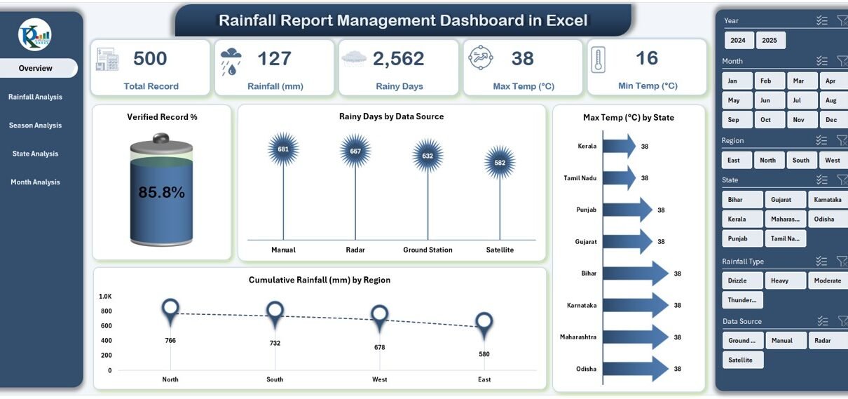
1️⃣ Overview Page
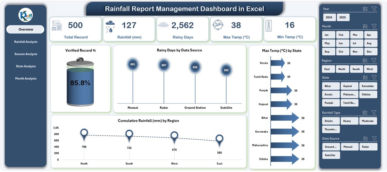
The Overview Page is the main control center of the dashboard.
On the right side, a silencer (slicer panel) helps filter the data by parameters such as state, season, or month.
The page includes:
-
Five KPI Cards showing key rainfall metrics like Total Rainfall, Max Temperature, Min Temperature, Total Rain Days, and Verified Record %.
Four Dynamic Charts:
- Verified Record %
- Rain Days by Data Source
- Max Temperature (°C) by State
- Cumulative Rainfall (mm) by Region
This page provides a bird’s-eye view of overall rainfall performance and data quality.
2️⃣ Rainfall Analysis Page
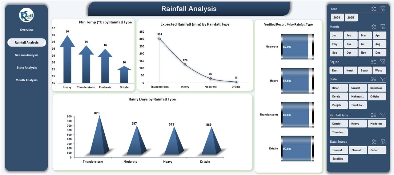
This page allows users to analyze rainfall trends based on different rainfall types — such as light rain, moderate rain, heavy rain, and storm rainfall.
Charts Included:
-
Min Temperature (°C) by Rainfall Type
-
Expected Rainfall (mm) by Rainfall Type
-
Verified Record % by Rainfall Type
-
Rain Days by Rainfall Type
By analyzing these parameters, users can identify how rainfall intensity affects temperature variations and data verification accuracy.
3️⃣ Season Analysis Page
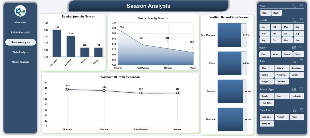
Seasonal variations play a major role in rainfall management.
This page provides a season-wise breakdown of key performance indicators.
Charts Included:
-
Rainfall (mm) by Season
-
Rain Days by Season
-
Verified Record % by Season
-
Average Rainfall (mm) by Season
These visuals help users monitor how rainfall fluctuates across summer, monsoon, winter, and post-monsoon periods.
4️⃣ State Analysis Page
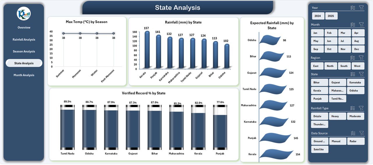
The State Analysis page is ideal for comparing rainfall performance geographically.
It allows meteorologists or administrators to evaluate differences in rainfall behavior across states.
Click to Purchases Rainfall Report Management Dashboard in Excel
Charts Included:
-
Max Temperature (°C) by State
-
Rainfall (mm) by State
-
Expected Rainfall (mm) by State
-
Verified Record % by State
This page is perfect for identifying regions that are prone to droughts or excessive rainfall and helps forecast future patterns effectively.
5️⃣ Month Analysis Page
The Month Analysis page provides time-series insights, helping users identify monthly rainfall trends and patterns.
Charts Included:
-
Total Records by Month
-
Cumulative Rainfall (mm) by Month
-
Rain Days by Month
Users can easily filter and compare monthly results to determine seasonal performance and detect unusual rainfall months.
Support Sheet – Data Sheet
The Data Sheet acts as the backbone of the dashboard.
It contains raw rainfall data with all relevant fields such as:
-
Date
-
Region
-
State
-
Season
-
Rainfall Type
-
Actual Rainfall (mm)
-
Expected Rainfall (mm)
-
Verified Record (Yes/No)
-
Min Temp (°C)
-
Max Temp (°C)
All pivot tables and charts pull their values dynamically from this sheet. By updating the dataset, all visuals in the dashboard automatically refresh, making it truly dynamic and scalable.
Key Features of the Rainfall Report Management Dashboard in Excel
✅ Interactive Page Navigator: Located on the left side for quick and seamless movement between pages.
✅ Dynamic Filters (Slicers): Filter results by region, season, or rainfall type with one click.
✅ Automated KPI Cards: Instantly show metrics like Verified Record %, Total Rainfall, or Average Temperature.
✅ Multi-Page Visualization: Analyze rainfall from multiple perspectives — Overview, Rainfall Type, Season, State, and Month.
✅ Data Consistency: All charts are connected to a single source of truth, ensuring accurate and synchronized updates.
✅ Conditional Formatting: Highlights key insights visually, such as performance above or below target.
✅ User-Friendly Design: Built entirely in Excel with no need for add-ins or macros — anyone can use it easily.
Why Use a Rainfall Management Dashboard in Excel?
Managing rainfall data manually can be time-consuming, inconsistent, and prone to errors. Using an Excel-based dashboard simplifies the entire process through automation, visualization, and data centralization.
1. Simplifies Rainfall Monitoring
All rainfall data gets captured and analyzed in one place, reducing manual effort and improving data accuracy.
2. Enables Quick Decision-Making
Visual summaries help users make data-driven decisions regarding water management, irrigation, and infrastructure planning.
3. Provides Seasonal Insights
The seasonal analysis feature highlights how different weather patterns affect rainfall behavior.
4. Enhances Data Transparency
Verified Record % ensures that data sources and records are validated, improving the reliability of reporting.
5. Boosts Collaboration
Teams can share the Excel dashboard easily, ensuring consistent information across departments.
How to Use the Rainfall Report Management Dashboard
Using the dashboard is simple and intuitive:
-
Open the Excel file and navigate through the pages using the page navigator.
-
Upload or paste rainfall data into the Data Sheet.
-
Refresh the pivot tables (Data → Refresh All) to update all visuals.
-
Use slicers on each page to filter results by parameters like State, Month, or Rainfall Type.
-
Analyze charts to understand rainfall trends, data verification accuracy, and temperature relationships.
This simplicity makes it a perfect fit for beginners, analysts, and weather data professionals alike.
Advantages of Using Rainfall Report Management Dashboard in Excel
✅ 1. Real-Time Rainfall Insights
Click to Purchases Rainfall Report Management Dashboard in Excel
All KPIs and charts update instantly when new data is entered, ensuring real-time visibility.
✅ 2. Accurate Data Validation
The Verified Record % metric ensures that only validated records are included in the analysis.
✅ 3. Easy Customization
Users can add or remove KPIs, charts, or filters to suit their requirements without any coding.
✅ 4. Comprehensive Analysis
Covers all analytical dimensions — type, state, season, and month — for 360-degree rainfall evaluation.
✅ 5. Budget-Friendly Solution
No external software or subscription is required. The dashboard runs entirely on Microsoft Excel.
✅ 6. Scalability
Can handle thousands of records and multiple years of rainfall data with minimal performance lag.
✅ 7. Enhanced Presentation
Clean visuals and interactive charts make rainfall reporting attractive and professional.
🧩 Analysis Possibilities from This Dashboard
With this Excel dashboard, you can perform multiple types of analyses:
-
Trend Analysis: Identify rainfall increases or decreases over time.
-
Regional Comparison: Evaluate which state or region receives maximum rainfall.
-
Seasonal Behavior: Understand how rainfall shifts between monsoon and dry seasons.
-
Data Quality Check: Track how many records are verified vs. unverified.
-
Temperature Correlation: Observe how temperature influences rainfall levels.
-
Monthly Summary: Compare cumulative rainfall and rainy days across months.
Best Practices for the Rainfall Report Management Dashboard
Follow these best practices to make the most of your rainfall dashboard:
✅ 1. Keep Data Consistent
Ensure that all entries follow the same units (e.g., millimeters for rainfall, °C for temperature).
✅ 2. Update Data Regularly
Refresh your data weekly or monthly to keep reports up-to-date and relevant.
✅ 3. Use Filters Wisely
Apply slicers only when necessary to maintain focus on specific insights.
✅ 4. Validate Data Sources
Verify records before analysis to maintain data integrity and reliability.
✅ 5. Automate Calculations
Use Excel formulas or Power Query to automate rainfall and temperature metrics.
✅ 6. Visualize Clearly
Avoid over-crowded charts — keep them simple and easy to interpret.
✅ 7. Document Changes
Maintain a log of updates and formula changes for future reference.
Opportunities for Improvement
Even though the dashboard is comprehensive, users can enhance it further:
-
Add Forecasting Models: Incorporate Excel’s forecasting functions to predict future rainfall.
-
Integrate with APIs: Connect real-time rainfall data sources for live updates.
-
Include Geographic Maps: Use Excel’s 3D Maps for spatial rainfall visualization.
-
Add Alerts: Set up conditional alerts for extreme rainfall conditions.
-
Automate Data Entry: Use macros or Power Automate to import data from sensors automatically.
🏁 Conclusion
The Rainfall Report Management Dashboard in Excel is more than just a reporting tool — it’s a comprehensive weather intelligence solution. It allows users to collect, validate, and visualize rainfall data effortlessly.
By combining Excel’s analytical capabilities with interactive design, it transforms raw rainfall information into meaningful insights for better planning, forecasting, and resource management.
From identifying seasonal patterns to ensuring data accuracy, this dashboard empowers users to make smarter environmental and operational decisions — efficiently, accurately, and visually.
❓ Frequently Asked Questions (FAQs)
1. What is the purpose of a Rainfall Report Management Dashboard in Excel?
It helps users record, analyze, and visualize rainfall data efficiently. The dashboard turns complex data into easy-to-read charts and KPIs for better understanding and decision-making.
2. Can beginners use this dashboard?
Yes. The dashboard is designed for users of all skill levels — no coding or Excel expertise is required.
3. How can I update the data?
Simply enter new records in the Data Sheet and click Refresh All. All charts and KPIs will update automatically.
4. Can I customize the charts?
Absolutely. You can modify chart types, colors, and filters to suit your reporting needs.
5. Does it support multiple regions or years?
Yes. You can record rainfall data for multiple states, regions, or years and use slicers to filter by your desired range.
6. Can I add additional metrics or KPIs?
Yes. You can easily insert new KPIs in the Data Sheet and create pivot charts based on them.
7. Is Excel the only software needed?
Yes. The entire dashboard runs within Microsoft Excel — no add-ons or external tools are required.
8. How often should I update the dashboard?
Ideally, update it weekly or monthly based on the data frequency. Regular updates ensure timely and accurate insights.
9. Can this dashboard be used for academic or research purposes?
Definitely. Researchers and students can use it to analyze rainfall patterns, study seasonal changes, or support environmental projects.
10. Where can I get this ready-to-use dashboard?
You can download it from NextGenTemplates.com, which offers professionally designed Excel dashboards for various industries and analytical needs.
Visit our YouTube channel to learn step-by-step video tutorials