Rural Development Dashboard in Excel is a ready-to-use reporting template built for teams that manage village development programs, public-sector schemes, NGO projects, grant-funded initiatives, infrastructure work, and service quality monitoring. The workbook brings 5 high-level KPI cards, 20 chart views, 7 worksheet tabs, slicer-based filtering, a structured data sheet, and refreshable pivot support into one Excel file.
Rural development reporting usually combines beneficiaries, households, budgets, jobs, infrastructure units, funding sources, grievances, satisfaction scores, states, districts, and implementing agencies. When this information is spread across separate spreadsheets, monthly reviews become slow and inconsistent. This dashboard gives you a repeatable format: update the data sheet, click Refresh All from the Excel Data tab, and review the updated dashboard pages.
Rural Development Dashboard in Excel
Key Features of Rural Development Dashboard in Excel
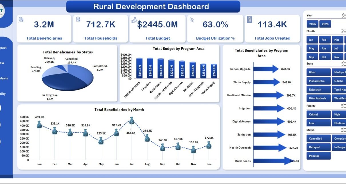
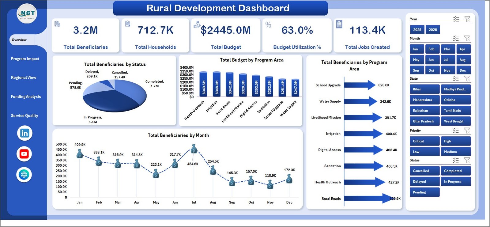
The workbook is designed around practical rural development reporting. The top-level Overview page includes KPI cards for Total Beneficiaries, Total Households, Total Budget, Budget Utilization %, and Total Jobs Created. These cards help decision-makers quickly understand program scale, funding movement, and employment outcomes.
Across the dashboard pages, you get charts for beneficiary status, program areas, monthly trends, priorities, infrastructure units, state-level budgets, district reach, funding sources, implementing agencies, grievances, spend by month, satisfaction, and resolution rate. The workbook also includes slicers so users can apply filters and review the dashboard quickly without rebuilding charts.
Because the template is built in Excel, it is easy to adapt for government departments, rural development offices, NGOs, CSR teams, nonprofit program managers, and monitoring and evaluation teams. You can use it for monthly reviews, donor reporting, district comparison, agency performance checks, budget utilization tracking, and service quality meetings.
Dashboard Pages Explanation
Overview Page
The Overview Page shows the high-level status of the rural development program. At the top, KPI cards summarize Total Beneficiaries, Total Households, Total Budget, Budget Utilization %, and Total Jobs Created.
Total Beneficiaries by Status shows how beneficiaries are distributed across status categories. This helps identify whether people are enrolled, active, completed, pending, or delayed based on your dataset.
Total Budget by Program Area compares funding allocation across rural development areas. This chart helps leaders see which program areas receive the largest share of budget.
Total Beneficiaries by Program Area shows beneficiary reach by initiative. It is useful for comparing which program areas are serving the most people.
Total Beneficiaries by Month shows the monthly movement of beneficiary coverage. Use it to spot seasonal patterns, growth, reporting delays, or sudden changes in program reach.
Overview Page
Program Impact
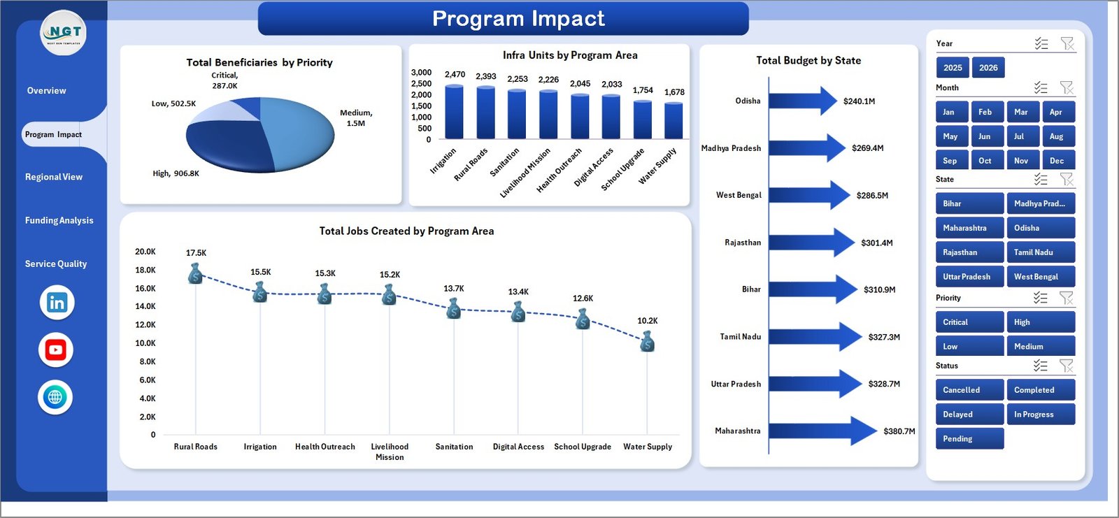
The Program Impact page focuses on outcome and delivery indicators. It is useful for understanding which programs are creating visible benefits and where attention may be needed.
Total Beneficiaries by Priority compares beneficiaries across priority levels. This helps confirm whether high-priority groups are receiving enough program coverage.
Infra Units by Program Area tracks infrastructure units across program categories. It helps compare physical delivery progress between development initiatives.
Total Budget by State shows how budget is distributed across states. This chart is helpful for state-level allocation review and funding comparison.
Total Jobs Created by Program Area shows employment outcomes by initiative. It helps identify the development programs generating the highest livelihood impact.
Program Impact
Regional View
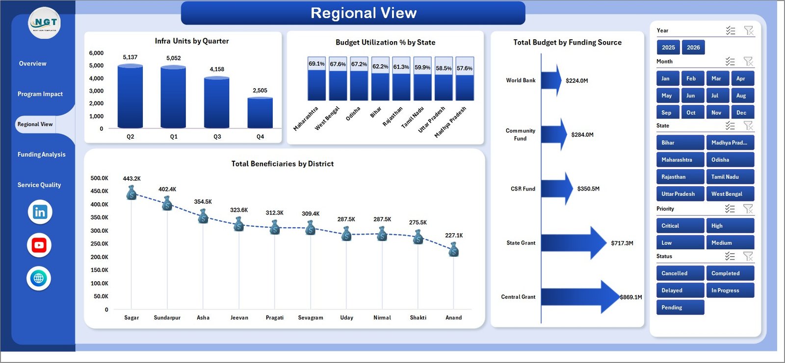
The Regional View page helps compare rural development performance by geography and funding structure. It is useful for district, state, and quarterly monitoring.
Infra Units by Quarter shows infrastructure delivery over time. Use it to review quarterly progress and detect delays in physical implementation.
Budget Utilization % by State compares how effectively each state is using its allocated budget. This makes it easier to find states with slow or strong execution.
Total Budget by Funding Source compares funding from different sources such as government, donor, CSR, or internal allocations. It helps finance and program teams understand dependency by source.
Total Beneficiaries by District shows district-level reach. This chart helps identify districts with strong coverage and districts that may need more program support.
Regional View
Funding Analysis
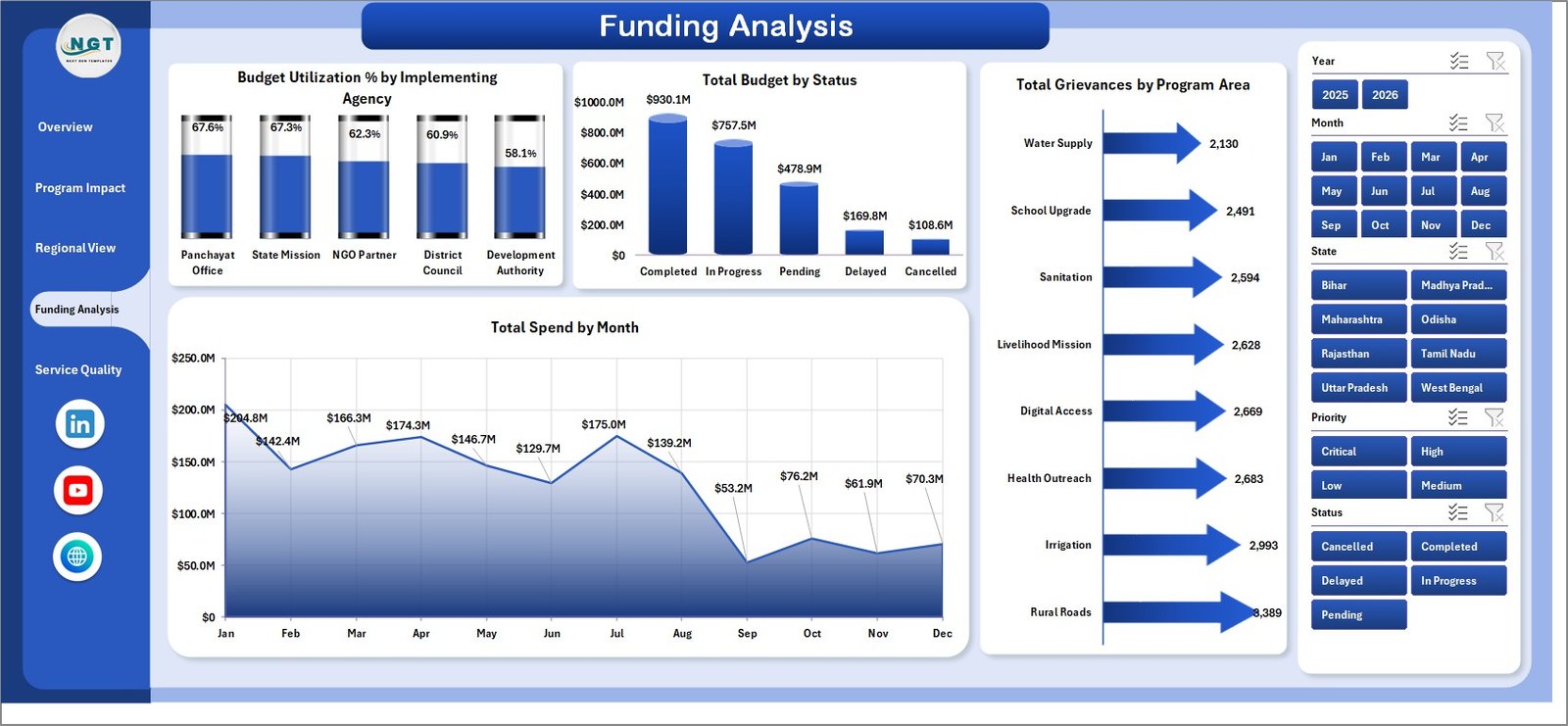
The Funding Analysis page connects financial utilization with execution status and grievance reporting. It helps leadership review whether funding is moving in line with program delivery.
Budget Utilization % by Implementing Agency compares how different agencies are using assigned funds. It helps identify agencies with strong utilization and agencies that may need follow-up.
Total Budget by Status shows budget distribution by status category. This is useful for separating completed, active, delayed, pending, or approved funds.
Total Grievances by Program Area shows which rural development programs receive the most complaints or issues. This helps connect funding and delivery with citizen or beneficiary experience.
Total Spend by Month tracks spending movement over time. Use it to review monthly budget burn and identify unusual spikes or slow spending periods.
Funding Analysis
Service Quality
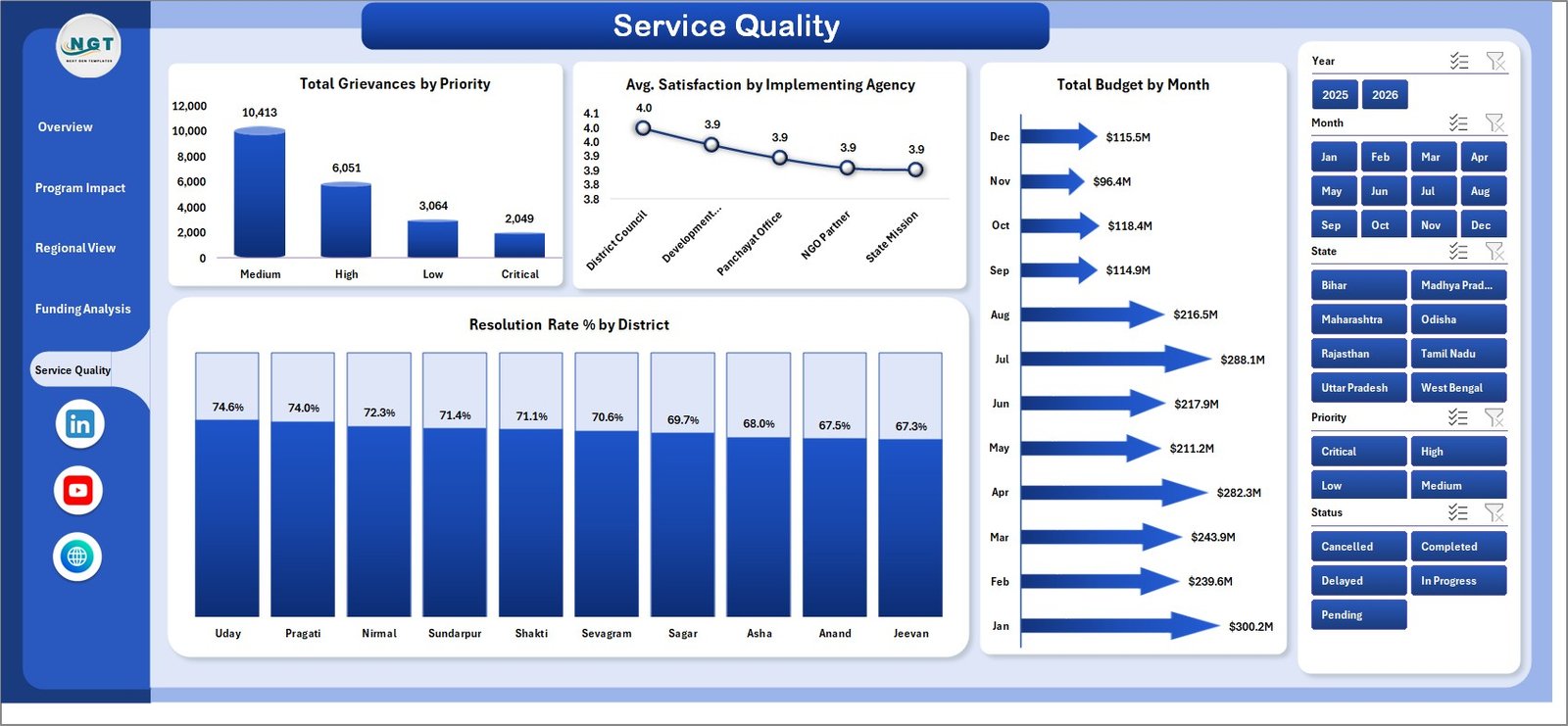
The Service Quality page focuses on grievances, satisfaction, budget trend, and resolution performance. It is useful for tracking whether development services are not only delivered, but also accepted and resolved well.
Total Grievances by Priority shows the urgency level of reported issues. This helps teams decide which service problems should be handled first.
Avg. Satisfaction by Implementing Agency compares beneficiary satisfaction by agency. It helps identify partners or agencies delivering better field experience.
Total Budget by Month shows how budget allocation or budget values move month by month. This gives finance and program teams a simple time-based funding view.
Resolution Rate % by District compares grievance resolution performance across districts. This helps managers identify districts that are closing issues effectively and districts that need process improvement.
Service Quality
Data Sheet Tab
The Data Sheet tab is where you add your records in the same structure used by the template. After replacing the sample data, the dashboard can be refreshed so cards, charts, slicers, and pivots reflect the updated information.

Data Sheet tab
Support Sheet
The Support Sheet contains the pivot tables used to build the dashboard dynamically. After updating the Data Sheet tab, go to the Excel Ribbon, open the Data tab, and click Refresh All. The pivot tables and charts will refresh automatically. You can keep this sheet hidden after setup.

Support sheet tab
Rural Development Dashboard in Excel vs. Google Sheets vs. Paid SaaS – Feature Comparison
| Feature | Rural Development Dashboard in Excel | Google Sheets Alternative | Paid SaaS Alternative |
|---|---|---|---|
| Cost | One-time template purchase | Free or template-based, but often manual | Monthly or annual subscription |
| Platform | Microsoft Excel | Google Sheets | Cloud web platform |
| Setup time | Replace data and refresh | Build formulas, pivots, charts, and filters | Requires onboarding and configuration |
| Real-time team collaboration | Available through OneDrive or SharePoint | Native browser collaboration | Usually available |
| Mobile access | Excel mobile app with limitations | Google Sheets mobile app | Usually available |
| Customizable fields | Editable data sheet and dashboard elements | Editable but easy to break | Often limited by plan or admin settings |
| Share with link | Available through Microsoft 365 sharing | Native link sharing | Depends on user permissions |
| Year-1 cost at 5 users | Template cost only | Low software cost, higher build time | Can become expensive with per-user pricing |
| Rural development analysis | Built for beneficiaries, budgets, jobs, grievances, districts, and agencies | Must be built manually | May require custom dashboards |
| Offline use | Strong fit for Excel-based local reporting | Limited without internet | Usually internet dependent |
Who Should Use This Template
This template is useful for rural development officers, district administrators, nonprofit managers, CSR program teams, grant managers, public-sector analysts, monitoring and evaluation officers, and consultants who prepare recurring Excel reports. It is especially helpful when your stakeholders want quick answers about beneficiaries, households, budget use, jobs created, infrastructure delivery, regional performance, funding sources, grievances, satisfaction, and resolution rate.
It is also a good fit when you already receive data in Excel or CSV format. You can paste the latest records into the data sheet, refresh the workbook, and use the dashboard pages for review meetings. Microsoft provides guidance for refreshing PivotTable data in Excel, which is useful if you are new to pivot-backed dashboards: Microsoft Support: Refresh PivotTable data.
Real-World Use Cases
District development review: A district officer can update the monthly data and review beneficiary reach, budget utilization, jobs created, infrastructure units, and district performance before a leadership meeting.
NGO donor reporting: A nonprofit program manager can use the Program Impact and Funding Analysis pages to prepare a concise donor update showing reach, priorities, funding sources, spend, and grievances.
CSR rural program monitoring: A CSR team can compare implementing agencies, program areas, satisfaction scores, resolution rates, and regional outcomes across funded initiatives.
Advantages of Rural Development Dashboard in Excel
The biggest advantage is speed. Once your data follows the template structure, you can refresh the workbook and review updated results without rebuilding charts every month. This is especially useful for small teams that do not have a dedicated business intelligence platform.
The second advantage is familiarity. Most public-sector, NGO, and operations teams already use Excel. That means users can update records, check pivots, modify labels, adjust charts, and export dashboard pages without learning a new system.
The third advantage is focused reporting. The workbook is not a generic sales or finance dashboard. It is structured around rural development indicators such as beneficiaries, households, jobs, budgets, funding source, infrastructure units, grievances, satisfaction, districts, states, agencies, and service resolution.
Opportunities for Improvement
This is an Excel dashboard, so it does not replace a full MIS, mobile data collection app, or workflow management system. If your organization needs live API integration, automated field submissions, approval flows, role-based access, or real-time web reporting, a custom app or paid SaaS platform may be more suitable.
It is also important to keep the data sheet format consistent. If columns are renamed, deleted, or moved without updating the pivots and charts, the dashboard may not refresh correctly. Keep a backup copy before making structural changes.
Best Practices
Keep one clean version of the workbook as your master template. Each reporting period, make a copy, update the Data Sheet tab, and click Refresh All from the Excel Ribbon. This keeps previous months preserved and makes it easier to audit changes.
Use consistent naming for states, districts, program areas, funding sources, agencies, and status values. Even small spelling differences can split results into separate chart categories. Before refreshing, scan the data sheet for blanks, duplicate labels, and inconsistent entries.
Hide the Support Sheet after review so everyday users focus on the dashboard pages and data entry. Keep it accessible for advanced users who need to inspect or update pivot tables.
Explore Relevant Templates
You can explore the product here: Rural Development Dashboard in Excel.
Related templates include Rural Development KPI Dashboard in Power BI, Community Services Dashboard in Excel, and Nonprofit Fundraising Dashboard in Excel.
Frequently Asked Questions
What is included in the Rural Development Dashboard in Excel?
The workbook includes Overview, Program Impact, Regional View, Funding Analysis, Service Quality, Data Sheet, and Support Sheet tabs. It includes KPI cards, slicers, charts, a data input sheet, and pivot support.
What KPI cards are shown on the Overview page?
The Overview page shows Total Beneficiaries, Total Households, Total Budget, Budget Utilization %, and Total Jobs Created.
How do I update the dashboard?
Update the Data Sheet tab using the same column format, then go to the Excel Ribbon, open the Data tab, and click Refresh All. The pivot tables and charts will refresh.
Can I hide the Support Sheet?
Yes. The Support Sheet contains pivot tables used to power the dashboard. You can keep it hidden after setup to make the workbook cleaner for end users.
Is this dashboard suitable for NGOs?
Yes. NGOs can use it to track beneficiaries, priorities, funding sources, grievances, satisfaction, implementing agencies, districts, and program areas.
Does this dashboard work for government reporting?
Yes. It is suitable for government and public-sector teams that need Excel-based rural development reporting across states, districts, budgets, agencies, and service indicators.
Can I customize the charts?
Yes. You can customize charts, labels, colors, slicers, and layouts in Excel. Keep a backup before making major structure changes.
About the Author
Built by PK – Microsoft Certified Professional with 15+ years of Excel, Google Sheets, and Power BI experience. Founder of NextGenTemplates, reaching 300K+ subscribers across YouTube channels. Every template is hand-built and tested before release.
Conclusion
The Rural Development Dashboard in Excel is built for teams that need practical, repeatable, and presentation-ready reporting without moving into expensive software. With KPI cards, slicers, 20 chart views, a structured data sheet, and refreshable pivots, it helps you monitor beneficiaries, budgets, jobs, funding, regions, agencies, grievances, and service quality from a single workbook.
For more Excel dashboard tutorials, visit YouTube.com/@PKAnExcelExpert.