Security installation businesses measure themselves in fragments. Job counts live in the scheduling system, callbacks live in a service inbox, safety incidents live on a paper form, and attach rates live in the sales manager’s head. The Security System Installation KPI Dashboard in Excel pulls those fragments into one monthly scorecard: 14 KPIs, five groups, one month dropdown, and a traffic light against every number.
Before anything else, be clear about what this file is. It is a reporting template over data the buyer types in. It does not monitor, test, certify or assure any alarm, CCTV, access-control or life-safety system. Every figure shipped inside it is demo data.
Key Features of the Security System Installation KPI Dashboard in Excel
- 14 installation KPIs across 5 groups – Operations, Quality, Sales, Workforce and Customer.
- A single month dropdown that re-points the scorecard and the analysis page together.
- Seven summary cards: KPIs tracked, On Target, At Risk, Missed, improving vs prior year, and average achievement for MTD and YTD.
- Direction-aware scoring – each KPI is flagged UTB or LTB, so a falling cycle time scores above 100% rather than reading as a failure.
- Twelve months of actual, target and prior-year demo values on three separate input sheets.
- Eleven worksheets, no macros, no Power Query, no Power Pivot and no add-ins.
The 14 KPIs and How They Are Scored
| Group | KPIs | Direction |
|---|---|---|
| Operations | Installations Completed, On-Time Installation Rate, Average Install Cycle Time | First two higher-is-better, cycle time lower-is-better |
| Quality | First-Time Commissioning Pass Rate, Post-Install False Alarm Rate, Customer Callback Rate, Warranty Claim Rate | Pass rate higher-is-better, the other three lower-is-better |
| Sales | Quote-to-Close Rate, Average Job Value, Monitoring Attach Rate | All higher-is-better |
| Workforce | Technician Utilisation, Safety Incidents, Revenue per Technician | Safety Incidents lower-is-better, the other two higher-is-better |
| Customer | Customer Satisfaction (CSAT) | Higher-is-better |
Achievement is actual divided by target for an upper-the-better KPI and target divided by actual for a lower-the-better one. Status follows from there: On Target from 100%, At Risk between 95% and 99%, Missed below 95%. The thresholds are plain formulas on the dashboard sheet, so a business with tighter governance can change them.
Dashboard Pages Explanation
Home: navigation and scope
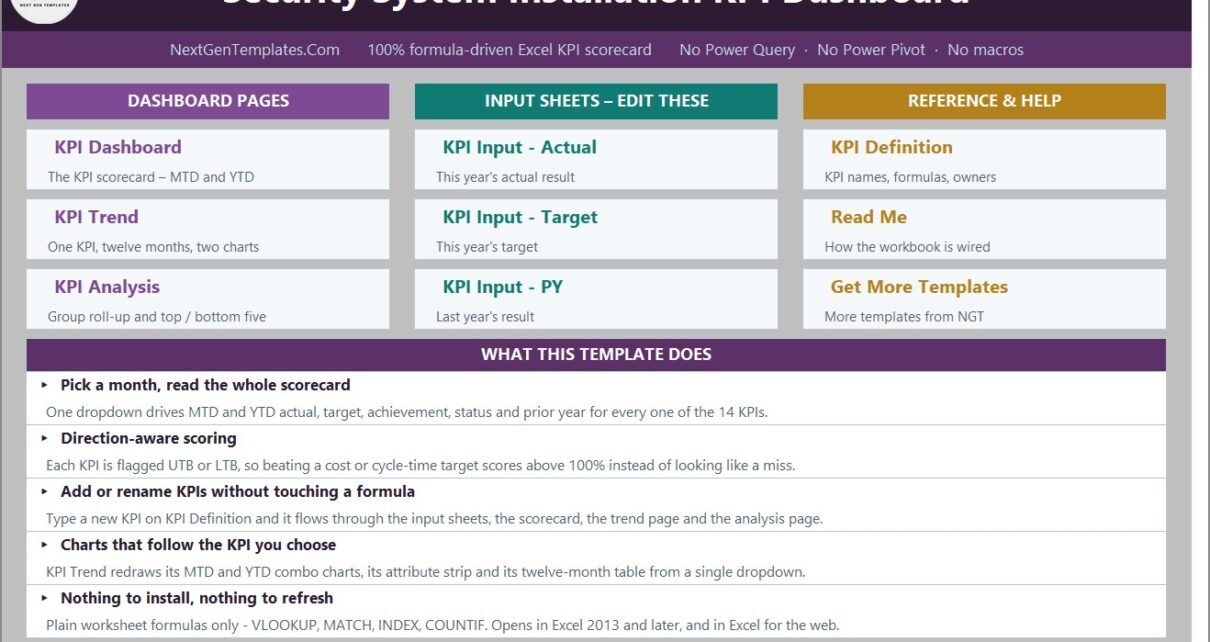
A tiled index of the three dashboard pages, the three input sheets and the three reference sheets, with a short statement of what the workbook does and what it runs on – plain worksheet formulas, Excel 2013 and later, and Excel for the web.
KPI Dashboard: the monthly management view
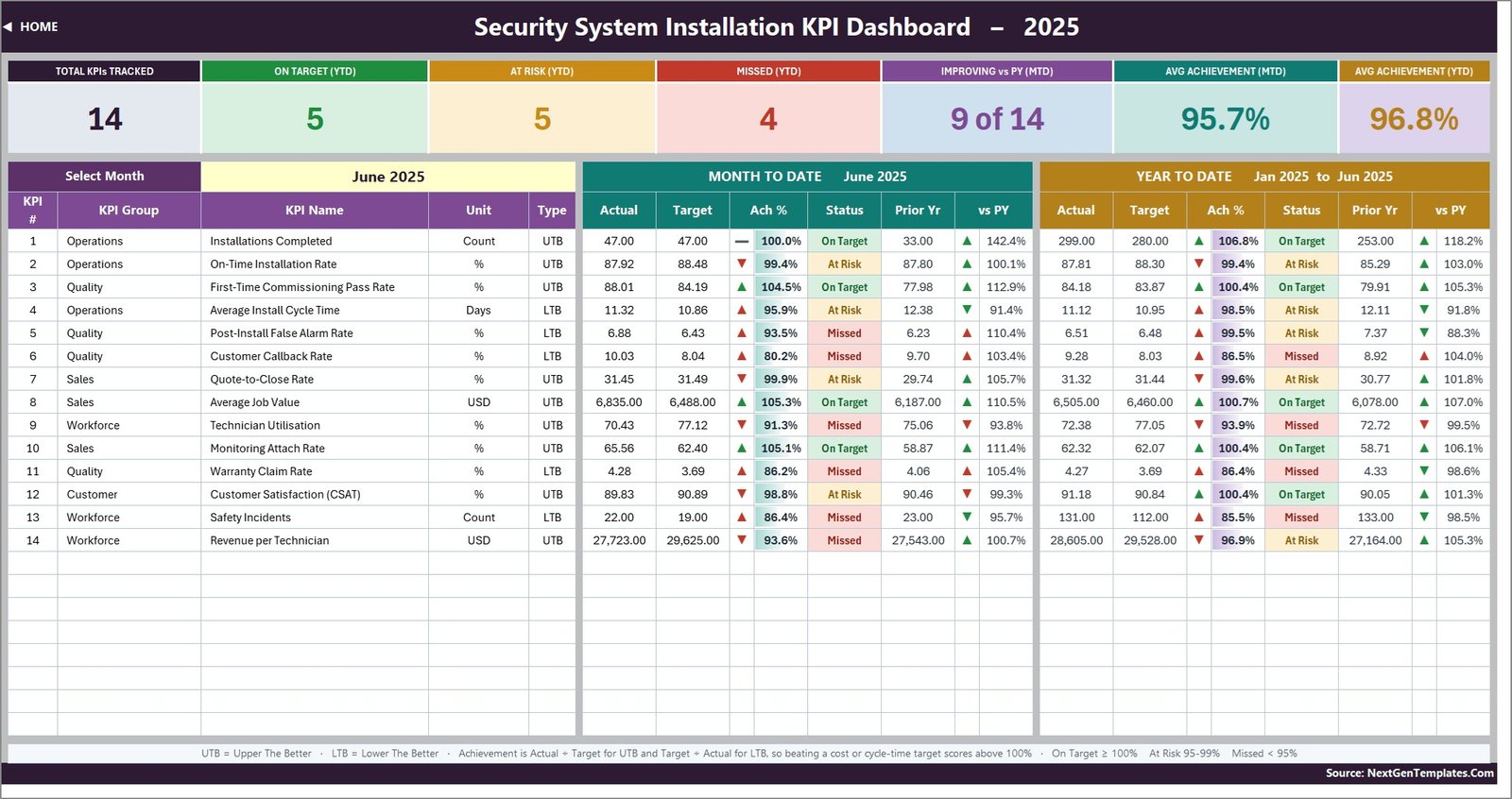
The scorecard sits on one screen. Seven cards run across the top, then one row per KPI carrying number, group, name, unit and type, followed by MTD actual, target, achievement, status, prior year and vs-PY, and the same six columns again for year to date. On the shipped June 2025 sample the cards read 14 tracked, 5 On Target, 5 At Risk, 4 Missed, 9 of 14 improving against prior year, 95.7% average achievement MTD and 96.8% YTD.
The arrows are worth a closer look, because this is where most KPI templates get it wrong. The arrow shows raw direction – actual above or below its comparator – while its colour shows whether that direction is good for that KPI. Average Install Cycle Time falling from 12.38 days last June to 11.32 this June draws a green down-arrow, not a red one.
KPI Trend: one measure over twelve months
Pick any KPI from a dropdown and the page rebuilds – its attribute strip, its formula and definition, a twelve-month table of MTD and YTD figures, and two combo charts named for the KPI you chose, MTD Trend for [KPI] and YTD Trend for [KPI]. Each plots actual and prior-year columns against a target line. This page deliberately shows all twelve months regardless of the dashboard’s month picker; it is the one page where that is the intended behaviour rather than a bug.
KPI Analysis: groups and rankings
Achievement rolled up by group – KPI count, On Target, At Risk and Missed counts, and average achievement for MTD and YTD – alongside an Average YTD Achievement by KPI Group bar chart and Top 5 and Bottom 5 tables. On the demo month Operations leads on 101.6% and Workforce trails on 92.1%.
Actual, Target and Prior Year input sheets
Three sheets, identical in shape: 14 KPI rows by twelve months, each month holding an MTD and a YTD column. The KPI rows are driven from the KPI Definition sheet so all three always line up. Cell E3 on the Actual sheet is the first month of the reporting year – change it and the Target sheet, the Prior Year sheet, the month dropdown and every sheet title re-base.
KPI Definition and Read Me
KPI Definition is the master list: number, group, name, unit, formula, definition, type, owner, priority and frequency. Every other sheet reads names from here, so renaming a KPI is a single edit. Read Me documents the MTD and YTD rules, the UTB and LTB convention, the achievement maths, the status thresholds and how to add, rename or remove a KPI.
Security System Installation KPI Dashboard in Excel vs. Google Sheets vs. Field-Service SaaS
| Capability | This Excel workbook | Google Sheets scorecard | Field-service SaaS |
|---|---|---|---|
| Pricing model | One-off | One-off | Per user per month |
| Time to first report | Minutes | Minutes | Weeks |
| Data capture | Typed monthly totals | Typed monthly totals | Captured from live jobs |
| Formula transparency | Every cell readable | Every cell readable | Closed |
| Offline use | Yes | No | No |
| Scheduling and invoicing | No | No | Yes |
| Certifies installed systems | No | No | No |
Who Should Use This Template
Security installation contractors, alarm and CCTV installers, access-control integrators, monitoring companies, and the operations or general managers who report to an owner or a board each month. The common factor is that the monthly numbers already exist somewhere and just need a consistent home.
It is the wrong tool if you want live job data, dispatch, scheduling or invoicing, or if you need documentary evidence that an installed system performs. There are no connections in the file; a person types the totals in.
Real-World Use Cases
Monthly operations review
Pick last month, read the four count cards, then work down the Missed rows. On the demo data those are Customer Callback Rate, Technician Utilisation, Warranty Claim Rate and Safety Incidents – a tidy agenda for a one-hour meeting.
Quality and safety review
Take the Quality group and Safety Incidents together, then switch to KPI Trend to separate a single bad month from a genuine slide.
Commercial performance meeting
Read Quote-to-Close Rate, Average Job Value and Monitoring Attach Rate side by side to see whether volume, price or recurring revenue is moving the result.
Advantages of This Template
- Nothing to install, refresh or enable – it is an .xlsx that simply opens.
- Direction-aware achievement, which most spreadsheet scorecards handle badly.
- Spare capacity for 22 KPIs, with 14 filled, so growth needs no formula work.
- Every formula is visible and editable, so an analyst can trace any number back to its inputs.
Opportunities for Improvement
Two things are worth knowing before you buy. The dashboard formats every value as a number with two decimals, so count KPIs such as Installations Completed and Safety Incidents display as 47.00 and 22.00 – correct, but a little odd on a count. And the Read Me sheet’s note on cumulative versus average year-to-date illustrates its point with “aircraft deliveries, non-conformance reports”, wording carried over from another template in the range; the rule it describes is right, the example is off-topic. Both are cosmetic and neither affects a calculation.
Best Practices
- Fix the KPI list on the KPI Definition sheet before you type a single number.
- Set the reporting year in cell E3 on the Actual sheet first, so every other sheet re-bases once.
- Keep counts cumulative and rates as running averages in the YTD columns – a percentage that sums to 1,100% by December is the classic sign of a broken KPI pack.
- Record owner and priority for each KPI; the trend page surfaces them, which makes accountability visible in the meeting.
- Replace all demo data before the file goes anywhere near a customer or a board.
Explore Relevant Templates
- Window and Door Installation KPI Dashboard in Excel
- Solar Panel Installation KPI Dashboard in Excel
- Glass Installation KPI Dashboard in Excel
- Elevator Maintenance KPI Dashboard in Excel
A Power BI edition of this dashboard, and a separate Security System Installation KPI Scorecard in Excel on the scorecard line, are both being prepared and will be linked here once they are published.
Frequently Asked Questions
Does this certify our installations or make us compliant?
No. It is a spreadsheet that reports numbers a person types in. It does not monitor, test, certify or assure any alarm, CCTV, access-control or life-safety system, and it does not establish compliance with UL 681 or UL 827, NFPA 72, EN 50131, SIA standards, local alarm permitting, electrical or fire codes, or any installer licensing requirement. It is not a security risk assessment, a system design, a commissioning record or an inspection certificate, and it does not replace a licensed installer’s statutory duties.
Are the numbers in the workbook real?
No – they are demo data. Any installation, compliance, response-time or inspection figure in the file is a placeholder to show the formulas working, never evidence that a system functions.
How many KPIs are included?
14, in 5 groups, with the sheets wired for up to 22.
Does it use Power Query, Power Pivot or macros?
None of the three. Plain VLOOKUP, MATCH, INDEX and COUNTIF in an .xlsx file.
What are UTB and LTB?
Upper-the-better and lower-the-better. They tell the workbook which direction counts as good, so cost, cycle-time and incident KPIs are scored correctly instead of upside down.
Can I replace the KPIs with my own?
Yes. Edit the KPI Definition sheet and the input sheets, scorecard, trend page and analysis page all follow.
Which line is this – dashboard or scorecard?
This is the Excel KPI Dashboard line: a month-picker scorecard with a per-KPI trend page and a group analysis page. It is a different product from the analytical Excel Dashboard range and from the Excel KPI Scorecard range, even where the industry name is the same.
A Note on Standards
Where this article mentions fire and life-safety codes it does so only to be clear about what the template is not. Requirements for alarm and detection systems are published by bodies such as the National Fire Protection Association; consult them and your local authority rather than any spreadsheet.
About the Author
Built by the NextGenTemplates team, who produce Excel, Power BI and Google Sheets reporting templates for field-service and installation businesses. Every template ships with sample data so you can see the formulas working before you commit your own numbers.
Conclusion
If your monthly security-installation review currently means three exports and a whiteboard, the Security System Installation KPI Dashboard in Excel replaces it with one sheet, one dropdown and fourteen honestly-scored KPIs. Type your numbers in, pick the month, and the review agenda writes itself – while the file stays exactly what it is: a reporting template, not a compliance or monitoring system.