Modern businesses run on servers, and every second of downtime can impact revenue, customer trust, and productivity. Because of this, IT teams must track uptime KPIs with accuracy and speed. A Server Uptime KPI Dashboard in Power BI gives you a smart and simple way to monitor server health, uptime trends, system reliability, and performance scores. It turns raw server data into useful visuals that help you take action before problems grow.
This detailed article explains what this dashboard is, how it works, and why every IT team should use it. You will also see its major features, benefits, best practices, and answers to the most common questions. The goal is to give you a clear and easy guide that helps you use this dashboard with confidence.
Click to Purchases Server Uptime KPI Dashboard in Power BI
What Is a Server Uptime KPI Dashboard in Power BI?
A Server Uptime KPI Dashboard in Power BI is a reporting tool that tracks server availability, uptime percentage, downtime incidents, and performance trends across the year. IT teams use it to compare actual uptime with SLA targets, see MTD/YTD performance, check previous year numbers, and identify issues instantly.
Power BI makes the entire monitoring process fast and easy. You can switch between KPI groups, track uptime in different months, and compare multiple servers with simple slicers. Additionally, you can review server trends, performance history, and monthly uptime scores in clean visuals. Because Power BI updates automatically, you always see real-time uptime metrics without manual work.
This dashboard runs on a structured Excel file, which contains actual values, target values, and KPI definitions. You fill the data once, and the dashboard refreshes with one click.
Why Do IT Teams Need a Server Uptime KPI Dashboard?
Server uptime plays a central role in every company’s operations. However, tracking it manually becomes slow, confusing, and incomplete. IT teams face challenges such as:
-
Multiple servers running different workloads
-
Uptime incidents spread across several environments
-
Manual calculations for SLA %
-
Missing month-wise and year-wise comparison
-
Difficulty spotting uptime trends
A Power BI dashboard solves all these problems in one place. It shows the uptime KPIs visually and simplifies analysis for IT engineers, managers, and technical leaders.
Key Features of the Server Uptime KPI Dashboard in Power BI
This dashboard includes three main pages, each designed for clear analysis and easy navigation.
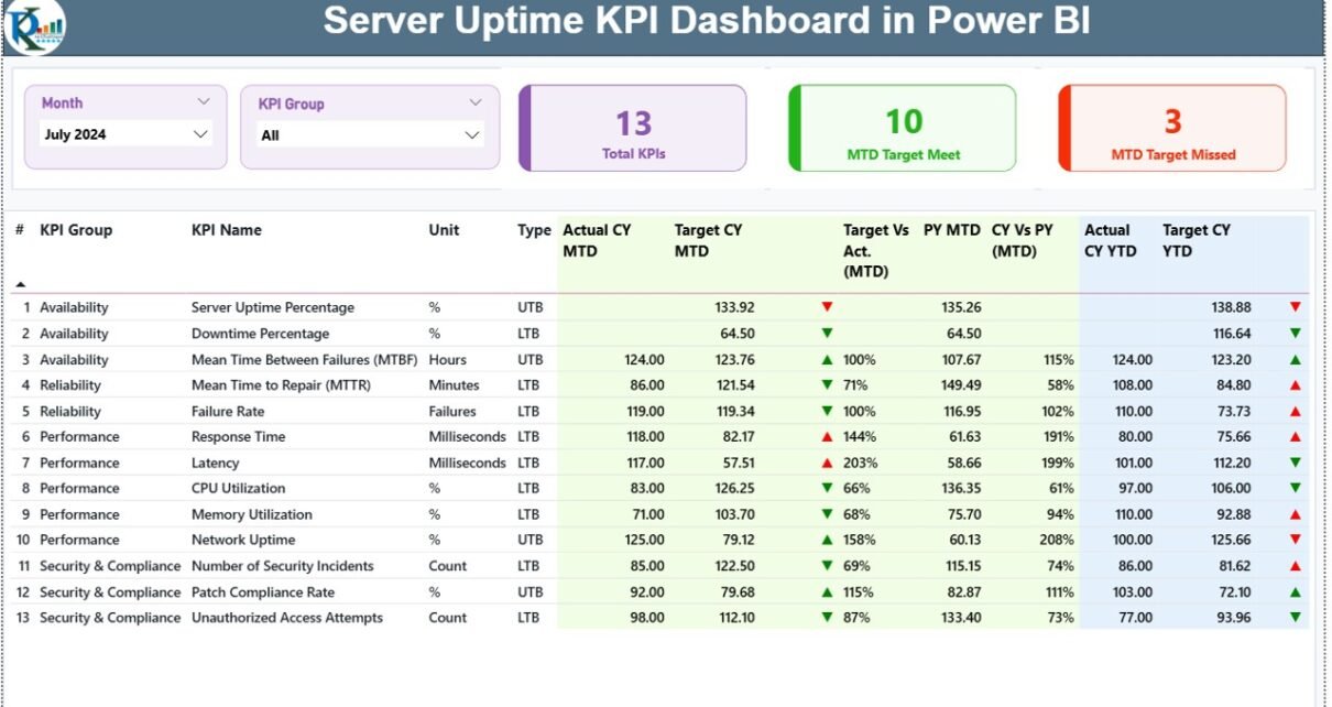
1. Summary Page – Your Main Monitoring View
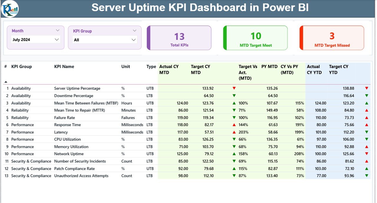
The Summary Page works as the heart of the dashboard. It shows all server uptime details in one compact and interactive screen.
Main Elements on the Summary Page
🔹 Month Slicer
You can switch to any month and see the uptime values instantly.
🔹 KPI Group Slicer
Categorize KPIs such as:
-
Availability metrics
-
Performance metrics
-
Reliability metrics
-
Uptime vs SLA metrics
🔹 Top Cards
The dashboard displays three important cards:
-
Total KPIs Count
-
MTD Target Meet Count
-
MTD Target Missed Count
These cards help you understand how your server environment performs in the current period.
🔹 Detailed KPI Table
The table shows complete server uptime details, including:
-
KPI Number
-
KPI Group
-
KPI Name
-
Unit
-
KPI Type (UTB/ LTB)
-
Actual CY MTD
-
Target CY MTD
-
MTD Icon (Green ▲ for good, Red ▼ for poor)
-
Target vs Actual (MTD %)
-
Previous Year MTD
-
CY vs PY (MTD %)
-
Actual CY YTD
-
Target CY YTD
-
YTD Icon (Green ▲ or Red ▼)
-
Target vs Actual (YTD %)
-
Previous Year YTD
-
CY vs PY (YTD %)
This table lets you compare server uptime at a deeper level. You can spot problem areas and act quickly.
2. KPI Trend Page – Visualizing Uptime Over Time
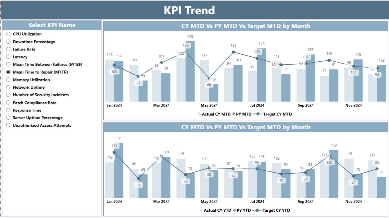
The KPI Trend Page adds more clarity to your metrics. It shows two combo charts:
-
MTD Trend Chart
-
YTD Trend Chart
Both charts compare:
-
Actual CY
-
Previous Year
-
Target values
This helps you spot long-term patterns and seasonality in server performance. You can also use the slicer to select a specific KPI for deeper analysis.
3. KPI Definition Page – Understanding Every KPI Clearly
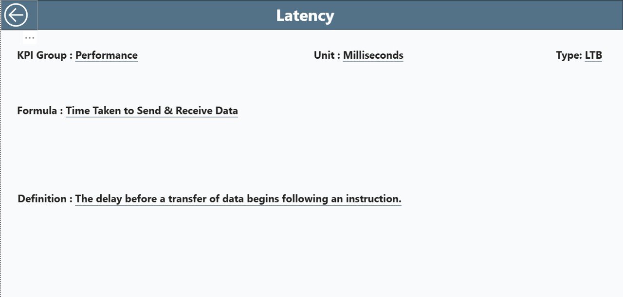
This is a drill-through page and stays hidden from the main navigation. You can open it by right-clicking on any KPI in the summary table.
The definition page includes:
-
KPI Number
-
KPI Group
-
KPI Name
-
Unit
-
Formula
-
Definition
-
Type
This page helps new users, IT managers, and auditors understand every KPI without confusion.
Click to Purchases Server Uptime KPI Dashboard in Power BI
How to Use the Excel Data Source for This Dashboard
The dashboard runs on a structured Excel file with three worksheets.
1. Input_Actual Sheet
Here you enter:
-
KPI Name
-
Month (use the first date of the month)
-
Actual MTD
-
Actual YTD
This sheet stores your server uptime performance.
2. Input_Target Sheet
Here you enter:
-
KPI Name
-
Month
-
Target MTD
-
Target YTD
These targets help compare actual uptime with SLA expectations.
3. KPI Definition Sheet
Enter the master data:
-
KPI Number
-
KPI Group
-
KPI Name
-
Unit
-
Formula
-
Definition
-
Type (UTB or LTB)
This sheet powers the drill-through definition page.
Why Server Uptime KPIs Matter for IT Operations
Server uptime KPIs help IT teams maintain stability and deliver consistent performance. When uptime drops, users face delays, applications crash, and business processes slow down. With clear KPIs and accurate dashboard visuals, IT leaders can stay ahead of problems and improve systems continuously.
Here are some reasons why server uptime tracking matters:
-
Uptime keeps business and customer operations stable
-
Reliable servers improve employee productivity
-
Continuous uptime supports IT security layers
-
Uptime metrics help justify budgets and resources
-
Managers can take action based on real-time data
What KPIs Should You Track in a Server Uptime Power BI Dashboard?
You can customize your dashboard, but common KPIs include:
-
Server Uptime %
-
Downtime Duration
-
Number of Incidents
-
SLA Achievement %
-
Mean Time Between Failures (MTBF)
-
Mean Time to Repair (MTTR)
-
Network Uptime %
-
Application Availability %
-
Peak Load Performance
-
Server Health Score
These KPIs offer a complete picture of server stability.
Advantages of Using a Server Uptime KPI Dashboard in Power BI
A dashboard like this adds structure and clarity to your uptime monitoring process. Below are the major advantages.
1. Real-Time Visibility
You see current uptime values for all servers in one place.
2. Faster Decision-Making
You can take corrective action immediately when uptime drops.
3. Better SLA Compliance
The dashboard compares actual performance with targets and highlights issues instantly.
4. Consistent Reporting
You no longer prepare manual reports every month. Power BI automates everything.
5. Improved Server Reliability
You can track uptime trends and identify problem areas early.
6. Clear Comparative Insights
You can compare:
-
Current year vs previous year
-
MTD vs YTD
-
Actual vs target
This helps IT teams improve strategic planning.
7. Easy for Beginners and Experts
Even non-technical users can understand the visuals and data structure.
How to Improve Server Uptime With Better KPIs
Tracking KPIs is the first step. When you act on these insights, your uptime improves faster.
Here are some ways to boost uptime:
-
Monitor uptime every day
-
Track server logs regularly
-
Address incidents before peak hours
-
Set realistic targets
-
Compare uptime across teams and locations
-
Review your previous year performance
-
Upgrade failing infrastructure early
Best Practices for the Server Uptime KPI Dashboard in Power BI
To get the best results, follow these practices:
1. Update Actual and Target Data Monthly
Always enter the month’s first date and correct KPI values.
2. Use Clean and Consistent KPI Names
Avoid long and complicated names.
3. Keep KPI Definitions Clear
Short formulas and simple definitions help everyone understand the numbers.
4. Track Both MTD and YTD Values
This improves long-term analysis and accuracy.
5. Review Trend Charts Every Week
Trend charts show upcoming performance risks early.
6. Train IT Staff to Read KPI Icons
Green ▲ means performing well
Red ▼ means performing below target
7. Build Alerts Based on Dashboard Insights
Use Power BI alerts for instant notifications.
8. Refresh the Dashboard Regularly
A daily or weekly refresh ensures accurate tracking.
Conclusion
A Server Uptime KPI Dashboard in Power BI makes server monitoring simple, fast, and powerful. It helps IT teams track uptime KPIs, compare performance, understand trends, and maintain SLA compliance. You can build better strategies, reduce downtime, and improve server stability with ease.
Since this dashboard runs on Excel data, updating it is effortless. You only need to enter actual numbers, target values, and KPI details. Power BI handles everything else.
This dashboard is not just a reporting tool—it is a complete performance monitoring solution that helps IT leaders make smart decisions and maintain server reliability throughout the year.
Frequently Asked Questions (FAQs)
1. What is a Server Uptime KPI Dashboard in Power BI?
It is a reporting tool that tracks uptime metrics, downtime incidents, SLA % achievement, and server performance in interactive charts.
2. Who should use this dashboard?
IT teams, server administrators, system engineers, infrastructure managers, cloud teams, and technical leaders.
3. What data do I need to maintain?
You need to fill actual values, target values, and KPI definitions for each month in Excel.
4. Can I add more KPIs?
Yes. You can add new KPIs in the Excel sheet and refresh the dashboard.
5. Does this dashboard work for cloud servers?
Yes. It works for on-prem, hybrid, and cloud servers.
6. How often should I update the dashboard?
Weekly or monthly updates offer accurate tracking.
7. Can beginners use this dashboard?
Yes. It has simple visuals, easy slicers, and clear KPI definitions.
Visit our YouTube channel to learn step-by-step video tutorials