Strategic planning is the backbone of every successful organization. Without a clear roadmap and measurable goals, even the most ambitious business initiatives can lose direction. That is why companies rely on Key Performance Indicators (KPIs) to track their strategic goals and measure progress. However, simply defining KPIs is not enough. Organizations also need a powerful yet simple tool to track, visualize, and analyze them.
This is where the Strategic Planning KPI Dashboard in Excel plays a critical role. Excel remains one of the most accessible and flexible platforms for managing KPIs. With the right design, businesses can create a centralized dashboard that not only monitors performance but also drives smarter decision-making.
In this article, we will explore the structure, features, and benefits of the Strategic Planning KPI Dashboard in Excel. We will also provide best practices, advantages, and common FAQs to help you make the most out of this tool.
Click to Purchases Strategic Planning KPI Dashboard in Excel
What Is a Strategic Planning KPI Dashboard in Excel?
A Strategic Planning KPI Dashboard is an Excel-based reporting tool that consolidates key performance indicators related to an organization’s strategic goals. It provides managers, executives, and teams with a clear picture of performance trends, achievements, and areas for improvement.
Instead of juggling multiple spreadsheets or static reports, this dashboard creates a single source of truth. By using dynamic charts, slicers, and conditional formatting, decision-makers can quickly analyze trends, compare results with targets, and adjust their strategies accordingly.
Key Features of the Strategic Planning KPI Dashboard in Excel
The dashboard is structured into 7 worksheet tabs, each designed to perform a specific function. Below is a detailed explanation:
Home Sheet
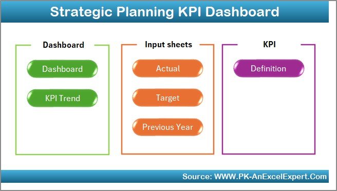
The Home sheet acts as the index page. It contains buttons that allow users to quickly navigate across all worksheets. This eliminates manual searching and ensures smooth usability.
Key highlights:
-
Contains 6 navigation buttons linked to respective tabs.
-
Provides a clean and professional entry point into the dashboard.
-
Makes navigation user-friendly for non-technical team members.
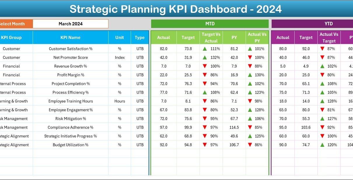
Dashboard Sheet Tab
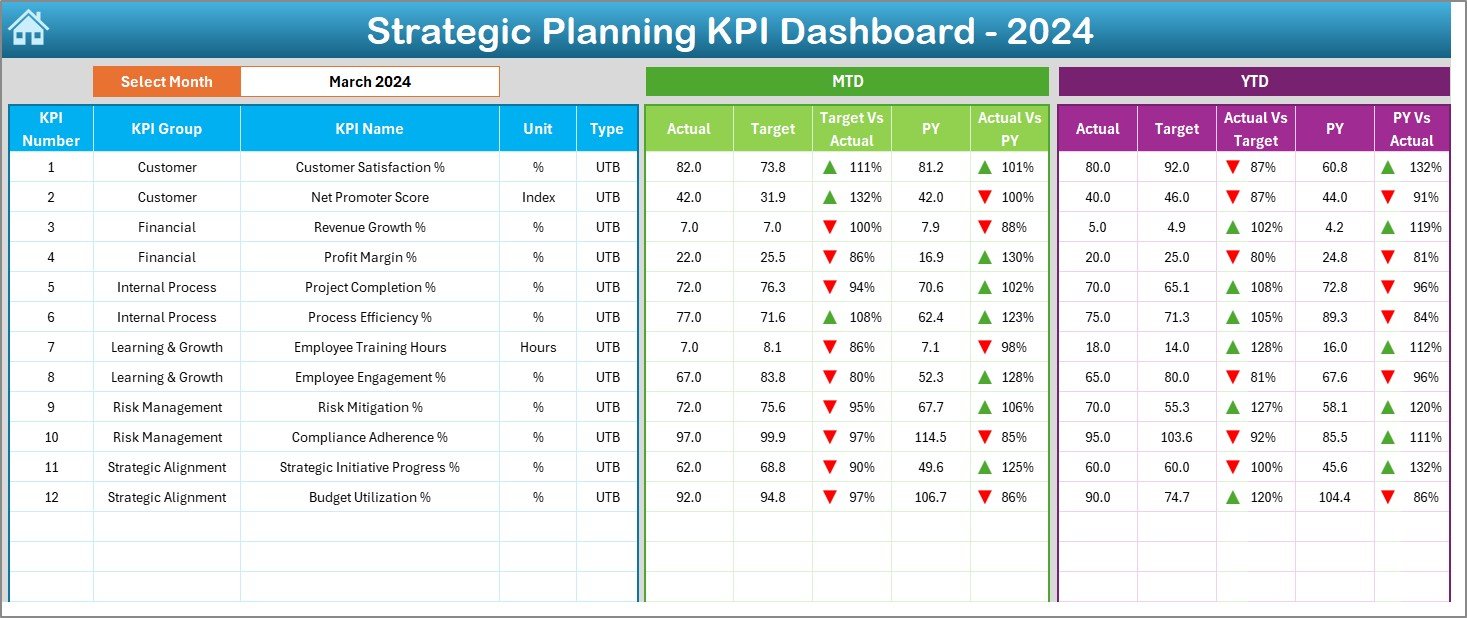
The Dashboard sheet is the main reporting area. Here, the dashboard displays the performance of all KPIs in a visually engaging format.
Key highlights:
-
At cell D3, a drop-down allows you to select the month. Once selected, the dashboard updates automatically.
-
Displays MTD (Month-to-Date) Actual, Target, and Previous Year values.
-
Shows Target vs Actual and Previous Year vs Actual comparisons.
-
Uses conditional formatting with up/down arrows to highlight progress or decline.
-
Also displays YTD (Year-to-Date) metrics with the same comparative analysis.
This feature makes it easy for executives to analyze both short-term (monthly) and long-term (yearly) performance in one place.
KPI Trend Sheet Tab
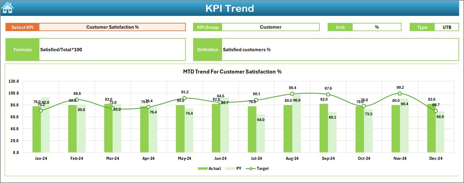
The KPI Trend tab provides a detailed view of each KPI. Users can select a KPI name from a drop-down at cell C3, and the sheet will show all the necessary details.
Information displayed:
-
KPI Group
-
Unit of Measurement
-
KPI Type (Lower the Better or Upper the Better)
-
Formula used for calculation
-
Definition of the KPI
Additionally, this sheet provides trend charts showing Actual, Target, and Previous Year numbers for both MTD and YTD. This allows for an easy understanding of progress and long-term growth.
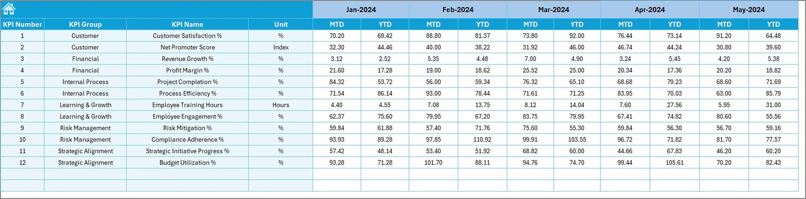
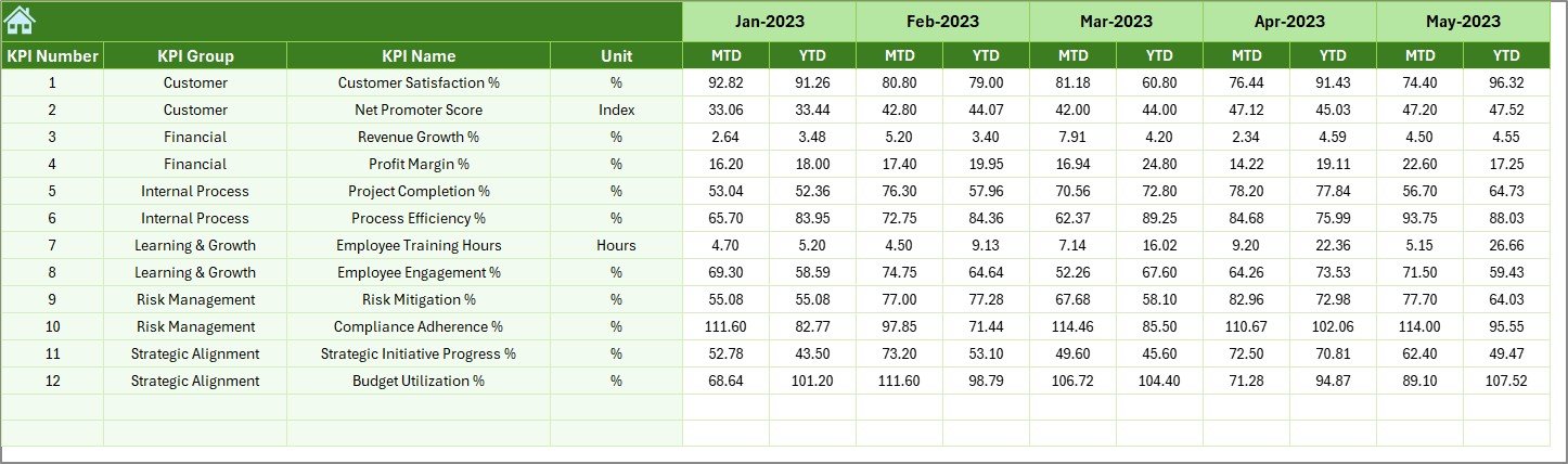
Actual Numbers Input Sheet
Data accuracy is crucial, and the Actual Numbers Input sheet is where real performance data is entered.
Key highlights:
-
Enter MTD and YTD actual values for each KPI.
-
Month can be adjusted by updating cell E1.
-
Once updated, all linked sheets (Dashboard, KPI Trend, etc.) update automatically.
This ensures the dashboard always reflects the most recent performance.
Click to Purchases Strategic Planning KPI Dashboard in Excel
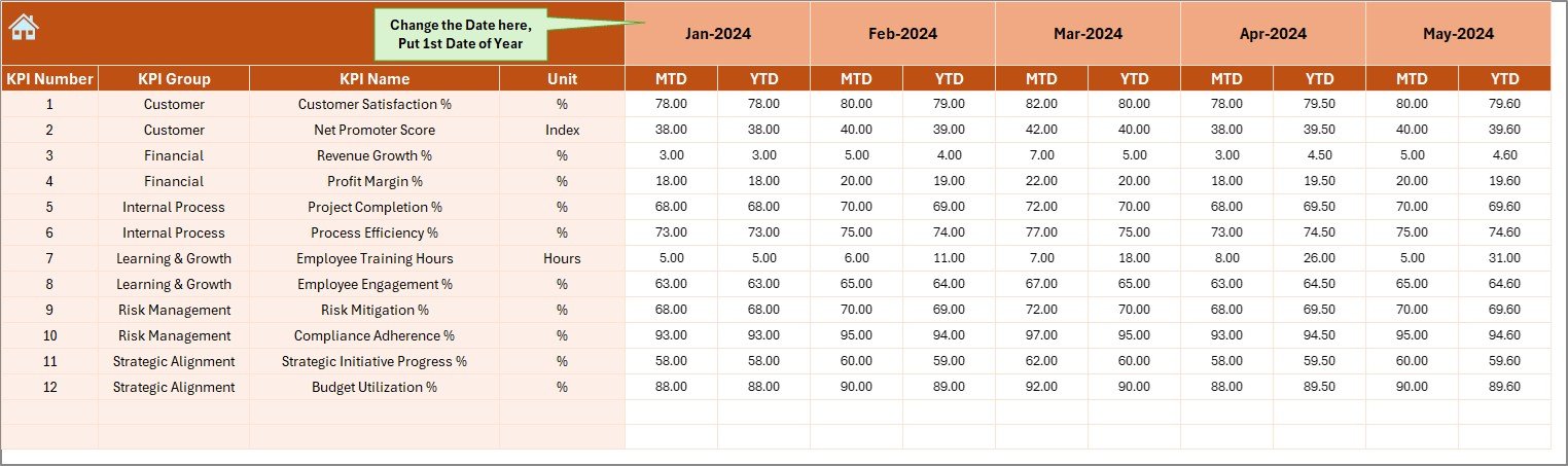
Target Sheet Tab
The Target sheet is where organizations input their monthly and yearly KPI goals.
Key highlights:
-
Enter both MTD and YTD targets for each KPI.
-
Makes comparisons with actual numbers seamless.
-
Enables automated variance analysis in the Dashboard tab.
Previous Year Number Sheet Tab
Tracking historical performance is essential to evaluate progress. The Previous Year Number sheet stores the last year’s actual data.
Key highlights:
-
Enter monthly and yearly figures for each KPI.
-
Enables comparison with current year performance.
-
Helps in identifying growth trends and areas that require attention.
KPI Definition Sheet Tab
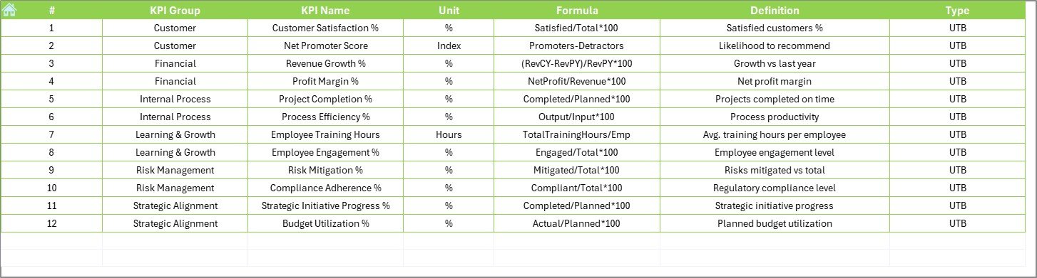
The KPI Definition sheet acts as a reference library for all KPIs used in the dashboard.
Columns included:
-
KPI Name
-
KPI Group
-
Unit of Measurement
-
Formula
-
KPI Definition
This sheet ensures that every KPI is standardized and clearly defined. It eliminates ambiguity and makes it easier for teams to understand what each metric represents.
Why Use a Strategic Planning KPI Dashboard in Excel?
Organizations often wonder why they should use Excel when there are advanced BI tools available. The answer lies in simplicity, accessibility, and cost-effectiveness.
-
Excel is widely available: No need for expensive software.
-
User-friendly interface: Even non-technical users can manage it.
-
Highly customizable: Dashboards can be tailored to meet industry-specific needs.
-
Familiarity: Teams already know how to use Excel.
-
Quick deployment: Dashboards can be built and used immediately without long implementation cycles.
Advantages of Strategic Planning KPI Dashboard in Excel
Using this dashboard comes with several benefits:
✅ Centralized reporting – All KPIs in one place for easy monitoring.
✅ Real-time updates – Enter new numbers, and the dashboard updates instantly.
✅ Data-driven decision-making – Helps managers act on facts, not assumptions.
✅ Historical comparison – Compare current results with previous years.
✅ Improved accountability – Each KPI is linked to a target and responsible owner.
✅ Clear visualization – Charts, arrows, and conditional formatting make performance easy to understand.
✅ Cost-effective – No additional software costs.
Best Practices for Using the Strategic Planning KPI Dashboard
To maximize the effectiveness of your KPI dashboard, follow these best practices:
Define clear KPIs
- Only include KPIs that align with strategic goals.
- Avoid cluttering the dashboard with too many metrics.
Set realistic targets
- Ensure targets are measurable and achievable.
- Review them quarterly to stay aligned with business strategy.
Update data regularly
- Assign responsibility for updating the Actual Numbers Input sheet.
- Keep data consistent and accurate.
Use conditional formatting wisely
- Highlight only the most important trends.
- Avoid excessive colors that may distract users.
Review KPI definitions
- Ensure all users understand the KPI formulas and meanings.
- Update definitions as business needs evolve.
Leverage automation
- Use formulas and links to minimize manual work.
- Automate variance calculations for faster insights.
Opportunities for Improvement in the Dashboard
While Excel dashboards are powerful, there are always ways to enhance them:
🔹 Add slicers for filtering by department, region, or product line.
🔹 Integrate Power Query for automated data imports.
🔹 Use macros or VBA to automate repetitive tasks.
🔹 Enhance visual appeal with customized charts.
🔹 Link with external data sources for real-time updates.
Conclusion
The Strategic Planning KPI Dashboard in Excel is more than just a reporting tool. It is a performance management system that empowers organizations to track, analyze, and act on their strategic goals. With features like automated comparisons, KPI trends, and clear definitions, this dashboard brings clarity and focus to strategic planning.
By using the best practices outlined above, businesses can ensure that their dashboards remain accurate, user-friendly, and insightful. Whether you are a small business or a large corporation, this Excel-based tool can help you take control of your strategy and drive measurable results.
Frequently Asked Questions (FAQs)
1. What is a Strategic Planning KPI Dashboard?
It is an Excel-based tool that tracks and visualizes KPIs related to strategic goals. It consolidates data into one place for better decision-making.
2. How many KPIs should I include in the dashboard?
Ideally, keep it between 10–15 critical KPIs to avoid clutter. Only include metrics that align with strategic priorities.
3. Can this dashboard be customized for different industries?
Yes. You can modify KPI definitions, targets, and visualizations to suit any business sector, from finance to manufacturing.
4. Is Excel better than Power BI for KPI dashboards?
Excel is cost-effective, easy to use, and widely available, making it great for small to mid-sized businesses. Power BI is better for advanced analytics and large-scale operations.
5. How often should I update the Actual Numbers Input sheet?
Update it monthly for accuracy. However, some KPIs may require weekly or daily updates depending on business needs.
6. What is the difference between MTD and YTD in the dashboard?
-
MTD (Month-to-Date): Performance for the current month.
-
YTD (Year-to-Date): Cumulative performance from the beginning of the year to the present date.
7. Can I automate this dashboard?
Yes. You can use Excel formulas, Power Query, and even VBA macros to automate data entry, analysis, and reporting.
Visit our YouTube channel to learn step-by-step video tutorials