Managing heavy machinery without clear data always creates risk. Equipment breakdowns delay projects. Maintenance costs increase suddenly. Productivity drops without warning. Therefore, companies need a simple yet powerful way to monitor machinery performance in real time.
That is where a Heavy Machinery Dashboard in Excel becomes essential.
In this detailed guide, you will learn what a Heavy Machinery Dashboard in Excel is, why it matters, how it works, its structure, key features, advantages, best practices, and common questions. Moreover, this article explains how a ready-to-use Excel dashboard helps operations teams control costs, reduce downtime, and improve production efficiency.
Click to Purchases Heavy Machinery Dashboard in Excel
What Is a Heavy Machinery Dashboard in Excel?
A Heavy Machinery Dashboard in Excel is a centralized reporting and visualization tool that tracks machinery performance, maintenance, costs, and production metrics in one interactive file. Instead of reviewing multiple spreadsheets, managers view all critical insights on a single screen.
Moreover, Excel dashboards allow slicers, pivot charts, and KPI cards. As a result, users analyze machinery data by plant, project, machine type, brand, region, or shift in just a few clicks.
Most importantly, Excel remains accessible, flexible, and cost-effective. Therefore, even small and mid-sized organizations can implement advanced machinery analytics without expensive software.
Why Do Businesses Need a Heavy Machinery Dashboard in Excel?
Heavy machinery operations involve high capital investment. Any inefficiency directly impacts profitability. Therefore, companies must track performance continuously.
Here is why this dashboard matters:
-
Equipment downtime causes production loss
-
Maintenance costs grow without proper monitoring
-
Repair planning becomes reactive instead of proactive
-
Managers struggle to compare plants, projects, or brands
-
Decision-making slows without visual insights
However, when organizations use a Heavy Machinery Dashboard in Excel, they gain clarity, control, and confidence.
How Does a Heavy Machinery Dashboard in Excel Work?
The dashboard connects structured data with interactive visuals. First, users maintain raw data in a dedicated data sheet. Then, Excel pivot tables summarize this data. Finally, pivot charts and KPI cards display insights visually.
Moreover, slicers allow instant filtering. For example, users can filter data by plant, machine type, brand, project, or shift.
As a result, the dashboard updates automatically without manual calculations.
Structure of a Heavy Machinery Dashboard in Excel
This ready-to-use dashboard contains 5 analytical pages, supported by data and support sheets. Each page focuses on a specific business view.
Overview Page: What Does the Overview Page Show?
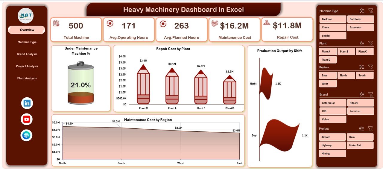
The Overview Page acts as the executive summary of machinery operations. It provides a quick snapshot of performance across the organization.
Key Elements on the Overview Page
-
Page Navigator on the left side for smooth navigation
-
Four KPI cards for instant performance insights
-
Four analytical charts for operational monitoring
Charts Included on the Overview Page
-
Maintenance Machine %
-
Repair Cost by Plant
-
Production Output by Shift
-
Maintenance Cost by Region
Therefore, decision-makers instantly understand where issues exist and where performance improves.
Machine Type Analysis: How Do Different Machine Types Perform?
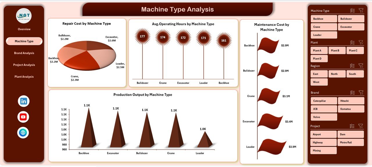
The Machine Type Analysis Page focuses on performance comparison across different machinery categories.
Why This Page Matters
Different machine types behave differently. Some require more maintenance. Others deliver higher output. Therefore, this page helps optimize machinery utilization.
Charts Included in Machine Type Analysis
-
Repair Cost by Machine Type
-
Average Operating Hours by Machine Type
-
Maintenance Cost by Machine Type
-
Production Output by Machine Type
As a result, managers identify cost-intensive machines and plan replacements or maintenance schedules effectively.
Brand Analysis: Which Machinery Brands Perform Best?
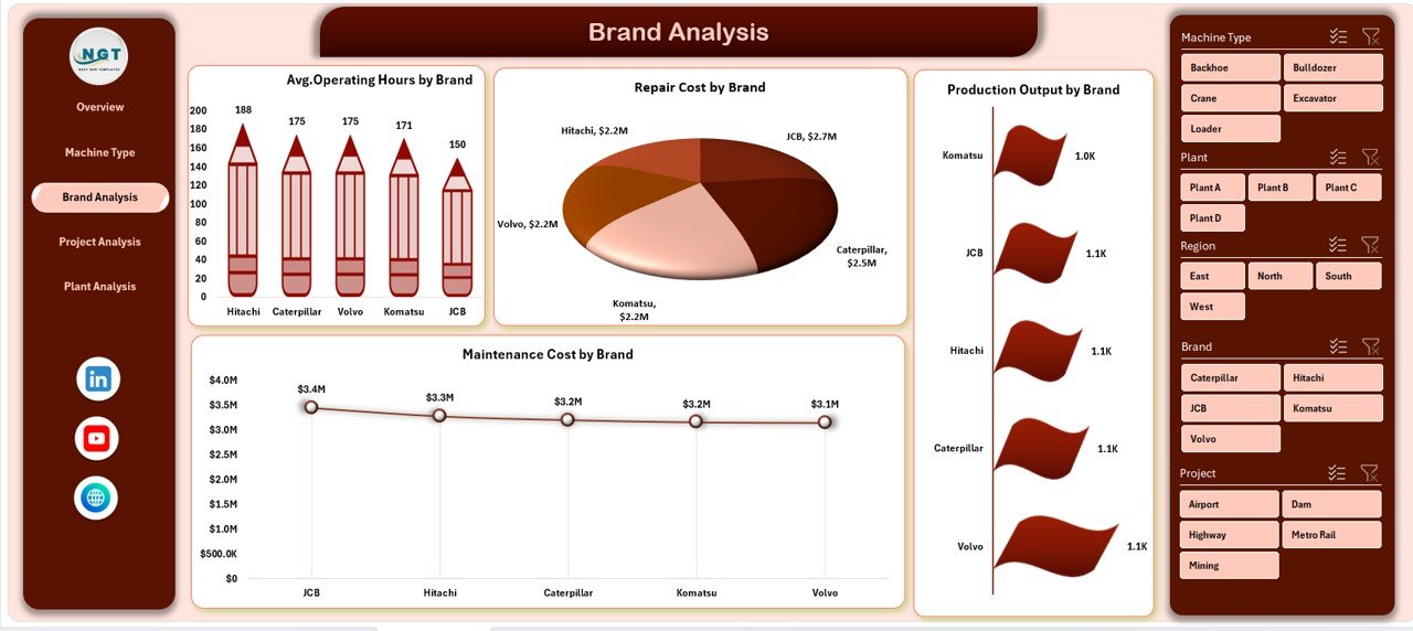
The Brand Analysis Page compares machinery performance by manufacturer or brand.
Why Brand Analysis Is Important
Brands differ in durability, maintenance needs, and output quality. Therefore, analyzing brand-wise performance supports better procurement decisions.
Charts Included in Brand Analysis
-
Average Operating Hours by Brand
-
Repair Cost by Brand
-
Production Output by Brand
-
Maintenance Cost by Brand
Consequently, procurement teams choose reliable brands based on real performance data.
Project Analysis: How Does Machinery Perform Across Projects?
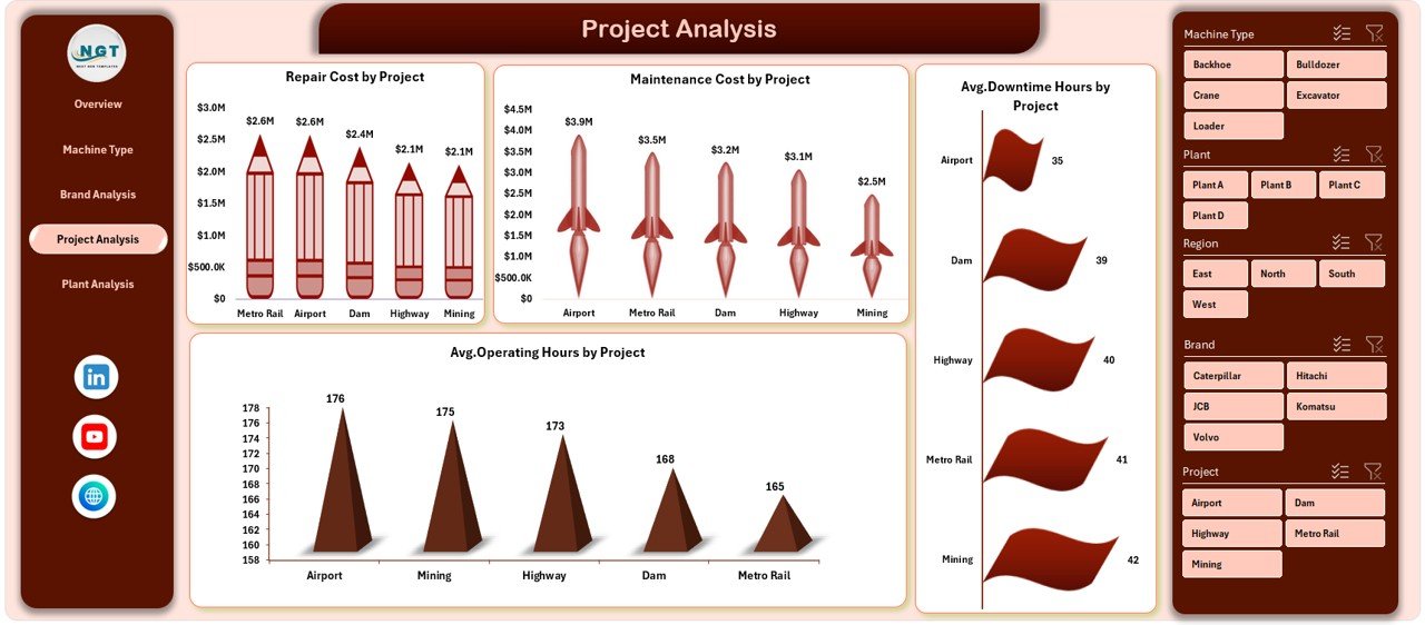
The Project Analysis Page evaluates machinery usage and costs across different projects.
Why Project-Level Analysis Matters
Each project has unique working conditions. Some projects demand intensive machinery use. Others require frequent maintenance.
Charts Included in Project Analysis
-
Repair Cost by Project
-
Maintenance Cost by Project
-
Average Downtime Hours by Project
-
Average Operating Hours by Project
Therefore, project managers optimize equipment allocation and control project budgets more effectively.
Click to Purchases Heavy Machinery Dashboard in Excel
Plant Analysis: How Do Different Plants Compare?
The Plant Analysis Page compares machinery performance across manufacturing or operational plants.
Importance of Plant-Level Analysis
Plants differ in workload, maintenance practices, and environmental conditions. Therefore, comparing plants highlights operational gaps.
Charts Included in Plant Analysis
-
Maintenance Cost by Plant
-
Average Operating Hours by Plant
-
Total Machines by Plant
-
Production Output by Plant
As a result, leadership identifies best-performing plants and replicates their practices.
What Are the Support and Data Sheets Used For?
Behind every powerful dashboard lies clean data.
Data Sheet
-
Stores raw machinery data
-
Includes machine type, brand, plant, project, shift, costs, hours, and output
-
Acts as the foundation for all pivot tables
Support Sheet
-
Contains lookup tables
-
Stores slicer values and mapping logic
-
Keeps the dashboard clean and user-friendly
Key Metrics Tracked in a Heavy Machinery Dashboard in Excel
This dashboard tracks all essential machinery KPIs, including:
-
Maintenance cost
-
Repair cost
-
Production output
-
Operating hours
-
Downtime hours
-
Machine count
-
Maintenance percentage
Therefore, users monitor both cost efficiency and operational productivity.
Advantages of Heavy Machinery Dashboard in Excel
Why Should You Use This Dashboard?
A Heavy Machinery Dashboard in Excel delivers multiple business benefits:
-
📊 Centralized machinery performance tracking
-
⏱ Faster decision-making with visual insights
-
💰 Better control over maintenance and repair costs
-
🏭 Improved plant and project comparisons
-
🔄 Automatic updates using pivot tables
-
📉 Reduced downtime through trend analysis
-
💼 No need for expensive BI tools
Most importantly, Excel offers flexibility. Therefore, users customize the dashboard easily.
How Does This Dashboard Improve Decision-Making?
First, the dashboard converts raw data into visual insights. Then, managers quickly identify patterns, trends, and anomalies. As a result, decisions become data-driven instead of assumption-based.
Moreover, visual comparisons simplify communication between teams.
Who Should Use a Heavy Machinery Dashboard in Excel?
This dashboard suits multiple industries and roles:
-
Construction companies
-
Manufacturing plants
-
Mining operations
-
Infrastructure projects
-
Operations managers
-
Maintenance teams
-
Plant heads
-
Project managers
Therefore, any organization using heavy equipment benefits from this dashboard.
Best Practices for the Heavy Machinery Dashboard in Excel
How Can You Use This Dashboard Effectively?
Follow these best practices to maximize value:
-
Maintain clean and consistent data
-
Update the data sheet regularly
-
Use slicers to analyze specific views
-
Review trends monthly instead of daily
-
Compare plants and projects periodically
-
Monitor high-maintenance machines closely
-
Use insights to plan preventive maintenance
By following these practices, the dashboard remains accurate and actionable.
How Can You Customize the Dashboard?
Excel allows easy customization:
-
Add new charts using pivot tables
-
Modify slicers for additional filters
-
Include new KPIs based on business needs
-
Change chart layouts and formatting
-
Expand data ranges without breaking visuals
Therefore, the dashboard grows with your business.
Common Challenges Without a Machinery Dashboard
Without this dashboard, businesses face:
-
Scattered Excel files
-
Manual calculations
-
Delayed reporting
-
Poor visibility into costs
-
Reactive maintenance planning
However, a structured dashboard eliminates these issues.
Why Excel Is Still the Best Tool for Machinery Dashboards?
Click to Purchases Heavy Machinery Dashboard in Excel
Despite modern BI tools, Excel remains powerful because:
-
Most teams already use it
-
No learning curve exists
-
It supports pivot analytics
-
It allows offline access
-
It offers full control over data
Therefore, Excel dashboards remain highly practical.
Conclusion: Is a Heavy Machinery Dashboard in Excel Worth It?
Absolutely.
A Heavy Machinery Dashboard in Excel transforms complex machinery data into clear, actionable insights. It improves cost control, boosts productivity, and supports smarter planning. Moreover, it helps teams move from reactive maintenance to proactive management.
If your organization depends on heavy equipment, this dashboard becomes a must-have operational tool.
Frequently Asked Questions About Heavy Machinery Dashboard in Excel
What data do I need to use this dashboard?
You need machinery details such as machine type, brand, plant, project, operating hours, downtime, maintenance cost, repair cost, and production output.
Can I use this dashboard without advanced Excel skills?
Yes. The dashboard uses pivot tables and slicers. Therefore, basic Excel knowledge is sufficient.
Can I add more charts to the dashboard?
Yes. Excel allows unlimited customization. You can add new pivot charts easily.
How often should I update the data?
You should update the data weekly or monthly, depending on operational needs.
Is this dashboard suitable for small businesses?
Yes. Excel dashboards work perfectly for small, medium, and large organizations.
Does this dashboard support decision-making?
Yes. It provides visual trends and comparisons that support faster and better decisions.
Visit our YouTube channel to learn step-by-step video tutorials