Subscription box services continue to grow rapidly across industries such as beauty, food, fashion, wellness, books, and lifestyle products. Because customer expectations increase every month, subscription businesses must track performance clearly and act quickly. However, many teams still rely on scattered spreadsheets, manual reports, and delayed reviews. As a result, decision-making becomes slow and inaccurate.
That is exactly why a Subscription Box Services Dashboard in Excel becomes a powerful and practical solution.
In this detailed, SEO-friendly guide, you will learn what a Subscription Box Services Dashboard in Excel is, why it matters, how it works, its page-wise structure, advantages, best practices, and frequently asked questions. Moreover, this article uses clear language, strong transitions, and real-world explanations so that you can apply everything confidently.
Click to Purchases Subscription Box Services Dashboard in Excel
What Is a Subscription Box Services Dashboard in Excel?
A Subscription Box Services Dashboard in Excel is a ready-to-use analytical tool that consolidates all key subscription metrics into one interactive Excel file. Instead of reviewing multiple sheets and reports, you can view revenue, costs, customer satisfaction, and acquisition performance in one place.
Because the dashboard works inside Excel, you do not need expensive BI tools or complex software. You simply update the data, and the visuals refresh automatically. Therefore, teams save time while improving accuracy.
More importantly, this dashboard helps subscription businesses answer critical questions such as:
-
Which subscription plans generate the highest recurring revenue?
-
Which box types drive higher customer satisfaction?
-
Which acquisition channels cost the most?
-
Which regions perform better month after month?
Why Do Subscription Box Businesses Need a Dashboard in Excel?
Subscription businesses operate on recurring revenue models. Because margins can shrink quickly, tracking the right KPIs becomes essential. However, without a structured dashboard, teams struggle to connect data points.
A Subscription Box Services Dashboard in Excel solves this challenge by providing:
-
Centralized performance tracking
-
Visual insights instead of raw numbers
-
Faster monthly and quarterly reviews
-
Better planning and forecasting
As a result, founders, managers, analysts, and marketing teams can make data-driven decisions with confidence.
What Are the Key Features of the Subscription Box Services Dashboard in Excel?
This dashboard includes several powerful features that make analysis simple and effective.
Page Navigator for Easy Navigation
The dashboard includes a Page Navigator located on the left side. Because of this navigator, users can switch between analytical pages instantly. As a result, navigation becomes smooth and intuitive.
Right-Side Slicers for Dynamic Analysis
Each page includes right-side slicers. These slicers allow users to filter data by month, region, plan type, box type, or acquisition channel. Consequently, analysis becomes flexible and interactive.
Multiple Analytical Pages in One Excel File
The Excel dashboard contains five structured pages, each focusing on a specific business area. In addition, the file includes support and data sheets for seamless data management.
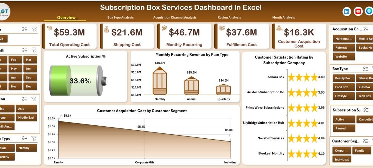
How Does the Overview Page Help Subscription Businesses?
The Overview Page serves as the main landing page of the dashboard. Because it provides a high-level summary, decision-makers can understand performance at a glance.
Overview Page KPIs and Cards
On the Overview Page, you will find four KPI cards that highlight essential subscription metrics. These cards give instant visibility into overall performance.
Overview Page Charts Explained
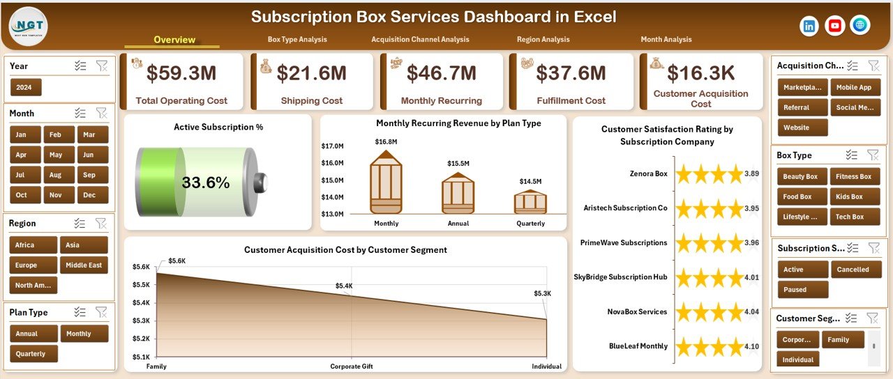
The Overview Page includes four powerful charts:
-
Active Subscription %
This chart shows the percentage of active subscriptions compared to total subscriptions. Therefore, businesses can monitor retention health. -
Monthly Recurring Revenue by Plan Type
This visual breaks down recurring revenue by subscription plan. As a result, teams can identify high-performing plans easily. -
Customer Satisfaction Rating by Subscription Company
This chart compares satisfaction ratings across different subscription offerings. Consequently, service quality gaps become visible. -
Customer Acquisition Cost by Customer Segment
This chart highlights how much it costs to acquire customers across segments. Therefore, marketing efficiency becomes measurable.
What Insights Does the Box Type Analysis Page Provide?
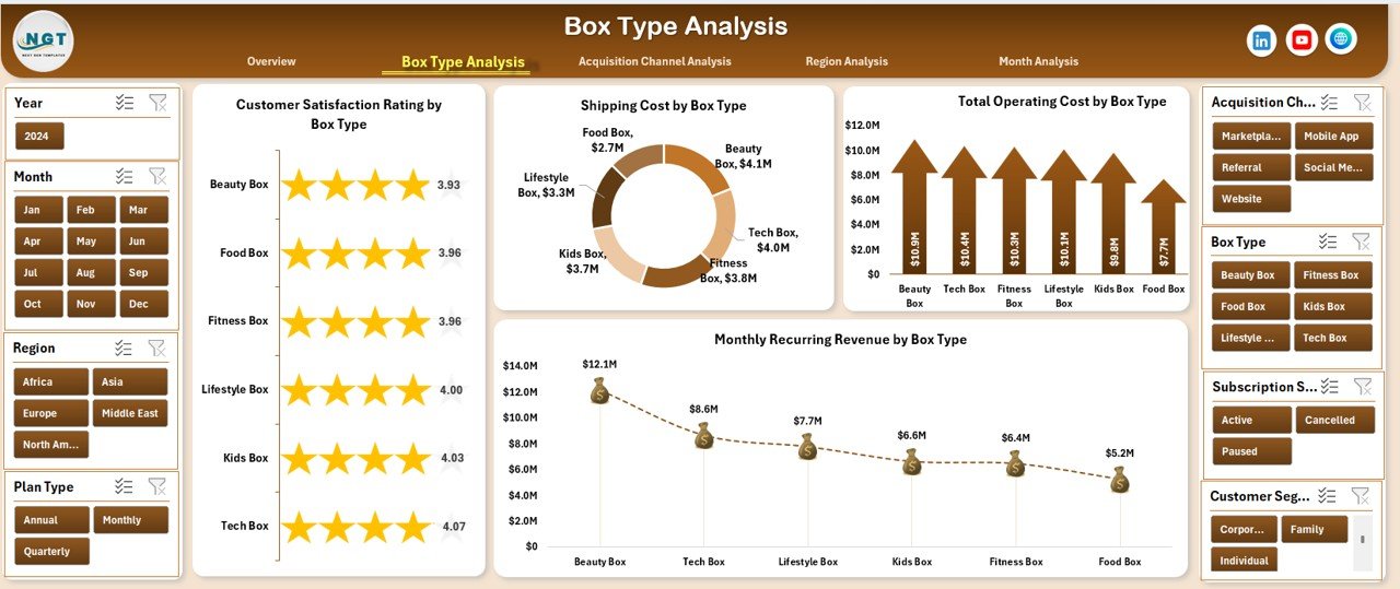
The Box Type Analysis Page focuses on understanding how different subscription box types perform.
Why Is Box Type Analysis Important?
Different box types often have different costs, logistics, and satisfaction levels. Because of this variation, analyzing box types separately becomes essential.
Key Charts on the Box Type Analysis Page
This page includes four detailed charts:
-
Customer Satisfaction Rating by Box Type
This chart helps identify which box types delight customers the most. -
Shipping Cost by Box Type
Because shipping impacts margins, this chart highlights cost-heavy box types. -
Total Operating Cost by Box Type
This visual shows the full operational expense for each box type. -
Monthly Recurring Revenue by Box Type
This chart compares revenue contribution across box types.
As a result, businesses can balance customer satisfaction with profitability.
How Does Acquisition Channel Analysis Improve Marketing Decisions?
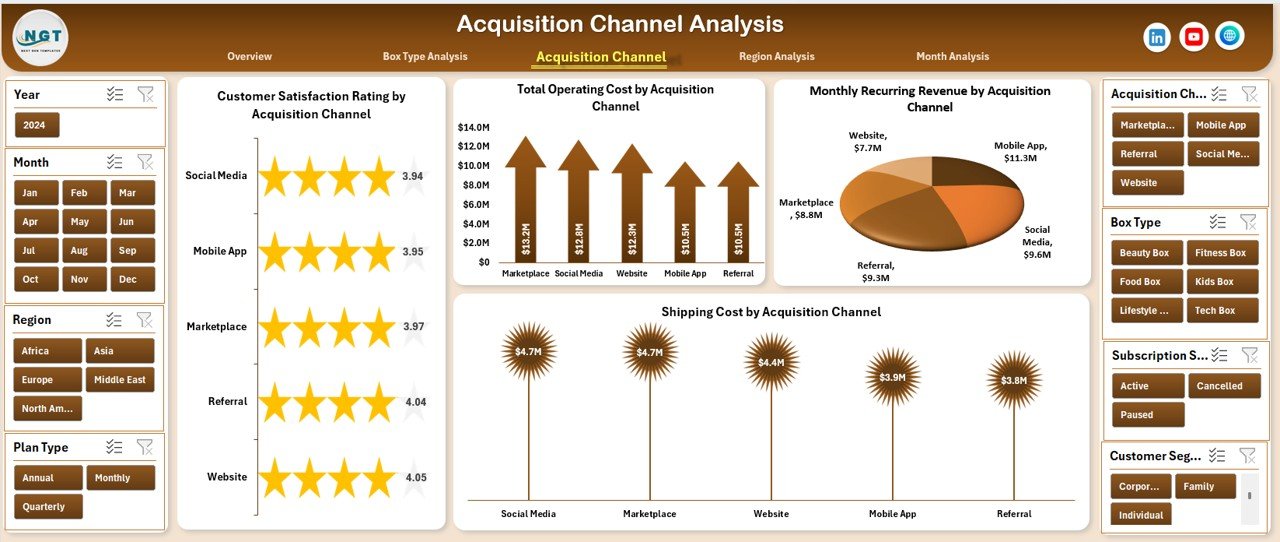
The Acquisition Channel Analysis Page evaluates how customers enter the subscription ecosystem.
Why Should You Analyze Acquisition Channels?
Different channels such as social media, referrals, ads, or partnerships deliver customers with varying costs and satisfaction levels. Therefore, analyzing these channels helps optimize marketing spend.
Key Charts on the Acquisition Channel Analysis Page
This page includes four charts:
-
Customer Satisfaction Rating by Acquisition Channel
This chart shows how customer experience varies by channel. -
Total Operating Cost by Acquisition Channel
This visual highlights operational costs associated with each channel. -
Monthly Recurring Revenue by Acquisition Channel
This chart identifies which channels bring long-term revenue. -
Shipping Cost by Acquisition Channel
This visual reveals hidden logistics costs linked to acquisition methods.
Consequently, marketing teams can focus on high-value channels.
Click to Purchases Subscription Box Services Dashboard in Excel
What Can You Learn from the Region Analysis Page?
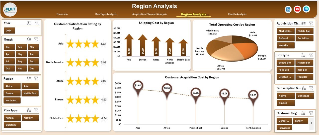
The Region Analysis Page breaks down subscription performance geographically.
Why Is Regional Analysis Important?
Customer behavior, shipping costs, and acquisition expenses vary by region. Therefore, regional insights help in expansion and cost control.
Key Charts on the Region Analysis Page
This page includes four essential charts:
-
Customer Satisfaction Rating by Region
-
Shipping Cost by Region
-
Total Operating Cost by Region
-
Customer Acquisition Cost by Region
Together, these charts help identify profitable and high-risk regions.
How Does the Month Analysis Page Support Trend Analysis?
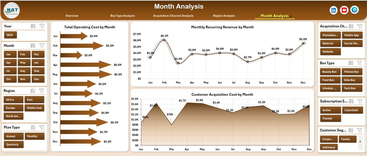
The Month Analysis Page focuses on time-based performance.
Why Track Monthly Trends?
Subscription businesses rely on consistency and growth. Because trends reveal patterns, monthly analysis becomes critical.
Key Charts on the Month Analysis Page
This page includes three trend charts:
-
Total Operating Cost by Month
-
Monthly Recurring Revenue by Month
-
Customer Acquisition Cost by Month
As a result, businesses can detect seasonal patterns and cost spikes early.
What Are the Support and Data Sheets Used For?
Data Sheet
The Data Sheet acts as the backend of the dashboard. All charts and KPIs pull data from this sheet. Because of this structure, updating the dashboard becomes easy.
Support Sheet
The Support Sheet handles calculations, helper columns, and lookup logic. As a result, the dashboard remains clean and efficient.
Advantages of Subscription Box Services Dashboard in Excel
Click to Purchases Subscription Box Services Dashboard in Excel
Using a Subscription Box Services Dashboard in Excel delivers several benefits.
Key Advantages
-
📊 Centralized performance tracking in one file
-
⏱ Faster decision-making with real-time visuals
-
💰 Better control over recurring revenue and costs
-
📈 Clear insights into customer satisfaction
-
🔄 Easy monthly updates without complex tools
-
💻 No dependency on external BI software
Because of these advantages, Excel dashboards remain a top choice for growing subscription businesses.
Best Practices for the Subscription Box Services Dashboard in Excel
To maximize the value of your dashboard, follow these best practices.
Data Management Best Practices
-
Keep data clean and structured
-
Use consistent naming for plans, regions, and channels
-
Update data regularly
Dashboard Design Best Practices
-
Limit charts to meaningful KPIs
-
Use slicers wisely for flexibility
-
Maintain consistent color themes
Analysis Best Practices
-
Review trends monthly
-
Compare satisfaction with costs
-
Focus on recurring revenue growth
When you follow these best practices, the dashboard delivers long-term value.
Who Should Use a Subscription Box Services Dashboard in Excel?
This dashboard suits a wide range of users.
Ideal Users
-
Subscription box founders and owners
-
Operations and logistics managers
-
Marketing and growth teams
-
Financial analysts and planners
-
Strategy and leadership teams
Because Excel is widely used, teams can adopt this dashboard quickly.
How Does This Dashboard Support Business Growth?
A Subscription Box Services Dashboard in Excel supports growth by:
-
Highlighting profitable plans and box types
-
Identifying cost leaks early
-
Improving customer experience
-
Optimizing acquisition strategies
-
Supporting data-driven expansion
As a result, businesses grow sustainably instead of relying on guesswork.
Conclusion: Why Subscription Box Services Dashboard in Excel Is a Smart Choice
A Subscription Box Services Dashboard in Excel transforms raw subscription data into actionable insights. Because it combines revenue, costs, satisfaction, and trends in one file, it simplifies decision-making. Moreover, it reduces manual effort and improves clarity.
If you want better control over your subscription business without investing in complex tools, this dashboard provides an ideal solution.
Frequently Asked Questions (FAQs)
What is a Subscription Box Services Dashboard in Excel used for?
It helps track recurring revenue, customer satisfaction, acquisition costs, operating costs, and trends in one Excel file.
Can beginners use this dashboard easily?
Yes. Because the dashboard uses Excel with slicers and charts, beginners can use it without technical skills.
How often should I update the data?
You should update the data monthly or weekly, depending on your reporting needs.
Does the dashboard support multiple regions and box types?
Yes. The dashboard includes region and box type analysis pages.
Can I customize the dashboard?
Yes. You can modify charts, KPIs, and layouts based on your business requirements.
Is Excel sufficient for subscription analytics?
For small to mid-sized subscription businesses, Excel dashboards provide excellent flexibility and cost efficiency.
Visit our YouTube channel to learn step-by-step video tutorials