Organizing a successful virtual event goes beyond streaming and online engagement—it requires a deep understanding of performance. That’s where the Virtual Events KPI Dashboard in Power BI comes into play. This ready-to-use dashboard not only offers real-time visibility into event performance but also ensures data-driven decision-making at every step.
In this comprehensive article, you’ll learn how this dashboard works, why it matters, and how to get the most out of it.
What Is a Virtual Events KPI Dashboard in Power BI?
A Virtual Events KPI Dashboard in Power BI is a powerful analytics tool that helps event planners and marketers track the key performance indicators (KPIs) of online events. With this dashboard, users can measure event outcomes such as attendee engagement, registration rates, content performance, and more—all from a central, easy-to-read location.
It connects to an Excel-based data source, making it easy to update and maintain. The dashboard contains three interactive pages:
- Summary Page
- KPI Trend Page
- KPI Definition Page
Each of these pages plays a unique role in helping users visualize and interpret event metrics.
Key Features of the Virtual Events KPI Dashboard
Summary Page (Main Dashboard)
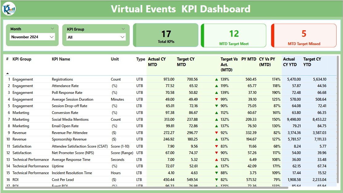
This page serves as the command center for all your virtual event KPIs. It contains:
- Slicers: For filtering data by Month and KPI Group.
KPI Cards: Showing:
- Total KPI Count
- MTD Target Met Count
- MTD Target Missed Count
Click to Purchases Virtual Events KPI Dashboard in Power BI
KPI Trend Page
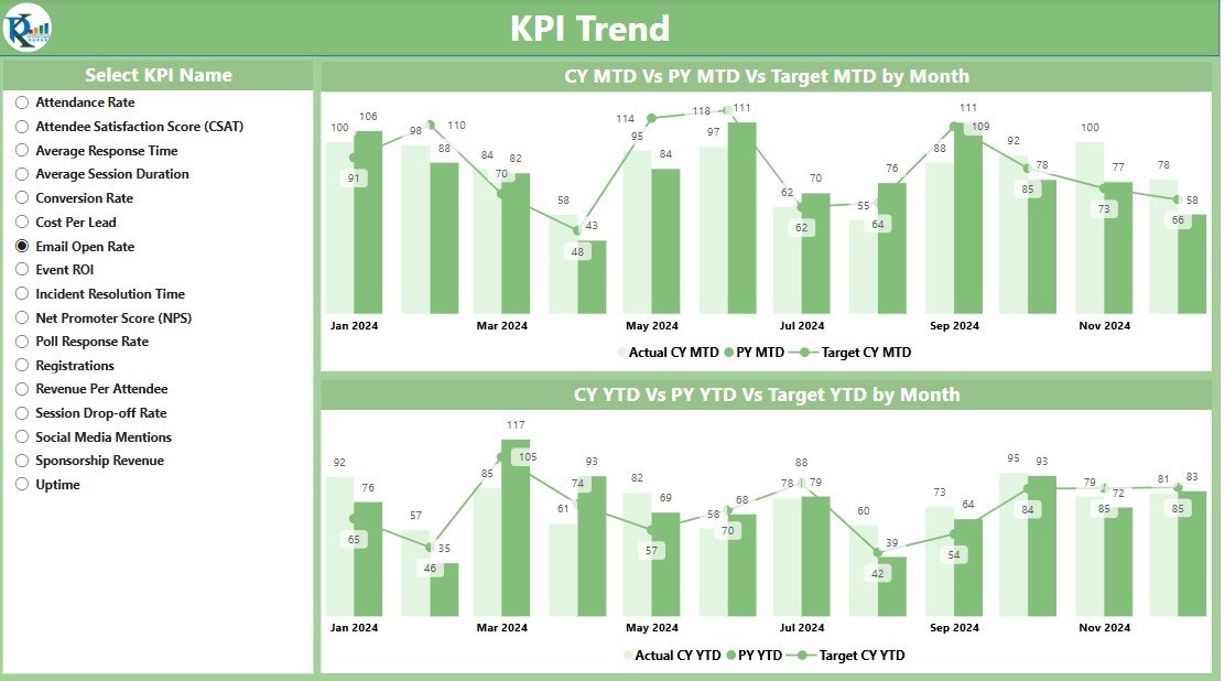
This page is perfect for visual learners and those who want to see progress over time.
- KPI Name Slicer: Select specific KPI for analysis.
Combo Charts: Display MTD and YTD numbers for:
- Current Year Actual
- Previous Year Actual
- Current Year Target
KPI Definition Page
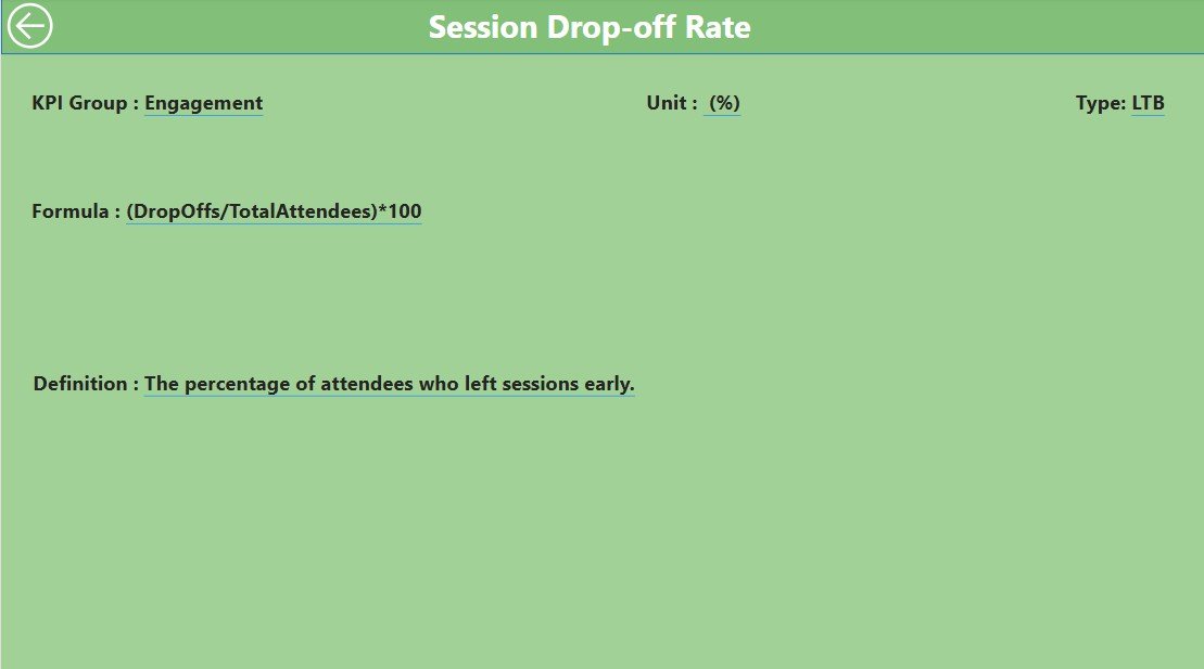
This is a hidden drill-through page accessible from the Summary page.
View in-depth details like:
- KPI Formula
- Definition
- Type
How Does the Excel Data Source Work?
The dashboard is powered by a simple Excel file, which includes three sheets:
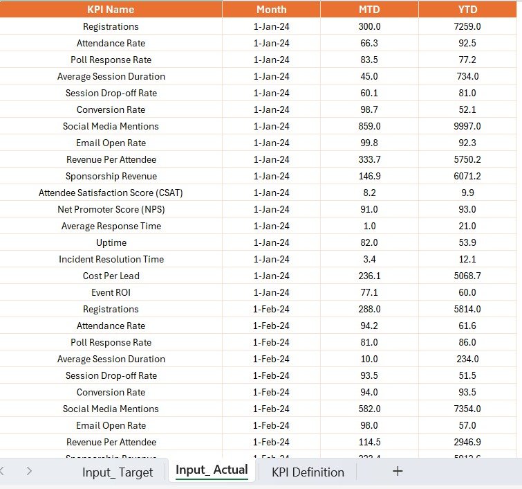
1. Input_Actual Sheet
- Add monthly MTD and YTD actuals for each KPI.
- Use the first date of the month for consistency.
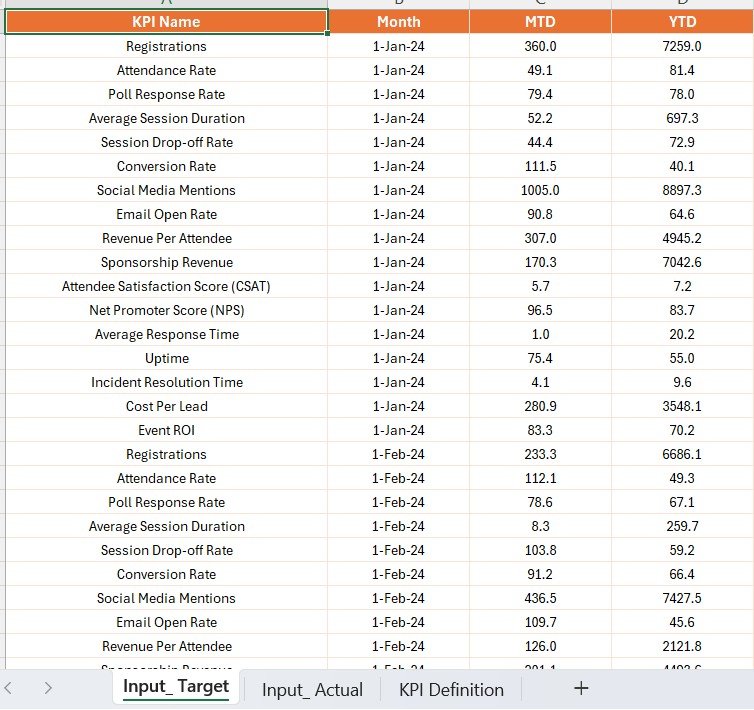
2. Input_Target Sheet
- Enter monthly MTD and YTD targets per KPI.
- Follow the same date format as in the actual sheet.
3. KPI Definition Sheet
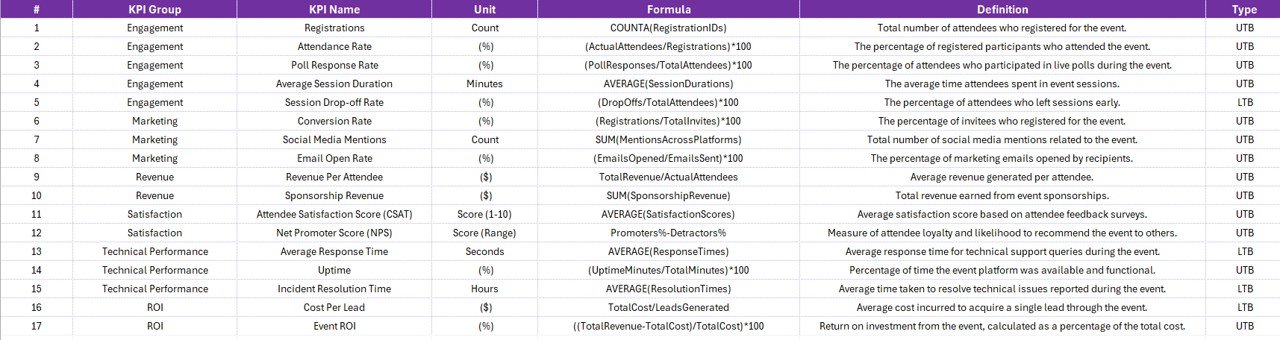
Maintain metadata for each KPI:
- KPI Number
- Group
- Name
- Unit
- Formula
- Definition
- Type (LTB/UTB)
Advantages of the Virtual Events KPI Dashboard
Click to Purchases Virtual Events KPI Dashboard in Power BI
✅ Real-Time Monitoring
You get up-to-date insights without waiting for post-event reports.
✅ Data-Driven Decisions
Know instantly which strategies work and which need adjustment.
✅ Enhanced Visibility
All stakeholders can access clear, interactive visuals on event performance.
✅ Easy Maintenance
The Excel backend makes it simple for non-tech users to update data.
Best Practices for the Virtual Events KPI Dashboard
1. Use Consistent Date Formats
Always use the first of the month to avoid loading errors.
2. Keep KPI Names Short and Clear
Use simple, easy-to-understand labels for better readability.
3. Maintain Data Hygiene
Regularly update and verify KPI actuals, targets, and definitions.
4. Leverage Drill-Through Pages
Encourage users to explore definitions and formulas before drawing conclusions.
5. Use Icons Wisely
Let visual cues (like ⯅ ⯆) indicate success or risk.
Frequently Asked Questions (FAQs)
Q1. Who can use the Virtual Events KPI Dashboard?
A: Event managers, marketing teams, analysts, or any stakeholder involved in virtual events can benefit from this dashboard.
Q2. Do I need Power BI Pro to use this dashboard?
A: No, you can use Power BI Desktop for development. However, Power BI Pro or Premium is needed for cloud sharing.
Q3. Can I connect it to other data sources like SQL or SharePoint?
A: Yes, Power BI allows integration with multiple data sources beyond Excel.
Q4. What are LTB and UTB types in KPIs?
A: LTB means “Lower the Better” (e.g., bounce rate), and UTB means “Upper the Better” (e.g., attendee engagement).
Q5. Can I add more KPIs to this dashboard later?
A: Absolutely! Just update the Excel sheets and refresh the data in Power BI.
Conclusion
The Virtual Events KPI Dashboard in Power BI transforms raw data into actionable insights. It empowers teams to monitor every metric in real time, spot trends, and improve event outcomes quickly. Whether you are a beginner or a seasoned data analyst, this dashboard simplifies your virtual event tracking like never before.
Click to Purchases Virtual Events KPI Dashboard in Power BI
Visit our YouTube channel to learn step-by-step video tutorials