In the era of clean and renewable energy, hydropower plays a pivotal role in ensuring sustainable electricity generation. But how can power plant managers and energy analysts effectively monitor performance, identify bottlenecks, and improve efficiency? That’s where the Hydropower KPI Dashboard in Power BI becomes a game-changer.
This detailed guide explores everything you need to know about the Hydropower KPI Dashboard, from how it works to its advantages and best practices. If you’re in the energy sector or data analytics field, this dashboard is built to empower you with real-time insights and actionable data.
Click to Purchases Hydropower KPI Dashboard in Power BI
What is a Hydropower KPI Dashboard in Power BI?
A Hydropower KPI Dashboard is a pre-designed, interactive dashboard created in Power BI that helps users monitor, analyze, and report key performance indicators (KPIs) specific to hydropower operations.
The data is captured using an Excel data source, which feeds directly into the Power BI report. With clean visuals, smart filters, and insightful trends, this tool simplifies how energy professionals track operational goals.
Key Features of the Dashboard
The Hydropower KPI Dashboard includes three core pages within the Power BI Desktop application:
Summary Page
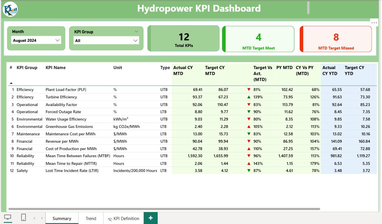
This is the central hub of the dashboard, offering an at-a-glance view of all KPIs.
- Month and KPI Group Slicer: Allows dynamic filtering of data.
Top Cards:
- Total KPIs Count
- MTD (Month-To-Date) Target Met Count
- MTD Target Missed Count
Detailed KPI Table:
- KPI Number: Identifier for each KPI
- KPI Group: The category the KPI belongs to (e.g., Maintenance, Operations)
- KPI Name: The actual name of the KPI
- Unit: Unit of measurement (e.g., MW, Hours)
- Type: Either LTB (Lower the Better) or UTB (Upper the Better)
- Actual CY MTD / YTD: Current Year Month-to-Date and Year-to-Date values
- Target CY MTD / YTD: Corresponding target values
- Icons: ▲ and ▼ with red/green color indicators
- Target vs Actual %: Performance ratio in percentage
- Previous Year (PY) MTD / YTD: For comparison
- CY vs PY %: Percentage variance over the previous year
KPI Trend Page
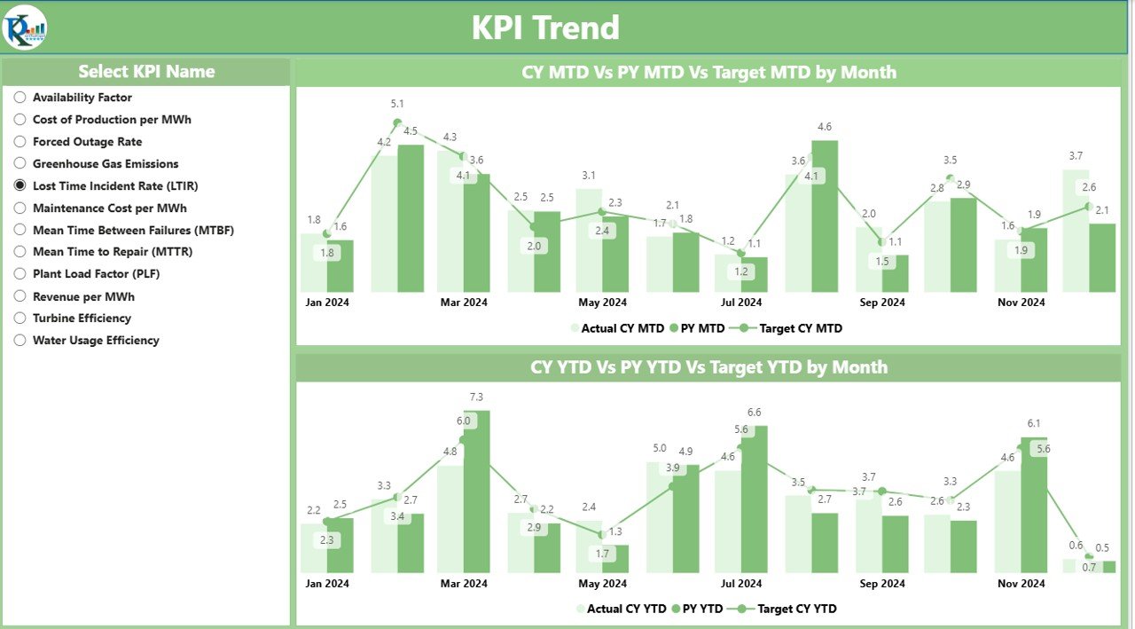
A visually rich section that includes two combo charts:
- MTD Trend: Compares Current Year, Previous Year, and Target values.
- YTD Trend: Offers similar comparative visuals.
- Slicer: Allows users to select any KPI name for focused analysis.
KPI Definition Page
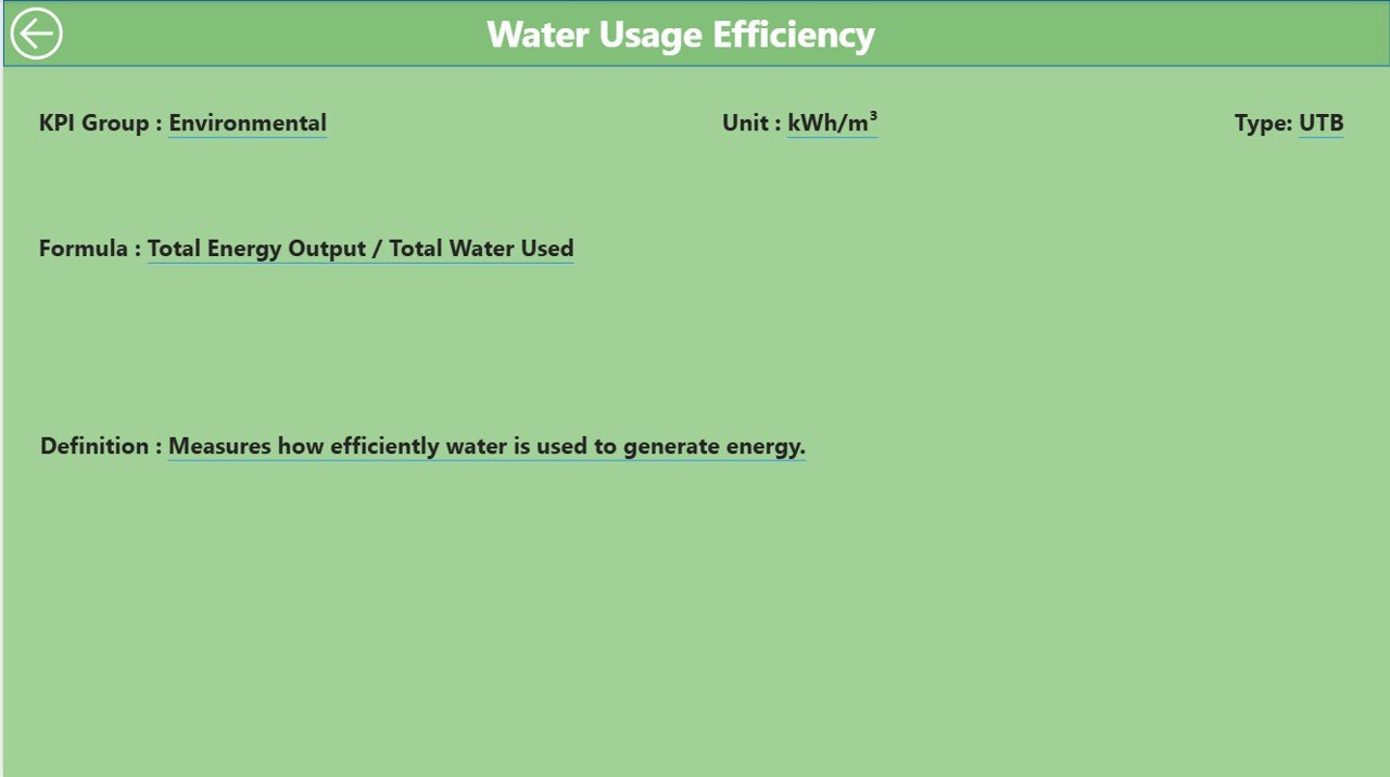
This hidden drill-through page reveals:
- Formula
- Description/Definition
To return, users can simply click the Back Button located in the top-left corner.
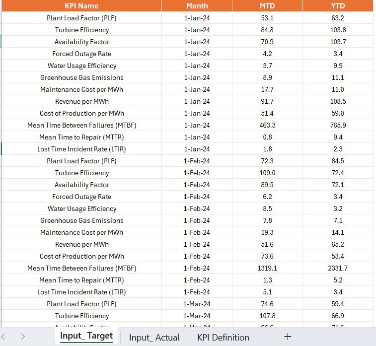
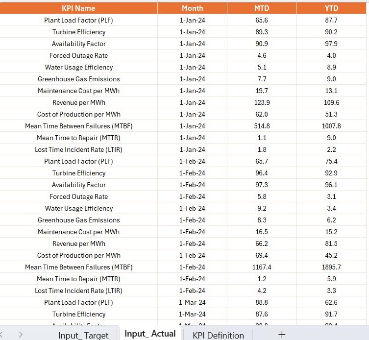
Excel Data Source Structure
The Power BI Dashboard pulls data from an Excel file that includes three worksheets:
Input Actual
- Fields: KPI Name, Month (first date), MTD value, YTD value
- Role: To capture actual performance metrics
Click to Purchases Hydropower KPI Dashboard in Power BI
Input Target
- Fields: KPI Name, Month (first date), MTD value, YTD value
- Role: To set benchmarks for comparison
KPI Definition
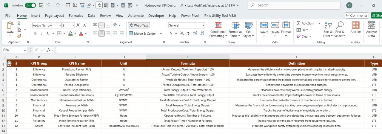
- Fields: KPI Number, Group, Name, Unit, Formula, Definition, Type (LTB or UTB)
- Role: For metadata and definitions used in drill-through
Advantages of Hydropower KPI Dashboard in Power BI
✨ Real-Time Monitoring
You don’t need to wait for monthly reports. The dashboard provides near real-time KPI status.
✨ Visual Clarity
Power BI’s sleek interface and conditional icons (green/red) simplify interpretation.
✨ Historical Comparisons
Easily compare current performance against last year’s benchmarks (PY MTD/YTD).
✨ Drill-Through Analysis
Users can explore KPI definitions and formulas instantly without switching applications.
✨ Customizable and Scalable
Add or remove KPIs, update slicers, or plug in additional data as needed.
Best Practices for Using the Hydropower KPI Dashboard
✅ Keep Data Updated
Ensure the Excel input files are consistently maintained. Even small gaps can skew the metrics.
✅ Use Meaningful KPI Groupings
Grouping KPIs into categories like Operations, Maintenance, and Compliance makes analysis more intuitive.
✅ Leverage the Icons
Use the red and green arrows effectively. They are visual signals for quick decisions.
✅ Review Trends Monthly
Check the KPI Trend page at least once a month to track improvements or declines.
✅ Train the Team
Make sure your energy analysts or operations team knows how to use slicers, drill-throughs, and visuals.
How to Get Started with the Dashboard
Step 1: Prepare Your Excel Data
Fill in the three sheets—Actuals, Targets, and Definitions. Use correct date formatting and consistent KPI names.
Step 2: Open the Power BI File
Load the data by refreshing the file. Make sure all three tabs from Excel are correctly mapped.
Step 3: Use the Dashboard
Start by checking the Summary Page. Use slicers to explore by month or KPI group. Drill through if you need deeper insights.
Why Power BI for Hydropower KPIs?
Power BI isn’t just a visualization tool—it’s a decision-making engine. In the hydropower industry, KPIs like equipment uptime, water usage, and generation efficiency are critical. Power BI allows plant managers to:
- Visualize large datasets easily
- Monitor deviations in real-time
- Automate updates from Excel
- Share insights with teams securely
The combination of flexibility and functionality makes Power BI the ideal tool for hydropower analytics.
Conclusion
The Hydropower KPI Dashboard in Power BI is more than just a reporting tool—it’s your gateway to smarter, data-driven decision-making. With clear visuals, real-time monitoring, and easy drill-throughs, your team can boost performance and streamline operations. By following best practices and keeping your data updated, this dashboard will become an essential part of your hydropower strategy.
Frequently Asked Questions (FAQs)
1. What KPIs are commonly used in hydropower dashboards?
Some common KPIs include generation efficiency, downtime hours, water usage, maintenance completion rate, and safety incidents.
2. Can I use Google Sheets instead of Excel for data input?
Power BI currently works best with Excel for local or scheduled refreshes. You can use Google Sheets with some connectors, but Excel remains the most reliable.
3. How often should I update the dashboard data?
Ideally, update the input Excel files weekly or monthly, depending on the operational frequency of your KPIs.
4. Is it possible to add more KPIs later?
Yes, the dashboard is scalable. You can add new KPIs to the Excel sheet and update the Power BI visuals accordingly.
5. What are LTB and UTB in the dashboard?
- LTB (Lower The Better): Lower values indicate better performance (e.g., Downtime).
- UTB (Upper The Better): Higher values indicate better performance (e.g., Power Generation).
6. Do I need Power BI Pro to use this dashboard?
You only need Power BI Pro if you plan to share the dashboard with others or publish it to the cloud. For individual use, the free version of Power BI Desktop is sufficient.
Click to Purchases Hydropower KPI Dashboard in Power BI
Visit our YouTube channel to learn step-by-step video tutorials