The Luxury Travel KPI Dashboard in Power BI is a plug-and-play performance tracking tool built with Power BI and Excel. It simplifies how luxury travel brands monitor performance, track targets, and spot business trends.
No coding. No complex configurations. Just actionable insights that help improve guest experiences and boost profitability.
Key Features of the Dashboard
Click to Purchases Luxury Travel KPI Dashboard in Power BI
This dashboard file includes 3 main pages:
Summary Page – The Command Center
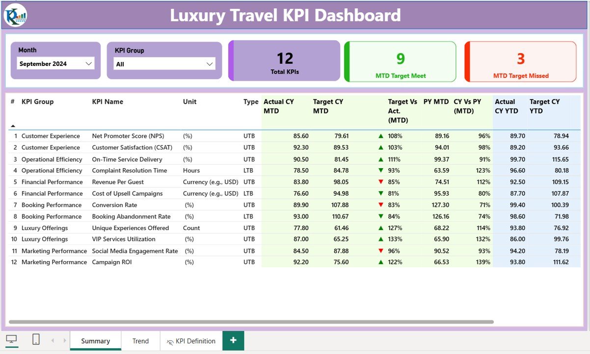
This is the core of your dashboard. It offers:
- Month and KPI Group Slicers for quick filtering.
Three KPI Cards showing:
- Total KPIs Count
- MTD Target Met
- MTD Target Missed
Below, a detailed table displays:
- KPI Number
- KPI Group
- KPI Name
- Unit of Measurement
- KPI Type (LTB = Lower the Better, UTB = Upper the Better)
- Actual CY MTD and Target CY MTD
- ⬇/⬆ icons in red/green based on performance
- MTD % vs Target
- Previous Year MTD
- CY vs PY MTD %
- Actual CY YTD and Target CY YTD
- YTD performance icons
- YTD % vs Target
- PY YTD and CY vs PY YTD %
This real-time snapshot helps decision-makers act fast and smart.
KPI Trend Page – Spot the Patterns
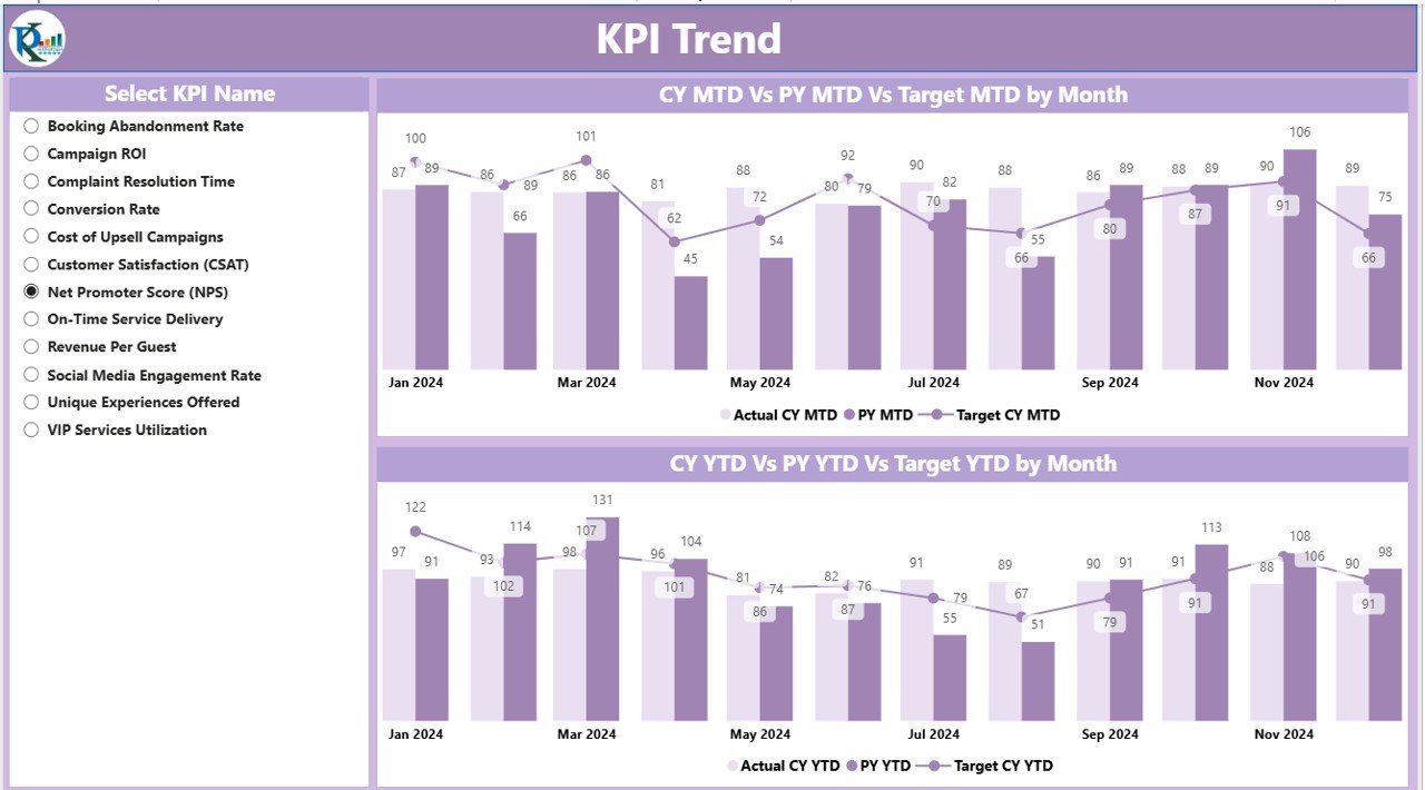
Here, you’ll find two combo charts:
- One for MTD comparison (Actual, Target, PY)
- One for YTD comparison (Actual, Target, PY)
Use the KPI Name Slicer to drill into the performance of individual KPIs.
KPI Definition Page – Understand the Metrics
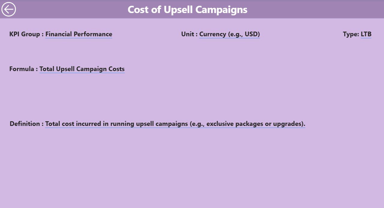
This hidden drill-through page gives details on:
- KPI Formula
- KPI Definition
Just right-click on a KPI in the Summary page and drill through to see its details. To return, click the “Back” button on the top-left.
Data Source: Excel File
Power BI pulls its data from an Excel workbook, which includes three critical sheets:
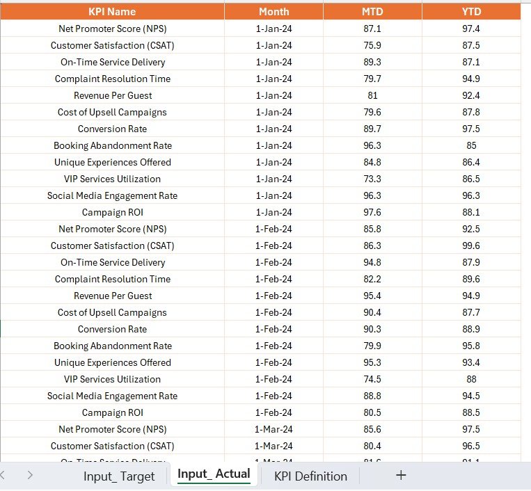
Input Actual Sheet
Enter:
- KPI Name
- First day of the Month (for MTD and YTD)
- MTD and YTD Actual Numbers
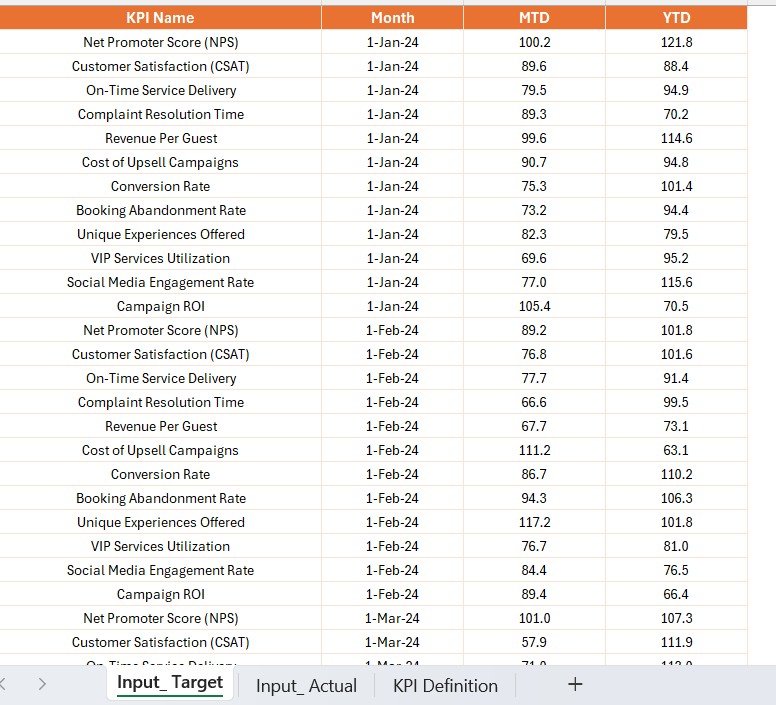
Input Target Sheet
Fill in:
- KPI Name
- Month Start Date
- MTD and YTD Target Numbers
Click to Purchases Luxury Travel KPI Dashboard in Power BI
KPI Definition Sheet
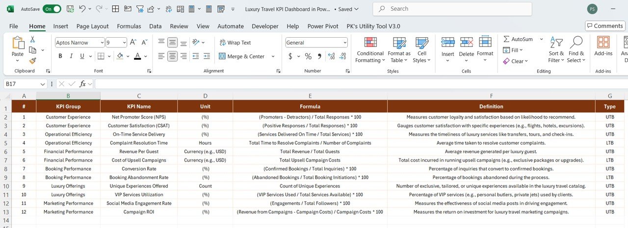
Define:
- KPI Number
- KPI Group
- KPI Name
- Unit of Measurement
- Formula
- Definition
- Type (UTB or LTB)
Advantages of Using a Luxury Travel KPI Dashboard
🔹 Fast Decision-Making: Real-time metrics help eliminate guesswork.
🔹 Visual Insights: Intuitive visuals like trend lines, icons, and KPIs improve clarity.
🔹 Goal Alignment: Easily compare Actuals vs Targets and Previous Year.
🔹 Client Satisfaction Monitoring: Track service-related KPIs for luxury experiences.
🔹 Time-Saving: Excel-based input means minimal training and fast onboarding.
Best Practices for Using the Dashboard
🔄 Update Excel Data Monthly: Keep your actual and target numbers fresh.
🔍 Review KPI Trends Weekly: Spot patterns early to make timely decisions.
🕡 Use Drill-Through Smartly: Don’t just skim KPIs. Understand their meaning.
🕰️ Highlight Red Flags: Address KPIs with declining trends or missed targets.
📆 Align KPIs with Business Goals: Don’t track for the sake of tracking. Focus on impact.
Who Should Use This Dashboard?
🤝 Operations Managers
🤜 Sales Directors
💻 Tech-Savvy Travel Planners
🤞 Compliance & Audit Teams
📈 Strategy Analysts
Whether you manage boutique resorts or global concierge services, this tool fits any luxury travel model.
Conclusion
Luxury travel is about experience, but behind every seamless experience is a well-oiled operational machine. The Luxury Travel KPI Dashboard in Power BI lets you manage that machine with confidence.
Use it to track what matters, make proactive decisions, and stay ahead in a competitive market. It’s not just a dashboard; it’s your control center.
Frequently Asked Questions (FAQs)
1. Can I customize the KPIs shown in the dashboard?
Yes! Just update the KPI Definition sheet in Excel and Power BI will reflect your new structure.
2. Is coding required to use or modify this dashboard?
No, it’s a no-code solution. All updates come from Excel sheets.
3. How often should I update the Excel data?
Ideally, every month—especially before monthly reviews.
4. Can I use this dashboard for other industries?
Absolutely. You can adapt it for any KPI-driven operation with minor changes.
5. Is this dashboard compatible with Power BI Pro?
Yes, it works seamlessly with Power BI Desktop and Power BI Pro.
Click to Purchases Luxury Travel KPI Dashboard in Power BI
Visit our YouTube channel to learn step-by-step video tutorials