Economic development boards handle millions in grant awards, disbursements, private investment commitments, job creation targets, and regional projects. When these numbers live in separate spreadsheets, it becomes difficult to answer simple questions: Are funds being disbursed on time? Which regions are creating the most jobs? Which program areas are producing the highest impact?
The Economic Development Boards Dashboard in Excel solves that reporting problem with a ready-made Excel workbook containing 5 dashboard pages, 5 executive KPI cards, multiple slicers, a structured Data sheet, and a Support sheet powered by pivot tables. It is designed for board reviews, monthly grant reporting, program evaluation, and economic impact analysis. You can download the Economic Development Boards Dashboard in Excel here.
For users new to Excel dashboard refresh workflows, Microsoft explains PivotTables and refresh options in its official PivotTable documentation.
Key Features of Economic Development Boards Dashboard in Excel
- 5 dedicated dashboard pages: Overview, Funding Analysis, Jobs Impact, Regional Analysis, and Program Insights.
- 5 high-level KPI cards: Total Grant Amount, Total Funds Disbursed, Total Jobs Created, Total Projects, and Total Private Investment.
- Multiple slicers: Filter the dashboard by month, board region, sector, program area, funding source, and project status.
- Funding and disbursement tracking: Compare approved grant values with actual disbursed funds across time and funding sources.
- Jobs and private investment analysis: Track job commitments, jobs created, businesses assisted, and private investment by sector and region.
- Refreshable Excel model: Replace sample data in the Data sheet, click Refresh All, and update the dashboard quickly.
Dashboard Pages Explanation
1. Overview Page
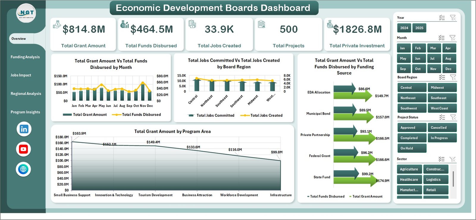
The Overview page is the executive summary for the dashboard. At the top, KPI cards show Total Grant Amount, Total Funds Disbursed, Total Jobs Created, Total Projects, and Total Private Investment. These cards give decision-makers a quick read of funding scale, execution progress, economic activity, and employment impact.
The chart Total Grant Amount Vs Total Funds Disbursed by Month compares awarded funds with actual payout timing. If grant awards are high but disbursements lag, the board can identify months where follow-up is needed.
The chart Total Jobs Committed Vs Total Jobs Created by Board Region compares planned job creation with actual jobs delivered. This helps regional directors understand whether project outcomes are keeping pace with commitments.
The chart Total Grant Amount Vs Total Funds Disbursed by Funding Source shows how different funding sources are converting from approval to disbursement. It is especially useful when multiple federal, state, local, or private funding streams are involved.
The chart Total Grant Amount by Program Area breaks down grant allocation across programs. It helps leadership explain where investment is concentrated and whether funding aligns with strategic priorities.
Economic Development Boards Dashboard in Excel – Overview Page
2. Funding Analysis
The Funding Analysis tab goes deeper into disbursement performance and funding conversion. It includes Disbursement % by Month, which shows whether grant payouts are improving or slowing over time. This is helpful for monthly operations reviews and for explaining delays before they become year-end issues.
Disbursement % by Board Region compares payout execution across regions. If one region receives many awards but has a low disbursement rate, managers can investigate documentation delays, project readiness, or approval bottlenecks.
Total Jobs Committed Vs Total Jobs Created by Sector connects funding activity to employment outcomes by sector. This chart reveals whether manufacturing, technology, retail, tourism, healthcare, or other sectors are converting commitments into actual jobs.
Total Grant Amount Vs Total Private Investment by Sector helps evaluate leverage. A sector with modest grants but high private investment may be producing strong multiplier effects.
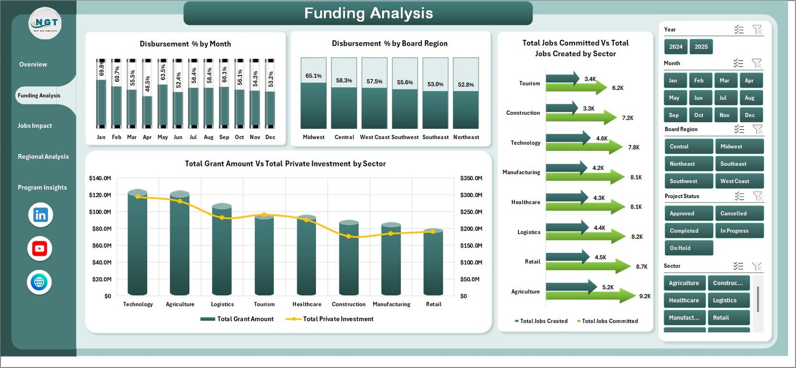
Funding Analysis
3. Jobs Impact
The Jobs Impact tab focuses on employment, business assistance, and investment outcomes. Total Businesses Assisted by Board Region highlights how economic development support is distributed geographically. This is useful when boards need to demonstrate regional fairness and coverage.
Job Achievement % by Program Area compares actual jobs created against committed jobs. Program managers can use this view to identify which programs are achieving targets and which need more implementation support.
Total Grant Amount Vs Total Private Investment by Board Region compares public funding with private capital commitments. It helps show where grants are helping attract outside investment.
Total Jobs Created by Month shows the timing of employment impact. This chart is useful for quarterly reports because it makes job creation trends visible over time.
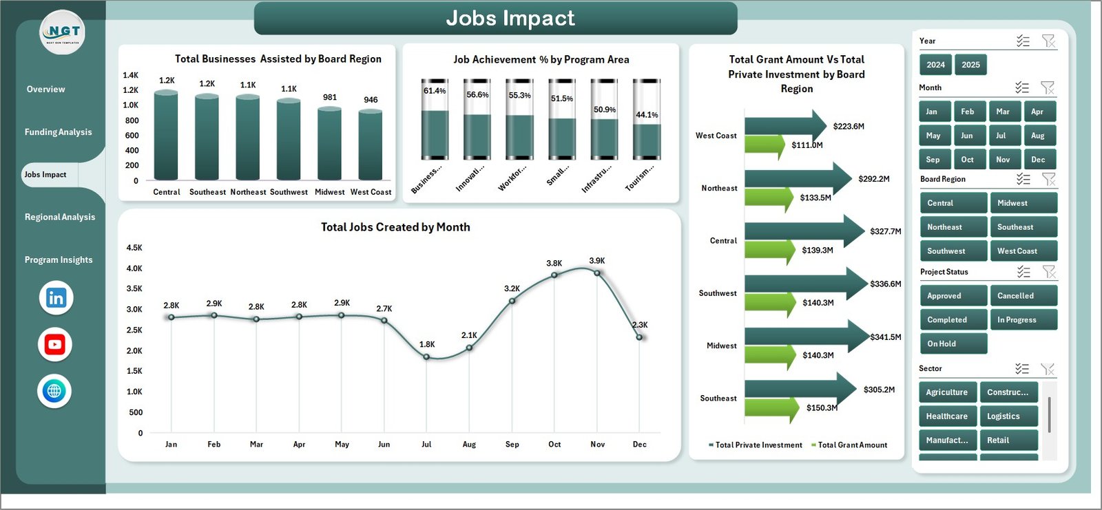
Jobs Impact
4. Regional Analysis
The Regional Analysis page compares performance across board regions. Completion % by Board Region shows project execution quality and helps identify where delays are concentrated.
Total Projects Vs Completed Projects by Board Region gives an operational view of project volume and completion status. Leaders can immediately see which regions have a large open-project workload.
Total Projects Vs Completed Projects by Program Area shows whether specific programs are moving faster or slower than others. This can influence staffing, grant review processes, and partner follow-up.
Avg. Impact Score by Board Region provides a normalized performance measure for comparing outcomes beyond raw project volume.
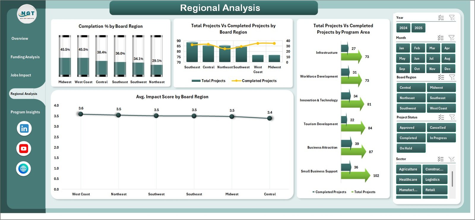
Regional Analysis
5. Program Insights
The Program Insights page reviews program-level performance. Total Jobs Created by Program Area shows which programs are producing the strongest employment outcomes.
Avg. Impact Score by Program Area helps compare program quality and results, not only funding size. This is useful for future budget allocation decisions.
Total Funds Disbursed by Month shows month-by-month funding movement and supports cash-flow or grant-cycle reviews.
Total Projects by Project Status summarizes how many projects are completed, active, pending, or delayed. This chart is ideal for board packets and monthly governance updates.
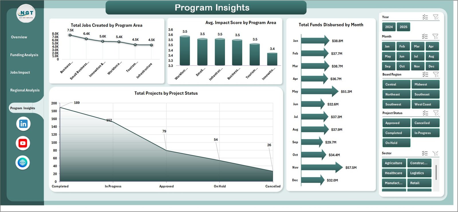
Program Insights
6. Data Sheet Tab
The Data sheet is where users enter or paste the source records. Keep the same column format, replace the sample data with your own program, region, funding, jobs, sector, project, disbursement, and investment records, then refresh the dashboard.
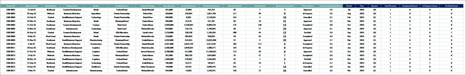
Data Sheet tab
7. Support Sheet
The Support sheet contains the pivot tables used to drive the dashboard dynamically. After updating the Data sheet, go to the Excel Ribbon, open the Data tab, and click Refresh All. All pivot tables and charts refresh together. You can keep this sheet hidden for regular dashboard users.
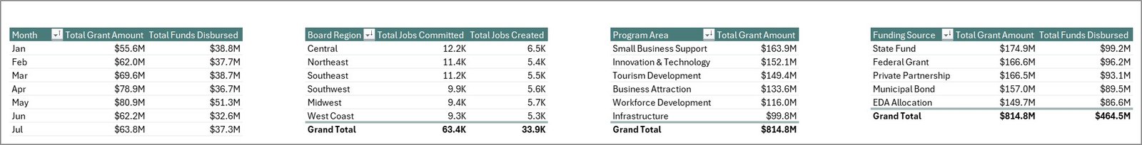
Support sheet tab
Economic Development Boards Dashboard in Excel vs. Google Sheets vs. Paid CRM/SaaS – Feature Comparison
| Feature | Economic Development Boards Dashboard in Excel | Google Sheets Dashboard | Paid Grant Management SaaS |
|---|---|---|---|
| Cost | $17.99 one-time | Low software cost, manual setup | Subscription or implementation fees |
| Platform | Microsoft Excel | Google Sheets | Vendor cloud system |
| Setup time | Under 15 minutes | Several hours to rebuild | Days or weeks |
| Real-time collaboration | Limited unless saved in OneDrive/SharePoint | Strong browser collaboration | Usually strong |
| Customizable fields | Fully editable workbook | Editable but requires rebuild skill | Limited by plan and vendor settings |
| Share with link | Possible via OneDrive or SharePoint | Native link sharing | Native user access |
| Best for | Board reporting, grant analysis, and impact dashboards | Lightweight team tracking | Workflow, approvals, and compliance portals |
| Year-1 cost at 5 users | $17.99 total | Free to low cost plus build time | Hundreds to thousands of dollars |
Who Should Use This Template
- Economic development boards preparing monthly or quarterly reports.
- Grant administrators tracking funds awarded and disbursed.
- Regional development agencies comparing regions, sectors, and program areas.
- Non-profit or public-sector analysts reporting jobs, business assistance, and private investment.
- Consultants who need a fast Excel-based reporting model for clients.
This template is not meant to replace a full grant management platform. It does not include applicant portals, automated approvals, document collection, payment workflows, or role-based enterprise permissions. Its strength is visual reporting and analysis inside Excel.
Real-World Use Cases
Maria, an economic development director, uses the Overview page before every board meeting. Instead of preparing separate charts manually, she updates the Data sheet, clicks Refresh All, and uses the KPI cards to explain total grants, disbursements, jobs created, and private investment.
Dev, a grant program analyst, reviews the Funding Analysis page every month. When disbursement percentage drops in one region, he uses slicers to isolate the funding source and program area causing the delay.
Angela, a policy consultant, uses the Jobs Impact and Regional Analysis pages to prepare client reports. The charts help her compare which sectors and regions are converting public funding into measurable employment and investment outcomes.
Advantages of Economic Development Boards Dashboard in Excel
The main advantage is speed. The workbook already includes the dashboard pages, slicers, pivot tables, and chart structure, so users do not need to build the reporting model from scratch.
The second advantage is ownership. Because the file is an Excel workbook, you can edit the layout, rename fields, change chart colors, add sheets, or extend calculations without depending on a vendor.
The third advantage is affordability. Many grant or program management systems are built for workflows and compliance. If your immediate need is reporting, a one-time Excel dashboard can be a much lighter option.
Opportunities for Improvement
The template works best when the Data sheet is maintained consistently. Users should define clear rules for region names, program areas, project status values, and funding sources before adding live records.
Teams that need multi-user approval workflows, document storage, automatic emails, or applicant portals should pair this dashboard with an operational system. The dashboard can then become the reporting layer for summarized program data.
Best Practices
- Keep field names and column order unchanged in the Data sheet.
- Use consistent region, sector, funding source, and program area names.
- Refresh the workbook after every data update.
- Hide the Support sheet after setup so casual users focus on dashboard pages.
- Review jobs committed vs jobs created every month to catch underperformance early.
- Use slicers during board meetings to answer follow-up questions live.
Explore Relevant Templates
For more Excel reporting tools, browse the Excel Dashboard templates and Excel KPI Dashboard templates on NextGenTemplates.
You may also find the Economic Development Boards KPI Dashboard in Excel useful for KPI-style target tracking, or the Bridge Construction Dashboard in Excel for infrastructure project reporting.
Frequently Asked Questions
What does the Economic Development Boards Dashboard in Excel track?
It tracks grant amounts, funds disbursed, jobs committed, jobs created, total projects, private investment, businesses assisted, completion percentage, project status, impact score, regions, sectors, and program areas.
How do I update the dashboard with my own data?
Replace the sample records in the Data sheet while keeping the same format. Then go to the Excel Data tab and click Refresh All to update pivot tables and dashboard charts.
Can I use this for monthly board reporting?
Yes. The Overview, Funding Analysis, Jobs Impact, Regional Analysis, and Program Insights pages are designed for recurring board packs and management reviews.
Does the workbook include slicers?
Yes. The dashboard includes multiple slicers so users can quickly filter the analysis by dimensions such as month, board region, sector, program area, funding source, and project status.
Can I hide the Support sheet?
Yes. The Support sheet contains pivot tables used by the dashboard and can remain hidden after setup.
Is this better than paid grant management software?
It depends on your need. If you need reporting and visual analysis, this Excel dashboard is faster and cheaper. If you need applicant portals, approvals, compliance workflows, and document management, dedicated software may be better.
About the Author
Built by PK – Microsoft Certified Professional with 15+ years of Excel, Google Sheets, and Power BI experience. Founder of NextGenTemplates, reaching 300K+ subscribers across YouTube channels. Every template is hand-built and tested before release.
Conclusion
The Economic Development Boards Dashboard in Excel gives public-sector and development teams a practical way to monitor funding, disbursements, regional performance, jobs, projects, and private investment. Instead of rebuilding reports every month, users can update the Data sheet, refresh the pivots, and present a clean dashboard to leadership.
Click here to purchase the Economic Development Boards Dashboard in Excel.
Visit our YouTube channel for step-by-step Excel tutorials: Youtube.com/@PKAnExcelExpert