The global coworking industry now hosts over 42,000 flexible workspaces across 170+ countries, yet most operators still rely on scattered spreadsheets and expensive SaaS platforms that cost $149 to $499 per location per month. The Coworking Space Dashboard in Excel offers a practical alternative — a 7-sheet Microsoft Excel template that tracks 5 headline KPIs, 15+ pivot-powered charts, and 7 interactive slicers across revenue, occupancy, membership mix, and member satisfaction.
If you run a coworking space, flex-office, or hybrid workplace and want portfolio-level visibility without signing a multi-year SaaS contract, the Coworking Space Dashboard in Excel gives you investor-grade analytics at a one-time $17.99 price point. This detailed walkthrough explains every page, every chart, and how to make this Excel dashboard the single source of truth for your coworking operations.
Coworking Space Dashboard
📖 Click here to Purchase the Coworking Space Dashboard in Excel
Key Features of Coworking Space Dashboard in Excel
The Coworking Space Dashboard in Excel is built on Excel’s native pivot-table engine, which means every chart, KPI, and slicer refreshes automatically when you replace sample data with your own booking records. Here is what makes it a professional coworking analytics toolkit:
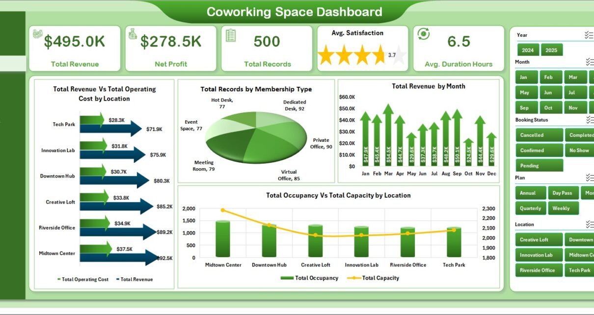
- 5 Headline KPI Cards — Total Revenue, Net Profit, Total Records, Average Satisfaction, and Average Duration Hours shown at the top of the Overview page.
- 15+ Pivot-Powered Charts — Each chart maps a business question: which location is most profitable, which plan drives repeat bookings, which industry pays the most.
- 7 Interactive Slicers — Location, Membership Type, Plan, Industry, Referral Source, Payment Status, and Year. Click any slicer and the whole dashboard refreshes in under 2 seconds.
- 5 Analysis Pages — Overview, Space Utilization, Revenue Analysis, Member Insights, and Trend Analysis.
- Data + Support Sheets — A flat Data Sheet for raw records and a Support Sheet where the pivot tables live.
- Works Offline — No login, no cloud sync, no monthly fees. Runs on Excel for Windows, Excel for Mac, and Excel Online.
Dashboard Pages Explanation
The Coworking Space Dashboard in Excel spans seven sheets. Each is engineered to answer a specific set of operational questions that coworking managers face every month.
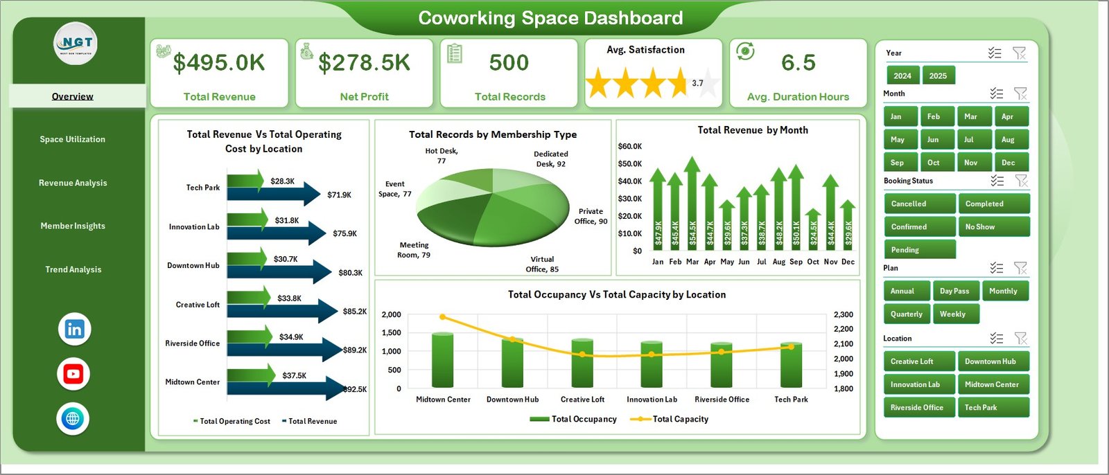
1. Overview Page
The Overview is the command center. At the top you see the 5 KPI cards — Total Revenue, Net Profit, Total Records, Average Satisfaction, and Average Duration Hours. Below the KPIs sit four analytical charts that tell the full story of your coworking portfolio:
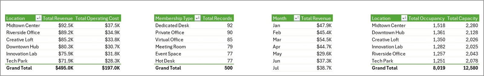
- Total Revenue Vs Total Operating Cost by Location — A side-by-side comparison that instantly reveals which branch is eating into margin and which is subsidizing the others.
- Total Records by Membership Type — Breaks down the membership mix across Hot Desk, Dedicated Desk, Private Office, and Virtual Office members.
- Total Revenue by Month — A 12-month seasonality view that surfaces your strongest and weakest revenue months.
- Total Occupancy Vs Total Capacity by Location — The classic utilization gap chart, showing how much unused inventory sits in each location.
Seven slicers on the right side filter every visual at once, so you can move from a portfolio view to a single-location view in a single click.
Coworking Space Dashboard
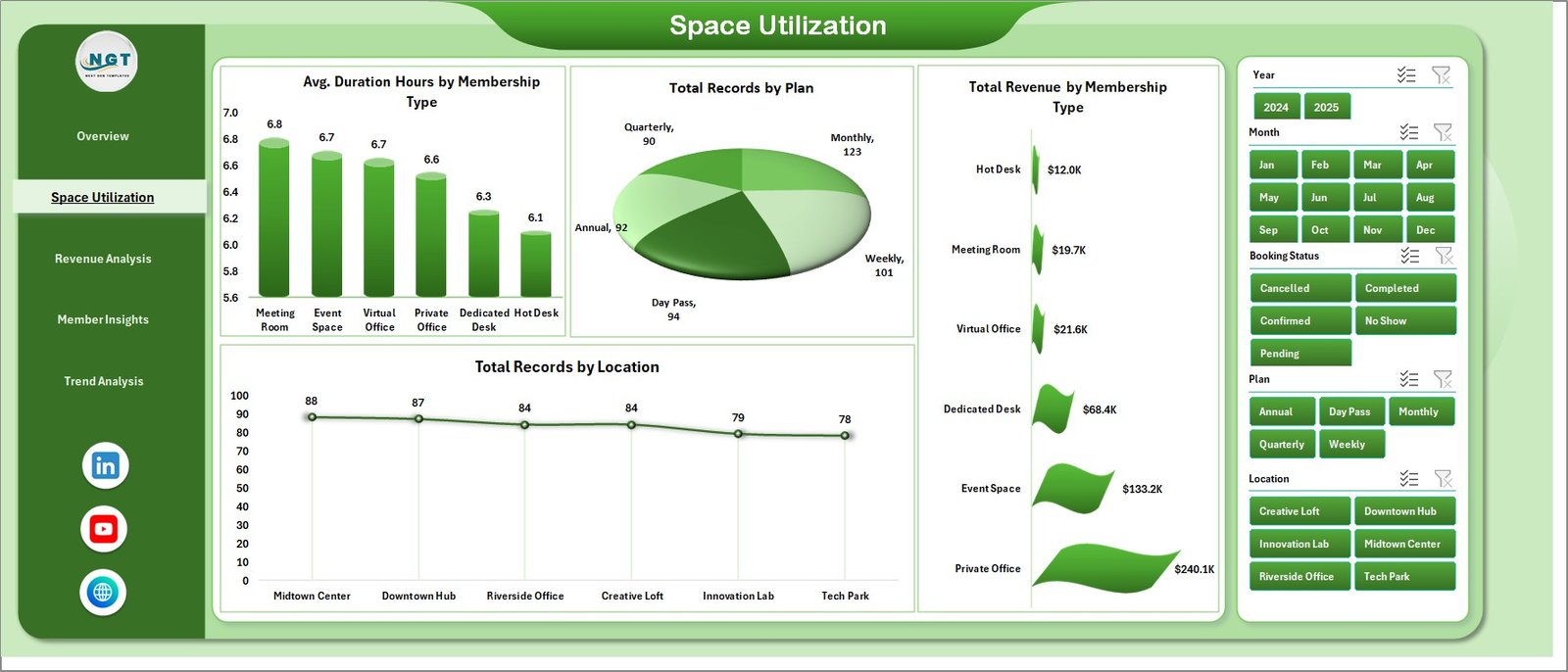
2. Space Utilization Page
This page answers the question every coworking operator obsesses over: are we using our space efficiently? It contains four analysis charts:
- Avg. Duration Hours by Membership Type — Private Office members typically stay the longest; Hot Desk users turn over fastest.
- Total Records by Plan — Compare Monthly, Daily, and Hourly plan volume to see which commitment level drives most of your bookings.
- Total Revenue by Membership Type — Lets you isolate where revenue actually comes from, regardless of booking count.
- Total Records by Location — Which branch is busiest? Which is struggling?
Space Utilization
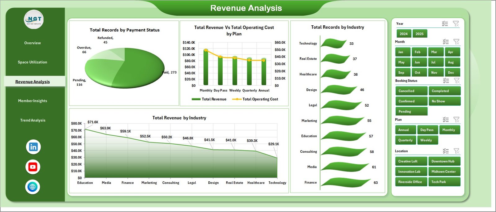
3. Revenue Analysis Page
This page zooms into monetization and collection health. The four charts here are:
- Total Records by Payment Status — Paid, Pending, Overdue buckets so you can spot collection gaps early.
- Total Revenue Vs Total Operating Cost by Plan — Exposes which plan is actually profitable once operating costs are factored in.
- Total Records by Industry — See which verticals (tech, agencies, freelancers, finance) book the most.
- Total Revenue by Industry — Some industries book rarely but pay more per booking. This chart tells you which.
Revenue Analysis
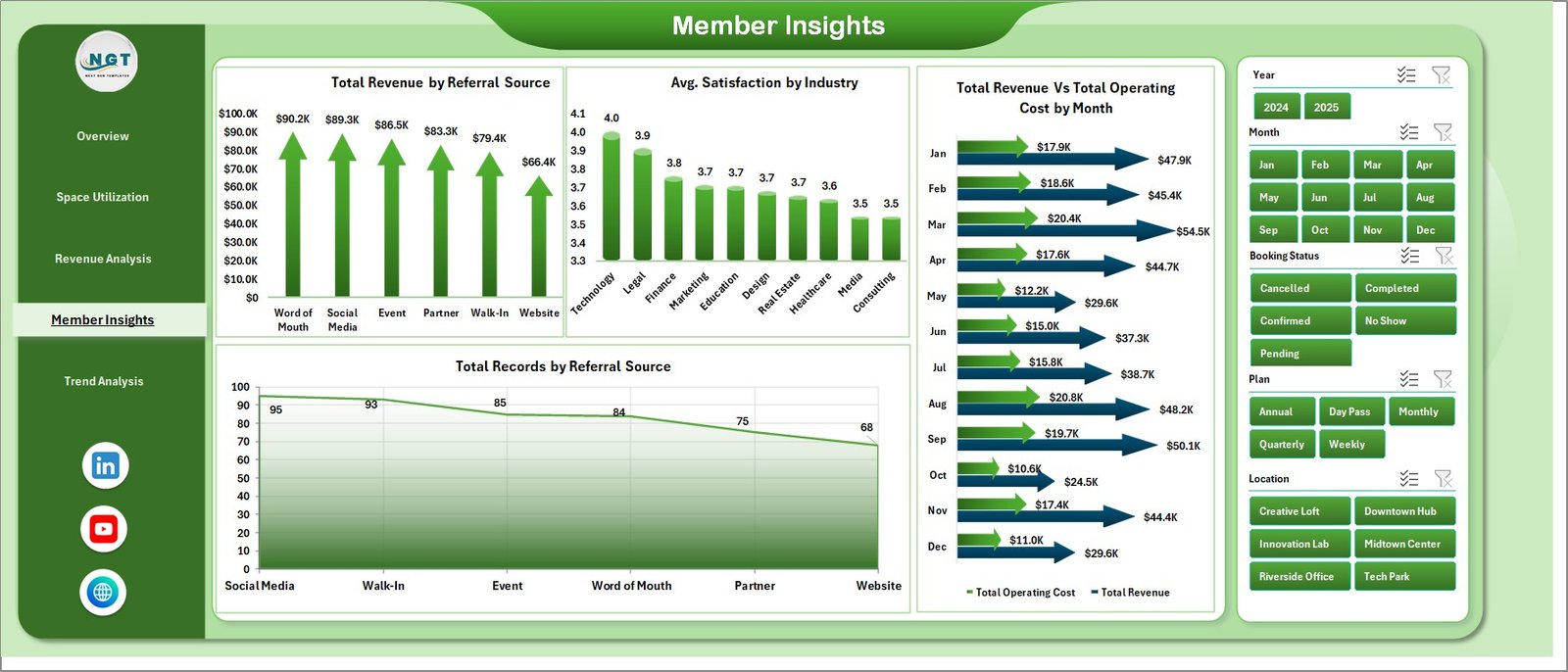
4. Member Insights Page
Member Insights focuses on acquisition quality and satisfaction. The four charts are:
- Total Revenue by Referral Source — Identifies which acquisition channel actually pays back: Instagram, LinkedIn, Google, walk-ins, partner referrals.
- Avg. Satisfaction by Industry — Reveals which industry verticals are happiest inside your space, and which are flight risks.
- Total Revenue Vs Total Operating Cost by Month — Monthly profitability trend line.
- Total Records by Referral Source — Volume from each channel, complementing the revenue-by-source chart.
Member Insights
5. Trend Analysis Page
The Trend Analysis page is where you zoom out for budgeting, forecasting, and investor reporting. Three charts anchor this page:
- Total Revenue Vs Total Discount by Year — Shows how much of your top-line is being given away through discounts year over year.
- Total Records by Year — Your multi-year growth trajectory at a glance.
- Total Records by Month — Seasonal booking curve, essential for forecasting staff and utility spend.
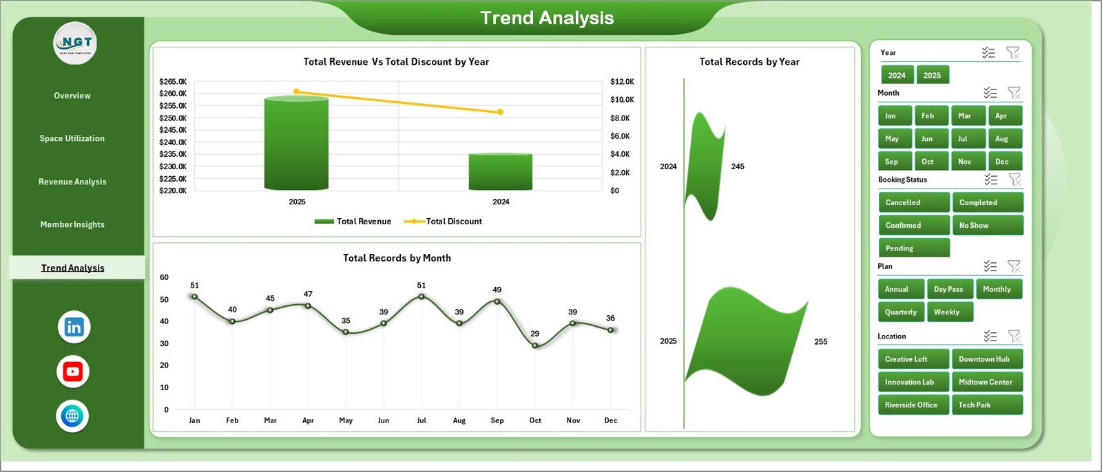
Trend Analysis
6. Data Sheet
This is the foundation of the dashboard. Replace the sample booking records with your own data, keeping the column format exactly as provided: Date, Location, Member, Membership Type, Plan, Industry, Referral Source, Payment Status, Duration Hours, Revenue, Operating Cost, Discount, Satisfaction, Capacity. The dashboard is designed to scale from 100 rows up to tens of thousands.
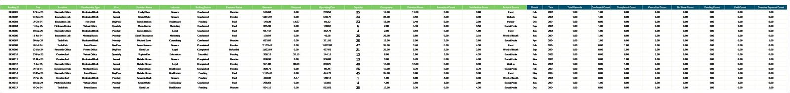
Data Sheet tab
7. Support Sheet
The Support Sheet holds every pivot table that feeds the charts and KPIs. After updating the Data Sheet, go to the Data tab in the Excel ribbon and click Refresh All. Every pivot, slicer, chart, and KPI updates in one action. You can safely hide this sheet from end users.
Support sheet tab
Coworking Space Dashboard in Excel vs. Google Sheets Equivalent vs. Paid Coworking SaaS — Feature Comparison
| Feature | Coworking Space Dashboard in Excel | Google Sheets Equivalent | OfficeRnD / Nexudus / Cobot |
|---|---|---|---|
| Cost | $17.99 one-time | $6.99 one-time | $149–$499 / location / month |
| Platform | Microsoft Excel | Google Sheets (browser) | Cloud SaaS |
| Setup time | 10 minutes | 15 minutes | 2–6 weeks onboarding |
| Works offline | ✅ Yes | ❌ Browser only | ❌ Cloud only |
| Real-time team collaboration | ✅ OneDrive / SharePoint | ✅ Native | ✅ Native |
| Customizable charts & KPIs | ✅ Unlimited | ✅ Unlimited | ⚠️ Vendor-defined |
| Your data stays with you | ✅ Fully local | ⚠️ Google servers | ❌ Vendor servers |
| Year-1 cost at 3 locations | $17.99 | $6.99 | $5,364–$17,964 |
For coworking operators that want portfolio-level visibility without paying $5K–$18K a year for SaaS, the Coworking Space Dashboard in Excel sits in the sweet spot.
Who Should Use This Template
Perfect for:
- Coworking space founders and owner-operators running 1–10 locations
- Flexible workspace managers tracking occupancy, revenue, and member satisfaction
- Hospitality and real-estate investors analyzing coworking portfolio performance
- Business center and serviced-office managers replacing manual monthly reports
- Consultants and analysts preparing coworking investor decks or quarterly reviews
Not a fit if:
- You run a 50+ location enterprise chain needing SSO, SOC 2 compliance, or real-time API feeds
- You need live door-access integration or WiFi-based presence tracking
- You prefer mobile-first, app-native booking and billing tools
Real-World Use Cases
Priya operates three coworking hubs in Bangalore, Mumbai, and Pune. Before using the Coworking Space Dashboard in Excel, her operations team was exporting CSVs from three separate booking tools every month and manually stitching them together. Now she opens the Excel file on the first of every month, refreshes the pivots, and has a 5-page PDF ready for her investors by lunch — without paying ₹12,000 per location per month for OfficeRnD.
Marcus runs a 40-desk boutique coworking space in Berlin. He uses the Member Insights page to track which referral source — Instagram ads, LinkedIn, or walk-ins — delivers the highest-paying members. Within two quarters he shifted his marketing budget entirely toward the top-performing channel, cutting acquisition cost per member by 34%.
Lena is a real-estate asset manager overseeing a mixed-use building in London. She uses the Trend Analysis page to present year-over-year revenue and discount impact to the building owner, replacing a $299/month dashboard tool she was using before. The Coworking Space Dashboard in Excel paid for itself in the first 20 minutes of use.
Advantages of Coworking Space Dashboard in Excel
- Cost Savings — Save $5,364–$17,964 per year at 3 locations versus OfficeRnD or Nexudus subscriptions.
- Time Savings — Replace 4–6 hours of manual monthly reporting with a single click.
- Investor-Ready Output — Every page is print- and PDF-friendly for board decks and LP updates.
- Full Data Ownership — Your booking and financial data never leaves your laptop.
- Customization Freedom — Add new columns, new pivots, new charts without needing a vendor’s permission.
Opportunities for Improvement
In the spirit of balanced reporting, the Coworking Space Dashboard in Excel has some honest limitations:
- It does not pull data automatically from booking platforms like OfficeRnD, Nexudus, or Cobot — you have to export and paste.
- There is no mobile-native view; the dashboard is designed for desktop Excel.
- It does not include member-level CRM features like email workflows or lead scoring.
- For teams over 50 people needing SSO and audit logs, an enterprise SaaS will still be a better fit.
These are deliberate trade-offs: the dashboard focuses on what Excel does best — fast pivot-driven analytics — and leaves CRM and booking automation to specialized tools.
Best Practices
- Refresh monthly, at minimum. Set a calendar reminder on the first business day of each month to update the Data Sheet and refresh pivots.
- Keep column formats consistent. The pivot tables rely on exact column headers — do not rename them mid-use.
- Archive old data annually. Move records older than 3 years into a separate archive file to keep the working file fast.
- Use slicers, not filters. Slicers refresh every chart simultaneously; column filters only refresh one pivot.
- Export to PDF before presenting. A frozen PDF prevents accidental edits during stakeholder reviews.
Explore Relevant Templates
- Co-working Space KPI Dashboard in Excel — The MTD/YTD KPI scorecard version of this dashboard for operators who want target vs actual tracking with visual indicators.
- Space Utilization Dashboard in Google Sheets — Google Sheets alternative for teams fully on Google Workspace.
- Office Space Utilization Report in Excel — For corporate offices tracking meeting room and desk occupancy rather than coworking operations.
- Virtual Office Services KPI Dashboard in Power BI — Power BI version for virtual office and serviced-office providers.
- Property Management Dashboard in Excel — For landlords managing multi-tenant commercial properties.
Frequently Asked Questions
What KPIs does the Coworking Space Dashboard in Excel track?
The Coworking Space Dashboard in Excel tracks 5 headline KPIs on the Overview page — Total Revenue, Net Profit, Total Records, Average Satisfaction, and Average Duration Hours — plus 15+ supporting charts across Space Utilization, Revenue Analysis, Member Insights, and Trend Analysis pages. Every metric updates instantly when you refresh pivot tables.
How long does setup take?
Setup takes about 10 minutes for most coworking operators. Download the file, paste your booking data into the Data Sheet in the same column format, and click Data → Refresh All in the Excel ribbon. Every chart and KPI in the Coworking Space Dashboard in Excel updates instantly.
How does the Coworking Space Dashboard in Excel compare to OfficeRnD or Nexudus?
The Coworking Space Dashboard in Excel is a $17.99 one-time purchase, while OfficeRnD and Nexudus charge $149–$499 per location per month. For 3 locations, the Excel template saves you $5,364–$17,964 in year one. The trade-off is no real-time door access, no automated invoicing, and no API integrations.
Can I track multiple coworking locations in this dashboard?
Yes. The Location slicer on every page lets you filter the Coworking Space Dashboard in Excel from portfolio-wide totals down to a single location, and the Revenue vs Operating Cost by Location chart exposes which branch is dragging margin across all 1–10 locations you manage.
Do I need to know Excel formulas or VBA to use this?
No. The Coworking Space Dashboard in Excel is pivot-driven, not formula-driven. You only need to know how to paste data and click Data → Refresh All. If you can use basic Excel, you can run this dashboard without any macro, formula, or VBA knowledge.
Will this template work in Excel for Mac or Excel Online?
Yes. The Coworking Space Dashboard in Excel runs on Excel for Windows, Excel for Mac, and Excel Online (Microsoft 365). Pivot tables and slicers are supported on all three. Excel desktop delivers the smoothest slicer experience, especially on larger datasets.
Can I customize the charts and add my own KPIs?
Absolutely. Since the Coworking Space Dashboard in Excel uses standard Excel pivot tables, you can add columns to the Data Sheet, create new pivots on the Support Sheet, and insert new charts on any analysis page without touching code or scripts.
About the Author
Built by PK — Microsoft Certified Professional with 15+ years of Excel, Google Sheets, and Power BI experience. Founder of NextGenTemplates, reaching 300K+ subscribers across YouTube channels. Every template is hand-built and tested before release.
Conclusion
The Coworking Space Dashboard in Excel gives coworking operators the same visibility that expensive SaaS platforms offer — without the subscription, without the vendor lock-in, and without waiting weeks for onboarding. For $17.99, you get 5 KPIs, 15+ charts, 7 slicers, and a refresh-all workflow that compresses hours of monthly reporting into a single click.
👉 Click here to Purchase the Coworking Space Dashboard in Excel
✅ Instant download · One-time payment · No subscription
📅 Last updated: April 2026
Visit our YouTube channel for step-by-step video tutorials — Youtube.com/@PK-AnExcelExpert