Wealth management teams handle large amounts of financial data every day. They track investments, clients, portfolios, and monthly trends to make better decisions. Because the financial world changes quickly, analysts need reports that update in real time and show clear insights. A Wealth Management Dashboard in Power BI helps them achieve this with ease. It brings all key metrics into one place so users can understand performance without confusion.
In this complete guide, you will learn everything about the Wealth Management Dashboard in Power BI. You will discover how it works, why it matters, what key features it includes, and how professionals can use it to monitor investments. You will also explore its advantages, best practices, and answers to common questions.
Click to Purchases Wealth Management Dashboard in Power BI
What Is a Wealth Management Dashboard in Power BI?
A Wealth Management Dashboard in Power BI is a visual reporting tool that tracks client portfolios, investment performance, risk levels, AUM trends, diversification scores, and monthly contributions. It helps wealth managers and financial advisors understand where money flows, how portfolios grow, and which areas need improvement.
Power BI connects to Excel, databases, or online financial sources, and it updates the visuals instantly. You can filter your data, compare performance across segments, and analyze results in a clean and interactive format. Because of this flexibility, the dashboard becomes a powerful asset for investment teams.
Why Do Wealth Management Teams Need a Power BI Dashboard?
The wealth management industry deals with rapidly changing markets. Every client portfolio needs regular monitoring, and every investment decision depends on data. A Power BI dashboard makes this process faster, simpler, and more accurate.
Wealth managers use Power BI dashboards because they:
-
Make data easy to understand
-
Reduce manual work
-
Improve decision-making
-
Highlight risk areas quickly
-
Show trends clearly
-
Allow smooth client reporting
Therefore, teams handle operations smoothly and track every important metric without delay.
Key Features of a Wealth Management Dashboard in Power BI
Our Wealth Management Dashboard in Power BI includes five powerful pages, each designed to offer deep insights. These pages help users explore performance from different angles. You can check portfolios, advisors, investment types, and monthly trends in just a few clicks.
Below are the detailed features of each page.
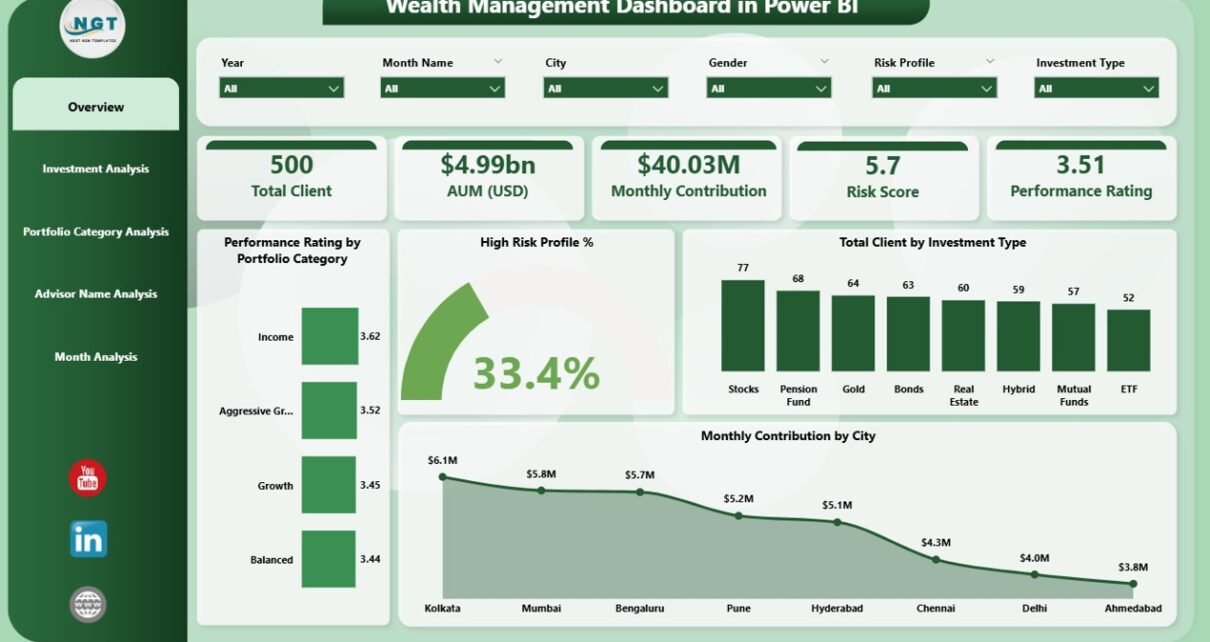
1. Overview Page – What Does It Show?

The Overview Page is the main page of the dashboard. It gives a quick summary of all major insights. Because this page works like a snapshot, users understand their overall financial health within seconds.
This page includes:
✔ 4 Key Cards
These cards show important metrics such as:
-
Total Clients
-
High-Risk Profile %
-
Monthly Contribution
-
AUM (USD)
These cards offer instant updates and let users judge current performance quickly.
✔ 4 Detailed Charts
The charts on this page provide a structured understanding of your data:
-
Performance Rating by Portfolio Category
-
High Risk Profile %
-
Total Clients by Investment Type
-
Monthly Contribution by City
These charts help users compare performance across categories. They also show which regions, investment types, or portfolios perform better.
2. Investment Analysis Page – What Insights Does It Provide?

The second page focuses only on investments. Because investment trends shape financial decisions, this page plays an important role in planning and forecasting.
This section includes:
✔ Performance Rating by Investment Type
Click to Purchases Wealth Management Dashboard in Power BI
This chart shows how each investment option performs. You can track which investment type offers the highest returns.
✔ AUM (USD) by Investment Type
Track total assets under management across investment types. This helps identify which categories attract the most capital.
✔ Monthly Contribution by Investment Type
This chart reveals how investment flow changes month after month. It shows growing and declining segments clearly.
This page helps wealth managers guide clients toward better investment choices.
3. Portfolio Category Analysis Page – Why Is It Important?

The third page focuses on portfolio categories. Since every portfolio has a different risk and return structure, this page offers clarity from multiple angles.
This section includes three important charts:
✔ Total Clients by Portfolio Category
Users can see how many clients fall under each portfolio type.
✔ High-Risk Profile % by Portfolio Category
This chart helps identify which categories carry the most risk.
✔ Monthly Contribution by Portfolio Category
Users learn how each portfolio contributes to overall investments every month.
This page improves portfolio planning and helps managers balance risk and growth.
4. Advisor Name Analysis Page – How Does It Help Teams?

The fourth page highlights performance at the advisor level. Because advisors manage client relationships and portfolios, their performance matters in wealth management.
This page includes:
✔ Diversification Score by Advisor Name
You can track how well advisors diversify client portfolios.
✔ AUM (USD) by Advisor Name
This chart shows how much capital each advisor manages.
✔ Monthly Contribution by Advisor Name
You can check which advisors bring more contributions and maintain stronger client engagement.
This page supports performance reviews and incentive planning.
5. Monthly Trends Page – Why Are Monthly Trends Important?

The fifth and final page shows month-wise changes. Tracking trends every month helps teams make future plans with accuracy.
This page includes:
-
High Risk Profile % by Month
-
AUM (USD) by Month
-
Monthly Contribution by Month
These charts help identify growth patterns, seasonal behavior, and market mood. Therefore, monthly insights support better forecasting.
What Are the Advantages of a Wealth Management Dashboard in Power BI?
A wealth management dashboard offers several advantages. Because it organizes complex financial data into simple visuals, users work efficiently and make faster decisions.
✔ 1. Real-Time Insights
Power BI updates visuals instantly, so users stay ahead of market movements.
✔ 2. Better Client Management
You can monitor client distribution, risk profiles, and investment behavior easily.
✔ 3. Stronger Portfolio Decisions
The dashboard shows performance across categories, making portfolio allocation easier.
✔ 4. Deep Investment Analysis
Users compare investment types, returns, contributions, and AUM trends easily.
✔ 5. Advisor-Level Insights
It highlights productivity, diversification scores, and contribution performance.
✔ 6. Improved Reporting
Teams save time because Power BI creates automated, error-free reports.
✔ 7. Easy Customization
You can add KPIs, filters, slicers, and charts as needed without difficulty.
✔ 8. Accurate Forecasting
Monthly trends help managers plan future strategies with more confidence.
✔ 9. User-Friendly Interface
The dashboard layout remains simple and clean, so even non-technical users navigate easily.
How Does a Wealth Management Dashboard Improve Decision-Making?
A dashboard improves decision-making in many ways:
-
It simplifies portfolio comparison
-
It highlights weak areas quickly
-
It helps identify profitable investment types
-
It supports risk control
-
It improves advisor performance tracking
Because of all these abilities, wealth managers handle clients and portfolios more effectively.
Best Practices for Using a Wealth Management Dashboard in Power BI
Below are the best practices that help users get maximum value from the dashboard:
✔ 1. Maintain Clean and Updated Data
Always keep your Excel or database clean. Remove duplicates and add correct entries.
✔ 2. Group KPIs Properly
Organize KPIs under themes like investment, advisor, risk, and performance.
✔ 3. Use Clear Visuals
Pick charts that clearly explain the data. Avoid cluttered visuals.
✔ 4. Use Filters and Slicers
Monthly slicers, client filters, advisor filters, and category filters help users analyze with speed.
✔ 5. Compare Trends Regularly
Use month-wise and year-wise comparisons to understand long-term behavior.
✔ 6. Track Risk Indicators Frequently
Monitor high-risk profiles every week to protect client portfolios.
✔ 7. Update Targets and Benchmarks
Keep your performance targets realistic and adjust them based on market conditions.
✔ 8. Share Dashboard With Teams
Use Power BI sharing so teams can collaborate and view insights together.
✔ 9. Check Advisor Performance Monthly
Track advisor growth, contribution, and AUM monthly to reward high performers.
Conclusion
A Wealth Management Dashboard in Power BI helps investment teams understand financial performance with clarity. It simplifies decision-making, improves client management, and highlights important insights across portfolios, investment types, and monthly trends. Because the dashboard updates automatically, wealth managers work smarter and faster. With strong visuals, advisor insights, and trend analysis, this dashboard becomes one of the most powerful tools for financial teams.
Frequently Asked Questions (FAQs)
1. What is a Wealth Management Dashboard?
It is a visual report that tracks investment trends, client portfolios, AUM, and performance metrics.
2. Who uses a Wealth Management Dashboard?
Financial advisors, wealth managers, analysts, and client relationship teams use it.
3. Can I connect Excel data to Power BI?
Yes, you can update Excel files and Power BI refreshes instantly.
4. Why is trend analysis important?
Trends help teams plan future strategies and understand financial behavior.
5. Can I customize this dashboard?
Yes, Power BI offers full customization options for charts, KPIs, and filters.
6. Is this dashboard suitable for small firms?
Yes, even small firms use Power BI dashboards for better financial insights.
Visit our YouTube channel to learn step-by-step video tutorials