4D printing is changing how industries design, produce, and use materials. Unlike traditional manufacturing, 4D printing introduces time-based transformation, smart materials, and adaptive behavior. However, innovation alone never guarantees success. Organizations still need visibility, control, and performance measurement. That is exactly where a 4D Printing KPI Dashboard becomes essential.4D Printing KPI Dashboard in Power BI .
A 4D Printing KPI Dashboard helps organizations track progress, compare performance against targets, and improve decision-making. Instead of managing scattered Excel files or manual reports, teams gain a single, interactive view of their key metrics. As a result, leaders stay informed, proactive, and confident.
In this detailed guide, you will learn what a 4D Printing KPI Dashboard is, how it works, why it matters, its structure, advantages, best practices, and answers to the most common questions.
Click to buy 4D Printing KPI Dashboard in Power BI
What Is a 4D Printing KPI Dashboard?
A 4D Printing KPI Dashboard is a centralized analytics and reporting solution designed to track, analyze, and visualize key performance indicators related to 4D printing operations.
Instead of reviewing raw data, users see clear visuals, trends, and comparisons. Because the dashboard uses Power BI with Excel as the data source, it remains flexible and easy to maintain. Moreover, teams can update data monthly and instantly refresh insights.
Most importantly, the dashboard focuses on both Month-to-Date (MTD) and Year-to-Date (YTD) performance. Therefore, organizations can monitor short-term execution and long-term progress at the same time.
Why Do Organizations Need a 4D Printing KPI Dashboard?
4D printing involves complex processes, advanced materials, and high investment costs. Without proper tracking, performance gaps remain hidden. Consequently, delays, inefficiencies, and budget overruns increase.
A 4D Printing KPI Dashboard solves these challenges because it:
- Centralizes all KPIs in one place
- Compares actual performance with targets
- Highlights improvement areas instantly
- Supports data-driven decisions
- Saves time on manual reporting
As a result, leaders gain clarity instead of confusion.
How Does a 4D Printing KPI Dashboard Work?
The dashboard works by connecting Power BI to structured Excel input files. Users update monthly data, refresh the report, and instantly view updated results.
Because the logic follows standardized formulas, results remain consistent. Furthermore, slicers allow users to filter data by month and KPI group. Therefore, analysis becomes fast and interactive.
What Are the Key Pages of the 4D Printing KPI Dashboard?
The 4D Printing KPI Dashboard includes three main pages in the Power BI Desktop file. Each page serves a clear purpose and supports better analysis.
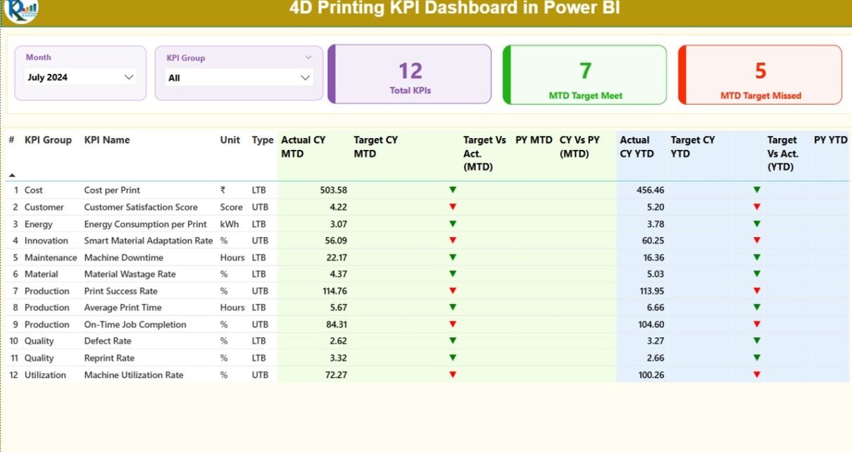
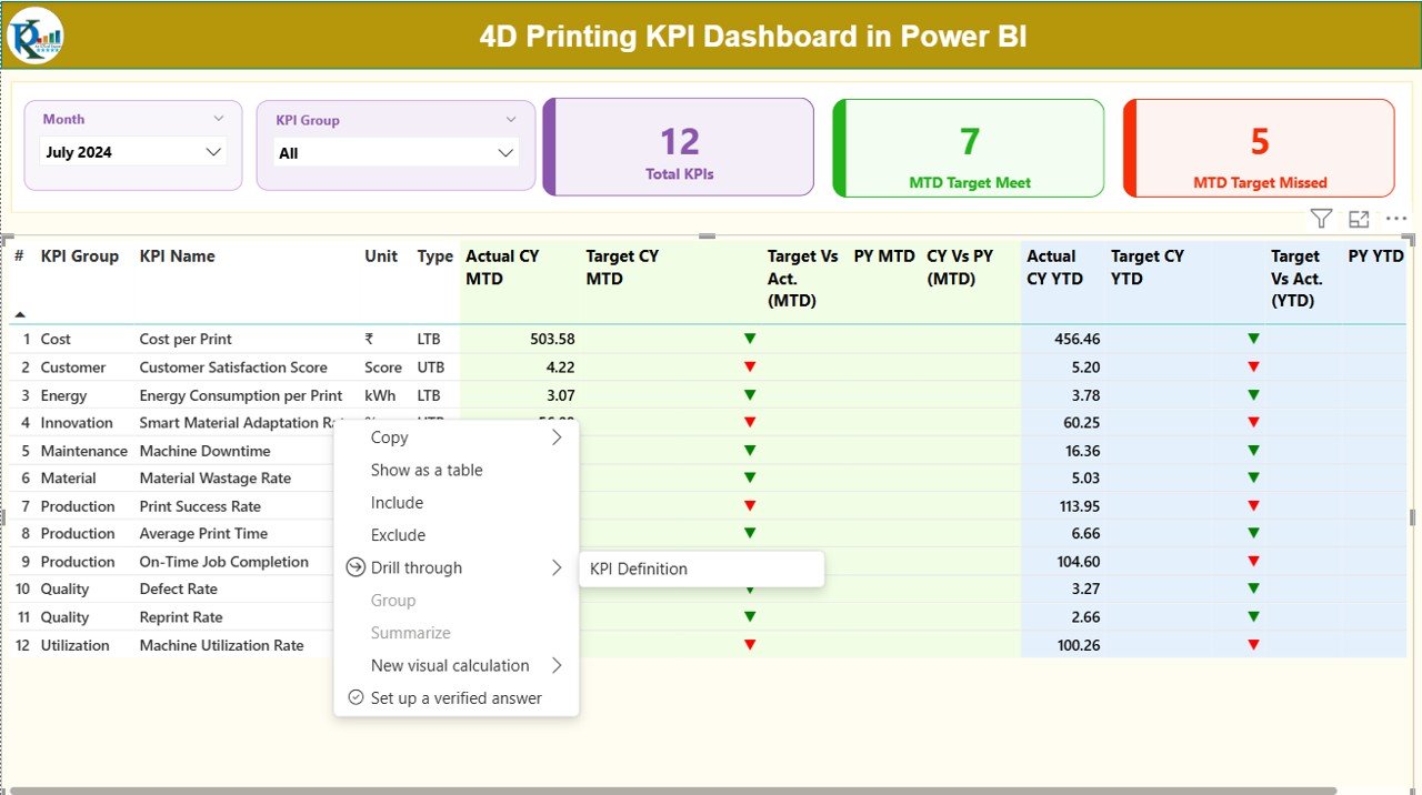
Summary Page
The Summary Page acts as the main control center of the dashboard. It provides a complete snapshot of performance at a glance.
Key Elements of the Summary Page
- Month Slicer: Allows users to select a specific month
- KPI Group Slicer: Filters KPIs by category
- Performance Cards:
Total KPIs Count
MTD Target Met Count
MTD Target Missed Count
These cards immediately show overall health. As a result, users know where they stand before diving deeper.
Detailed KPI Table on the Summary Page
The detailed table displays each KPI with comprehensive metrics:
- KPI Number: Sequential identifier
- KPI Group: Category of the KPI
- KPI Name: Name of the metric
- Unit: Measurement unit
- Type: LTB (Lower the Better) or UTB (Upper the Better)
MTD Performance Metrics
- Actual CY MTD: Current year actual MTD value
- Target CY MTD: Current year target MTD value
MTD Icon:
▲ Green for target met
▼ Red for target missed
Target vs Actual (MTD):
Formula: Actual / Target
PY MTD: Previous year MTD value
CY vs PY (MTD):
Formula: CY MTD / PY MTD
YTD Performance Metrics
- Actual CY YTD: Current year actual YTD value
- Target CY YTD: Current year target YTD value
- YTD Icon: Visual status indicator
Target vs Actual (YTD):
Formula: Actual / Target
PY YTD: Previous year YTD value
CY vs PY (YTD):
Formula: CY YTD / PY YTD
Because of this structured layout, users can compare performance across time periods effortlessly.
Click to buy 4D Printing KPI Dashboard in Power BI
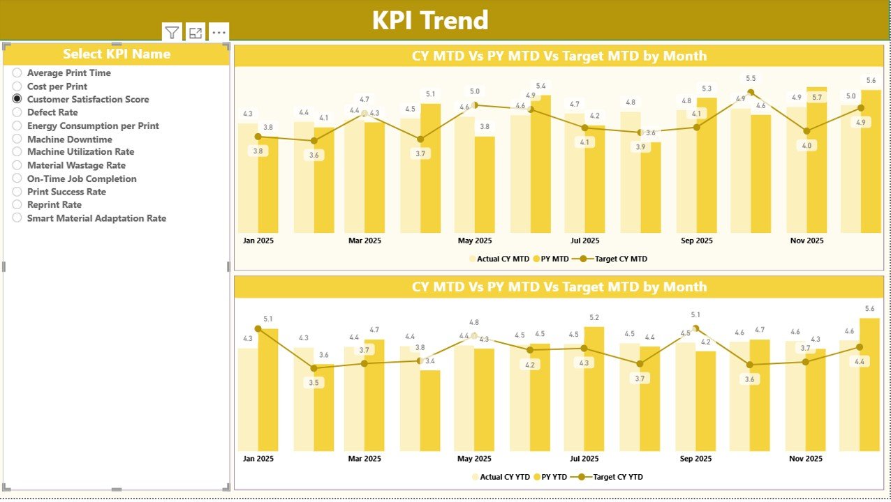
KPI Trend Page
The KPI Trend Page focuses on historical analysis. While the summary page shows current performance, the trend page reveals patterns over time.
Features of the KPI Trend Page
- Two Combo Charts:
MTD Actual vs Target vs Previous Year
YTD Actual vs Target vs Previous Year
KPI Name Slicer on the left
Users select a KPI and instantly see how it performs month after month. Therefore, trend analysis becomes simple and visual.
Click to buy 4D Printing KPI Dashboard in Power BI
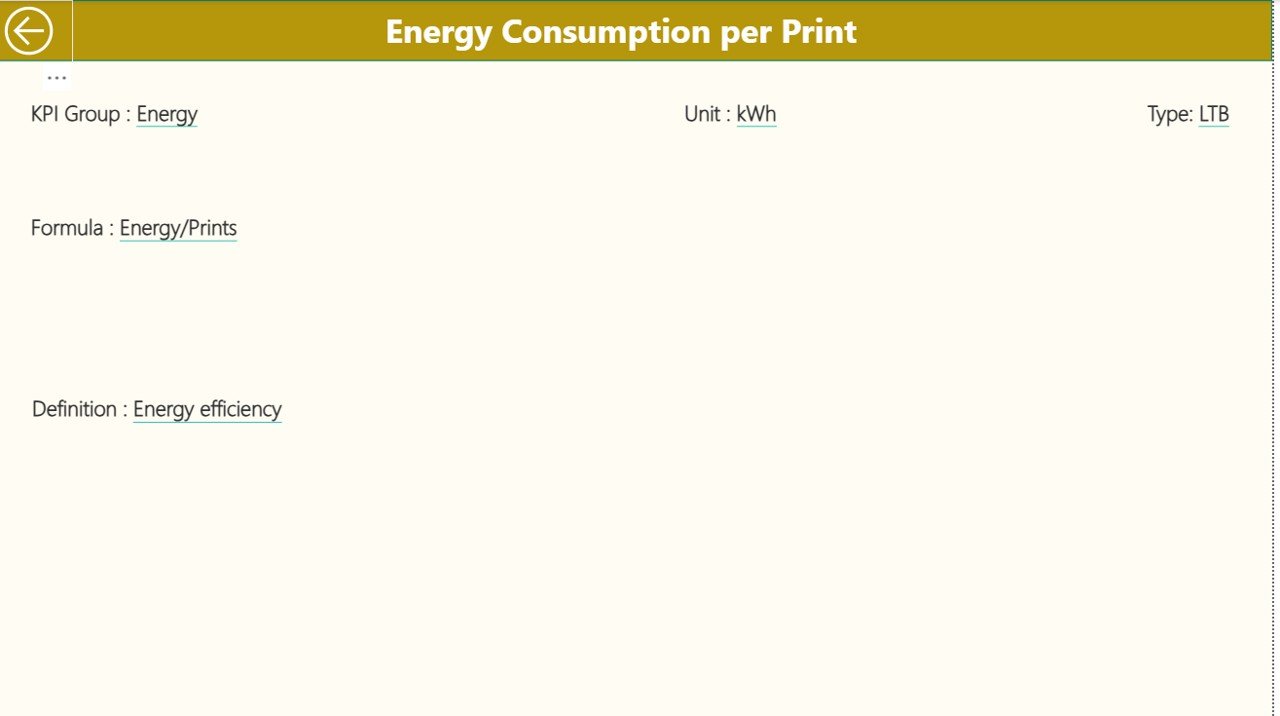
KPI Definition Page
The KPI Definition Page acts as a reference and governance layer. Although hidden by default, users can access it through drill-through from the summary page.
What Information Does the KPI Definition Page Show?
- KPI Formula
- KPI Definition
- KPI Purpose
- KPI Type (LTB or UTB)
Because this page standardizes definitions, it avoids confusion and misinterpretation. Teams always work with the same understanding.
Click to buy 4D Printing KPI Dashboard in Power BI
How Does Excel Support the 4D Printing KPI Dashboard?
Excel serves as the data backbone of the dashboard. Users only need to update three structured worksheets.
Input_Actual Sheet
In this sheet, users enter actual performance values.
Required Columns
- KPI Name
- Month (use first date of the month)
- MTD Value
- YTD Value
Because data entry remains simple, errors reduce significantly.
Click to buy 4D Printing KPI Dashboard in Power BI
Input_Target Sheet
This sheet captures target values.
Required Columns
- KPI Name
- Month (use first date of the month)
- MTD Target
- YTD Target
Targets drive performance evaluation. Therefore, accurate data here is critical.
KPI Definition Sheet
This sheet stores KPI metadata.
Required Columns
- KPI Number
- KPI Group
- KPI Name
- Unit
- Formula
- Definition
- Type (LTB or UTB)
This structure ensures consistency across reporting cycles.
Advantages of the 4D Printing KPI Dashboard
A 4D Printing KPI Dashboard delivers measurable value across teams and leadership.
- Centralized Performance Visibility
All KPIs live in one dashboard. As a result, users stop switching between reports.
- Faster Decision-Making
Visual indicators and trends highlight issues instantly. Therefore, leaders act quickly.
- Consistent KPI Evaluation
Standard formulas and definitions ensure fairness and accuracy.
- Time Savings
Automated calculations replace manual reporting tasks.
- Scalability
Organizations can easily add new KPIs without redesigning the dashboard.
How Does the Dashboard Improve Operational Control?
Operational control improves when teams monitor performance regularly. The dashboard supports this by:
- Tracking targets vs actuals
- Comparing current year vs previous year
- Highlighting underperforming KPIs
- Supporting proactive corrective actions
As a result, performance improves steadily.
Best Practices for the 4D Printing KPI Dashboard
To maximize value, organizations should follow these best practices.
- Define Clear KPIs
Choose KPIs that align with strategic goals. Avoid unnecessary metrics.
- Maintain Data Discipline
Update Excel input sheets monthly and validate data accuracy.
- Use LTB and UTB Logic Correctly
Ensure KPI types match business intent. This keeps icons meaningful.
- Review Trends Regularly
Do not focus only on monthly results. Analyze trends for deeper insights.
- Train Users
Ensure users understand slicers, drill-through, and KPI definitions.
How Can Organizations Customize the 4D Printing KPI Dashboard?
Customization allows organizations to align the dashboard with unique needs.
You can:
- Add new KPI groups
- Introduce cost, quality, or innovation metrics
- Extend trend analysis to quarterly views
- Add executive summary pages
Because the foundation remains flexible, customization stays simple.
Conclusion: Why the 4D Printing KPI Dashboard Matters
A 4D Printing KPI Dashboard transforms raw operational data into actionable intelligence. Instead of guessing performance, organizations measure it clearly. Because the dashboard combines Power BI visuals with structured Excel inputs, it delivers flexibility, clarity, and control.
Most importantly, the dashboard supports continuous improvement. Teams identify gaps, track progress, and align actions with strategy. Therefore, organizations stay competitive in the rapidly evolving world of 4D printing.
Frequently Asked Questions (FAQs)
What is the main purpose of a 4D Printing KPI Dashboard?
The main purpose is to track, analyze, and visualize key performance indicators related to 4D printing operations in one centralized view.
Can beginners use the 4D Printing KPI Dashboard?
Yes, beginners can use it easily. The dashboard relies on simple Excel inputs and intuitive Power BI visuals.
How often should data be updated?
You should update data monthly. Regular updates ensure accurate MTD and YTD analysis.
What is the difference between MTD and YTD?
MTD shows performance for the current month. YTD shows cumulative performance from the start of the year.
Why are LTB and UTB important?
LTB and UTB define whether lower or higher values indicate better performance. They ensure correct visual indicators.
Can this dashboard handle future growth?
Yes, the dashboard design supports adding new KPIs, groups, and time periods easily.
Does the dashboard support drill-through analysis?
Yes, users can drill through from the summary page to the KPI definition page for detailed explanations.
Visit our YouTube channel to learn step-by-step video tutorial
Watch the step-by-step video tutorial:
.com/@PKAnExcelExpert”>Youtube.com/@PKAnExcelExpert
Click to buy 4D Printing KPI Dashboard in Power BI