In today’s digital education world, data has become the foundation of growth and success. Online learning platforms generate massive amounts of information — from course enrollments and instructor performance to revenue tracking and learner satisfaction. However, without a proper system to analyze and visualize this data, decision-making can quickly become overwhelming.
That’s where the Online Learning Platforms Dashboard in Excel comes in.
This ready-to-use, data-driven solution helps educators, administrators, and business owners transform complex educational data into actionable insights — all within the familiar environment of Microsoft Excel.
This article explains everything you need to know about the Online Learning Platforms Dashboard in Excel, including its key features, advantages, structure, and best practices for effective use.
Click to Purchases Online Learning Platforms Dashboard in Excel
🎯 What Is an Online Learning Platforms Dashboard in Excel?
An Online Learning Platforms Dashboard in Excel is a comprehensive performance monitoring tool designed for educational institutions, e-learning companies, and course creators. It consolidates essential metrics such as enrollments, revenue, instructor ratings, and learner satisfaction into one interactive Excel file.
The dashboard converts raw data into easy-to-understand visuals — making it simple to evaluate performance trends, identify profitable courses, and make data-driven improvements.
With its automated charts, slicers, and interactive cards, this dashboard enables real-time tracking and analysis of various performance parameters across multiple online learning platforms.
🧭 Key Features of the Online Learning Platforms Dashboard in Excel
The Online Learning Platforms Dashboard is built with simplicity, automation, and insight in mind. Let’s explore its five key analytical pages and support sheets:
1️⃣ Overview Page
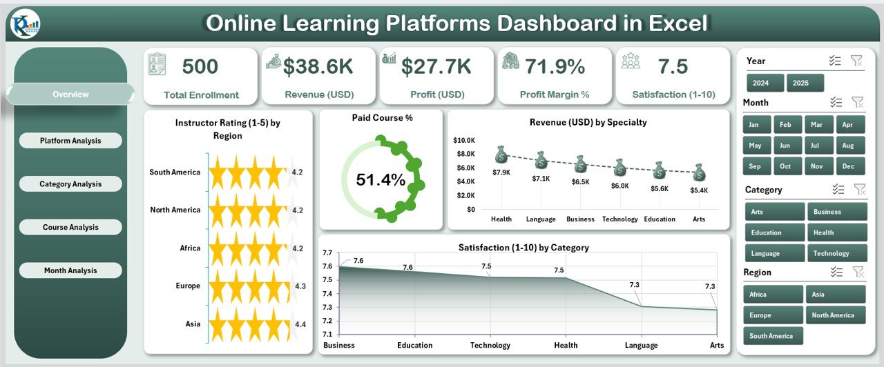
This is the main analytical page of the dashboard — your one-stop destination for summary insights.
-
Slicers: Conveniently placed on the right side, slicers allow users to filter data by time, platform, or category.
-
KPI Cards: Five dynamic KPI cards display critical metrics such as:
-
Total Revenue (USD)
-
Paid Course Percentage
-
Instructor Rating
-
Certificate Enrolment Rate
-
Satisfaction Score
-
-
Charts Displayed:
-
Instructor Rating by Region
-
Paid Course %
-
Revenue (USD) by Specialty
-
Satisfaction by Category
-
This page offers a quick snapshot of business performance and helps identify high-performing regions, specialties, and learner satisfaction trends.
2️⃣ Platform Analysis Page
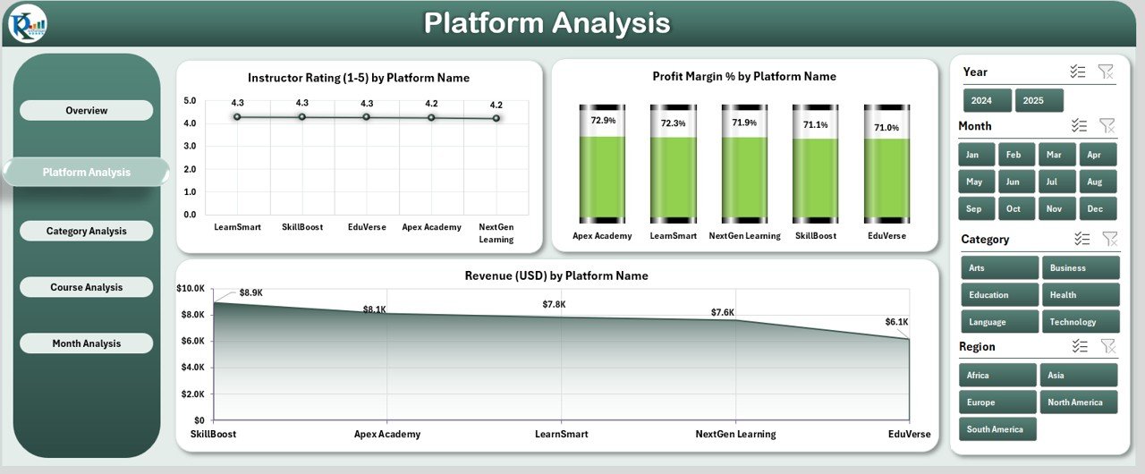
The Platform Analysis page focuses on comparing performance across different e-learning platforms.
-
Charts Displayed:
-
Instructor Rating by Platform Name
-
Profit Margin % by Platform Name
-
Revenue (USD) by Platform Name
-
This view helps stakeholders understand which platforms generate the highest returns and which may require strategic changes or marketing focus.
Click to Purchases Online Learning Platforms Dashboard in Excel
3️⃣ Category Analysis Page
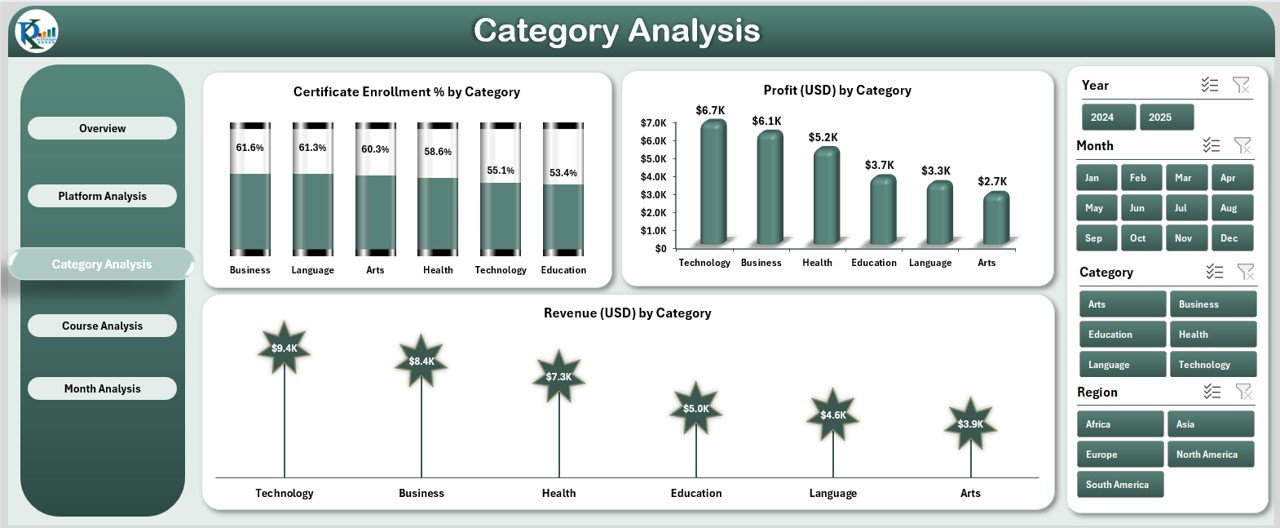
The Category Analysis page explores how different learning categories — such as Technology, Business, Arts, or Health — perform in terms of enrolments, profit, and revenue.
-
Charts Displayed:
-
Certificate Enrolment % by Category
-
Profit (USD) by Category
-
Revenue (USD) by Category
-
This helps administrators pinpoint high-demand subjects and allocate resources accordingly.
4️⃣ Course Analysis Page
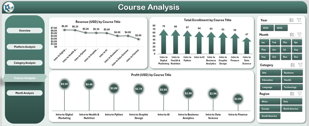
The Course Analysis page provides detailed insights into individual course performance.
-
Charts Displayed:
-
Revenue (USD) by Course Title
-
Total Enrolment by Course Title
-
Profit (USD) by Course Title
-
It allows instructors and managers to track which courses generate the most income, which have the most enrollments, and where profitability can be improved.
5️⃣ Month Analysis Page

The Month Analysis page examines performance trends over time.
-
Charts Displayed:
-
Certificate Enrolment % by Month
-
Revenue (USD) by Month
-
Profit (USD) by Month
-
This page is particularly useful for identifying seasonal trends, evaluating the success of marketing campaigns, and tracking long-term growth patterns.
📑 Support Sheet
The Support Sheet contains the backend logic and lookup references that drive dashboard interactivity. It ensures smooth automation and consistent data flow across all pages.
📊 Data Sheet
The Data Sheet holds the raw data — including course titles, enrollment counts, instructor ratings, revenue, and platform names. This sheet acts as the data source for all charts and pivot tables in the dashboard.
🌟 Advantages of the Online Learning Platforms Dashboard in Excel
The benefits of using this dashboard extend far beyond simple data visualization. Here are the major advantages:
1. Centralized Data Analysis
Instead of switching between multiple reports and platforms, the dashboard consolidates all metrics into one Excel file. This unified view saves time and enhances decision-making.
2. Real-Time Insights
As data updates in the Excel sheets, all charts and KPIs refresh automatically — ensuring instant visibility of performance.
3. Fully Customizable
Users can easily modify slicers, KPIs, or chart types to suit their organization’s reporting style. This makes the dashboard versatile for any online learning business.
4. Cost-Effective Solution
Unlike expensive analytics software, Excel provides a familiar and affordable environment. The dashboard offers high-end analytics without any coding or subscription costs.
5. Performance Tracking
By displaying metrics like revenue, enrolments, and satisfaction ratings, the dashboard helps teams monitor business growth and identify performance gaps.
6. Data-Driven Decisions
Decision-makers can rely on visual data patterns to make informed strategies about pricing, marketing, and content development.
7. Improved Instructor Evaluation
Instructor ratings and feedback analytics help determine which educators perform well and which areas need development or training.
8. Enhanced Learner Experience
Tracking satisfaction and enrolment trends allows institutions to improve course quality and student engagement.
📈 Why Every E-Learning Business Needs This Dashboard
Click to Purchases Online Learning Platforms Dashboard in Excel
The global e-learning industry continues to grow exponentially, with millions of learners enrolling in online courses every year. However, managing such vast amounts of information — from enrollment data to revenue tracking — requires intelligent reporting.
An Online Learning Platforms Dashboard in Excel acts as a bridge between raw data and business intelligence. It helps you:
-
Visualize course profitability.
-
Evaluate platform-wise performance.
-
Optimize content strategy based on learner demand.
-
Identify underperforming categories or courses.
-
Align organizational goals with real-time results.
In short, it transforms Excel from a simple spreadsheet tool into a strategic analytics powerhouse.
💡 How to Use the Online Learning Platforms Dashboard in Excel
Using the dashboard is simple and requires no advanced Excel knowledge.
Step 1: Input Data
Enter or import your data into the Data Sheet. Include fields like:
-
Course Title
-
Platform Name
-
Category
-
Instructor Rating
-
Enrolments
-
Revenue (USD)
-
Profit Margin (%)
-
Satisfaction (%)
Step 2: Refresh Pivot Tables
Once the data is updated, refresh all pivot tables to ensure new information appears in the charts.
Step 3: Use Slicers
Navigate through the slicers to filter data by platform, month, or category and explore interactive insights instantly.
Step 4: Analyze and Act
Review each page — from Overview to Month Analysis — and identify performance gaps, profitable courses, and seasonal trends.
⚙️ Customization Options
The dashboard is flexible and can be tailored to fit your organization’s reporting needs:
-
Add new KPIs or dimensions such as Completion Rate, Average Study Time, or Refund Rate.
-
Change slicer fields to filter data by Instructor, Region, or Platform.
-
Modify color themes or chart types for brand alignment.
-
Extend the data model to include multiple years for longitudinal analysis.
🧭 Best Practices for the Online Learning Platforms Dashboard in Excel
To get the most accurate and insightful results from your dashboard, follow these best practices:
1. Maintain Data Accuracy
Always validate raw data for errors or inconsistencies before refreshing the dashboard. Clean and consistent data ensures reliable insights.
2. Refresh Data Regularly
Update your Excel data source frequently — weekly or monthly — to maintain relevance and ensure your decisions are based on current information.
3. Keep Visualization Simple
Avoid cluttering charts with excessive colors or labels. Focus on clarity and ease of interpretation.
4. Use Filters and Slicers Effectively
Apply slicers to narrow down specific time periods, categories, or platforms for more focused analysis.
5. Track KPIs Over Time
Monitor trends instead of one-time snapshots. Long-term tracking helps identify seasonal behaviors and recurring issues.
6. Protect Sensitive Data
Use Excel’s password protection and restricted editing features to secure business-critical information.
7. Backup Your File
Always keep a backup copy of your Excel dashboard to prevent data loss or accidental deletion.
💰 How Businesses Benefit from Dashboard Insights
The insights generated from the Online Learning Platforms Dashboard can directly impact business outcomes:
-
Revenue Optimization: Identify the most profitable platforms and allocate marketing budgets effectively.
-
Learner Retention: Analyze satisfaction scores to understand learner expectations and improve retention.
-
Instructor Development: Track ratings to recognize top instructors and provide support to others.
-
Product Strategy: Evaluate which categories and courses perform best to prioritize future development.
-
Marketing Efficiency: Understand seasonal trends to plan promotional campaigns strategically.
With consistent usage, this dashboard can help e-learning businesses achieve higher profitability, stronger engagement, and data-driven growth.
🧩 Integration Possibilities
While Excel serves as the main analysis tool, you can also integrate data from:
-
Learning Management Systems (LMS)
-
Google Sheets
-
Power BI or Tableau for advanced visualizations
-
CRM or Payment Systems to link customer and revenue data
These integrations enhance automation and create a connected analytics ecosystem.
🔍 Real-World Use Cases
-
EdTech Startups: Track student enrollment and course profitability in real time.
-
Universities: Monitor online program performance and faculty ratings.
-
Corporate Training Departments: Measure ROI of training initiatives.
-
Independent Instructors: Evaluate which online platforms generate maximum revenue.
-
E-Learning Marketplaces: Analyze category-wise performance to refine marketing strategies.
🏁 Conclusion
The Online Learning Platforms Dashboard in Excel is more than just a spreadsheet — it’s a complete performance management system. Whether you are an individual educator or a large EdTech company, this dashboard empowers you to make smarter, faster, and data-driven decisions.
By combining Excel’s versatility with advanced analytics, you can visualize complex e-learning data, measure success, and continuously improve learner engagement and profitability.
Embrace the power of data visualization — because what gets measured gets improved.
❓ Frequently Asked Questions (FAQs)
1. What is an Online Learning Platforms Dashboard in Excel?
It is a ready-to-use Excel template that tracks and analyzes performance metrics such as revenue, enrolments, satisfaction, and instructor ratings across different e-learning platforms.
2. Who can use this dashboard?
It is ideal for educators, institutions, EdTech startups, training managers, and freelance instructors who want to analyze their online learning data efficiently.
3. Does it require advanced Excel skills?
No. The dashboard uses built-in Excel features like slicers, pivot tables, and charts. Anyone with basic Excel knowledge can use it easily.
4. Can I customize the KPIs or charts?
Yes. The dashboard is fully customizable — you can modify KPIs, color themes, or even add new analysis pages.
5. Is the dashboard compatible with Google Sheets?
The design is optimized for Excel, but the data structure can be replicated in Google Sheets with similar pivot and chart functions.
6. How often should I update the dashboard?
Ideally, update the data weekly or monthly, depending on your business activity and reporting frequency.
7. Can I share the dashboard with my team?
Yes, you can share it via cloud storage like OneDrive or SharePoint and enable simultaneous collaboration.
8. What makes this dashboard different from other tools?
It combines Excel’s accessibility with powerful analytics and visualization, offering a low-cost, highly flexible alternative to expensive BI software.
Visit our YouTube channel to learn step-by-step video tutorials