Running a test preparation centre becomes challenging when the data sits in different sheets and teams handle everything manually. Students expect better progress tracking, trainers need updated performance reports, and management wants instant insights about batches, courses, revenue, and overall performance. Because of this, many centres search for a simple and reliable reporting system.
A Test Preparation Centres Dashboard in Excel solves this problem. It brings every major metric into one visual and interactive file. As a result, owners, trainers, and coordinators get a clear picture of daily, weekly, and monthly performance. This dashboard helps you understand what works well, which areas need focus, and how you can grow your coaching business faster.
In this article, you will explore everything about the Test Preparation Centres Dashboard in Excel, including its structure, features, advantages, best practices, and most common questions.
Click to Purchases Test Preparation Centers Dashboard in Excel
What Is a Test Preparation Centres Dashboard in Excel?
A Test Preparation Centres Dashboard in Excel is a ready-to-use reporting template designed to track and analyze the performance of coaching institutes and training centres. It organizes data from multiple sources—such as batches, trainers, courses, cities, expenses, and revenue—into a clean, visual dashboard.
Because it uses Excel, you can update the data easily, refresh the dashboard instantly, and use slicers to view information from different angles. Whether you manage IELTS coaching, UPSC training, coding bootcamps, language institutes, or academic test centres, this dashboard fits every training business model.
Key Features of the Test Preparation Centres Dashboard in Excel
The Test Preparation Centres Dashboard includes five powerful analytical pages, a page navigator, and a centralized data sheet. Each page focuses on a specific area of performance.
Below is the complete breakdown.
1. Page Navigator
The page navigator sits on the left side of the file and allows quick navigation across all dashboard pages. You can jump between Overview, Course Analysis, Batch Analysis, Trainer Analysis, and Month Analysis with one click.
Since data grows every day, this feature helps users move between pages faster without scrolling or searching.
Pages Inside the Test Preparation Centres Dashboard
The dashboard includes five interactive pages, each designed for a different type of analysis.
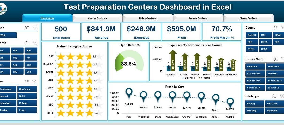
1. Overview Page
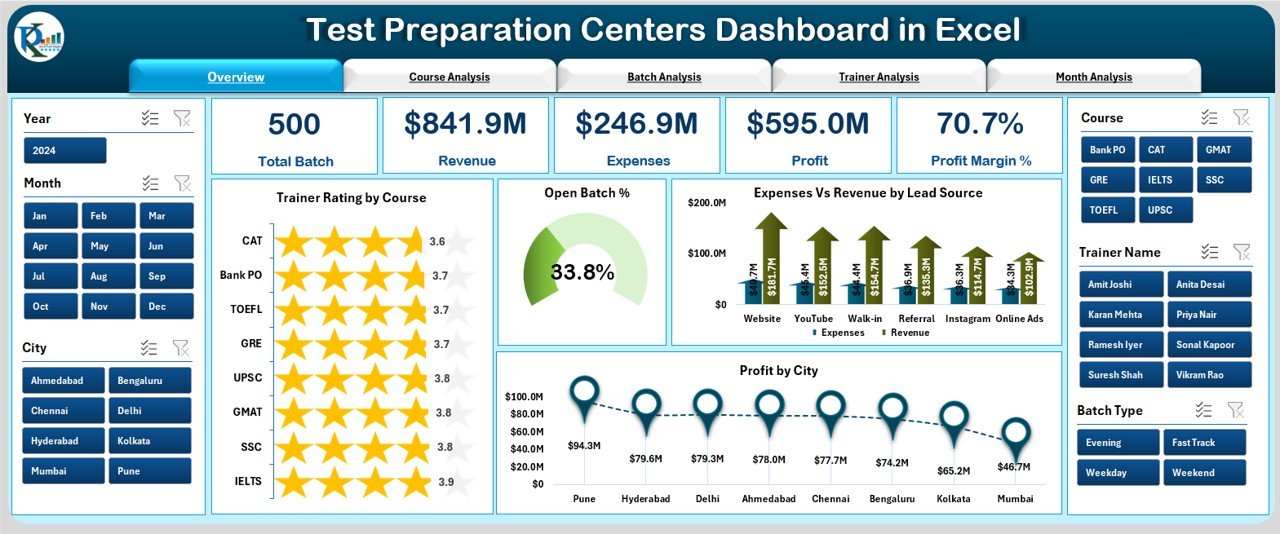
The Overview Page is the main screen of the dashboard. It gives you an instant summary of the entire coaching centre’s performance.
This page includes:
-
A right-side silencer area
-
5 KPI cards showing major highlights
4 charts:
- Trainer Rating by Course
- Open Batch %
- Expenses vs Revenue by Lead Source
- Profit by City
This page answers questions like:
-
Which course receives the highest trainer rating?
-
How many batches remain open?
-
Which lead source brings the most profit?
-
Which city performs best?
You get a quick bird’s-eye view, which helps you make faster decisions.
2. Course Analysis Page
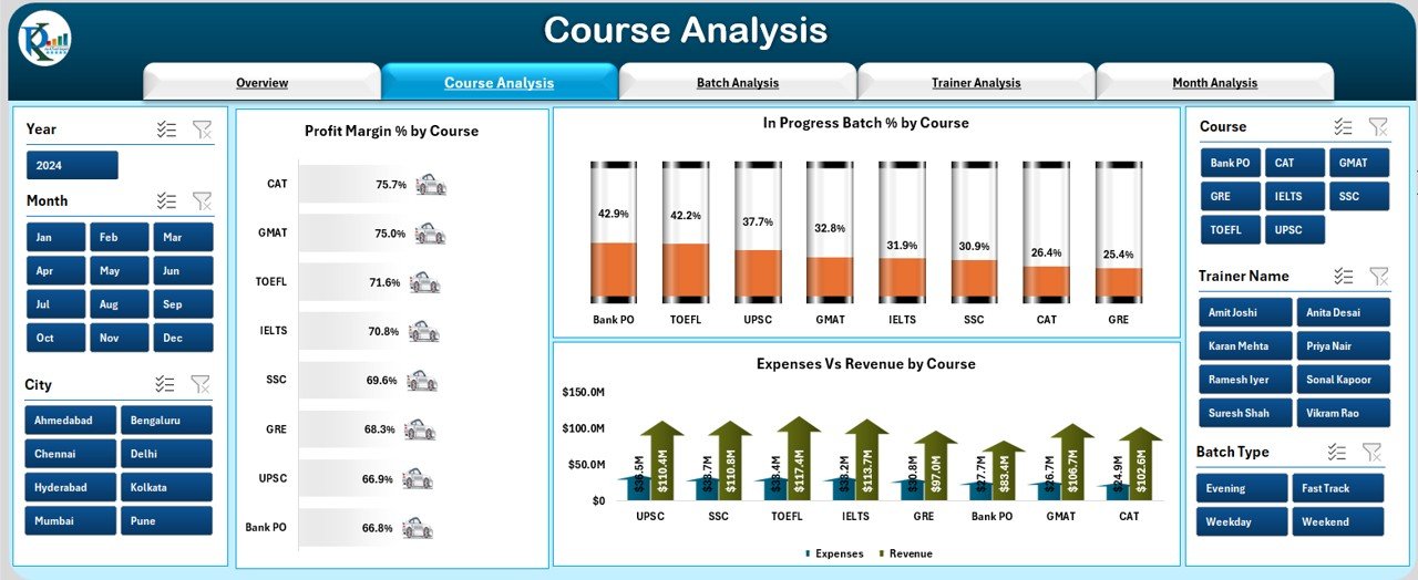
The Course Analysis page focuses on understanding how each course performs. You can compare expenses, revenue, batch progress, and profit margin.
Charts on this page include:
-
Profit Margin % by Course
-
In-Progress Batch % by Course
-
Expenses vs Revenue by Course
This page helps you find answers like:
-
Which courses generate the highest profit?
-
Which courses need more trainers or better planning?
-
Where should the institute invest more?
Because all course stats appear on one page, analysis becomes fast and easy.
3. Batch Analysis Page
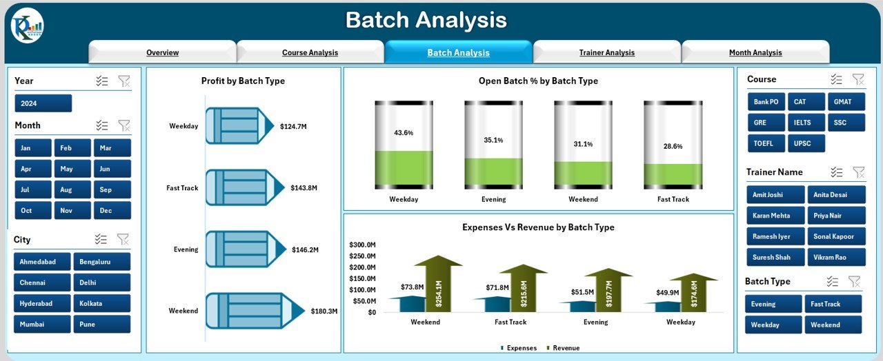
This page focuses on how different batch types perform.
It includes:
-
Profit by Batch Type
-
Open Batch % by Batch Type
-
Expenses vs Revenue by Batch Type
Click to Purchases Test Preparation Centers Dashboard in Excel
This page helps you answer:
-
Which batch type (weekday, weekend, online, offline) performs best?
-
Which batch type remains open longer?
-
How do batch expenses compare with revenue?
Since batch performance affects revenue directly, this page becomes important for planning.
4. Trainer Analysis Page
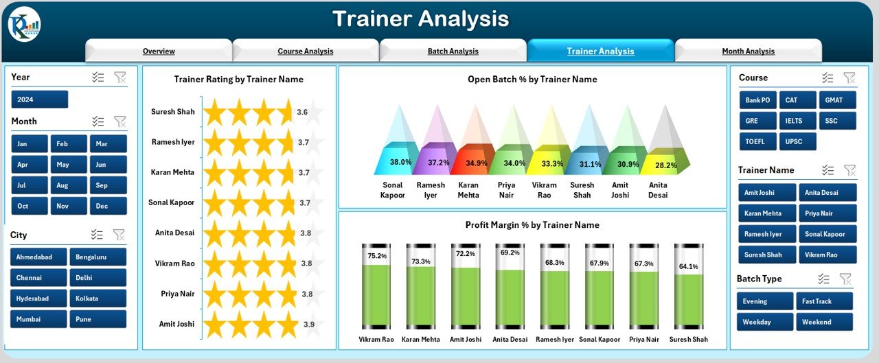
Trainer performance affects student satisfaction and overall course results. The Trainer Analysis Page highlights key trainer-level metrics.
Charts include:
-
Trainer Rating by Trainer Name
-
Open Batch % by Trainer Name
-
Profit Margin % by Trainer Name
With this page, you can analyze:
-
Which trainer performs best?
-
Who handles batches smoothly?
-
Which trainer needs training or guidance?
This page helps improve training quality and resource planning.
5. Month Analysis Page
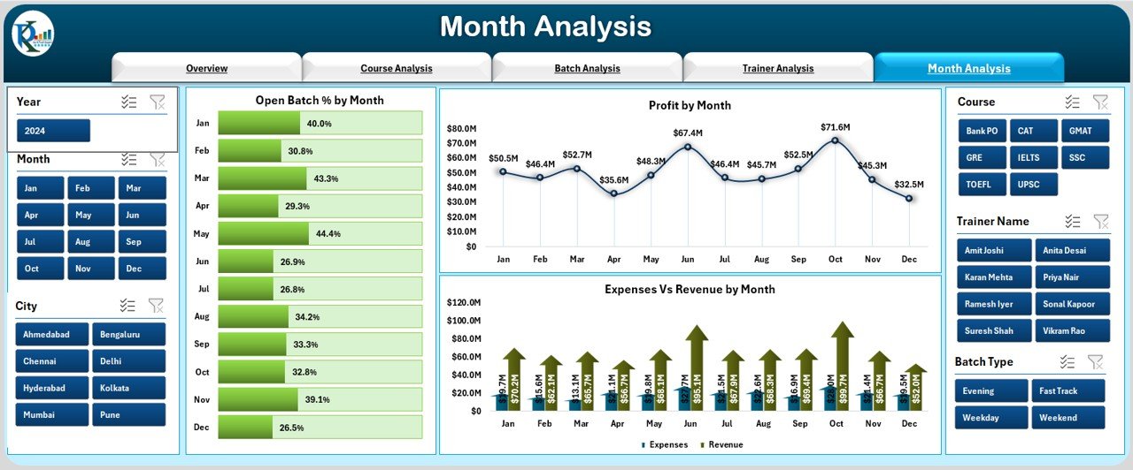
The Month Analysis page helps you understand trends over time. You can track how performance changes month-to-month.
Charts include:
-
Open Batch % by Month
-
Profit % by Month
-
Expenses vs Revenue by Month
This page answers:
-
Which months perform well?
-
How does revenue change across seasons?
-
Are expenses under control?
Monthly analysis helps in financial planning and performance forecasting.
Support Sheet & Data Sheet
The dashboard includes a Support Sheet for formulas, calculations, and mapped values.
The Data Sheet is where you enter:
-
Course information
-
Batch details
-
Trainer info
-
Profit & expenses
-
Rating
-
Revenue
-
Lead sources
-
Cities
-
Monthly performance
Once you update the Data Sheet, you simply click Refresh All, and the entire dashboard updates instantly.
⭐ Advantages of Test Preparation Centres Dashboard in Excel
A Test Preparation Centres Dashboard offers many benefits that help you run your institute smoothly. Below are the main advantages.
1. You View All Performance Metrics in One Place
Instead of opening multiple sheets, you get everything on one dashboard:
-
Revenue
-
Expenses
-
Ratings
-
Batches
-
Trainers
-
Courses
-
Monthly performance
This saves time and helps you take faster decisions.
2. You Track Profit and Loss Easily
The dashboard shows real-time:
-
Profit by city
-
Profit by course
-
Profit by trainer
-
Profit by month
-
Profit margin %
This helps you identify which areas perform well and which ones need improvement.
3. You Improve Course Planning
The Course Analysis page helps you:
-
Track which courses attract more students
-
Understand which courses need improvement
-
Compare expenses vs revenue
-
Identify the best-performing course categories
Because of these insights, you can design better course schedules.
4. You Monitor Trainer Performance
Trainer ratings tell you:
-
Who performs consistently
-
Who manages batches efficiently
-
Who needs additional training
Strong trainer performance increases student satisfaction.
5. You Improve Batch Management
You can see:
-
Open Batch %
-
Batch progress
-
Batch profit
-
Revenue contribution
This helps you allocate resources and plan new batches effectively.
6. You Make Better Financial Decisions
The dashboard highlights:
-
Monthly revenue
-
Monthly expenses
-
Profit % by month
-
Lead source performance
This helps you understand which marketing channels bring the best returns.
7. You Save Time and Reduce Errors
Manual reporting wastes time and causes mistakes. The dashboard:
-
Updates with one click
-
Reduces manual calculations
-
Ensures accurate numbers
-
Improves reporting speed
Because of this automation, your team can focus on planning and growth.
⭐ Best Practices for Using the Test Preparation Centres Dashboard in Excel
Click to Purchases Test Preparation Centers Dashboard in Excel
To get the best results from this dashboard, follow these proven practices:
1. Update the Data Sheet Regularly
Daily or weekly updates ensure:
-
Accurate profit numbers
-
Real-time ratings
-
Up-to-date batch progress
-
Correct revenue figures
When data stays fresh, analysis improves.
2. Use Filters and Slicers
Filters help you compare performance across:
-
Months
-
Courses
-
Trainers
-
Batch types
-
Cities
-
Lead sources
You understand trends better when you slice data correctly.
3. Review Trainer Ratings Frequently
Trainer ratings directly affect student satisfaction. So, review:
-
Rating by course
-
Rating by trainer
-
Rating trends
This helps you improve training quality.
4. Track Expenses vs Revenue Every Month
Monthly analysis helps you:
-
Control costs
-
Increase profit
-
Allocate budget correctly
-
Analyze marketing ROI
Financial tracking keeps the institute healthy.
5. Analyze Batch Performance Before Creating New Batches
Before launching new batches, check:
-
Batch profit
-
Batch progress
-
Batch type performance
-
Open batch %
This ensures better planning and fewer delays.
6. Use the Dashboard for Decision Making
Use the dashboard for:
-
Planning new batches
-
Hiring trainers
-
Improving courses
-
Adjusting marketing strategies
Since the insights are clear, you can make decisions confidently.
7. Refresh the Dashboard After Every Update
Click Refresh All in the Excel ribbon to update:
-
Charts
-
KPIs
-
Cards
-
Trends
A refreshed dashboard ensures accurate insights.
How Does the Test Preparation Centres Dashboard Help Management?
This dashboard becomes a complete management solution because it:
-
Highlights strengths and weaknesses
-
Improves planning
-
Tracks performance across multiple dimensions
-
Supports data-driven decisions
-
Helps monitor business growth
-
Reduces manual work
-
Increases transparency
Whether you run one institute or multiple branches, this dashboard scales easily.
Conclusion
A Test Preparation Centres Dashboard in Excel makes academic management simple, visual, and data-driven. You track course performance, trainer efficiency, batch progress, revenue trends, expenses, and monthly performance on one powerful dashboard. Because all insights appear clearly, you can make better decisions, improve student satisfaction, and grow your institute faster.
When used with best practices, this dashboard becomes a reliable tool for planning, monitoring, and improving everyday operations in your coaching centre.
Frequently Asked Questions (FAQs)
1. What is a Test Preparation Centres Dashboard in Excel?
It is a ready-to-use Excel template that tracks performance metrics like batches, courses, trainers, revenue, and expenses using charts and KPIs.
2. Who can use this dashboard?
Owners, trainers, admins, centre managers, coordinators, and financial teams can use it.
3. Do I need advanced Excel skills to use this?
No, you only update the Data Sheet and click Refresh All. The dashboard updates automatically.
4. Can I customize the charts?
Yes, you can modify colours, titles, fields, or formats based on your needs.
5. Does it support multiple branches or cities?
Yes, you can add multiple cities, courses, trainers, and batch details. The dashboard updates instantly.
6. Can I use this dashboard for online coaching businesses?
Yes, it works for offline institutes, online classes, hybrid training centres, and coaching franchises.
7. How often should I update the data?
Daily or weekly updates give the most accurate insights.
8. Does the template calculate profit automatically?
Yes, when you add expenses and revenue, the dashboard shows the profit and profit margin automatically.
Visit our YouTube channel to learn step-by-step video tutorials
Click to Purchases Test Pr
Watch the step-by-step video tutorial:
eparation Centers Dashboard in Excel