Marine operations sit at the center of global trade. Ports handle massive cargo volumes, manage vessel traffic, monitor fuel usage, and maintain strict operational safety standards. Because the marine and port industry works 24/7, leaders need a fast and accurate way to view their operations. However, data often stays scattered in spreadsheets, manual logs, emails, and isolated systems. As a result, decision-making slows down and teams struggle to track performance.
A Marine & Ports Dashboard in Power BI solves this challenge. It brings all key insights into one interactive and visual platform. You can monitor fuel cost, port charges, vessel performance, department-wise revenue, cargo satisfaction, and monthly trends without spending hours on manual reporting. This guide explains everything about the Marine & Ports Dashboard, including its structure, features, advantages, best practices, and answers to common questions.
Click to Purchases Marine & Ports Dashboard in Power BI
What Is a Marine & Ports Dashboard in Power BI?
A Marine & Ports Dashboard in Power BI is a ready-to-use reporting solution designed for port authorities, marine logistics teams, vessel operators, and cargo managers. It shows all important KPIs in one place and helps teams view performance for departments, operations, vessels, cargo types, and monthly trends.
The dashboard uses interactive charts, slicers, and filters, so users can switch between months, departments, operation types, or vessel categories in seconds. Since it runs in Power BI, teams get automated refreshes, drill-through insights, clean visuals, and data reliability.
⭐ Key Features of the Marine & Ports Dashboard in Power BI
In this dashboard, you will find 5 powerful pages inside the Power BI file. Each page offers a focused view of marine and port operations.
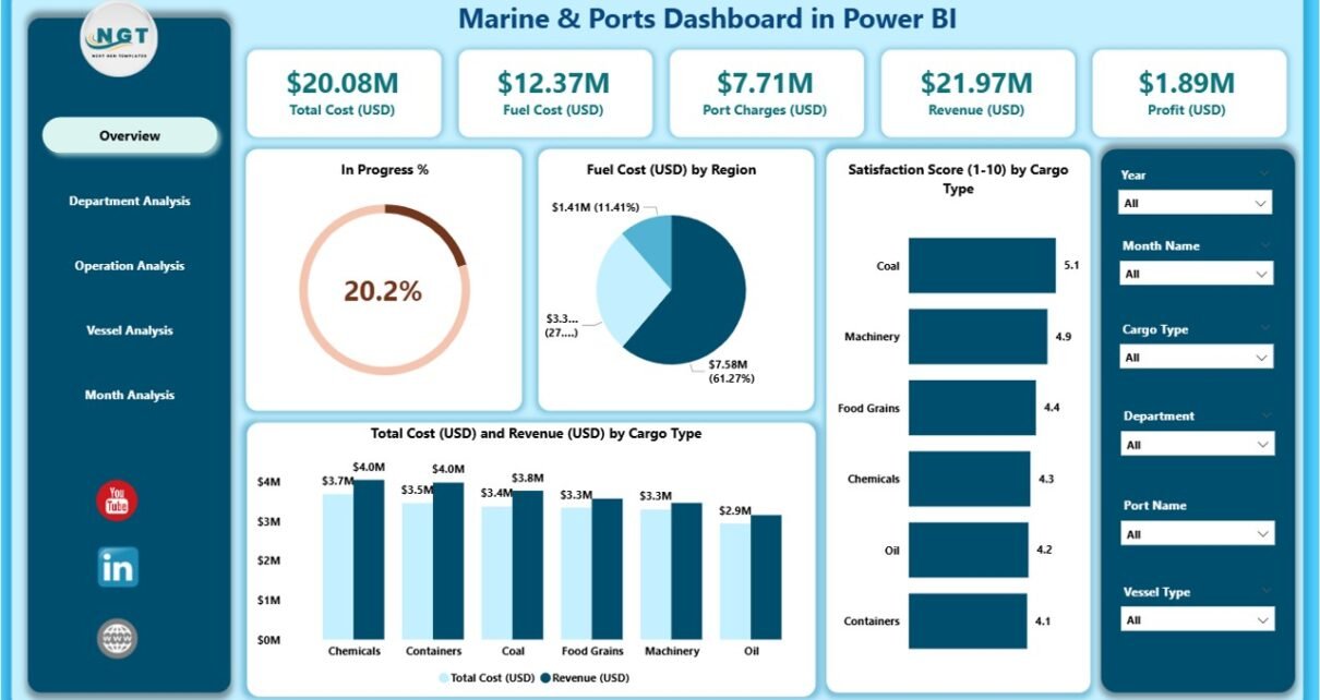
1. Overview Page
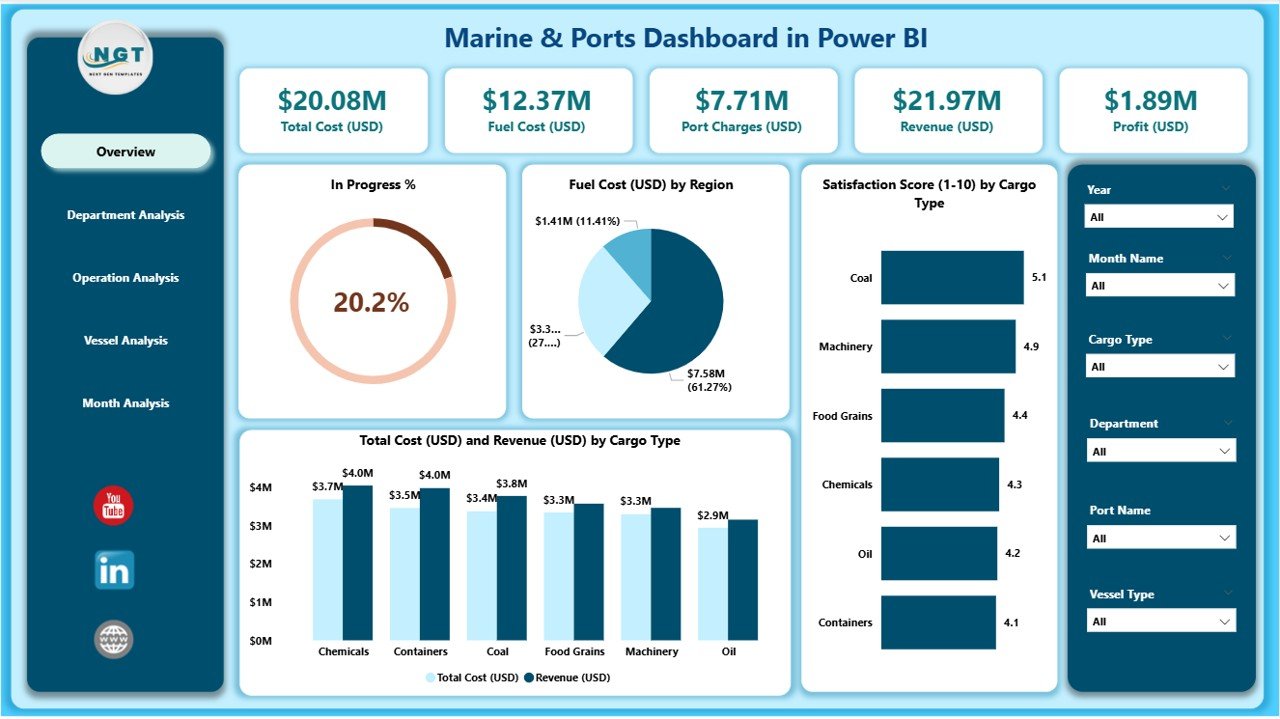
The Overview Page is the heart of the dashboard. It gives a quick summary of the most important performance indicators. When leaders open the file, they can see everything they need within a single screen.
What You See on the Overview Page
-
Slicers on the top for easy filtering
-
5 KPI cards for high-level numbers
-
4 powerful charts:
-
In Progress %
-
Fuel Cost (USD) by Region
-
Satisfaction Score by Cargo Type
-
Total Cost (USD) and Revenue (USD) by Cargo Type
-
This page helps management monitor performance across regions and cargo types. It also highlights fuel usage, which is one of the highest operational costs in the marine industry.
2. Department Analysis Page
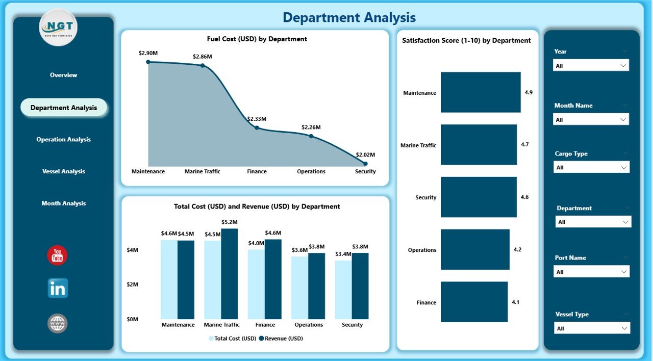
This page helps you understand how each department performs across cost, revenue, and service quality. You can filter by month, department, or year to study performance variations.
Charts on This Page
-
Fuel Cost (USD) by Department
-
Satisfaction Score by Department
-
Total Cost (USD) and Revenue (USD) by Department
With these insights, leaders can quickly detect departments that overspend, underperform, or generate strong revenue.
3. Operation Analysis Page
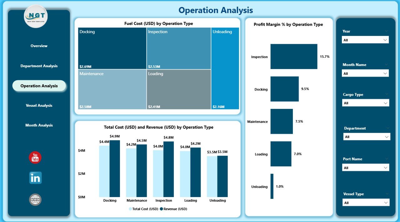
Marine operations involve many activities, including loading, unloading, handling, safety checks, and inland transport. This page shows how each operation type contributes to profitability and efficiency.
Charts Available
-
Fuel Cost (USD) by Operation Type
-
Profit Margin % by Operation Type
-
Total Cost (USD) and Revenue (USD) by Operation Type
This analysis helps teams improve operational efficiency and reduce unnecessary expenses.
Click to Purchases Marine & Ports Dashboard in Power BI
4. Vessel Analysis Page
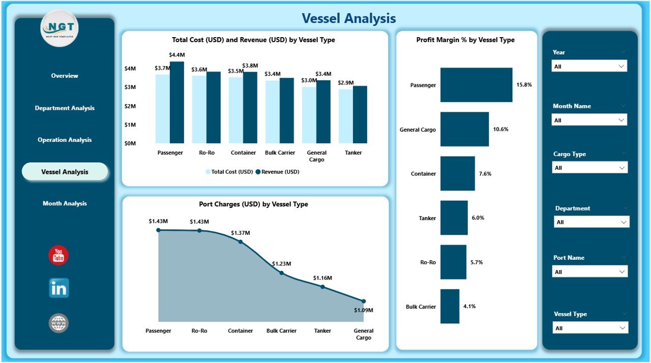
Every vessel performs differently. Some vessels consume more fuel; others generate high revenue. The Vessel Analysis page shows all vessel-related insights clearly.
Charts Included
-
Profit Margin % by Vessel Type
-
Total Cost (USD) and Revenue (USD) by Vessel Type
-
Port Charges (USD) by Vessel Type
This section helps port managers compare vessel types and make informed decisions for docking, scheduling, and cost planning.
5. Monthly Trends Page
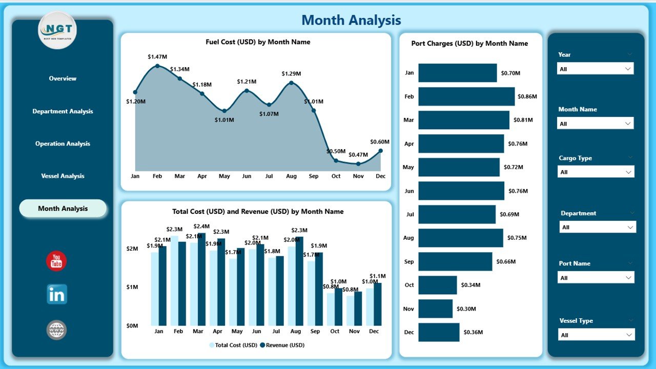
Monthly trends help you understand seasonal patterns, revenue changes, fuel cost fluctuations, and port charge variations.
Charts on This Page
-
Fuel Cost (USD) by Month
-
Total Cost (USD) and Revenue (USD) by Month
-
Port Charges (USD) by Month
When teams analyze these trends, they can plan budgets more effectively and improve future performance.
Why Do Marine and Port Teams Need This Dashboard?
Ports manage hundreds of activities every day, including:
-
Vessel arrivals
-
Cargo movement
-
Equipment handling
-
Workforce planning
-
Fuel usage
-
Operational approvals
-
Port charges
-
Revenue collection
Without a dashboard, teams waste time switching between spreadsheets and manual logs. The Marine & Ports Dashboard gives them a single source of truth.
Advantages of the Marine & Ports Dashboard in Power BI
Click to Purchases Marine & Ports Dashboard in Power BI
1. Faster Decision-Making
The dashboard shows real-time insights. Leaders do not wait for manual reports, so decisions become faster and more accurate.
2. Clear Cost Visibility
Fuel cost, port charges, and overall expenses appear in clean visuals. Teams can understand which regions, departments, or vessels use more resources.
3. Better Operational Efficiency
Teams monitor performance for operation types. This helps them take action quickly when cost or productivity changes.
4. Improved Customer Satisfaction
The dashboard includes satisfaction scores by cargo type and department. Management can plan improvements based on actual customer feedback.
5. Strong Financial Insights
Revenue, cost, and profit margin visuals help teams track financial health clearly. Leaders can compare performance by department, vessel, operation, or cargo category.
6. Easy Reporting
You can export charts, share dashboards online, or schedule updates automatically. Power BI makes reporting smoother and quicker.
7. Better Planning for Future
The Monthly Trends page helps teams spot cost peaks, evaluate seasonal trends, and plan upcoming months with confidence.
⚙️ How Does the Marine & Ports Dashboard Improve Operations?
1. It Connects All Data Sources
You connect Excel sheets, ERP systems, port management software, or logistics databases. All data flows into Power BI automatically.
2. It Reduces Manual Work
Teams do not create separate spreadsheets for each report. Everything updates with a single refresh.
3. It Shows Real-Time Numbers
Power BI pulls live data from connected sources. Teams track operations as they happen.
4. It Uses Clear Visuals
Charts, cards, and KPIs help users understand insights even if they are not technical experts.
5. It Helps Identify Problems Early
When cost increases, satisfaction decreases, or a department performs poorly, teams notice instantly.
📌 Best Practices for the Marine & Ports Dashboard in Power BI
1. Keep Data Structured
Use clean tables for vessel data, cargo data, operations, financials, and fuel consumption.
2. Refresh Data Daily
Daily refresh ensures leaders always view updated numbers.
3. Use Consistent KPI Definitions
Make sure every department follows the same formula for cost, revenue, and margins.
4. Add Tooltips for Clarity
Tooltips help users understand charts more easily.
5. Use Slicers Smartly
Avoid too many slicers. Keep only important ones like:
-
Month
-
Region
-
Department
-
Operation Type
-
Vessel Type
6. Keep Design Simple
Use clean colors and simple layouts. This helps users focus on insights rather than visuals.
7. Review Monthly Trends Often
Monthly reports help identify patterns and improve future planning.
8. Train Your Team
Teach your team how to navigate pages, apply slicers, and download insights.
🔎 Who Can Use the Marine & Ports Dashboard in Power BI?
This dashboard is designed for multiple roles:
-
Port Authority Officials
-
Marine Operations Managers
-
Vessel Operators
-
Cargo Supervisors
-
Finance Teams
-
Safety & Compliance Teams
-
Customer Service Departments
-
Senior Leadership
Every team gets insights that match their job responsibilities.
🚢 Use Cases of Marine & Ports Dashboard
1. Fuel Management
Track fuel cost by region, vessel, or operation to reduce wastage.
2. Cargo Performance Monitoring
Measure satisfaction scores and revenue by cargo type.
3. Vessel Profitability
Compare revenue, cost, and port charges by vessel type.
4. Department-Level Reporting
Each department can check its cost, revenue, and performance.
5. Financial Reporting
The dashboard helps finance teams analyze profit margin and cost trends.
6. Forecasting
Monthly trends offer a clear picture for planning next quarter or next year.
🧭 Conclusion
The Marine & Ports Dashboard in Power BI gives every port, marine logistics company, and cargo handling facility a strong data advantage. It simplifies reporting, reduces manual work, and offers deep insights into cost, revenue, vessel performance, operations, and customer satisfaction. With five powerful pages—Overview, Department Analysis, Operation Analysis, Vessel Analysis, and Monthly Trends—you get a 360-degree view of your entire marine ecosystem.
This dashboard helps leaders make faster decisions, monitor daily performance, and plan for the future with confidence. Because it runs on Power BI, you enjoy automation, reliability, and clean visual storytelling.
When teams use this dashboard regularly, they work smarter, respond faster, and improve operational performance across every area of marine and port management.
❓ Frequently Asked Questions (FAQs)
1. What is a Marine & Ports Dashboard in Power BI?
A Marine & Ports Dashboard in Power BI is a reporting tool that shows key KPIs related to fuel cost, revenue, vessel performance, port charges, operations, and satisfaction scores.
2. Who uses this dashboard?
Port authority officials, operations managers, vessel operators, finance teams, safety officers, and senior leadership use this dashboard daily.
3. How does the dashboard help operations?
It helps teams track fuel cost, revenue, profit margin, vessel performance, department efficiency, and monthly trends in one place.
4. Can I add more KPIs to the dashboard?
Yes, Power BI allows you to add new KPIs, charts, and pages easily.
5. Do I need technical knowledge to use this dashboard?
No. The dashboard includes user-friendly slicers, charts, and visuals that anyone can understand.
6. Can I connect live data sources?
Yes. You can connect Excel, SQL databases, port management software, and other systems.
7. How often should I refresh the data?
Daily or weekly refresh gives the best results depending on port operations.
8. Can I export reports from this dashboard?
Yes. You can export charts, tables, or the whole page to PDF or PowerPoint.
Visit our YouTube channel to learn step-by-step video tutorials