Managing pension funds requires constant monitoring, accurate reporting, and clear visibility across multiple investment types, fund names, and plan categories. Many organizations still track pension performance manually, and this slows down reporting and confuses employees and finance teams. Because of this challenge, a ready-to-use Pension Funds Dashboard in Excel becomes a powerful solution.
This article explains everything about the Pension Funds Dashboard in Excel. You will learn how it works, what pages it includes, how it helps you manage retirement funds faster, and why it improves your financial decision-making. I will also share the advantages, best practices, and answers to common questions.
Let us begin by understanding the purpose of this dashboard.
Click to Purchases Pension Funds Dashboard in Excel
What Is a Pension Funds Dashboard in Excel?
A Pension Funds Dashboard in Excel is a smart and interactive reporting tool that shows all the important pension KPIs in one clean view. It gives users a real-time understanding of fund value, contributions, risk levels, withdrawal eligibility, and performance across different plans and investment types.
This dashboard uses slicers, charts, and summary cards to simplify complex pension information. You see trends, compare fund categories, check employee contributions, and monitor growth without going through multiple spreadsheets. Because it runs in Excel, you update the data easily and see insights instantly.
Why Do You Need a Pension Funds Dashboard?
Pension management involves multiple components:
-
Different fund names
-
Several investment types
-
Many plan categories
-
Employee and employer contributions
-
Withdrawal rules
-
Monthly trends
When this information spreads across several spreadsheets, it becomes hard to track changes. You also struggle to maintain consistency and accuracy.
A centralized dashboard solves this problem. You use this dashboard to:
-
Analyze pension funds with one click
-
Make accurate retirement planning decisions
-
Review risk levels quickly
-
Compare fund values across months
-
Check plan performance with clear visuals
-
Improve transparency for employees and management
As a result, decision-making becomes faster and more reliable.
Key Features of the Pension Funds Dashboard in Excel
This Pension Funds Dashboard comes with a clean layout, interactive controls, and visually rich charts. It includes five analytical pages, and each page focuses on a different part of pension management.
Below are the features included in the dashboard.
Page Navigator
The Page Navigator sits on the left side of the dashboard. It helps users switch between different pages instantly. You do not search through sheet tabs. You click a button and jump to the exact page you want.
Detailed Breakdown of All Pages in the Dashboard
The dashboard has five pages, and each page provides a focused view of the pension fund structure.
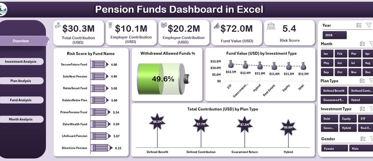
1. Overview Page – What Does It Show?
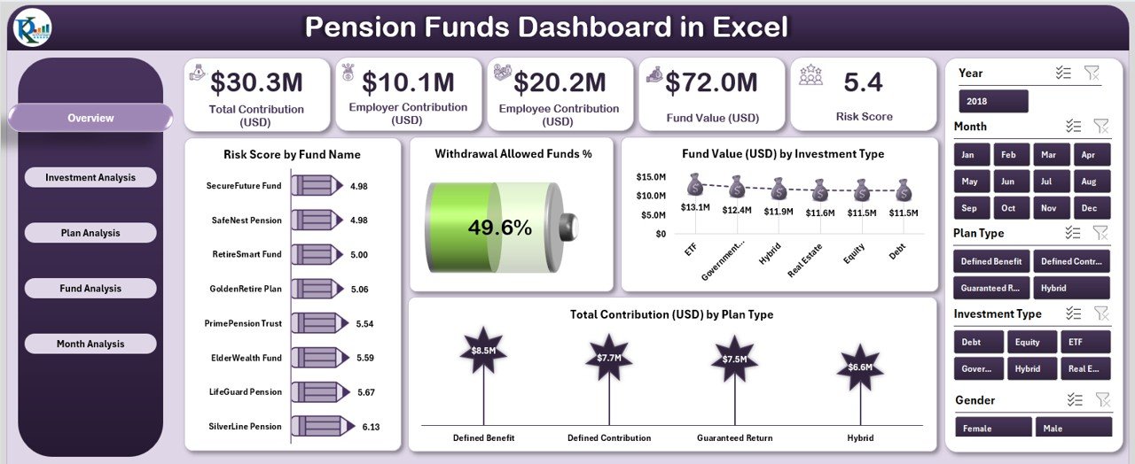
The Overview Page works as the main control center. You see all important KPIs on this page.
This page includes:
-
A right-side slicer panel
-
Five KPI cards
-
Four powerful charts
The KPI cards show the most important indicators of financial health. The charts help you understand the structure and performance of different funds.
The four charts on this page include:
1️⃣ Risk Score by Fund Name – This chart compares the risk levels across different fund names.
2️⃣ Withdrawal Allowed Funds % – This chart shows the percentage of funds that allow withdrawal.
3️⃣ Fund Value (USD) by Investment Type – You see how much value each investment category holds.
4️⃣ Total Contribution (USD) by Plan Type – You understand how much contribution each plan receives.
This page helps financial teams and employees get an instant snapshot of pension performance.
2. Investment Analysis Page – What Can You Track Here?
Click to Purchases Pension Funds Dashboard in Excel
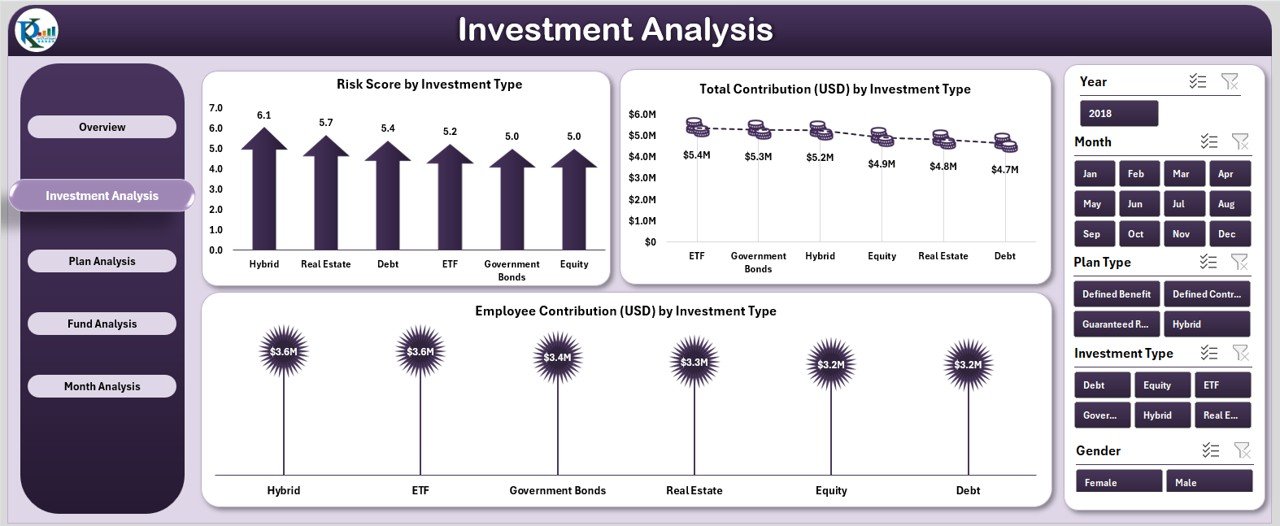
Investment structure plays a major role in pension planning. Different investment types carry different risk levels. This page helps you analyze these patterns.
This page includes three charts:
-
Risk Score by Investment Type
-
Total Contribution (USD) by Investment Type
-
Employee Contribution (USD) by Investment Type
How this page helps you
-
You compare which investment types receive higher contributions.
-
You check whether risk levels match the investment strategy.
-
You identify the investment categories that generate long-term stability.
As a result, this page helps you design a balanced fund distribution strategy.
3. Plan Analysis Page – Why Is It Important?
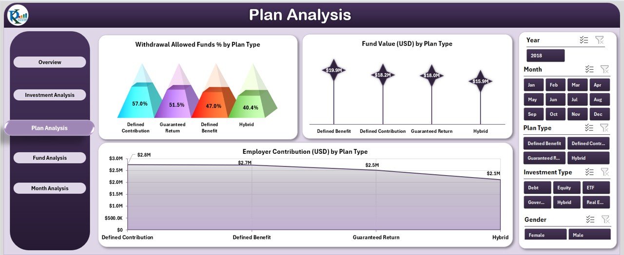
Different plans offer different features. Some plans allow withdrawals. Some have higher fund values. Some encourage higher employee contributions.
The Plan Analysis Page helps you examine each plan type in detail.
This page includes three charts:
-
Withdrawal Allowed Funds % by Plan Type
-
Fund Value (USD) by Plan Type
-
Employee Contribution (USD) by Plan Type
How this page helps you
-
You see which plans give more flexibility.
-
You find the plans that produce higher long-term value.
-
You compare how much employees contribute to each plan.
This page becomes useful for policy design, plan restructuring, and employee communication.
4. Fund Analysis Page – What Insights Does It Provide?
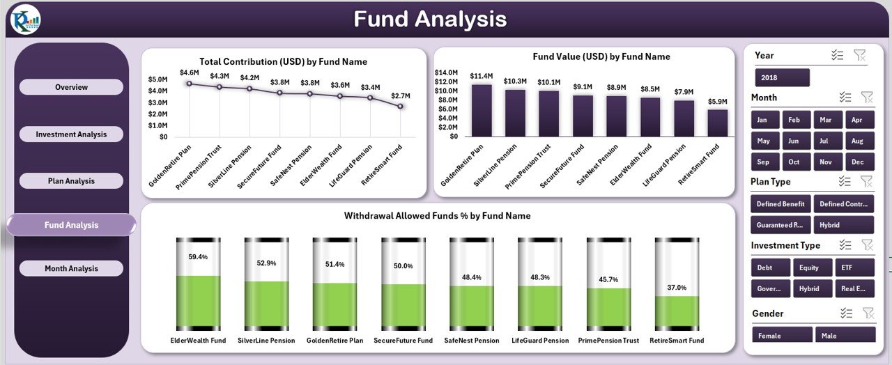
This page focuses on fund names. Organizations usually maintain multiple pension funds, and each fund performs differently.
This page includes three charts:
-
Total Contribution (USD) by Fund Name
-
Fund Value (USD) by Fund Name
-
Withdrawal Allowed Funds % by Fund Name
What you learn from this page
-
You identify top-performing funds.
-
You compare fund value growth.
-
You check fund-wise flexibility and withdrawal eligibility.
This page helps financial officers review and restructure their fund allocation strategy.
5. Month Analysis Page – How Does It Help Track Performance Over Time?
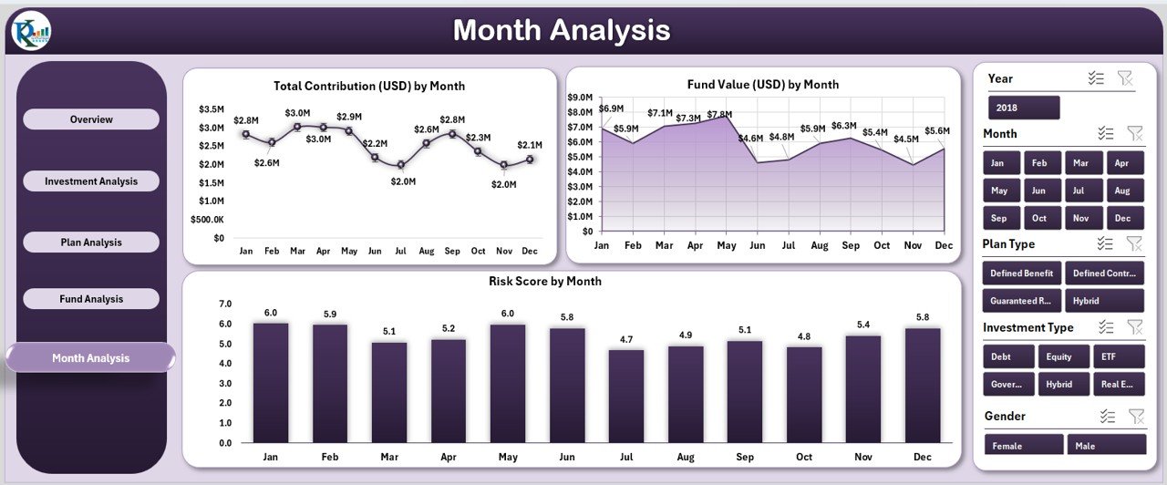
Monthly trends show whether contributions and fund values grow consistently. This page focuses on time-based performance.
This page includes three charts:
-
Total Contribution (USD) by Month
-
Fund Value (USD) by Month
-
Risk Score by Month
Why this page is important
-
You see contribution trends across the year.
-
You monitor the growth or decline of fund values.
-
You track changes in risk levels over time.
This page is extremely useful for long-term planning and performance reviews.
Support Sheet – What Does It Contain?
The Support Sheet stores formulas, calculations, and helper tables. These tables ensure that dashboard pages work smoothly.
Data Sheet – Why Is It Important?
The Data Sheet is the backbone of the entire dashboard. You enter all raw data here. As soon as you add or update the data, the dashboard updates automatically.
This sheet usually contains:
-
Fund names
-
Plan types
-
Investment types
-
Monthly contributions
-
Employee contributions
-
Fund values
-
Risk scores
-
Withdrawal eligibility
Because all sheets connect to the Data Sheet, you maintain full accuracy.
Advantages of Using a Pension Funds Dashboard in Excel
Click to Purchases Pension Funds Dashboard in Excel
A Pension Funds Dashboard offers many benefits. Below are the most important advantages.
1. Quick and Clear Insights
You see everything in real time. Charts and KPI cards make the financial picture easy to understand.
2. Better Retirement Planning
You compare different fund types, plan structures, and contributions. This helps you decide how to allocate funds more effectively.
3. Improved Employee Transparency
Employees often feel confused about their pension structure. This dashboard gives them clear visibility and builds trust.
4. Faster Financial Reporting
You do not spend hours building manual reports. Excel updates the dashboard automatically.
5. Accurate Decision-Making
You see trends, risk patterns, and fund performance. This helps you make smart retirement planning decisions.
6. Easy to Customize
Since it is built in Excel, you modify charts, add more fund types, or add new KPIs at any time.
Best Practices for Using the Pension Funds Dashboard in Excel
Follow these best practices to get maximum value from your pension dashboard.
1. Update the Data Sheet Regularly
The dashboard depends on your data. Enter new contributions and fund values every month.
2. Use Clear Naming Conventions
Use consistent names for fund types, plan categories, and investment types.
3. Keep Historical Data Organized
Store past year data separately. This helps you compare year-on-year growth easily.
4. Review Risk Levels Frequently
Risk levels change. Check the Risk Score charts to adjust your strategy.
5. Protect the Dashboard Structure
Lock formulas and avoid accidental changes. This keeps the dashboard stable.
6. Share a Read-Only Version With Employees
A read-only file maintains data integrity and prevents accidental changes.
How Does This Dashboard Help Financial Teams?
Financial teams use this dashboard to:
-
Track contributions
-
Analyze monthly trends
-
Identify high-value funds
-
Review fund policies
-
Communicate pension performance to employees
-
Improve retirement planning models
Because the dashboard is simple, the team saves time and works with better accuracy.
How Can Employees Use This Dashboard?
Employees often want clarity about:
-
Contribution amounts
-
Fund value growth
-
Withdrawal rules
-
Investment structure
This dashboard shows everything in one place. Employees make better retirement decisions because of this visibility.
Conclusion
A Pension Funds Dashboard in Excel brings clarity, transparency, and efficiency to retirement fund management. It organizes complex financial information into clean visuals and meaningful insights. You track fund values, contributions, withdrawal rules, investment types, and plan categories with just one click.
This dashboard helps organizations improve pension planning, support employees, and simplify financial reporting. It works as a foundational tool for any company that wants better financial control and smarter fund analysis.
Frequently Asked Questions (FAQs)
1. What is a Pension Funds Dashboard in Excel?
It is an interactive Excel-based tool that tracks fund values, contributions, risk levels, and plan performance through charts and slicers.
2. Who can use this dashboard?
Finance teams, HR departments, pension administrators, and employees can use this dashboard.
3. Do I need advanced Excel skills to use it?
No. You only update the Data Sheet. The dashboard updates automatically.
4. Can I add more funds or plans?
Yes. Excel allows full customization.
5. Does this dashboard support monthly analysis?
Yes. The Month Analysis page shows monthly contributions, fund values, and risk levels.
6. Can employees use this dashboard?
Yes. Employees get more clarity about their pension structure.
7. Is this dashboard suitable for large organizations?
Yes. It supports any size of data, including large pension structures.
8. What makes this dashboard helpful?
It improves transparency, reduces errors, speeds up reporting, and supports better financial decision-making.
Visit our YouTube channel to learn step-by-step video tutorials