The jewellery and watches industry grows every day, and retailers must stay ahead by understanding their sales, collections, gemstones, store performance, and monthly trends. Many businesses still rely on scattered spreadsheets, manual reports, or outdated tools. As a result, they struggle to make quick decisions and lose valuable insights.
A Jewellery & Watches Dashboard in Excel solves these problems. It brings all your data into one place and converts it into clear, interactive visuals. This dashboard helps you monitor costs, gross profit, sales, collections, gemstones, store types, and even monthly performance. You understand your business performance within seconds.
In this article, you will learn everything about the Jewellery & Watches Dashboard in Excel. You will explore its features, benefits, best practices, pages, charts, and how to use the dashboard to improve sales and profitability. You will also find answers to the most frequently asked questions at the end.
Click to Purchases Jewellery & Watches Dashboard in Excel
Let’s begin.
What Is a Jewellery & Watches Dashboard in Excel?
A Jewellery & Watches Dashboard in Excel is a ready-to-use template that gives you a 360-degree view of your business performance. It organizes your data into clean charts, cards, and tables so you track everything easily. You understand your sales trends, cost structure, margins, high-performing stores, popular gemstones, and the contribution of different collections.
This dashboard works perfectly for:
-
Jewellery retailers
-
Watch retailers
-
Multi-brand stores
-
E-commerce jewellery brands
-
Boutique jewellery shops
-
Small and medium businesses
Since this dashboard runs in Excel, you avoid any complex software. You simply load your data into the data sheet and explore all performance insights instantly.
Why Do Jewellery Businesses Need a Dashboard in Excel?
Jewellery and watches generate revenue through multiple channels—collections, stores, gemstones, cities, and styles. Without a dashboard, teams spend hours analyzing data manually. They make mistakes, miss trends, and fail to detect profitable opportunities.
An Excel dashboard solves these challenges because it:
-
Brings all data into one place
-
Shows real-time analysis from updated data
-
Helps you compare performance across stores, cities, collections, and gemstones
-
Saves time on reporting
-
Improves decision-making with data-backed insights
With one dashboard, leaders, managers, and store owners understand what drives their revenue and where they must improve.
Key Features of the Jewellery & Watches Dashboard in Excel
The dashboard includes powerful analytical pages and user-friendly features. Below is the complete structure of the dashboard.
1. Page Navigator – Easy Navigation Across All Pages
The dashboard includes a Page Navigator on the left side. This makes it easy to switch between all five analytical pages. You access any section with just one click.
The navigator contains:
-
Overview
-
Collection Analysis
-
Gemstone Analysis
-
Store Analysis
-
Month Analysis
This simple navigation saves time and improves user experience.
Dashboard Pages Explained in Detail
The dashboard contains 5 high-impact pages. Each page gives a different view of your jewellery and watch business.
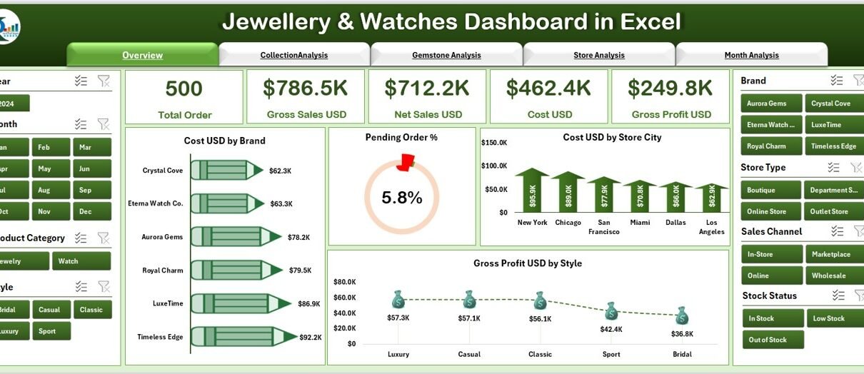
1. Overview Page – Complete Performance Snapshot
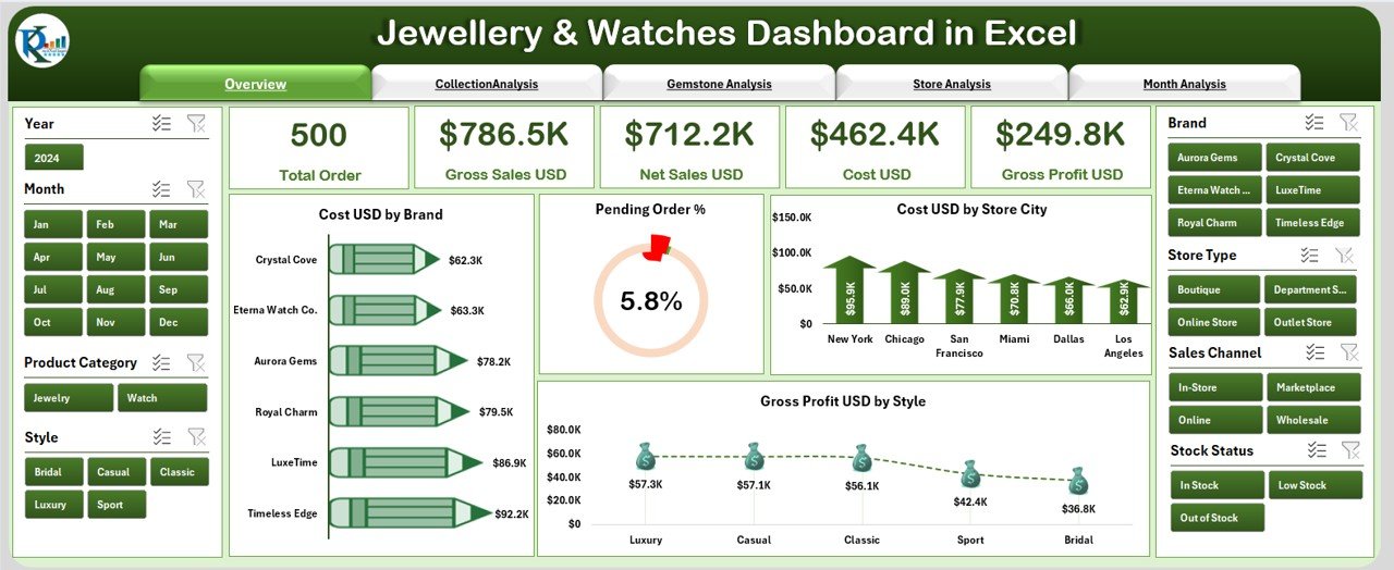
The Overview Page is the main summary page of your dashboard. It gives you an instant snapshot of your entire business.
🔹 Right-Side Slicer
You can slice data by different filters such as:
-
Year
-
City
-
Brand
-
Store
-
Collection
-
Style
🔹 KPI Cards – Quick Highlights
There are 5 key KPI cards, including:
-
Total Cost (USD)
-
Total Gross Profit (USD)
-
Pending Orders %
-
Total Stores
-
Total Sales
These cards help you see the overall performance in seconds.
🔹 Charts on the Overview Page
You will find four important charts:
-
Cost USD by Brand
-
Pending Order %
-
Cost USD by Store City
-
Gross Profit USD by Style
These visuals highlight your most profitable brands, high-cost cities, and best-performing styles. They also help you track pending orders efficiently.
Click to Purchases Jewellery & Watches Dashboard in Excel
2. Collection Analysis – Understand Which Collections Perform Best
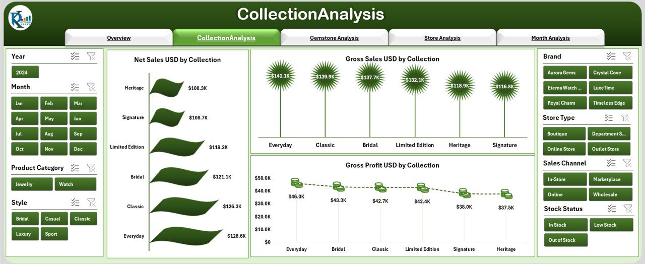
The Collection Analysis Page helps you evaluate the performance of different jewellery and watch collections.
🔹 Right-Side Slicer
You filter data easily based on:
-
Brand
-
Store
-
Category
-
City
🔹 Charts in Collection Analysis
You will see three important charts:
-
Net Sales USD by Collection
-
Gross Sales USD by Collection
-
Gross Profit USD by Collection
This page helps you find:
-
Which collections drive the highest revenue
-
Which collections deliver the highest margins
-
Which ones need more marketing support
-
Where to increase stock
3. Gemstone Analysis – Deep Dive into Gemstone Performance
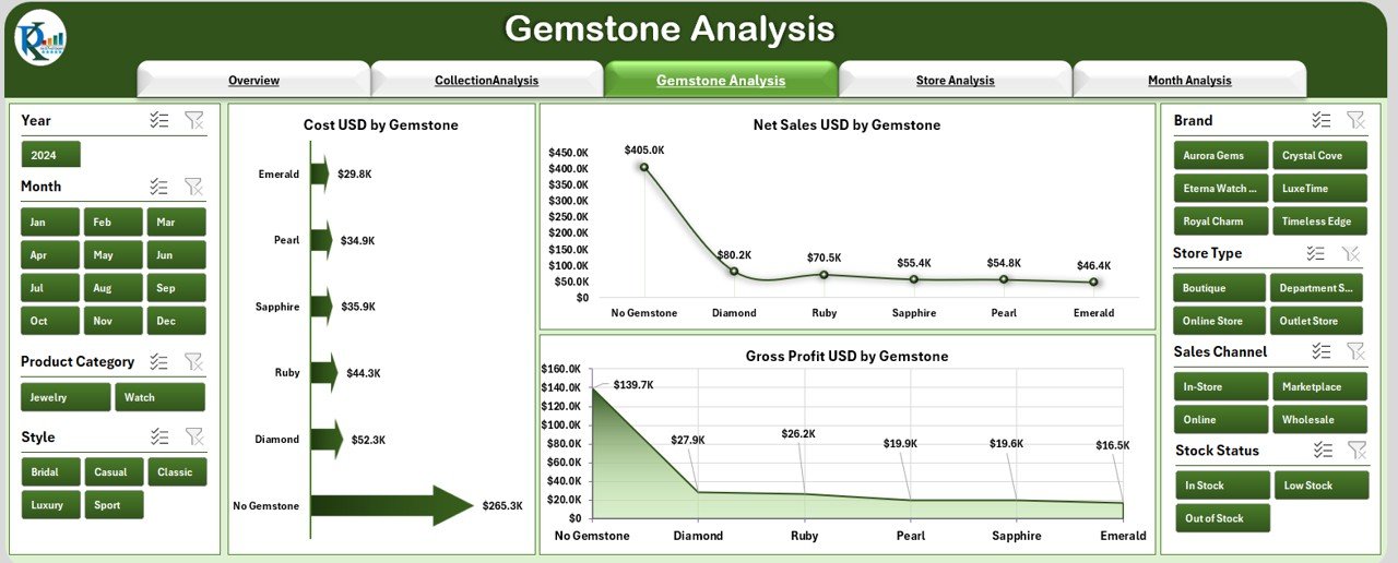
Gemstones impact both cost and selling price. This page helps you understand their role in business performance.
🔹 Right-Side Slicer
Filter by:
-
Gemstone
-
Brand
-
City
-
Store
🔹 Charts in Gemstone Analysis
You will see three charts:
-
Cost USD by Gemstone
-
Net Sales USD by Gemstone
-
Gross Profit USD by Gemstone
These insights help you decide:
-
Which gemstones sell most
-
Which gemstones increase profit
-
Which gemstones require better pricing
-
Which stones to stock more
In a jewellery business, gemstones show strong seasonal trends. This page helps you identify those patterns clearly.
4. Store Analysis – Compare Store Types and Locations
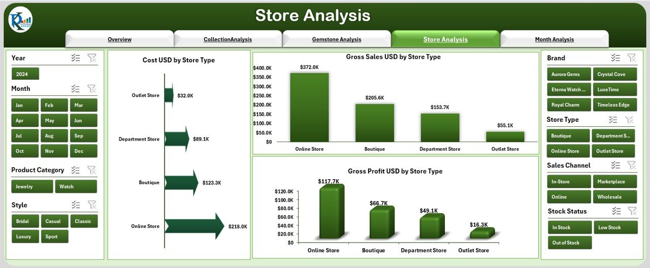
Store types and locations affect your revenue and cost. This page compares all store formats to reveal the strongest performers.
🔹 Right-Side Slicer
You filter by:
-
Store Type
-
Store City
-
Brand
-
Category
🔹 Charts in Store Analysis
This page displays three powerful charts:
-
Cost USD by Store Type
-
Gross Sales USD by Store Type
-
Gross Profit USD by Store Type
You quickly understand:
-
Which store type produces maximum sales
-
Which store generates highest profit margins
-
Which locations are underperforming
-
How store format impacts business growth
These insights help you plan new store openings and optimize existing stores.
5. Month Analysis – Track Performance Month-by-Month

The Month Analysis Page helps you understand your business trends over the year.
🔹 Right-Side Slicer
You can filter by:
-
Month
-
Year
-
Store
-
Brand
-
Collection
🔹 Charts in Month Analysis
This page includes:
-
Cost USD by Month
-
Gross Profit USD by Month
-
Net Sales USD by Month
This page answers questions like:
-
Which month gives the highest revenue?
-
Which month sees the highest cost?
-
What are the peak seasons?
-
How does profit vary month by month?
This analysis helps you plan inventory and marketing strategies.
Support Sheets in the Dashboard
The Excel file also includes:
Data Sheet
This sheet contains raw transactional data. You only update this sheet, and the dashboard updates automatically.
Other Supporting Sheets
-
Unique lists
-
Drop-down data
-
Calculated fields
These sheets ensure smooth working of the dashboard without manual effort.
Advantages of a Jewellery & Watches Dashboard in Excel
A dashboard gives you powerful insights that help you make smart decisions. Below are the major advantages:
1. Quick Decision-Making
You understand sales, costs, trends, and profits instantly.
2. One Dashboard for All Insights
You avoid checking multiple reports and spreadsheets.
3. Easy to Use
Excel makes it simple for anyone to use, even beginners.
4. Accurate Analysis
The dashboard updates automatically from fresh data.
5. Better Store Management
You compare store types, cities, and performance quickly.
6. Improved Inventory Planning
You track collections, gemstones, and styles easily.
7. Performance Tracking
You measure profits, costs, and monthly trends clearly.
8. Increased Profitability
Better decisions help you increase revenue and reduce cost.
Best Practices for Using the Jewellery & Watches Dashboard
Click to Purchases Jewellery & Watches Dashboard in Excel
To get the best results from your dashboard, follow these best practices:
1. Update Your Data Sheet Regularly
Daily or weekly updates keep your dashboard accurate.
2. Maintain Clean Data
Use consistent spellings, formats, and naming conventions.
3. Use Slicers Effectively
Check performance by brand, city, store, gemstone, or month.
4. Review All Five Pages Often
Each page provides unique insights that support better decisions.
5. Track Monthly Trends
Use month analysis to plan festive and seasonal stock.
6. Compare Store Performance
Identify low-performing stores and improve them.
7. Analyze Profit Margins
Monitor gross profit by brand, collection, and gemstone.
8. Optimize Your Pricing Strategy
Use cost and profit analysis to adjust prices smartly.
Conclusion
A Jewellery & Watches Dashboard in Excel gives you complete control over your business performance. It helps you track sales, cost, profit, collections, gemstones, store types, and month-wise trends. Because of this dashboard, you avoid complicated reports and make fast, data-driven decisions.
Retailers who use such dashboards increase profits, manage inventory better, and understand market trends clearly. When you analyze your jewellery and watch business with this dashboard, you improve your strategy and boost growth.
Frequently Asked Questions (FAQs)
1. What is a Jewellery & Watches Dashboard in Excel?
It is an Excel-based performance dashboard that tracks sales, cost, profit, gemstones, stores, and collections.
2. Do I need advanced Excel skills to use this dashboard?
No. You only update the data sheet, and the dashboard updates automatically.
3. Can I filter the analysis by brand or city?
Yes. Every page includes slicers for quick filtering.
4. How many pages does the dashboard include?
It includes five pages: Overview, Collection Analysis, Gemstone Analysis, Store Analysis, and Month Analysis.
5. Does the dashboard support monthly trend analysis?
Yes, the Month Analysis page shows monthly cost, sales, and profit.
6. Can I use this dashboard for multiple stores?
Yes. The store analysis page helps you compare store types and locations.
7. What data do I need to update?
You only update the Data Sheet with fresh transactions.
8. Can I track gemstone-level performance?
Yes. The Gemstone Analysis page gives detailed insights by gemstone.
9. Is this dashboard suitable for small retailers?
Yes. It works for small shops, boutiques, and large retail chains.
10. Will the dashboard calculate gross profit automatically?
Yes. You only enter data, and the dashboard calculates everything automatically.
Visit our YouTube channel to learn step-by-step video tutorials