Healthcare leaders rely on accurate data to make quick and confident decisions. Doctors, administrators, finance teams, and hospital managers handle huge volumes of information every day. Because of this, they struggle when data stays scattered in multiple systems. Reports take time, errors increase, and teams lose clarity.
A Hospitals Dashboard in Power BI solves this challenge. It brings clinical, operational, and financial data together in one interactive reporting system. You analyze performance in seconds, understand patient trends, and take action with confidence. As a result, hospitals improve quality of care, boost efficiency, and reduce costs.
Click to Purchases Hospitals Dashboard in Power BI
In this detailed article, you will learn:
-
What a Hospitals Dashboard in Power BI is
-
How each page works
-
Key features of the dashboard
-
Advantages of using this dashboard
-
Best practices for creating and using it
-
Frequently asked questions
Let’s explore everything step-by-step.
What Is a Hospitals Dashboard in Power BI?
A Hospitals Dashboard in Power BI is a ready-to-use analytical reporting system built for hospitals, clinics, healthcare groups, multi-specialty centers, and medical institutions. It converts raw hospital data into meaningful visuals. Every page gives you real-time insights into patient satisfaction, treatment cost, billing, revenue, insurance coverage, and operational performance.
You can track:
-
Patient satisfaction
-
Treatment expenses
-
Insurance claims
-
Department performance
-
Branch location metrics
-
Monthly trends
-
Profitability and cost behavior
This dashboard uses slicers, charts, KPIs, and interactive visuals so hospital teams understand performance without reading long spreadsheets. You explore insights with a single click and take timely decisions.
Why Do Hospitals Need a Power BI Dashboard?
Hospitals deal with thousands of data points every day. These include appointments, billing, medical procedures, insurance approvals, patient satisfaction, doctor performance, and branch operations. When teams manage all of this manually, mistakes occur and decisions slow down.
A Power BI dashboard gives you:
-
Instant access to updated information
-
Real-time performance monitoring
-
Accurate decision-making support
-
A unified view of all hospital operations
Because the dashboard connects with Excel, databases, or cloud data sources, you refresh everything with one click and get updated numbers immediately.
Key Features of the Hospitals Dashboard in Power BI
This dashboard includes five pages, and each page focuses on a specific area of hospital performance. Let’s explore every page with complete details.
1. Overview Page — The Complete Hospital Performance Snapshot
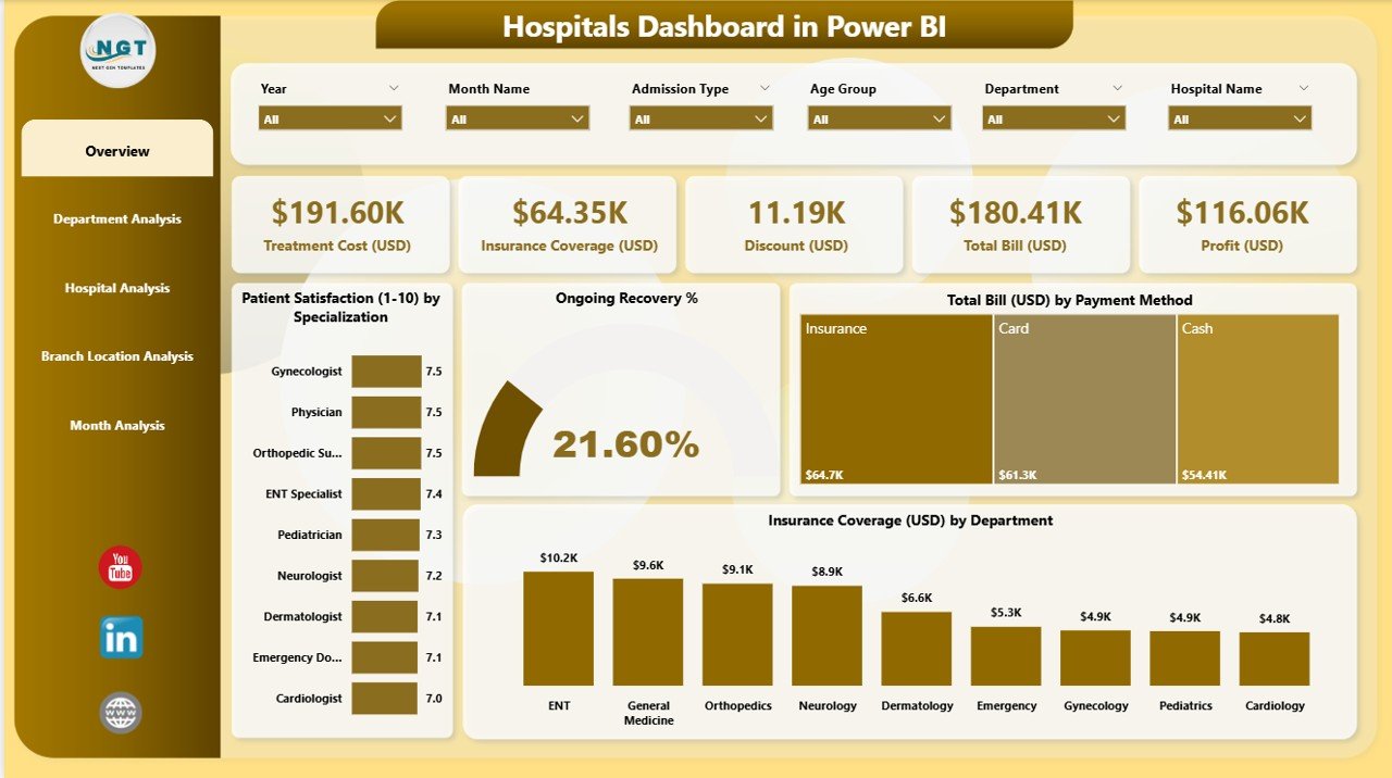
The Overview Page acts as the main control center of the dashboard. You get all major KPIs in one place. Because of this, leadership teams understand the overall performance in seconds.
What You See on the Overview Page
-
4 KPI Cards:
These cards show crucial metrics that matter most for daily decisions.
Examples include:-
Overall satisfaction
-
Total recovery rate
-
Total billing amount
-
Insurance coverage amount
-
-
4 Interactive Charts:
These charts help you learn how performance changes across key areas:-
Patient Satisfaction by Specialization
-
Ongoing Recovery %
-
Total Bill (USD) by Payment Method
-
Insurance Coverage (USD) by Department
-
Each chart plays a major role in understanding patient behavior, financial performance, and department-wise output. When you apply slicers, all visuals update instantly, and you see insights for the selected period, department, or hospital.
Click to Purchases Hospitals Dashboard in Power BI
2. Department Analysis — Deep Insights for Every Department
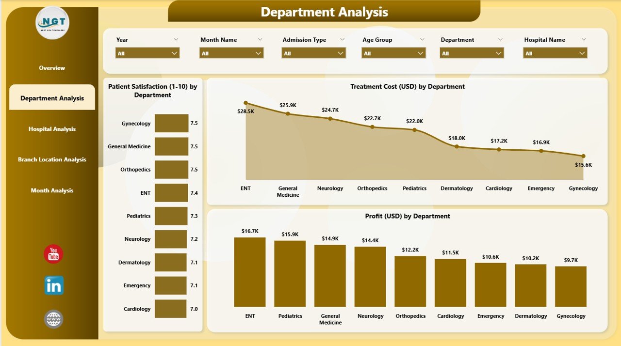
The Department Analysis Page focuses on department-level performance. You understand how each department performs in terms of patient experience, cost management, and profitability.
Key Visuals on This Page
-
Patient Satisfaction by Department
You identify departments that perform well and departments that require improvement. -
Treatment Cost (USD) by Department
You compare treatment costs across specialties like cardiology, neurology, orthopedics, emergency care, etc. -
Profit (USD) by Department
You see which departments generate the highest profit and which ones require cost optimization.
This page helps hospital managers take quick action to improve efficiency and enhance patient experience. Moreover, department heads use this page to develop better strategies and allocate resources properly.
3. Hospital Analysis — Compare Performance Across All Hospitals
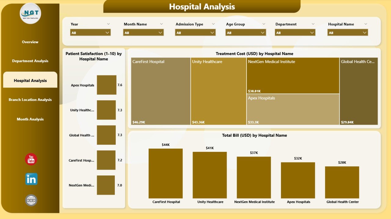
If you manage multiple hospitals or medical centers, the Hospital Analysis Page becomes extremely useful. You see performance updates for each hospital in your network.
What This Page Includes
-
Patient Satisfaction by Hospital Name
You identify hospitals that deliver excellent service and hospitals that need improvement. -
Treatment Cost (USD) by Hospital Name
You compare cost behavior across hospitals and evaluate whether expenses stay under control. -
Total Bill (USD) by Hospital Name
You understand how revenue changes across locations.
This page supports strategic decisions for hospital groups. It highlights strong-performing branches and helps you plan improvement programs for weaker branches.
4. Branch Location Analysis — Understand Performance at Every Location
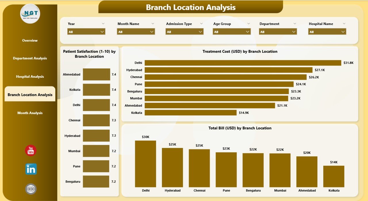
Many hospitals operate across different branch locations. The Branch Location Analysis Page gives a clear snapshot of performance across all locations.
Charts Included
-
Patient Satisfaction by Branch Location
-
Treatment Cost (USD) by Branch Location
-
Total Bill (USD) by Branch Location
You immediately see which location runs efficiently and which one needs support. Because of this, management improves resource allocation and operational strategies quickly.
5. Monthly Trends — Track Performance Month by Month
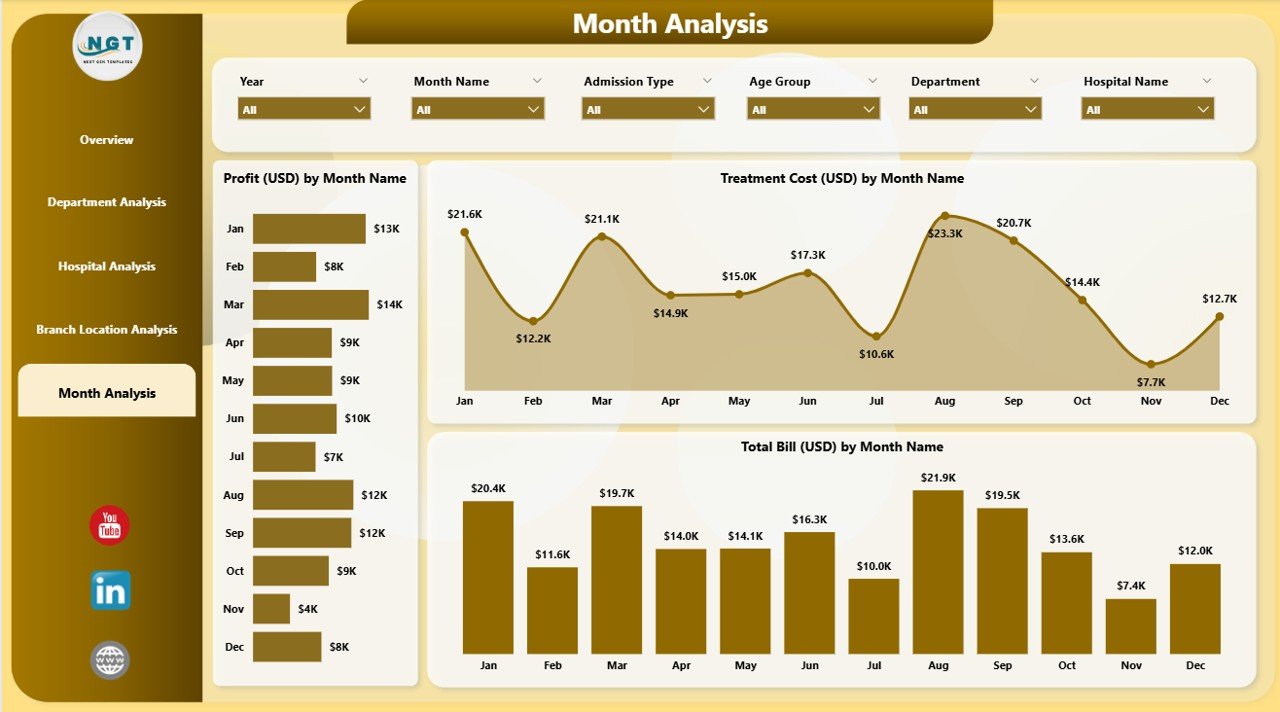
The Monthly Trends Page focuses on long-term analysis. This page helps you track how performance changes each month.
Charts You See Here
-
Profit (USD) by Month
-
Treatment Cost (USD) by Month
-
Total Bill (USD) by Month
These visuals help hospital teams:
-
Monitor monthly performance
-
Understand seasonality
-
Identify patterns
-
Plan budgets correctly
-
Improve forecasting
Monthly trends also help leadership teams decide whether the hospital meets yearly goals.
How the Dashboard Helps Hospital Teams
Every hospital team gains valuable insights from this dashboard:
1. Doctors and Medical Staff
They understand patient satisfaction, treatment success rates, and monthly progress.
2. Finance Team
They monitor billing, treatment costs, and profitability.
3. Hospital Administrators
They track operational performance and resource usage.
4. Senior Leadership
They make strategic decisions using clear and accurate visuals.
5. Department Heads
They analyze department-wise performance and improve operational efficiency.
Click to Purchases Hospitals Dashboard in Power BI
Advantages of a Hospitals Dashboard in Power BI
A Hospitals Dashboard brings many advantages. Here are the most important ones:
✔ 1. Complete 360-Degree View of Hospital Performance
You get clinical, operational, and financial insights on one screen.
✔ 2. Faster and Smarter Decision-Making
Accurate visuals help leadership teams make decisions without waiting for reports.
✔ 3. Real-Time Monitoring
You track performance instantly because the dashboard refreshes with updated data.
✔ 4. Improved Patient Satisfaction
You identify gaps, monitor service levels, and take action to improve patient care.
✔ 5. Better Cost Management
You track treatment costs, insurance coverage, and departmental expenses easily.
✔ 6. Deep Analysis for Departments and Branches
You compare performance across departments, hospitals, and branch locations.
✔ 7. Enhanced Forecasting and Planning
Monthly trends help you understand historical patterns and plan future strategies.
✔ 8. Easy to Use for All Healthcare Teams
Power BI visuals stay simple and intuitive, so every user understands insights quickly.
Best Practices for Using a Hospitals Dashboard in Power BI
To get the best results, follow these best practices:
1. Keep Data Clean and Structured
Clean data ensures correct insights. Maintain proper formats, remove duplicates, and update entries regularly.
2. Refresh Data Daily
Daily refresh gives you the most accurate information for decision-making.
3. Use Clear KPI Names
Simple KPI names help every team member understand the metrics instantly.
4. Update Dashboards Based on Feedback
Doctors, admin teams, and finance teams may request improvements. Make updates regularly.
5. Add Only Meaningful Visuals
Avoid unnecessary charts. Keep visuals focused on insights that support decision-making.
6. Use Slicers Effectively
Add slicers for month, department, hospital, branch, and payment method so users explore deeper insights.
7. Ensure Data Security
Always protect patient data and follow healthcare compliance rules while connecting data sources.
8. Standardize Department Codes and Hospital Names
Standard naming avoids confusion and ensures correct filtering.
9. Monitor Trends Every Month
Monthly patterns highlight seasonal behavior and help you plan budgets correctly.
10. Train Users Regularly
Offer training sessions so every user understands how to use the dashboard effectively.
Conclusion
A Hospitals Dashboard in Power BI empowers hospitals with strong data insights. It gives you instant visibility into satisfaction scores, billing trends, department performance, and branch operations. With interactive visuals, clear KPIs, and monthly analysis, hospitals improve patient care and operational efficiency. Power BI makes data easy to understand and helps you take informed decisions every day.
This dashboard supports doctors, administrators, finance teams, and hospital leadership. Because of its ability to convert raw data into meaningful visuals, it becomes an essential tool for modern healthcare management.
Frequently Asked Questions (FAQs)
1. What is a Hospitals Dashboard in Power BI?
It is an interactive reporting system that shows clinical, financial, and operational insights for hospitals through charts, KPIs, and dynamic visuals.
2. Who uses this dashboard in a hospital?
Doctors, administrators, department heads, finance teams, and senior management use this dashboard to make better decisions.
3. What data can I track in this dashboard?
You can track patient satisfaction, treatment cost, revenue, insurance coverage, department performance, hospital-level insights, and monthly trends.
4. Can I customize the dashboard?
Yes, you can customize slicers, charts, KPIs, colors, data sources, and page layouts based on hospital needs.
5. Does the dashboard support multiple hospital locations?
Yes, it includes branch-wise and hospital-wise analysis pages for multi-location healthcare organizations.
6. How often should I refresh the data?
Daily refresh ensures accurate and updated insights.
7. Do I need technical skills to use this dashboard?
No. Power BI visuals stay simple and user-friendly, so every team member can navigate easily.
8. What are the main benefits of this dashboard?
It improves patient satisfaction, enhances decision-making, reduces operational errors, and gives a complete picture of hospital performance.
Visit our YouTube channel to learn step-by-step video tutorials