Healthcare teams work every day to improve patient outcomes, manage services, reduce costs, and maintain quality standards. However, home healthcare brings even more challenges because nurses, caregivers, and service teams work outside hospitals and clinics. As a result, managers need reliable and real-time information to understand performance. A Home Healthcare Dashboard in Power BI solves this problem. It gives teams complete visibility, turns raw data into insights, and supports quick decision-making.
In this detailed guide, you will learn what a Home Healthcare Dashboard in Power BI is, how it works, what each page shows, why it helps healthcare teams, and how you can use it with best practices.
Click to Purchases Home Healthcare Dashboard in Power BI
What Is a Home Healthcare Dashboard in Power BI?
A Home Healthcare Dashboard in Power BI shows key metrics for patient satisfaction, service performance, billing trends, revenue, and team activities. It brings all important data into one place so that healthcare professionals can track performance without confusion.
Because Power BI offers interactive visuals, managers quickly compare regions, service types, conditions, and monthly trends. Instead of searching multiple files, they see insights instantly. The dashboard uses clean visuals, slicers, and data filters to help everyone understand information fast.
Why Do Home Healthcare Teams Need a Dashboard?
Home healthcare operations involve many moving pieces. Nurses visit patients at home, billing teams process payments, managers check service quality, and administrators track outcomes. Without a dashboard, teams depend on scattered spreadsheets and manual reporting.
A Power BI dashboard solves this because:
-
It improves accuracy
-
It reduces manual work
-
It gives real-time insights
-
It supports quick decisions
-
It keeps everyone aligned
Since healthcare teams deal with sensitive operations, they must know how each service performs. Therefore, a dashboard becomes the most important tool for daily monitoring.
Key Features of the Home Healthcare Dashboard in Power BI
Your Home Healthcare Dashboard includes five powerful pages. Each page presents a different analytical view. Let us explore them one by one.
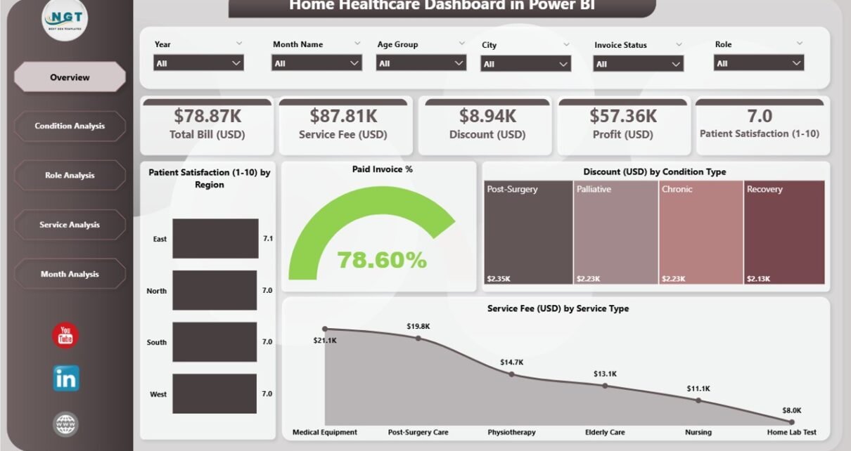
1. Overview Page – What Does It Show?

The Overview Page gives a quick snapshot of the entire home healthcare operation. It helps managers check performance at a glance.
Key Elements on the Overview Page
-
Four KPI Cards
-
Patient Satisfaction
-
Paid Invoice %
-
Discount (USD)
-
Service Fee (USD)
-
-
Four Charts
-
Patient Satisfaction by Region
-
Paid Invoice %
-
Discount (USD) by Condition Type
-
Service Fee (USD) by Service Type
-
Because this page shows the most important KPIs, decision-makers use it every day. It gives immediate clarity and highlights areas that need attention.
Click to Purchases Home Healthcare Dashboard in Power BI
2. Condition Analysis Page – How Does It Help You Understand Patient Conditions?

The Condition Analysis page focuses on how different patient conditions influence performance. Healthcare teams use this page to understand treatment outcomes for various categories.
Charts Included
-
Patient Satisfaction by Condition Type
-
Paid Amount (USD) by Condition Type
-
Service Fee (USD) by Condition Type
Because each condition category performs differently, managers study this page to understand what treatment types bring the highest satisfaction, revenue, and service usage.
3. Role Analysis Page – Why Should Teams Analyze Staff Roles?

Every role in home healthcare plays a unique part. Some roles support patient care directly, while others support billing, administration, and coordination. Therefore, analyzing performance by role becomes important.
Charts on the Role Analysis Page
-
Patient Satisfaction by Region
-
Paid Amount (USD) by Role
-
Total Bill (USD) by Role
With these charts, managers understand:
-
Which roles generate the highest revenue
-
Which roles need training
-
Which roles improve patient satisfaction
This information supports resource planning and staff performance improvement.
4. Service Analysis Page – What Can You Learn From Service Type Performance?

Services drive the entire home healthcare model. Some services generate high revenue, while others improve patient satisfaction. Therefore, the Service Analysis page helps managers track service-level performance.
Charts on the Service Analysis Page
-
Total Bill (USD) by Service Type
-
Discount (USD) by Service Type
-
Profit (USD) by Service Type
This page helps teams answer questions like:
-
Which services bring the highest revenue?
-
Which service types need better discount control?
-
Which services deliver the best profit margins?
With these insights, managers create better pricing and service planning strategies.
5. Monthly Trends Page – How Do You Analyze Monthly Performance?

Healthcare managers study trends every month to understand patterns, seasonality, and budget requirements. The Monthly Trends page offers a complete month-by-month view.
Charts on Monthly Trends Page
-
Total Bill (USD) by Month
-
Discount (USD) by Month
-
Profit (USD) by Month
These charts help managers identify:
-
Peak seasons
-
Drop-in revenue periods
-
Months with low or high discounts
-
Profitability changes
Since trends tell a clear story, this page becomes essential for forecasting and planning.
How Does a Home Healthcare Dashboard Improve Decision-Making?
Click to Purchases Home Healthcare Dashboard in Power BI
A dashboard supports smarter decisions in many ways. It speeds up reporting, improves clarity, and highlights important areas instantly.
Here is how it helps:
-
It simplifies complex healthcare data
-
It presents visual insights in seconds
-
It shows patient satisfaction patterns
-
It compares region-wise service performance
-
It reveals revenue and profit drivers
-
It improves resource allocation
-
It supports accurate forecasting
Because teams use these insights daily, the dashboard becomes a foundation for healthcare strategy.
Advantages of the Home Healthcare Dashboard in Power BI
A Power BI dashboard for home healthcare brings several benefits. Let us explore them in detail.
1. Better Patient Satisfaction Tracking
Teams check satisfaction scores by region, role, or condition. This helps them take action fast and improve service quality.
2. Strong Billing and Profit Insights
Since the dashboard tracks paid invoices, discounts, revenue, and profit, managers understand financial performance instantly.
3. Clear Condition-Based Insights
Condition-wise charts help teams understand treatment outcomes and revenue patterns.
4. Improved Staff Performance Evaluation
Managers compare performance by role. As a result, they balance workloads and improve staff efficiency.
5. Strong Service-Level Insights
Service analysis highlights which services perform best. This helps teams focus on profitable and high-impact services.
6. Monthly Trend Tracking
Monthly charts show performance changes. Managers use this information for planning and budgeting.
7. Real-Time Data Visibility
Teams access updated insights anytime. Therefore, they respond faster and make better decisions.
8. Easy Navigation Across Pages
Clear navigation helps users switch between pages without confusion.
Best Practices for Using the Home Healthcare Dashboard in Power BI
To get maximum value, follow these best practices when using your dashboard.
1. Review the Overview Page Daily
The Overview page shows the most important KPIs, so check it every morning.
2. Use Slicers for Deep Filtering
Slicers help you filter by region, role, service type, or condition. This provides deeper insights.
3. Compare Multiple Pages Together
Move across pages to understand the complete story. Condition analysis, service analysis, and role analysis together offer a full view.
4. Track Monthly Trends for Forecasting
Use the Monthly Trends page for future planning, budget allocation, and resource management.
5. Train Staff to Read Visuals
When staff understand charts, they make better decisions every day.
6. Update Data Regularly
Keep your source files up to date so the dashboard remains accurate.
7. Use Insights to Improve Operations
Use patient satisfaction data to improve service, staff performance data to assign roles better, and revenue data to make financial decisions.
How to Use This Dashboard Effectively?
You can use this dashboard in many ways:
-
Review satisfaction trends for service improvement
-
Check revenue and billing status weekly
-
Compare service types to identify top performers
-
Study trends to improve staffing decisions
-
Monitor profit changes
-
Adjust discount policies
-
Improve staff training
This dashboard gives you the confidence to make decisions based on facts, not guesswork.
Conclusion
A Home Healthcare Dashboard in Power BI transforms healthcare reporting. It brings all important information into one place and supports quick, smart, and data-driven decisions. With clear visuals, powerful analysis pages, and easy navigation, every healthcare team gains full clarity on performance. You understand patient satisfaction, service outcomes, billing trends, role effectiveness, and monthly changes without searching multiple files.
Since home healthcare depends on accuracy, the dashboard becomes an essential tool for managing operations. When you follow the best practices shared in this guide, you unlock the full power of Power BI and take your healthcare reporting to the next level.
Frequently Asked Questions (FAQs)
1. What is a Home Healthcare Dashboard in Power BI?
It is a reporting tool that shows patient satisfaction, billing trends, revenue, service insights, and staff performance in one interactive dashboard.
2. Why do home healthcare teams need this dashboard?
It helps teams track performance, improve service quality, manage operations, understand trends, and make better decisions every day.
3. How many pages does the dashboard include?
The dashboard includes five pages: Overview, Condition Analysis, Role Analysis, Service Analysis, and Monthly Trends.
4. Can the dashboard analyze patient satisfaction?
Yes. It shows satisfaction by region, role, and condition type.
5. Does this dashboard help with billing insights?
Yes, it tracks paid invoices, total bill amounts, discounts, and profit trends.
6. Can managers analyze service types?
Yes. The Service Analysis page shows total bill, discount, and profit for every service type.
7. How do trends help healthcare teams?
Trends show monthly changes in revenue, profit, and discounts. This helps managers plan better.
8. Is the dashboard easy for non-technical users?
Yes. Power BI visuals are simple and clear, so even beginners understand them easily.
9. Can this dashboard improve decision-making?
Yes. Because it brings real-time data into one place, it speeds up reporting and improves decisions.
10. How often should you use the dashboard?
Use it daily for operations, weekly for revenue review, and monthly for performance planning.
Visit our YouTube channel to learn step-by-step video tutorials