The radio and podcast industry grows every year because listeners want fast, engaging, and on-the-go content. With hundreds of shows, multiple platforms, diverse countries, and various devices, creators and media companies handle huge volumes of data. When this data spreads across files, reports, and sheets, it becomes tough to track performance. Therefore, a Radio & Podcasts Dashboard in Excel helps you monitor everything in one place.
This article explains the full structure of the dashboard, its benefits, its best practices, and how you can use it to improve decision-making. You will also learn how each page of the dashboard works and how this ready-to-use Excel template simplifies your analytics.
Click to Purchases Radio & Podcasts Dashboard in Excel
What Is a Radio & Podcasts Dashboard in Excel?
A Radio & Podcasts Dashboard in Excel is a ready-to-use performance tracking tool that collects your radio and podcast data into one central place. It displays Marketing Cost, Production Cost, Revenue, Listener Satisfaction, Show Type trends, and platform-wise performance with clean visuals. You can check your metrics month-to-month, compare platforms, track country performance, and study device usage.
This dashboard comes with slicers, cards, graphs, and page navigation buttons to help you move across pages without confusion. You gain full visibility into your operations, financial performance, audience engagement, and content growth.
The dashboard includes five powerful analytical pages, each showing detailed insights.
Why Do You Need a Radio & Podcasts Dashboard in Excel?
You create many shows. You publish across different platforms. You manage sponsorships, ads, marketing campaigns, production costs, and team budgets. If you track all this manually, you spend more time updating sheets than improving your content.
A dashboard solves this problem because:
-
It saves time.
-
It reduces errors.
-
It gives real-time insights.
-
It adds visual clarity.
-
It makes reporting simple.
-
It helps you compare performance across locations, devices, and platforms.
When you use this dashboard, you always know what works, what needs improvement, and which strategy gives the best results.
Key Features of the Radio & Podcasts Dashboard in Excel
This dashboard offers multiple features that simplify your analytics and improve your workflow. Here are the most important features:
✔ Page Navigator
The page navigator appears on the left side of the file. It lets you move across all five pages with one click. You don’t waste time searching for tabs or scrolling.
✔ Interactive Slicers
Every major page includes slicers on the right side. You can filter data by:
-
Month
-
Platform
-
Country
-
Device Type
-
Genre
-
Show Type
These slicers help you personalize your analysis in seconds.
✔ KPI Cards
The dashboard includes clean KPI cards on the top section. These cards give you instant numbers such as:
-
Total Revenue
-
Total Cost
-
Profit or Margin
-
Satisfaction Rating
-
Total Shows
You take quick decisions because all numbers stay visible at a glance.
✔ Meaningful Charts
Each page displays four visually appealing charts. These charts explain performance, cost, trends, and audience behavior with simplicity.
✔ Data Sheet
The Data sheet stores all raw data. The dashboard reads all numbers from this sheet. You never touch the visuals while updating.
Pages of the Radio & Podcasts Dashboard in Excel
This dashboard contains five analytical pages, each designed to display a specific part of your radio and podcast performance.
Let us explore each one.
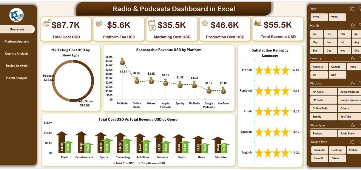
1. Overview Page: Your Main Control Center
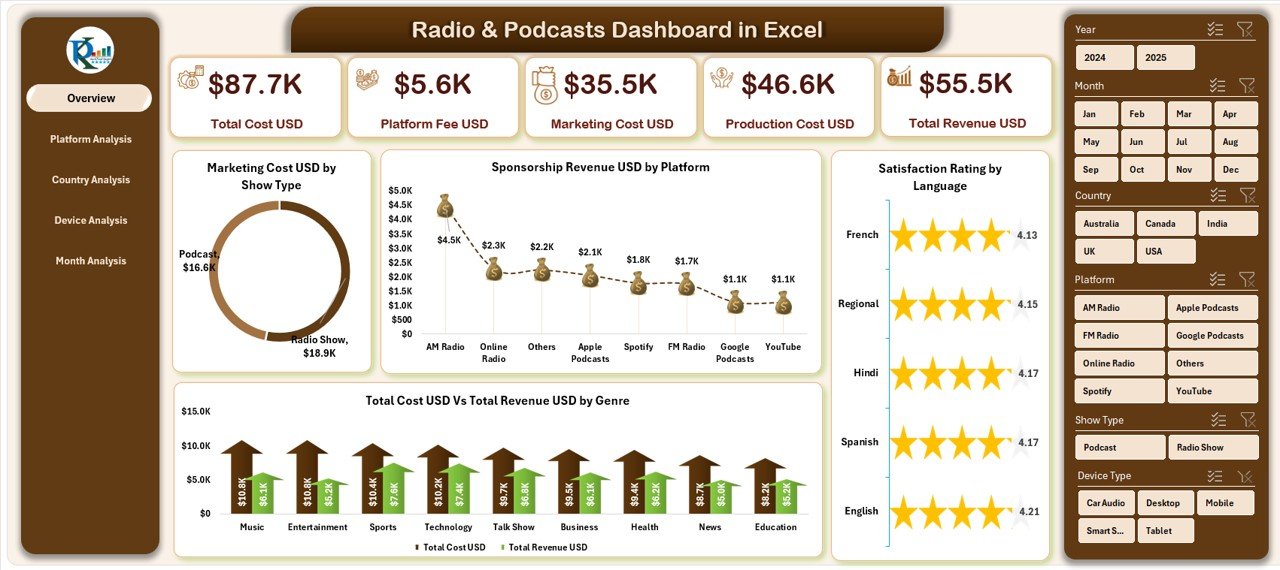
The Overview Page is your main page. It gives a clear snapshot of your entire radio and podcast business. You find:
✔ Slicers on the Right-Side
You can filter the overview based on multiple parameters.
✔ Five KPI Cards
These cards highlight your major performance areas.
✔ Four Key Charts
The Overview Page includes:
-
Marketing Cost USD by Show Type
This chart helps you understand where you spend more money on promotions. -
Sponsorship Revenue USD by Platform
It lets you see which platforms give the highest sponsorship revenue. -
Satisfaction Rating
You study your listener satisfaction across shows, genres, or platforms. -
Total Cost USD vs Total Revenue USD by Genre
This comparison helps you understand which genres produce profit and which need attention.
The Overview Page simplifies your performance monitoring. It becomes your first stop for every review meeting.
2. Platform Analysis: Which Platform Performs Best?
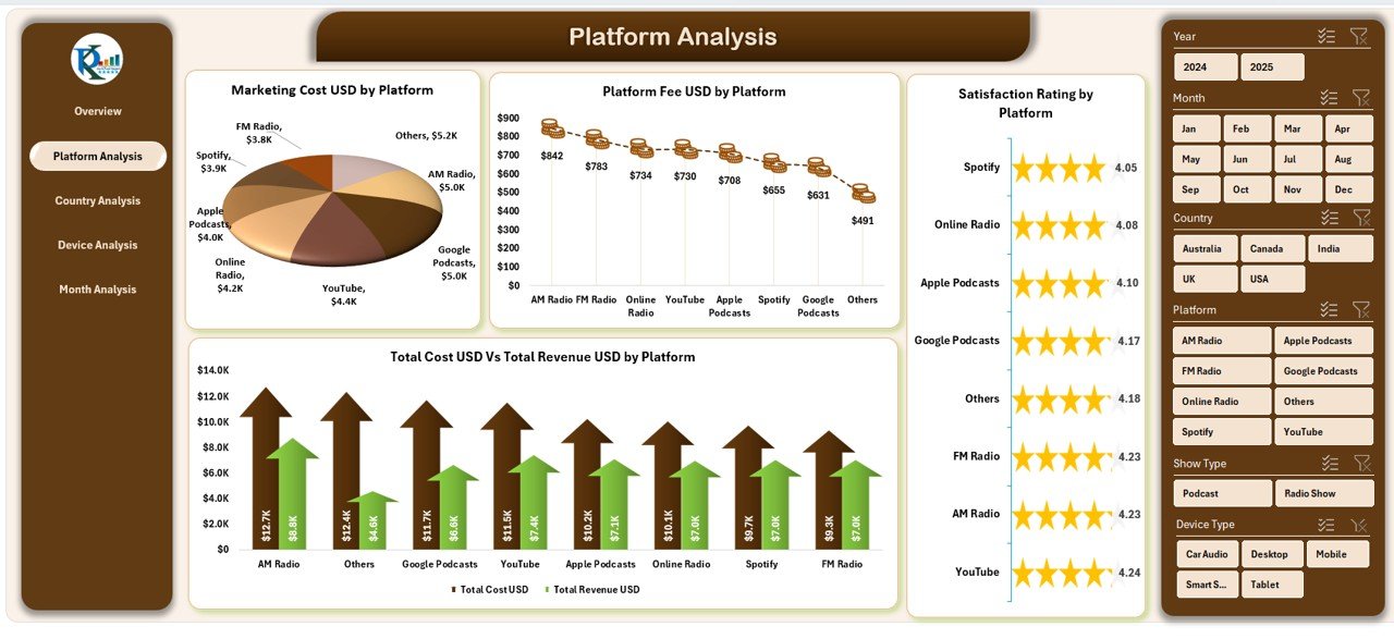
Today’s podcasts and radio shows run across many platforms such as Spotify, YouTube, Apple Podcasts, FM Radio, Google Podcasts, and regional apps. You must know which platform:
-
Gives you more revenue
-
Costs more to operate
-
Attracts the most listeners
-
Provides the best satisfaction score
The Platform Analysis page helps you evaluate this.
✔ Slicers on the Right Side
Filter the entire page based on month, genre, or show type.
✔ Four Platform Comparison Charts
-
Marketing Cost USD by Platform
Find the cost you spend on each platform. -
Platform Fee USD by Platform
Study the fee you pay to each platform. -
Satisfaction Rating by Platform
Understand where your listeners stay most happy. -
Total Cost USD vs Total Revenue USD by Platform
Compare profitability platform-wise.
This page lets you choose the best distribution channel for your content.
3. Country Analysis: How Do Different Countries Perform?
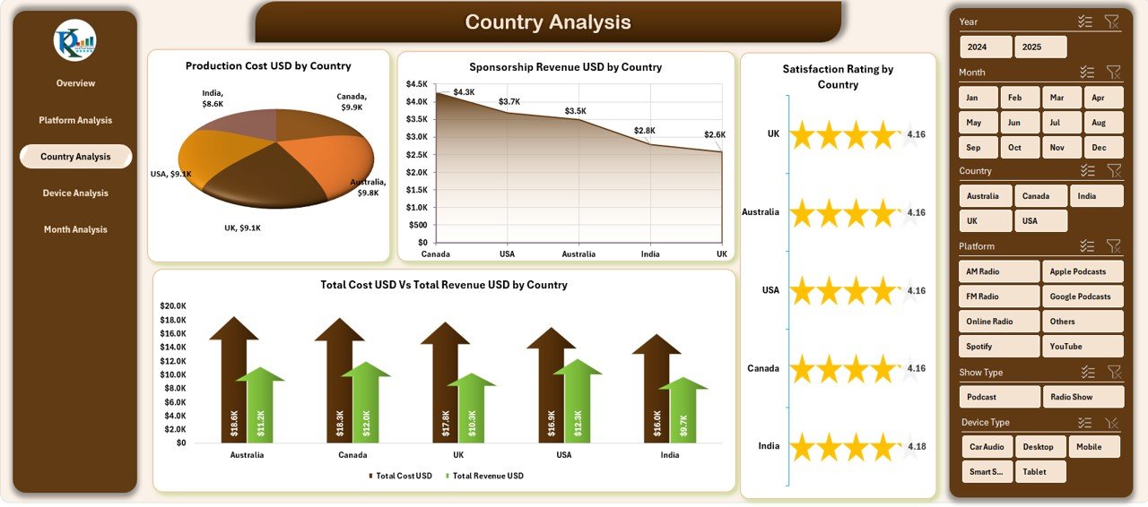
If your content targets global audiences, country-based insights matter. Many creators earn revenue from the US, UK, India, Canada, Europe, Australia, and Middle-East markets.
The Country Analysis page helps you understand the performance of each country with four charts:
✔ Production Cost USD by Country
You see how much you spend to produce shows for different regions.
✔ Sponsorship Revenue USD by Country
This shows your top earning countries.
✔ Satisfaction Rating by Country
Analyze audience happiness country-wise.
✔ Total Cost USD vs Total Revenue USD by Country
This comparison helps you identify profitable and non-profitable markets.
The Country Analysis page becomes helpful when you plan global expansion or want to understand regional audience behavior.
Click to Purchases Radio & Podcasts Dashboard in Excel
4. Device Analysis: Know Your Listener’s Preferred Device
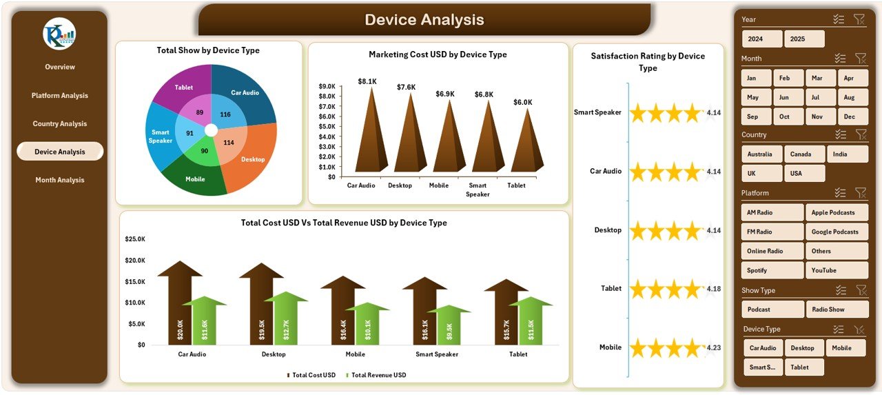
Your audience uses many devices—mobiles, laptops, smart speakers, desktop computers, and tablets. To improve content quality, you must know which device type brings the most engagement.
The Device Analysis page includes:
✔ Total Shows by Device Type
Know how many shows listeners consume through each device.
✔ Marketing Cost USD by Device Type
Check how much you spend on marketing across different devices.
✔ Satisfaction Rating by Device Type
Study listener happiness device-wise.
✔ Total Cost USD vs Total Revenue USD by Device Type
Analyze which device type gives the highest profit.
Device analytics help you optimize content for the right audience based on their listening behavior.
5. Month Analysis: Track Monthly Performance with Clarity

Every creator and company needs monthly insights to plan budgets, measure results, and forecast performance. The Month Analysis page gives you four powerful charts for monthly trend tracking.
You get:
✔ Ad Revenue USD by Month
Study how your monthly ad earnings change.
✔ Marketing Cost USD by Month
Track your month-wise promotional spending.
✔ Production Cost USD by Month
See how your production cost grows or drops each month.
✔ Total Cost USD vs Total Revenue USD by Month
Compare your monthly revenue against your monthly cost.
This page helps you plan future marketing campaigns, optimize monthly budgets, and understand performance cycles.
Advantages of Using a Radio & Podcasts Dashboard in Excel
Using this dashboard brings many advantages. Let us explore them:
✔ 1. You Track All Data in One Place
You stop switching between sheets and files.
✔ 2. You Save Time
You update data once, and the dashboard updates automatically.
✔ 3. You Improve Content Strategy
You understand what works for each platform, country, device, and month.
✔ 4. You Compare Costs and Revenue Easily
You make smarter financial decisions.
✔ 5. You Improve Listener Satisfaction
You learn which content your listeners love.
✔ 6. You Avoid Manual Errors
The dashboard calculates everything for you.
✔ 7. You Present Reports Professionally
You can use this dashboard in client meetings, marketing discussions, and strategy sessions.
Opportunities for Improvement in Radio & Podcasts Dashboard in Excel
Although the dashboard works well, you can improve it in the following areas:
✔ Add automation using macros
✔ Add forecasting charts
✔ Add audience demographics
✔ Add heatmaps for peak listening hours
✔ Add a profit margin calculator
✔ Add genre-wise performance comparison
These additions help you create deeper insights.
Best Practices for the Radio & Podcasts Dashboard in Excel
Click to Purchases Radio & Podcasts Dashboard in Excel
To use this dashboard smoothly, follow these best practices:
✔ Keep your data sheet clean
Remove duplicates, use standard formats, and update data regularly.
✔ Use consistent units
Use USD for all financial metrics.
✔ Refresh data before analysis
Always check if the dashboard is updated.
✔ Avoid merging cells in raw data
It affects formulas and visuals.
✔ Use slicers properly
Use one filter at a time to avoid confusion.
✔ Review trends monthly
Trends help you plan long-term decisions.
✔ Back up your file
Always keep a backup before making changes.
Conclusion
A Radio & Podcasts Dashboard in Excel gives you full control over your radio and podcast analytics. You track costs, revenue, satisfaction, platform performance, and listening behavior in one place. With five detailed pages, clean visuals, interactive slicers, and powerful charts, this dashboard becomes the smartest way to analyze your creative business.
Whether you create radio shows or run a podcast network, this dashboard helps you improve performance, increase revenue, and understand your audience better.
Frequently Asked Questions (FAQs)
1. What is a Radio & Podcasts Dashboard in Excel?
It is a ready-to-use Excel tool that helps you track costs, revenue, satisfaction, platform performance, and monthly trends for radio and podcast content.
2. Can beginners use this dashboard?
Yes, the dashboard is simple, clean, and beginner-friendly.
3. Do I need advanced Excel skills to use it?
No, you only need basic data entry skills. The dashboard updates automatically.
4. Can I customize the dashboard?
Yes, you can add charts, rename pages, and modify visuals based on your needs.
5. How often should I update the data sheet?
Update it daily, weekly, or monthly—based on how often you publish new content.
6. Does the dashboard support multiple platforms?
Yes, it supports analysis for all platforms such as Spotify, YouTube, FM Radio, and more.
7. Can I use this dashboard for client reporting?
Yes, the dashboard is professional and perfect for presentations.
Visit our YouTube channel to learn step-by-step video tutorials