Organizations go through change all the time. New systems, fresh processes, policy updates, technology upgrades, and team restructuring happen in every industry. Yet, leaders struggle when they track these changes in scattered spreadsheets or long email threads. Because of this, they cannot see the real progress, cost impact, risk level, or user satisfaction.
A Change Management Dashboard in Excel solves this problem with a simple and clear view of everything related to change requests and change processes. This dashboard brings all key metrics, trends, and insights together. As a result, leaders understand what works, what needs action, and what requires attention.
In this detailed guide, you will learn everything about the dashboard, its features, benefits, best practices, and how it helps you handle change with confidence.
Click to Purchases Change Management Dashboard in Excel
What Is a Change Management Dashboard in Excel?
A Change Management Dashboard in Excel is a ready-to-use analytical tool that tracks change requests, risk levels, cost impact, approvals, user satisfaction, and monthly trends. It converts raw data into clean visuals like charts, cards, slicers, and tables.
This dashboard helps managers monitor every part of the change lifecycle. You can see change types, change categories, change windows, risk levels, estimated cost, actual cost, and request approval rates. When all this data appears in one place, decision-making becomes fast and stress-free.
Moreover, Excel makes this dashboard easy to use, flexible, and ideal for companies of any size.
Why Do Organizations Need a Change Management Dashboard?
Companies run many projects at the same time. Every project requires some level of change. When these changes pile up, confusion grows. Without a proper tracking system, teams struggle with:
-
Delayed approvals
-
Miscommunication
-
Poor visibility
-
Wrong cost estimates
-
High risk issues
-
Low satisfaction
Therefore, a dashboard becomes essential. It gives clarity, control, and a structured way to manage every change.
Key Features of the Change Management Dashboard in Excel
This dashboard comes with a smart layout and multiple analytical pages. It includes a Page Navigator on the left side. Because of this, users can smoothly jump between different pages in just one click.
Inside the Excel file, you will find five powerful analytical pages, along with a Support Sheet and a Data Sheet.
Let’s explore each page in detail.
1. Overview Page: What Does It Display?
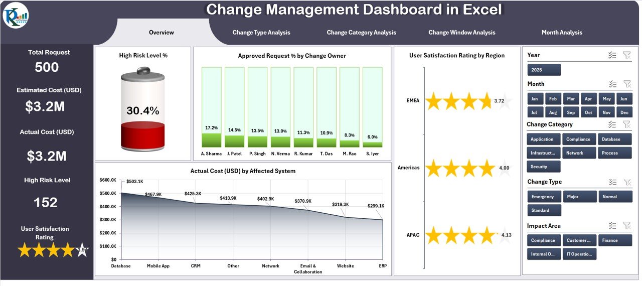
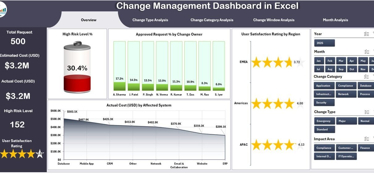
The Overview Page gives a complete picture of change management performance. It is the main page of the dashboard and includes:
✔️ Slicers on the right side
Slicers help you filter results by region, owner, month, system, and more.
✔️ Five KPI Cards
These cards help you monitor the most important numbers instantly.
✔️ Four Insightful Charts
This page shows clear visuals for:
-
High Risk Level %
-
Approved Request % by Change Owner
-
User Satisfaction Rating by Region
-
Actual Cost (USD) by Affected System
These visuals help leaders analyze performance, cost impact, and risk exposure without switching pages.
2. Change Type Analysis Page
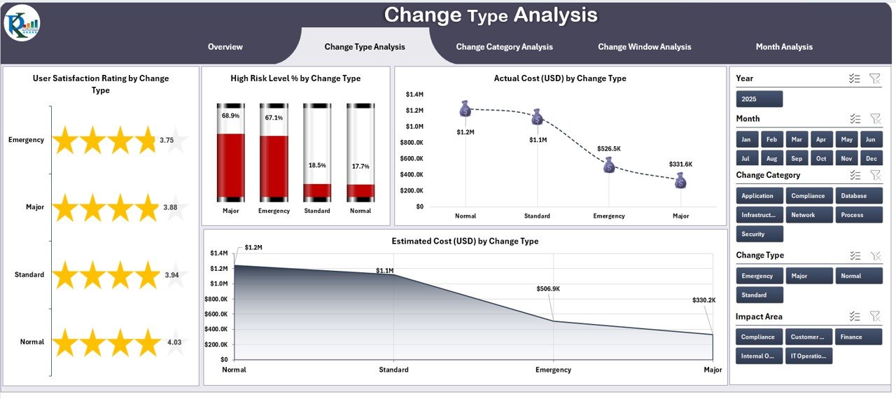
This page helps you understand how different types of changes perform. It includes:
✔️ Right-side slicers for quick filtering
✔️ Four charts that show:
-
User Satisfaction Rating by Change Type
-
High Risk Level % by Change Type
-
Actual Cost (USD) by Change Type
-
Estimated Cost (USD) by Change Type
These insights highlight which change types create more risk, higher cost, or better satisfaction. As a result, leaders make faster decisions when they approve or schedule future changes.
3. Change Category Analysis Page
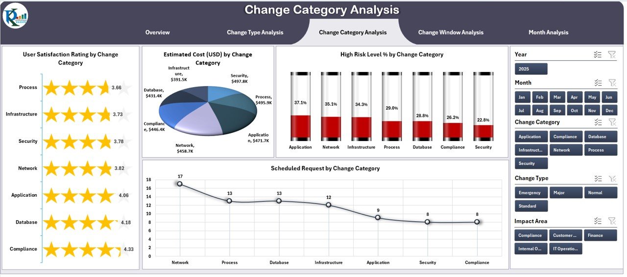
Change requests come under different categories such as technical, operational, financial, or strategic. This page shows a detailed view of each category.
✔️ Right-side slicers for smooth filtering
✔️ Four clean charts:
-
User Satisfaction Rating by Change Category
-
High Risk Level % by Change Category
-
Estimated Cost (USD) by Change Category
-
Actual Cost (USD) by Change Category
This page helps teams find the categories that need improvement and track cost accuracy across different change types.
Click to Purchases Change Management Dashboard in Excel
4. Change Window Analysis Page
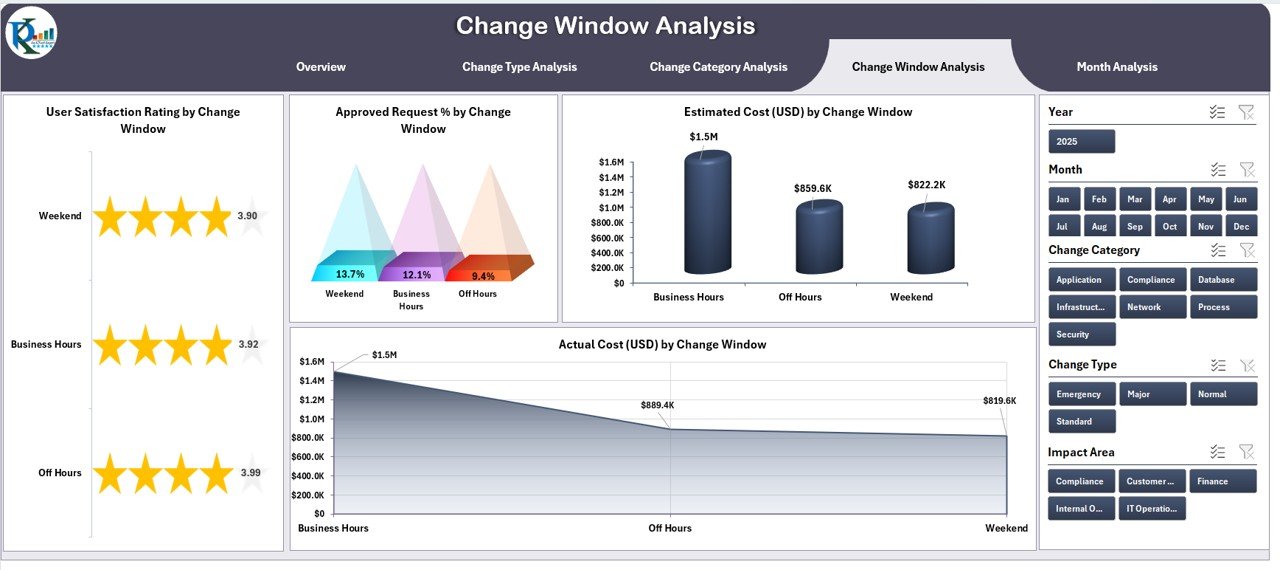
Companies often schedule changes during specific windows like weekends, night shifts, or maintenance blocks. This page tracks their performance.
✔️ Right-side slicers for filtering
✔️ The page includes four charts:
-
User Satisfaction Rating by Change Window
-
Approved Request % by Change Window
-
Estimated Cost (USD) by Change Window
-
Actual Cost (USD) by Change Window
This page shows which change windows deliver better success, low risk, and higher user satisfaction.
5. Month Analysis Page
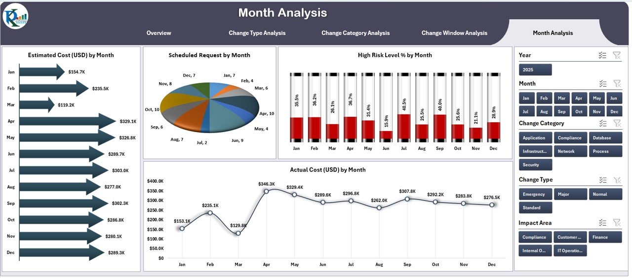
This page displays time-based insights. It helps you monitor how change requests behave month by month.
✔️ Right-side slicers for monthly analysis
✔️ It includes four powerful charts:
-
Estimated Cost (USD) by Month
-
Scheduled Requests by Month
-
High Risk Level % by Month
-
Actual Cost (USD) by Month
This page helps identify trends, seasonal patterns, and monthly progress.
Support Sheet and Data Sheet
The Support Sheet contains all lookup values, dropdowns, and background settings. It powers all slicers and charts.
The Data Sheet stores all raw data such as:
-
Request ID
-
Change type
-
Change category
-
Region
-
Change window
-
Estimated cost
-
Actual cost
-
Risk level
-
User rating
-
Status
After you enter the data, the dashboard updates automatically.
How Does a Change Management Dashboard Improve Decision-Making?
This dashboard helps leaders see everything in one place. It cuts confusion and brings clarity. Managers can quickly identify:
-
High-risk changes
-
High-cost requests
-
Monthly cost variation
-
Delayed approvals
-
Change owner performance
-
User satisfaction trends
Since all insights appear visually, you save hours of manual checking.
Advantages of Using a Change Management Dashboard in Excel
A Change Management Dashboard delivers many advantages that support project teams and leadership. Here are the biggest benefits:
1. Clear Visibility of All Change Requests
The dashboard gives a central place to track everything. As a result, teams stop depending on emails or disconnected sheets.
2. Faster Approvals and Smooth Communication
Since data appears clearly, managers approve changes quickly. Teams also get fewer escalations because everyone sees real-time updates.
3. Better Risk Control
Risk levels stay visible on every page. Because of this, leaders stop high-risk changes before they cause major issues.
4. Accurate Cost Tracking
The dashboard compares estimated cost vs actual cost across types, categories, and months. Therefore, financial planning becomes more accurate.
5. Improved User Satisfaction
You can see satisfaction ratings by region, owner, type, and category. This helps organizations identify areas where users need better experience.
6. Time-Based Trend Tracking
Monthly insights show how performance changes over time. Teams understand what improves and what needs immediate action.
7. High Flexibility and Zero Technical Complexity
Since this dashboard works in Excel, anyone can use it without technical skills. Moreover, companies can customize it easily at any time.
How to Use the Change Management Dashboard Effectively?
Click to Purchases Change Management Dashboard in Excel
You should follow a simple usage flow to get the best results:
-
Add raw data to the Data Sheet
-
Refresh the dashboard
-
Use slicers to filter views
-
Compare KPIs across pages
-
Identify high-risk or high-cost changes
-
Take action based on insights
When you follow this routine, the dashboard supports your entire change lifecycle.
Best Practices for Using a Change Management Dashboard in Excel
To get maximum value from this dashboard, you should follow some important best practices.
1. Keep Your Data Clean and Updated
Enter data regularly so the dashboard always shows real-time results. Clean data leads to accurate insights.
2. Use Clear Naming Conventions
Give simple names to change types, categories, and windows. This helps users find data quickly.
3. Review High-Risk Changes First
High-risk requests affect operations the most. Therefore, review those first in every meeting.
4. Compare Estimated Cost with Actual Cost Every Week
Cost variance shows how well your planning works. Track this comparison weekly to avoid cost overshoot.
5. Analyze User Satisfaction by Region and Category
User experience matters. When you track satisfaction regularly, you understand where users need more support.
6. Use the Page Navigator to Move Quickly
The navigator saves time and keeps the analysis smooth. Use it to shift across pages quickly.
7. Share Updates With Stakeholders Regularly
Export dashboard pages or share snapshots to keep everyone informed.
How Does This Dashboard Support Organizational Growth?
Change management plays a key role in growth. This dashboard supports growth by:
-
Improving planning
-
Reducing risk
-
Improving communication
-
Helping teams follow timelines
-
Supporting smart financial decisions
-
Increasing trust in the change process
Because of this, organizations move with confidence and stability.
Conclusion
A Change Management Dashboard in Excel gives organizations the power to manage change with clarity, confidence, and control. It brings all important metrics together—risk levels, cost analysis, satisfaction scores, and approval status. It also helps teams track performance across types, categories, months, and windows.
With this dashboard, leaders make better decisions, take timely actions, and guide teams smoothly during every stage of change. When organizations use this dashboard correctly, they enjoy faster approvals, fewer risks, and better communication.
Frequently Asked Questions (FAQs)
1. What is a Change Management Dashboard in Excel?
It is a ready-to-use analytical tool that tracks change requests, risk levels, costs, and performance metrics using Excel charts and slicers.
2. Why should companies use a change management dashboard?
It improves visibility, speeds up approvals, reduces risk, and supports data-driven decision-making.
3. Can beginners use this dashboard easily?
Yes. It uses simple Excel features, so anyone with basic Excel knowledge can use it.
4. Does the dashboard update automatically?
Yes. When you update the Data Sheet, the dashboard refreshes instantly.
5. What types of insights can I get?
You can track cost, risk, satisfaction, approvals, monthly trends, change categories, types, and much more.
6. Is this dashboard customizable?
Yes. You can modify cards, charts, formulas, or layouts based on your company’s needs.
Visit our YouTube channel to learn step-by-step video tutorials
