The paper and pulp industry runs on high production pressure, strict quality requirements, and continuous improvement. Every department works with large volumes of data—from production output and fiber loss to energy consumption and machine efficiency. Because of the complexity of the process, companies often struggle to maintain visibility and track performance effectively. When data stays scattered across spreadsheets, emails, and standalone systems, decision-making slows down.
A Paper and Pulp KPI Dashboard in Power BI solves these challenges with clarity, automation, and real-time insights. This dashboard transforms raw KPIs into meaningful visuals and gives teams the power to monitor their operations with confidence.
In this detailed guide, you will learn everything about the Paper and Pulp KPI Dashboard in Power BI, including its features, advantages, workflow impact, and best practices. You will also find answers to common questions that paper manufacturers ask when adopting a digital dashboard.
Click to Purchases Paper and Pulp KPI Dashboard in Power BI
What Is a Paper and Pulp KPI Dashboard in Power BI?
A Paper and Pulp KPI Dashboard in Power BI is an intelligent reporting system that displays key performance indicators related to production, quality, waste management, energy consumption, machine performance, fiber cost, and operational efficiency. It uses Power BI as the visual engine and an Excel file as the data source. As soon as the Excel data updates, the visuals refresh automatically.
Because of this seamless structure, the dashboard becomes a powerful digital command center for mill heads, production teams, quality engineers, maintenance staff, and business leaders.
This dashboard offers clarity, speed, and transparency. Since it shows monthly, yearly, and last-year comparisons, users understand which areas perform well and which require immediate action. With slicers, combo charts, and drill-through pages, teams can explore performance from every angle.
Click to Purchases Paper and Pulp KPI Dashboard in Power BI
Why Does the Paper and Pulp Industry Need a KPI Dashboard?
The paper and pulp industry faces unique challenges:
-
Raw material prices change frequently
-
Energy consumption remains high
-
Production depends on continuous machine operation
-
Fiber losses create high financial impact
-
Quality deviations lead to customer complaints
-
Waste management needs tight control
-
Process efficiency varies across grades and machines
When teams rely only on manual reporting, they lose time and visibility. Power BI helps them track KPIs faster and with more accuracy.
Some key problems a KPI Dashboard solves:
-
Delayed reports due to manual Excel work
-
Inconsistent KPI definitions
-
Lack of real-time tracking
-
Poor alignment between operations, quality, and management
-
Difficulty identifying trends and root causes
Once organizations implement a dashboard, they gain the ability to make stronger decisions every day.
Click to Purchases Paper and Pulp KPI Dashboard in Power BI
Key Features of the Paper and Pulp KPI Dashboard in Power BI
This dashboard includes three powerful pages inside the Power BI file. Each page gives a different level of insight, helping users understand their KPIs from every angle.
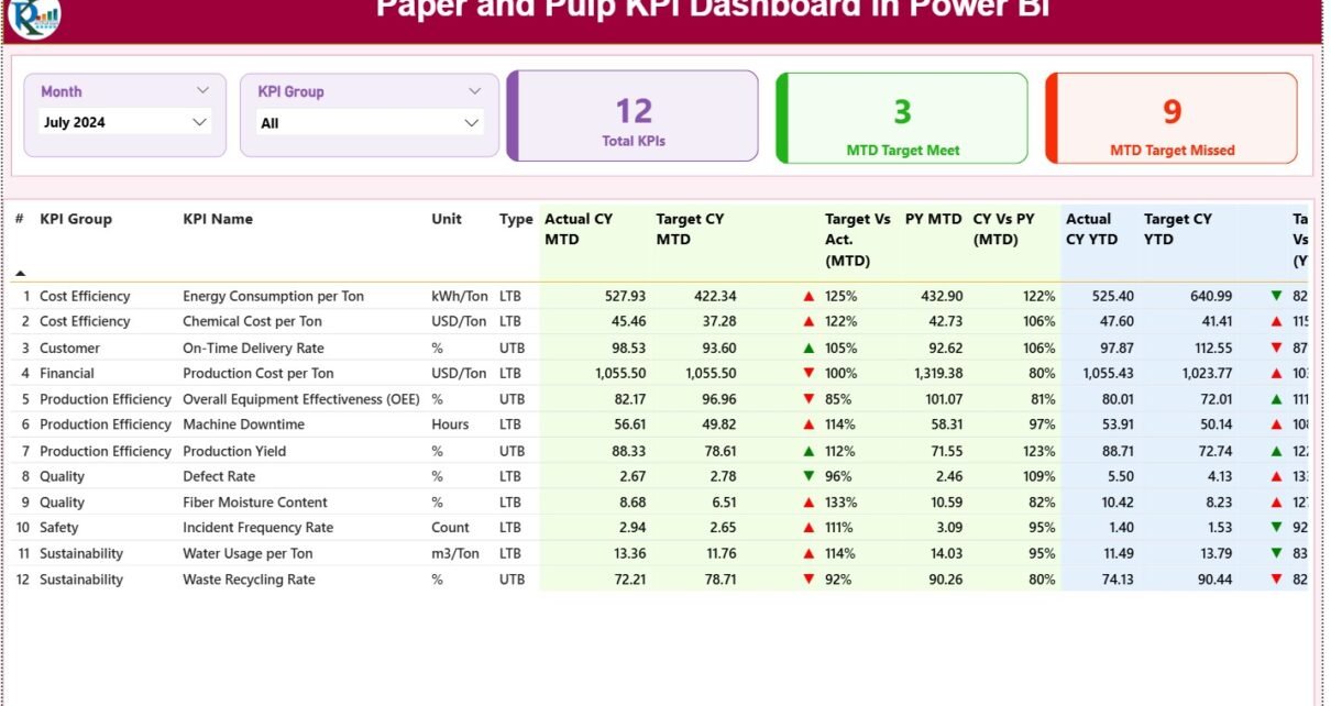
1. Summary Page – Your Complete Performance Overview
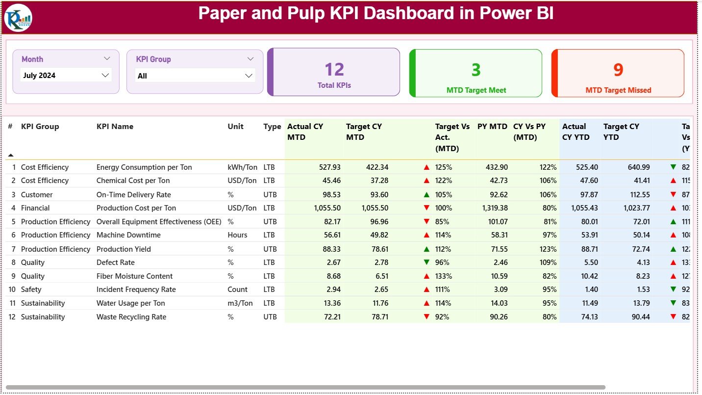
The Summary Page acts as the central view of the dashboard. This page shows the most important KPIs in a clean, structured format.
Top Section: Smart Slicers
At the top, users find two slicers:
-
Month Slicer
-
KPI Group Slicer
These slicers help users filter data by month and KPI category. With this filtering ability, teams stay focused on the metrics that matter at that moment.
Performance Cards for Quick Insights
The Summary Page displays three clear performance cards:
-
Total KPI Count
-
MTD Target Met
-
MTD Target Missed
These cards show how many KPIs are on track and how many require attention. This helps managers take immediate corrective action.
Detailed KPI Table for Deep Tracking
The heart of the Summary Page is the detailed KPI table. It includes the following fields:
-
KPI Number – Sequence number of the KPI
-
KPI Group – Category such as Production, Energy, Quality, Maintenance, Waste, or Cost
-
KPI Name – Name of the KPI
-
Unit – Measurement unit (e.g., MT, %, Hours, kWh, etc.)
-
Type – LTB (Lower the Better) or UTB (Upper the Better)
-
Actual CY MTD – Current Month-to-Date actual number
-
Target CY MTD – Month-to-Date target
-
MTD Icon – Green ▲ or Red ▼ indicator
-
Target vs Actual (MTD) – (Actual ÷ Target × 100)
-
PY MTD – Previous Year Month-to-Date
-
CY vs PY (MTD) – Comparison with last year
-
Actual CY YTD – Year-to-Date actual number
-
Target CY YTD – Year-to-Date target
-
YTD Icon – Green ▲ or Red ▼ status indicator
-
Target vs Actual (YTD) – Actual ÷ Target
-
PY YTD – Previous Year Year-to-Date
-
CY vs PY (YTD) – Year-to-Year change
This table gives a complete MTD and YTD comparison, making it easy to see where performance improves or falls behind.
Click to Purchases Paper and Pulp KPI Dashboard in Power BI
2. KPI Trend Page – Visual Analysis for Smarter Decisions
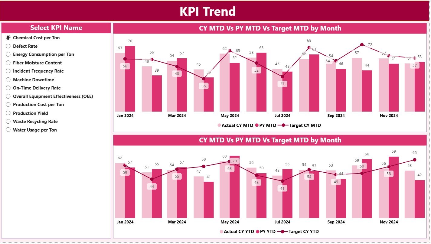
Trends matter more than static numbers. That is why the second page focuses on visual tracking using combo charts.
Left-Side KPI Slicer
Users select any KPI from the slicer. Once selected, both charts update instantly.
MTD Combo Chart
This chart displays:
-
Current Year Actual
-
Previous Year Actual
-
Target
The chart reveals performance patterns, seasonal variations, and sudden changes. When MTD numbers drop or rise significantly, teams respond faster.
YTD Combo Chart
Similar to the MTD chart, the YTD chart compares:
-
Current YTD Actual
-
Previous YTD Actual
-
YTD Target
This gives a long-term performance view, helping teams plan for upcoming months.
Trend charts help identify root causes. For example:
-
A rising fiber loss trend signals mixing issues
-
A falling machine efficiency trend indicates maintenance needs
-
A sudden increase in energy usage suggests process imbalance
Because trends appear visually, teams understand their KPIs without scrolling through spreadsheets.
Click to Purchases Paper and Pulp KPI Dashboard in Power BI
3. KPI Definition Page – Drill-Through Clarity
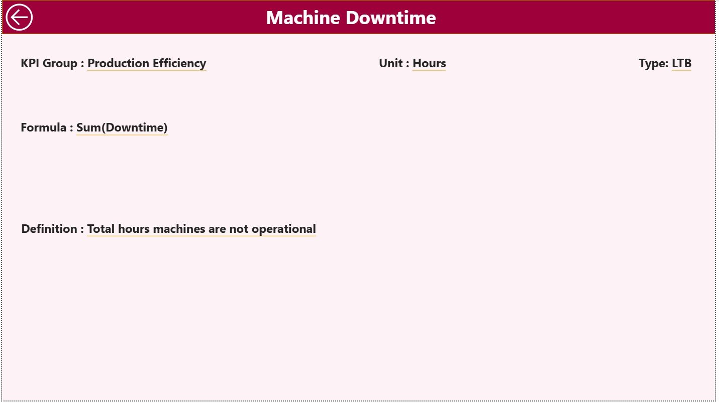
This hidden page provides complete definitions for each KPI.
The page includes:
-
KPI Number
-
KPI Group
-
KPI Name
-
Unit
-
Formula
-
Definition
-
KPI Type (LTB or UTB)
This page ensures clarity and removes confusion. Teams no longer debate KPI definitions because everything stays documented.
A simple Back Button allows users to return to the Summary Page.
Click to Purchases Paper and Pulp KPI Dashboard in Power BI
Excel Data Structure – Simple and Easy to Update
The dashboard works smoothly because the Excel data remains organized into three structured sheets.
1. Input_Actual Sheet
This sheet requires:
-
KPI Name
-
Month (use first day of each month)
-
Actual MTD
-
Actual YTD
These values update automatically inside Power BI.
2. Input_Target Sheet
In this sheet, users enter:
-
KPI Name
-
Month
-
Target MTD
-
Target YTD
This sheet compares goals with actual performance.
3. KPI Definition Sheet
This sheet stores:
-
KPI Number
-
KPI Group
-
KPI Name
-
Unit
-
Formula
-
Definition
-
Type (LTB or UTB)
This sheet supports the drill-through analysis.
What KPIs Should the Paper and Pulp Industry Track?
The paper and pulp process includes pulping, bleaching, refining, paper forming, pressing, drying, winding, and finishing. Because many steps create performance variation, each step requires proper KPIs.
Here are the most common KPIs:
Production KPIs
-
Daily Paper Production (MT)
-
Machine Speed
-
Machine Runtime (%)
-
Sheet Break Count
-
Yield %
-
Downtime Hours
Quality KPIs
-
Moisture %
-
GSM Variation
-
Defect Rate
-
Customer Complaints
-
Reject %
Energy KPIs
-
Steam Consumption
-
Power Consumption
-
Boiler Efficiency
-
Specific Energy Consumption
Cost KPIs
-
Cost per MT
-
Fiber Cost
-
Chemical Cost Variance
Sustainability KPIs
-
Water Consumption
-
Wastewater Treatment Efficiency
-
Recycled Fiber %
The Paper and Pulp KPI Dashboard allows complete tracking of all these KPIs.
Click to Purchases Paper and Pulp KPI Dashboard in Power BI
Advantages of Paper and Pulp KPI Dashboard in Power BI
The dashboard delivers many strengths that support efficiency, quality, and cost control. Here are the most important advantages:
1. You Track Performance in Real Time
The dashboard updates as soon as the Excel data changes. This removes waiting time and speeds up decision-making.
2. You Reduce Manual Reporting Work
Teams no longer prepare manual Excel reports. Power BI updates visuals automatically, reducing workload and errors.
3. You Improve Process Visibility
Managers see MTD, YTD, and last-year comparisons on a single screen. This improves clarity and highlights patterns.
4. You Detect Problems Early
Icons and trend charts reveal issues immediately. Whether it is rising defects or falling machine speed, teams act before problems grow.
5. You Align All Departments
Every team uses the same source of truth. Production, quality, maintenance, and leadership work with consistent KPI definitions.
6. You Improve Quality and Reduce Waste
Better tracking of fiber loss, sheet breaks, and quality variation helps mills reduce waste and save cost.
7. You Lower Operational Costs
Energy, steam, and raw material usage become easier to track. Because of this visibility, mills optimize costs more effectively.
8. You Strengthen Strategic Planning
YTD and PY comparisons help leaders set realistic targets and plan future improvements.
Click to Purchases Paper and Pulp KPI Dashboard in Power BI
How This Dashboard Improves the Workflow of a Paper Mill
A paper mill has several moving parts. The dashboard streamlines the workflow:
1. Production Team
Monitors output, runtime, speed, and downtime.
2. Quality Team
Tracks GSM, moisture, defect trends, and customer issues.
3. Maintenance Team
Analyzes machine stoppages and performance issues.
4. Energy Team
Monitors steam, water, and power consumption.
5. Management
Evaluates overall performance and identifies improvement areas.
The dashboard creates a unified view that makes the entire plant work smarter.
Click to Purchases Paper and Pulp KPI Dashboard in Power BI
Best Practices for Using the Paper and Pulp KPI Dashboard in Power BI
Follow these best practices to get maximum value:
1. Update Data on a Regular Schedule
Whether daily or weekly, consistent updates improve accuracy.
2. Track Only High-Value KPIs
Avoid adding too many KPIs. Choose those that impact cost, quality, or production directly.
3. Keep KPI Definitions Clear
Use easy and clear explanations in the definition sheet.
4. Use Visual Colors Consistently
Green = Good
Red = Needs Attention
This improves readability.
5. Review Trends Before Making Decisions
Trend charts help you avoid decisions based only on short-term numbers.
6. Train Teams to Use the Dashboard
A trained team uses the dashboard actively and takes smarter decisions.
7. Use Data to Create improvement Plans
Set action items based on insights from the dashboard.
Conclusion
A Paper and Pulp KPI Dashboard in Power BI gives complete visibility into production, quality, energy usage, maintenance, costs, and sustainability metrics. Since it uses Excel as a data source and Power BI for visual analytics, it becomes easy to maintain and extremely powerful for decision-making.
This dashboard helps paper mills improve productivity, reduce cost, lower waste, enhance quality, and strengthen their operational strategy. When teams use such a dashboard regularly, they gain control over their processes and work with more confidence and speed.
Click to Purchases Paper and Pulp KPI Dashboard in Power BI
Frequently Asked Questions (FAQs)
1. Why is a KPI dashboard important for the paper and pulp industry?
It helps mills track production, quality, energy, and cost metrics in real time, improving decision-making and efficiency.
2. Do I need technical knowledge to use this dashboard?
No. The dashboard uses Excel input, so anyone can update it easily.
3. Can I customize KPIs?
Yes. You can add new KPIs by updating the Excel sheets and adjusting the visuals.
4. How often should mills update KPI data?
Most mills update daily or weekly based on production schedules.
5. What are the most important KPIs for this industry?
Machine runtime, sheet breaks, fiber loss, energy usage, moisture %, GSM variation, and defect rate are critical KPIs.
Click to Purchases Paper and Pulp KPI Dashboard in Power BI
Visit our YouTube channel to learn step-by-step video tutorials