Software-as-a-Service (SaaS) companies work in a fast, competitive market. Customers expect reliable service, constant improvements, and smooth experiences. Because of this, SaaS companies must measure performance continuously. Renewal rates, churn trends, usage patterns, and customer engagement become critical indicators of long-term growth.
A SaaS Renewal KPI Dashboard in Power BI gives teams the clarity they need. It converts raw data into visual, interactive insights. It shows what is working well, where risks appear, and how customer relationships evolve over time. Most importantly, it helps leaders take action before renewal cycles begin.
In this complete guide, you will learn what a SaaS Renewal KPI Dashboard is, why it matters, what features it must include, and how Power BI helps you manage subscription performance with ease. You will also explore the dashboard structure, advantages, best practices, and answers to the most common questions.
Click to Purchases SaaS Renewal KPI Dashboard in Power BI
What Is a SaaS Renewal KPI Dashboard in Power BI?
A SaaS Renewal KPI Dashboard in Power BI is an interactive reporting tool that tracks all key performance indicators related to subscription renewals. It captures data from Excel or any SaaS system and converts it into meaningful visuals.
The dashboard helps you monitor:
-
Renewal rates
-
Churn rates
-
Expansion revenue
-
Contract values
-
Customer lifetime value
-
Monthly trends
-
Year-over-year comparisons
-
KPI performance against targets
Because Power BI supports rich visuals, slicers, drill-downs, and navigation buttons, the dashboard becomes a complete command center for SaaS teams. It provides clarity on customer health, renewal risk, and revenue opportunities.
Why Do SaaS Companies Need a Renewal Dashboard?
SaaS businesses grow when existing customers stay, upgrade, or expand usage. When renewal cycles drop, the company loses revenue and brand trust. With increasing competition, teams need data in real time.
A renewal dashboard offers:
-
Quick insights
-
Predictive trends
-
Real-time comparison
-
Better decision-making
-
Early warnings
This gives teams the power to fix issues before customers cancel their subscriptions.
Key Features of the SaaS Renewal KPI Dashboard in Power BI
Your SaaS Renewal KPI Dashboard includes three fully interactive pages:
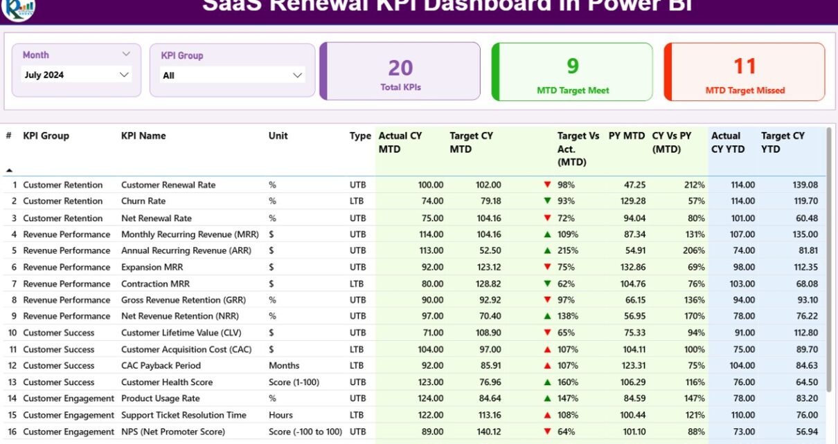
1. Summary Page: The Complete Renewal Performance Overview
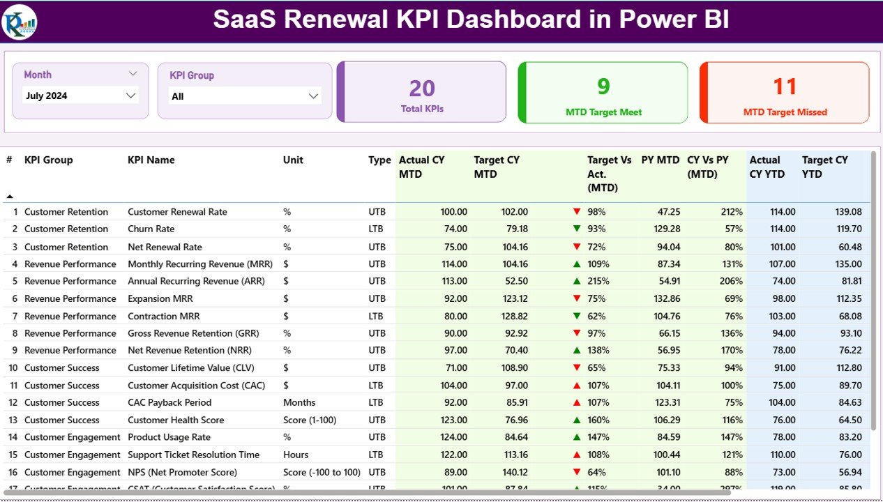
The Summary Page acts as the main screen of the dashboard. It brings all renewal KPIs into one view. With clean visuals, easy slicers, and interactive cards, users can view performance for any month or KPI group.
Click to Purchases SaaS Renewal KPI Dashboard in Power BI
Top Section – Slicers and KPI Cards
You see two slicers at the top:
-
Month
-
KPI Group
These slicers refresh the entire page instantly.
You also see three KPI cards:
-
Total KPIs Count
-
MTD Target Met Count
-
MTD Target Missed Count
These help you check progress at a glance.
Detailed KPI Table
This table is the heart of the summary page. It includes complete information for each renewal KPI.
Columns Included:
-
KPI Number – Sequential KPI identifier
-
KPI Group – Category of the KPI
-
KPI Name – Name of the KPI
-
Unit – Measurement unit
-
Type (LTB / UTB) – Lower The Better or Upper The Better
-
Actual CY MTD – Actual current year MTD
-
Target CY MTD – Target current year MTD
-
MTD Icon – ▲ or ▼ with green/red color
-
Target vs Actual (MTD) – Actual / Target percentage
-
PY MTD – Previous year MTD
-
CY vs PY (MTD) – Current year MTD / Previous year MTD
-
Actual CY YTD – Current year YTD
-
Target CY YTD – Target YTD
-
YTD Icon – ▲ or ▼ for YTD performance
-
Target vs Actual (YTD) – Actual / Target YTD
-
PY YTD – Previous year YTD
-
CY vs PY (YTD) – Current YTD / Previous YTD percentage
This table helps SaaS leaders compare target vs achievement with clarity. Icons make the interpretation even faster.
2. KPI Trend Page: Monthly and Yearly Renewal Tracking
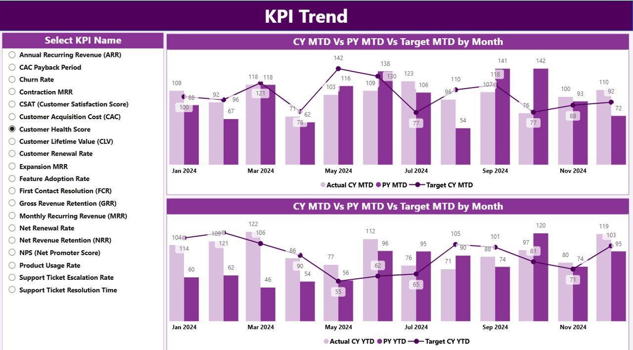
The KPI Trend Page shows the historical trend of renewals. Teams can select any KPI from the slicer.
Combo Charts for Deeper Insights
Click to Purchases SaaS Renewal KPI Dashboard in Power BI
You see two combo charts:
-
MTD Chart – Shows actual CY, actual PY, and targets
-
YTD Chart – Shows cumulative performance
These charts help you view:
-
Where the KPI improves
-
Where performance drops
-
How targets align with actual results
-
How renewal figures compare year over year
By selecting different KPIs from the slicer, the charts update automatically.
3. KPI Definition Page: Clear KPI Explanation
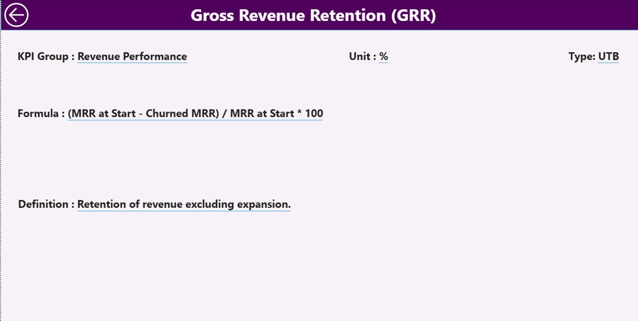
This page is hidden because it appears only through drill-through. When you right-click on any KPI in the Summary Page, you go to the KPI Definition Page.
On this page, you see:
-
KPI Number
-
KPI Group
-
KPI Name
-
Unit
-
Formula
-
Definition
-
Type (LTB or UTB)
This helps teams understand all KPIs before using them.
A back button at the top-left corner brings you back to the Summary Page.
How the Excel Data Source Works
The dashboard uses an Excel file as its data source. This makes data entry simple for teams who prefer a spreadsheet-based workflow.
You fill values in three sheets:
1. Input_Actual Sheet
You enter:
-
KPI Name
-
Month (First day of each month)
-
MTD values
-
YTD values
This sheet provides actual performance values.
2. Input_Target Sheet
You enter:
-
KPI Name
-
Month
-
MTD target
-
YTD target
These become the benchmarks for the actual data.
3. KPI Definition Sheet
You enter:
-
KPI Number
-
KPI Group
-
KPI Name
-
Unit
-
Formula
-
Definition
-
Type (LTB or UTB)
This table supports drill-through and ensures consistency across the dashboard.
What Are the Most Important SaaS Renewal KPIs?
A strong SaaS renewal dashboard usually includes KPIs such as:
-
Renewal Rate %
-
Customer Churn %
-
Net Revenue Retention
-
Monthly Recurring Revenue (MRR)
-
Customer Lifetime Value
-
Upsell / Cross-sell Rate
-
Expansion MRR
-
Contract Renewal Count
-
Customer Health Score
-
Late Renewal Count
Including all these KPIs in the dashboard helps you capture both financial and operational insights.
Advantages of a SaaS Renewal KPI Dashboard in Power BI
A renewal dashboard offers several advantages that support long-term SaaS growth.
1. Clear Visibility of Renewal Health
Power BI shows all KPIs visually. Teams see what is working and what needs attention.
2. Faster Decision-Making
Because the dashboard updates in real time, leaders take decisions quickly. They identify risks and fix them before customers churn.
3. Better Target Tracking
You compare actual values with targets for MTD and YTD. Icons make interpretation easier.
4. Improved Customer Retention
When renewal risks appear early, teams take action early. This improves customer satisfaction and reduces churn.
5. Easy Comparison With Previous Year
You compare CY with PY for MTD and YTD numbers. This helps you understand growth direction.
6. Smooth Data Management Through Excel
You simply fill three Excel sheets. Power BI refreshes data and updates all visuals automatically.
7. Better Understanding of KPIs
The KPI Definition Page gives clarity on formulas and definitions. This reduces confusion among teams.
Best Practices for the SaaS Renewal KPI Dashboard in Power BI
To get the best value from this dashboard, follow these practices:
1. Define KPIs Clearly
Every KPI must have a definition, formula, and owner. This keeps the dashboard accurate.
2. Update Data Every Month
MTD and YTD numbers must stay updated. This ensures your dashboard stays reliable.
3. Use Consistent Units
Use the same unit for each KPI across months. This avoids confusion and errors.
4. Review Trend Charts Regularly
Trend charts show early warning signs. Use them regularly to catch issues early.
5. Use Drill-Through for KPI Understanding
If a KPI looks unusual, drill through to view its definition. This helps you understand context.
6. Segment KPIs by Group
Using KPI Groups helps teams analyze performance by category.
7. Track YTD and MTD Separately
Both numbers give different insights. Use both while reviewing performance.
8. Compare With Previous Year
Use CY vs PY comparison to check long-term improvement.
Conclusion
A SaaS Renewal KPI Dashboard in Power BI gives SaaS businesses complete visibility into their renewal performance. It helps track targets, identify risks, compare historical trends, and improve customer retention. With three powerful pages—Summary, KPI Trend, and KPI Definition—users get deep insights with clean visuals.
This dashboard supports business leaders, finance teams, customer success managers, and renewal teams in understanding performance clearly. Because data comes from Excel, teams update numbers easily without technical skills. The dashboard then transforms that data into actionable insights.
When SaaS companies manage renewal KPIs well, they grow faster, retain customers longer, and increase revenue predictably. Power BI becomes the perfect tool to achieve this clarity.
Frequently Asked Questions (FAQs)
1. What is the purpose of a SaaS Renewal KPI Dashboard?
It helps track all renewal-related indicators like renewal rates, churn, expansion revenue, MRR, and customer health.
2. Why should SaaS companies track MTD and YTD numbers?
MTD shows current month performance while YTD shows overall yearly trends. Both are important for planning.
3. Can I use Excel as the only data source?
Yes. You can enter Actual, Target, and KPI Definition data in Excel, and Power BI will refresh the visuals.
4. What visuals are included in the dashboard?
Combo charts, cards, tables, slicers, and drill-through pages.
5. How often should I update data?
Update the Excel sheets once every month to maintain dashboard accuracy.
6. Can I add more KPIs later?
Yes. Add them in Excel and refresh the Power BI file.
7. Who uses this dashboard?
Customer success teams, renewal teams, finance teams, and SaaS leadership.
Visit our YouTube channel to learn step-by-step video tutorials