The mobile banking industry grows rapidly as customers demand faster, safer, and more convenient digital services. Every minute, thousands of transactions move through mobile banking apps—payments, transfers, bill settlements, deposits, withdrawals, and service requests. Because of this high activity, banks must track performance in real-time. This is exactly why a Mobile Banking Dashboard in Power BI becomes a powerful reporting solution.
This article explains everything about the Mobile Banking Dashboard, including its structure, page-by-page layout, charts, slicers, benefits, best practices, and FAQs. With simple language, strong transitions, and clearly organized sections, this guide helps teams understand how Power BI improves digital banking performance.
Click to Purchases Mobile Banking Dashboard in Power BI
What Is a Mobile Banking Dashboard in Power BI?
A Mobile Banking Dashboard in Power BI is a ready-to-use analytical reporting tool that helps banks track transaction performance, customer satisfaction, channel effectiveness, and service fees. It connects with structured banking data and transforms it into interactive visuals. This dashboard supports decision-making by providing clear insights into:
-
Transaction amounts
-
Successful and failed transactions
-
Service fee revenue
-
Customer satisfaction
-
Channel efficiency
-
Regional performance
-
Monthly trends
Because Power BI provides flexible filtering, drill-down options, and dynamic visuals, banks gain real-time visibility into every part of their mobile banking operations.
Why Is a Mobile Banking Dashboard Important for Banks?
Banks operate in a competitive market where digital performance matters more than ever. Customers expect mobile banking apps to work smoothly, quickly, and securely. A dashboard helps banks:
-
Monitor service performance
-
Identify failed or pending transactions
-
Improve customer experience
-
Track region-wise growth
-
Understand channel behavior
-
Evaluate transaction types
-
Measure financial performance
Since banks rely heavily on digital transactions, Power BI dashboards support fast, data-driven decisions with complete accuracy.
Structure of the Mobile Banking Dashboard in Power BI
This dashboard includes five detailed pages:
-
Overview Page
-
Bank Name Analysis
-
Transaction Type Analysis
-
Channel Analysis
-
Monthly Trends
Each page has slicers and charts that help users explore data from multiple dimensions. Let’s go through each page in depth.
Click to Purchases Mobile Banking Dashboard in Power BI
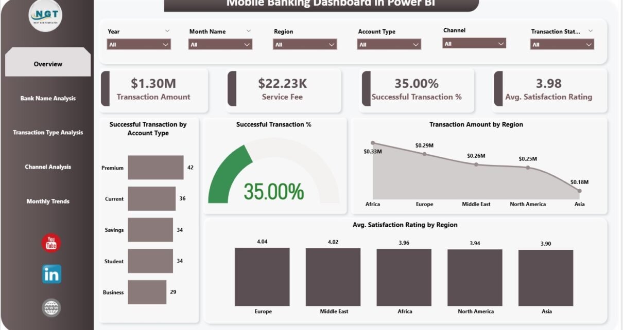
1. Overview Page – The Main Control Dashboard
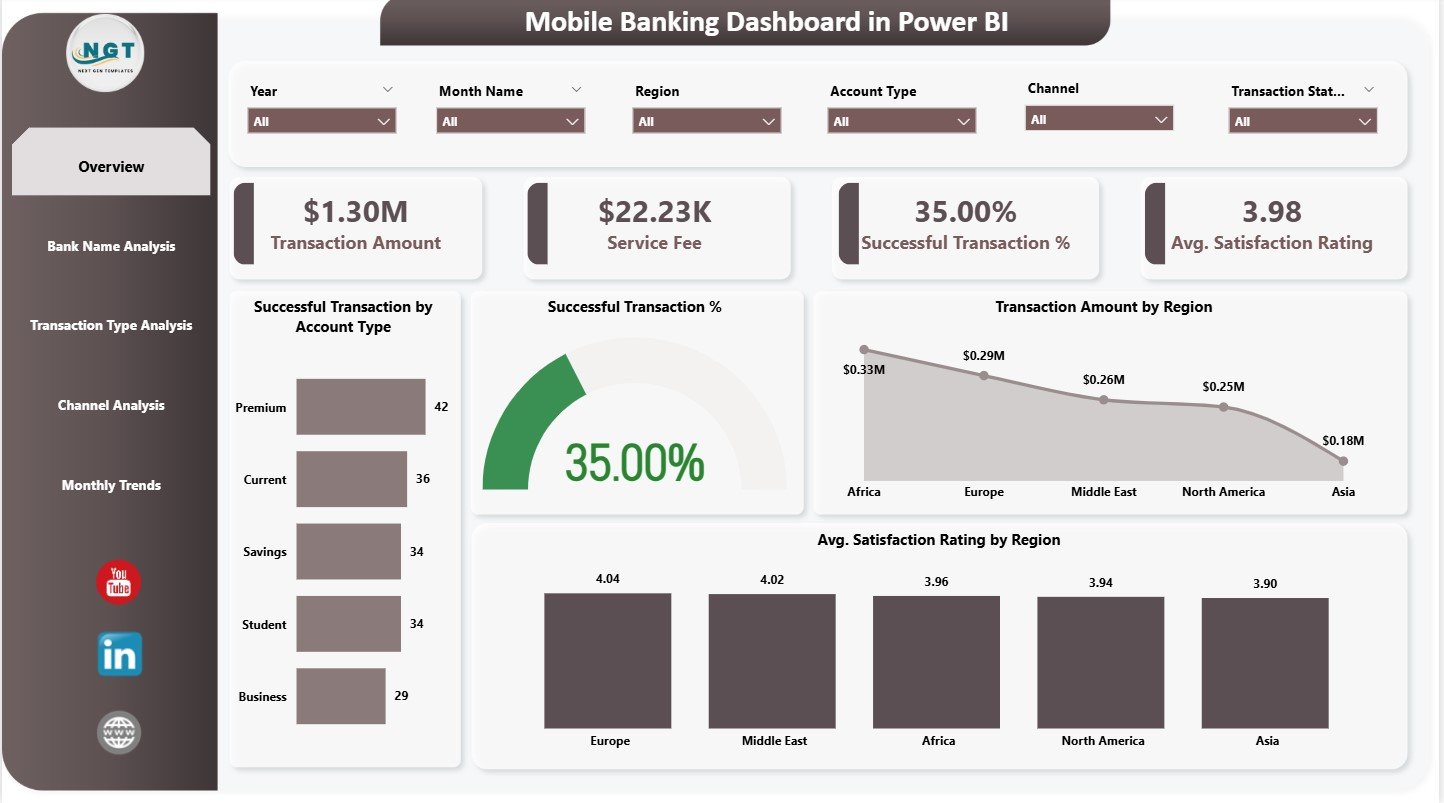
The Overview Page is the central area of the dashboard. It provides a summary of mobile banking performance for the selected period. The page contains slicers for filtering data and four important KPI cards.
KPI Cards on the Overview Page
The page displays four key metrics:
-
Transaction Amount – total value of processed transactions
-
Service Fee – revenue generated from transaction charges
-
Successful Transactions – total number of successful operations
-
Average Satisfaction Rating – customer feedback score
These cards help banking teams understand overall performance at a glance.
Charts on the Overview Page
The page also includes four charts:
1. Successful Transactions by Account Type
Shows which account types (savings, current, payroll, etc.) drive the highest success rates.
2. Successful Transactions (Overall)
Highlights total success volume to track system reliability.
3. Transaction Amount by Region
Compares financial activity across states or regions. This helps identify high-performing markets.
4. Average Satisfaction Rating by Region
Shows which regions give higher ratings and which require service improvement.
Together, these visuals help banks analyze performance from financial, operational, and customer perspectives.
Click to Purchases Mobile Banking Dashboard in Power BI
2. Bank Name Analysis – Performance by Financial Institution
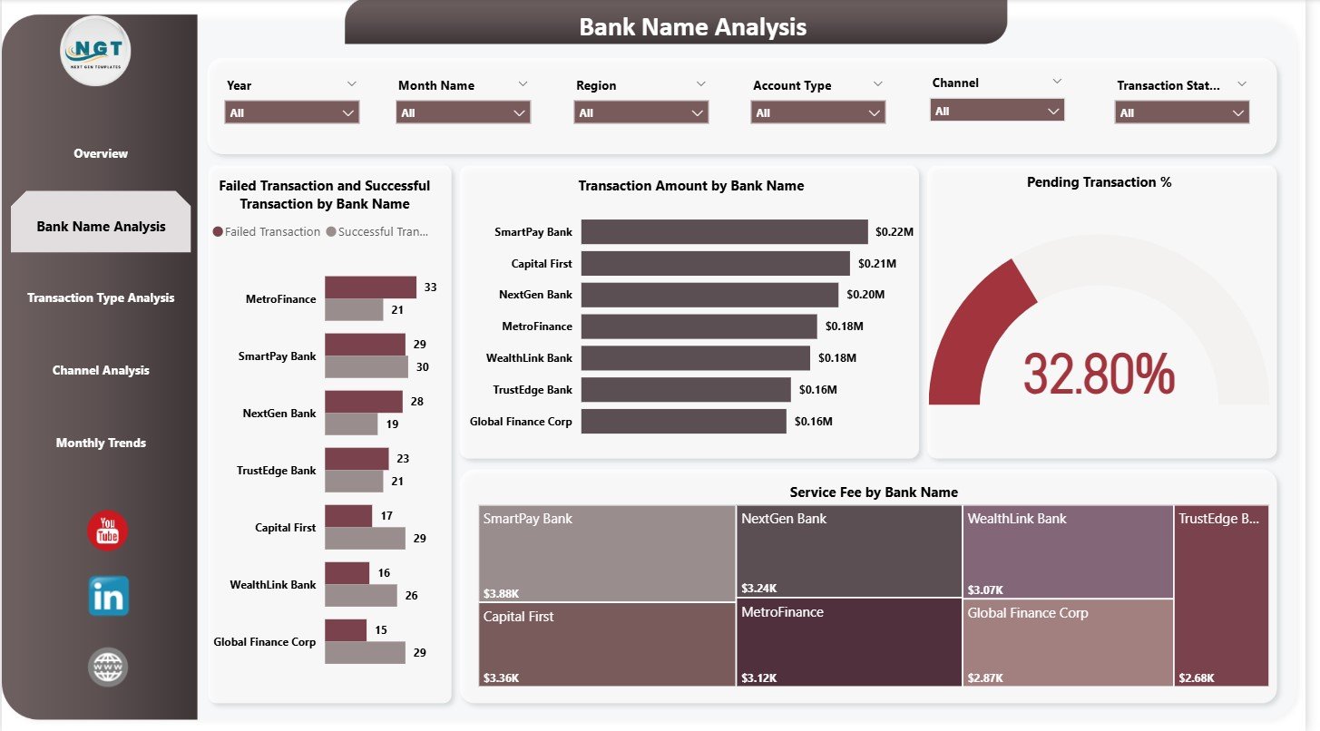
The Bank Name Analysis page focuses on how individual banks perform within the mobile banking ecosystem. This page has slicers and four key charts.
Charts on the Bank Name Analysis Page
1. Failed vs Successful Transactions by Bank Name
This highlights reliability issues. Banks with higher failure rates may need technical improvements.
2. Transaction Amount by Bank Name
Shows which banks generate higher mobile banking activity.
3. Pending Transaction Percentage
Helps identify delays that may affect customer satisfaction.
4. Service Fee by Bank Name
Displays service fee contribution from each bank.
This page helps banking partners understand their digital performance in comparison to others.
Click to Purchases Mobile Banking Dashboard in Power BI
3. Transaction Type Analysis – Understanding Customer Behavior
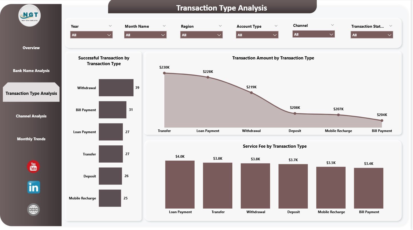
The Transaction Type Analysis page examines performance by transaction categories such as:
-
Fund transfers
-
Bill payments
-
Mobile recharges
-
Deposits
-
Withdrawals
-
Merchant payments
Charts on the Transaction Type Analysis Page
1. Successful Transactions by Transaction Type
Identifies which services customers use the most.
2. Transaction Amount by Transaction Type
Shows high-value categories.
3. Service Fee by Transaction Type
Helps banks understand which services generate the highest revenue.
This page helps product teams understand what customers prefer and where improvements are needed.
Click to Purchases Mobile Banking Dashboard in Power BI
4. Channel Analysis – Evaluating App and Platform Performance
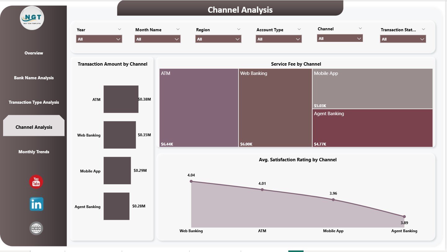
Customers access mobile banking using multiple channels, such as:
-
Mobile apps
-
Internet banking
-
ATM integrations
-
Merchant POS systems
-
USSD channels
-
Chatbots or digital assistants
The Channel Analysis page shows how each channel performs.
Charts on the Channel Analysis Page
1. Transaction Amount by Channel
Shows which channels customers prefer for financial transactions.
2. Service Fee by Channel
Explains revenue distribution across channels.
3. Average Satisfaction Rating by Channel
Helps identify best and worst-performing channels.
This data helps banks improve usability and customer experience across digital platforms.
Click to Purchases Mobile Banking Dashboard in Power BI
5. Monthly Trends – Understanding Long-Term Patterns
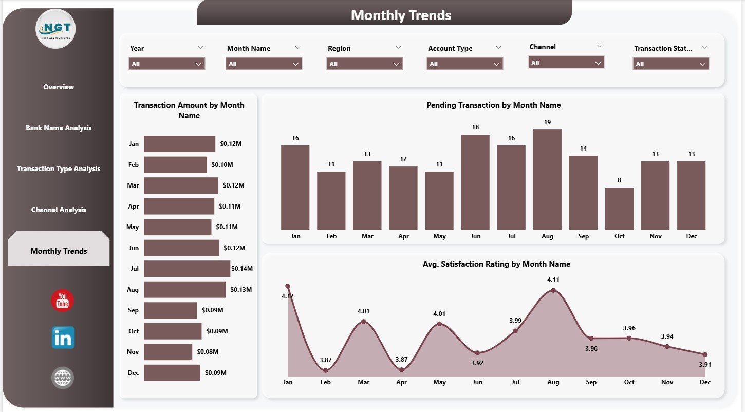
The Monthly Trends page provides a month-over-month visual analysis. Since digital activity changes frequently, monitoring monthly trends helps banks plan better.
Charts on the Monthly Trends Page
1. Transaction Amount by Month Name
Shows seasonal highs and lows.
2. Pending Transactions by Month Name
Helps identify months with network or server issues.
3. Average Satisfaction Rating by Month Name
Shows how customer experience changes over time.
This page helps management teams understand long-term performance patterns and forecast upcoming trends.
Advantages of Mobile Banking Dashboard in Power BI
A Power BI dashboard offers several benefits:
1. Real-Time Visibility
Teams monitor everything instantly—successful transactions, failures, fees, and satisfaction ratings.
2. Helps Reduce Transaction Failures
Failures and pending transactions become visible immediately. Banks can resolve issues faster.
3. Enhances Customer Experience
Satisfaction rating analytics highlight regions and channels that need improvement.
4. Improves Revenue Tracking
Service fee visuals help banks understand revenue contribution by bank, type, and channel.
5. Supports Data-Driven Decisions
Every chart provides clarity, helping banks plan upgrades and allocate resources efficiently.
6. Reveals Market Potential
Region-wise and type-wise data reveals where customers use banking most.
7. Identifies Digital Weak Points
Poor channels and high-failure banks become easy to detect.
Click to Purchases Mobile Banking Dashboard in Power BI
Best Practices for Mobile Banking Dashboards
To get the best results, follow these practices:
1. Validate Data Before Loading
Accurate transaction data ensures correct visual results.
2. Use Consistent Date Formats
Monthly trends break if dates are incorrect.
3. Segment Data by Region, Channel, and Bank
Segmentation improves detailed analysis.
4. Track Service Fee Separately
Service fees support revenue planning.
5. Use Customer Satisfaction Ratings Regularly
Ratings help improve the mobile banking experience.
6. Refresh Data Frequently
Daily or weekly refresh maintains accuracy.
7. Improve Channels with High Failure Rates
Use insights to upgrade platforms.
Conclusion
A Mobile Banking Dashboard in Power BI helps banks monitor digital performance with clarity and precision. With five well-designed pages—Overview, Bank Name Analysis, Transaction Type Analysis, Channel Analysis, and Monthly Trends—the dashboard gives a complete view of financial, operational, and customer service metrics.
Because Power BI provides strong visuals and advanced filtering, decision-makers get instant insights into how their mobile banking system performs. As digital banking continues to grow, dashboards like this help banks stay competitive, reliable, and customer-focused.
Click to Purchases Mobile Banking Dashboard in Power BI
Frequently Asked Questions (FAQs)
1. What is a Mobile Banking Dashboard in Power BI?
It is a visual reporting tool that analyzes mobile banking performance across transactions, fees, ratings, channels, and banks.
2. Who uses this dashboard?
Digital banking teams, IT teams, customer service teams, product managers, and senior leadership.
3. Can I add more charts?
Yes. Power BI allows flexible customization.
4. How often should I refresh the dashboard?
Daily refresh is ideal for mobile banking performance.
5. Can this dashboard track customer satisfaction?
Yes. It includes satisfaction rating charts by region and channel.
6. Does it support trend analysis?
Yes. The Monthly Trends page shows transaction and rating trends over time.
7. Do I need coding knowledge to use this dashboard?
No. Power BI handles everything with simple visuals and data connections.
Click to Purchases Mobile Banking Dashboard in Power BI
Visit our YouTube channel to learn step-by-step video tutorials