Glass manufacturing involves a long list of processes. Every stage matters—from melting and forming to cooling, cutting, and packing. Because each step affects quality, efficiency, safety, and cost, manufacturers need a clear way to track performance. That is why a Glass Manufacturing Dashboard in Excel becomes a powerful and practical reporting tool.
In this detailed guide, you will learn everything about this dashboard. You will see how it works, why you need it, what insights it provides, and how each page of the dashboard supports smarter decision-making. I also included the advantages, best practices, and frequently asked questions so you can understand the complete value of using Excel for glass manufacturing analytics.
Click to Purchases Glass Manufacturing Dashboard in Excel
What Is a Glass Manufacturing Dashboard in Excel?
A Glass Manufacturing Dashboard in Excel is a ready-to-use analytical tool that helps production teams monitor quality, time, energy, efficiency, and output in real time. It converts raw manufacturing data into clean visuals, clear metrics, and meaningful patterns. Because Excel is familiar to most teams, anyone can update, filter, and analyze the dashboard without learning new software.
This dashboard covers all key areas of the glass production process. It also shows cooling times, scrap percentages, furnace temperatures, shift performance, downtime reasons, and machine efficiency across various stages. As a result, managers can quickly identify where performance improves and where immediate action is necessary.
The dashboard contains five interactive pages using a left-side Page Navigator, which makes movement between pages smooth and simple.
Why Do Glass Manufacturers Need a Dashboard in Excel?
Glass production changes every minute. Because the melting temperature varies, machine speed fluctuates, and cooling time differs by product, managers need real-time insights. When teams rely on scattered spreadsheets, they miss early warnings. However, when they use a dashboard, they track everything in one structured and visual place.
This dashboard helps teams:
-
monitor efficiency
-
reduce scrap
-
manage energy consumption
-
track product performance
-
improve production planning
-
detect downtime patterns
-
strengthen quality control
Because the dashboard runs in Excel, teams enjoy low cost, high flexibility, simple modification, and complete control over their data.
Key Features of the Glass Manufacturing Dashboard in Excel
You will find the following powerful features inside the dashboard:
✔ Page Navigator on the Left Side
The Page Navigator helps you switch between pages instantly. You view all pages in one click without scrolling or searching.
✔ Interactive Cards
The Overview Page contains five performance cards, showing the most important KPIs at a glance.
✔ Charts for Production Insights
Each page contains well-designed charts to help you understand trends, patterns, and relationships across plant, shift, month, and product categories.
✔ Support Sheets
The dashboard includes:
-
Data Sheet for storing raw inputs
-
Support Sheet for lists, mapping tables, and dropdown controls
This setup keeps the dashboard fast, clean, and accurate.
How Does the Glass Manufacturing Dashboard Work?
Click to Purchases Glass Manufacturing Dashboard in Excel
The dashboard reads data from the Data Sheet. As soon as you enter or paste new production data, all charts, cards, and metrics update automatically. The slicers help you filter information by shift, plant, month, or product category. Because of this automation, you save time and get instant insights into performance.
Detailed Structure of the Glass Manufacturing Dashboard in Excel
The dashboard contains five analytical pages. Below is a full breakdown of each page and the insights they provide.
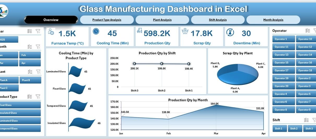
1. Overview Page: What Does the Summary Show?
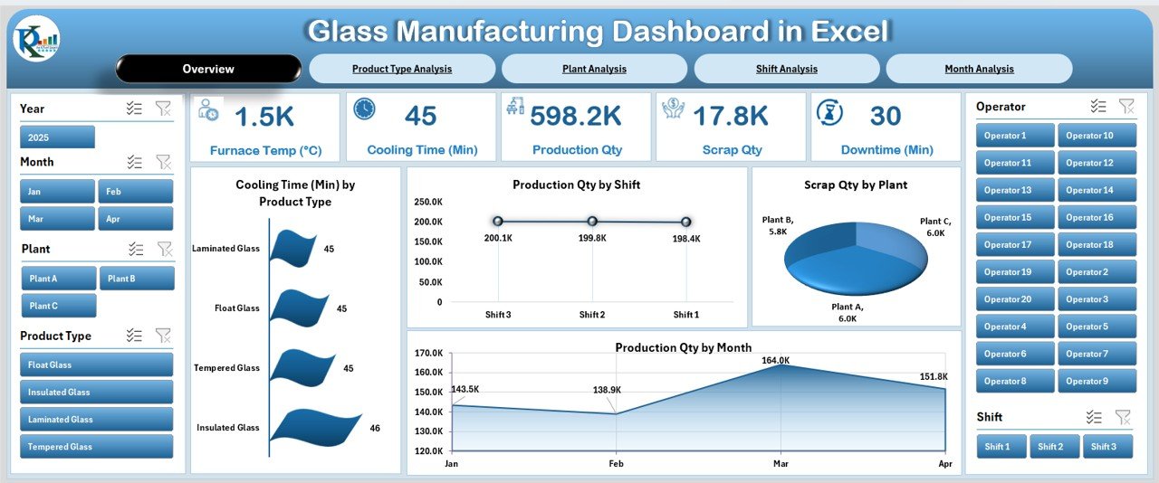
The Overview Page is the main performance page. It displays all high-level KPIs and charts to help you understand the complete production health in one glance. On the right side, the dashboard shows a silencer-style design with visuals that highlight trends clearly.
Key Cards on the Overview Page
You see five important KPI cards, such as:
-
Cooling Time
-
Production Quantity
-
Scrap Quantity
-
Energy Consumption
-
Shift or Month Indicators (based on the design)
These cards help you track performance instantly.
Charts on the Overview Page
The Overview Page includes four major charts:
-
Cooling Time by Product Type
-
Production Quantity by Shift
-
Scrap Quantity by Plant
-
Production Quantity by Month
You understand product quality, production speed, plant issues, and monthly performance trends through these visuals. This page supports quick decision-making and gives a simple snapshot of your manufacturing status.
2. Product Type Analysis: What Do We Learn From Product-Level Insights?
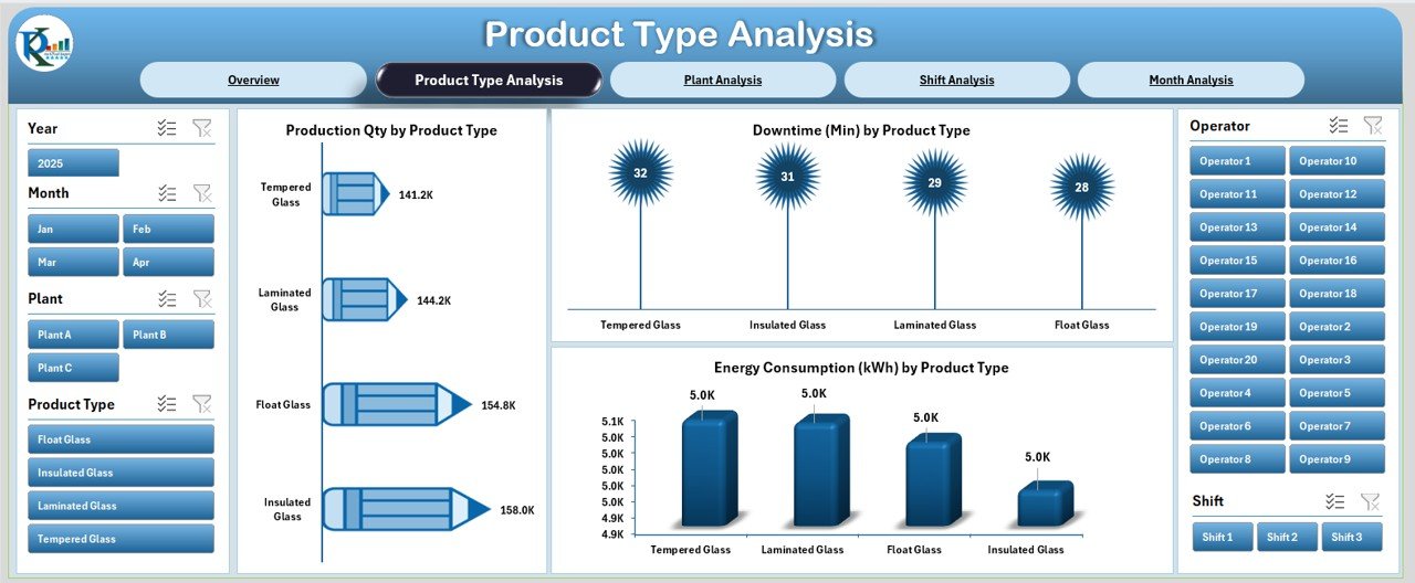
The Product Type Analysis Page focuses on how different glass products perform during production.
Charts on This Page
You will find three insightful visuals:
-
Production Quantity by Product Type
-
Downtime by Product Type
-
Energy Consumption by Product Type
This page helps you answer crucial questions:
-
Which products require more energy?
-
Which glass type causes more downtime?
-
Which product performs well across shifts and plants?
As a result, you improve planning, scheduling, and machine usage for each product category.
3. Plant Analysis: How Does Each Plant Perform?
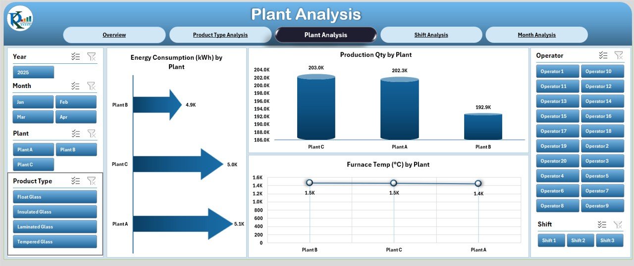
The Plant Analysis Page compares performance across different plants or manufacturing units. Because each plant may have different machines, operators, and workflows, this section helps leaders identify strengths and weakness areas.
Charts on This Page
You get three clear visuals:
-
Production Quantity by Plant
-
Furnace Temperature by Plant
-
Energy Consumption by Plant
These visuals help you detect:
-
Furnace performance variations
-
Energy inefficiencies
-
Plants with high or low production output
This improves quality control because glass melting and cooling depend heavily on furnace stability and energy use.
4. Shift Analysis: Which Shift Performs the Best?
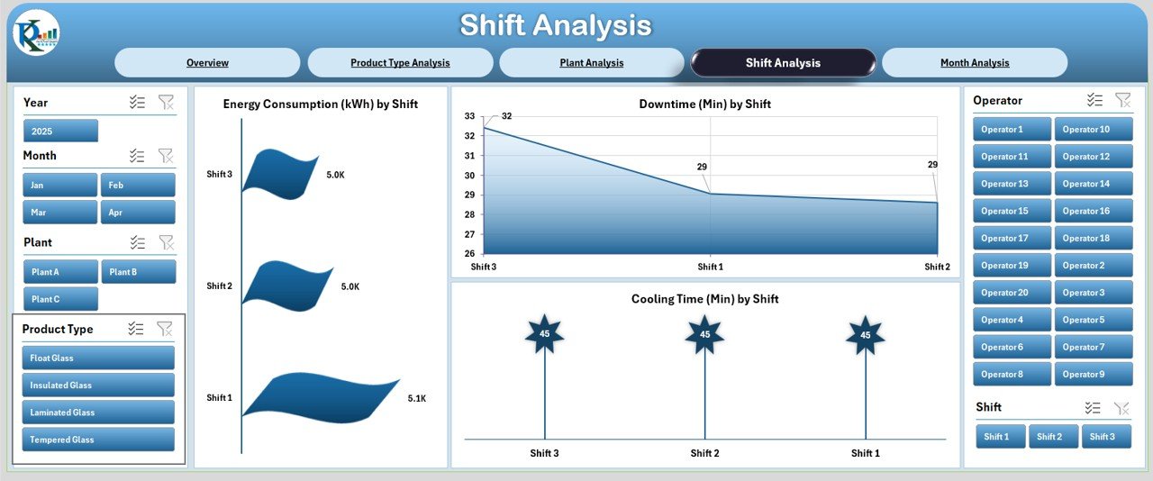
Shift-based performance is important in glass manufacturing because operators, working hours, and machine loads vary. The Shift Analysis Page gives a clear view of shift differences.
Charts on This Page
Click to Purchases Glass Manufacturing Dashboard in Excel
The page contains three powerful visuals:
-
Energy Consumption by Shift
-
Downtime by Shift
-
Cooling Time by Shift
This helps you see:
-
which shift uses more energy
-
which shift manages time well
-
where downtime increases
-
how cooling time differs between operators
Shift insights help managers improve training, resource planning, and work allocation.
5. Month Analysis: How Do Monthly Trends Change?
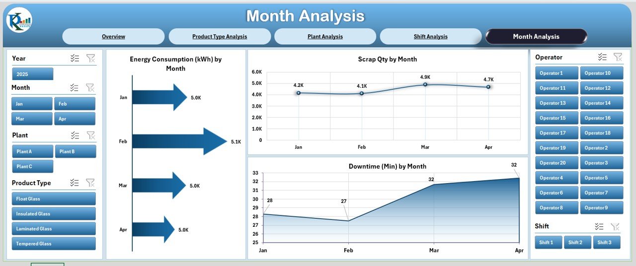
The Month Analysis Page shows seasonal or monthly performance variations. Because glass production changes with weather, demand, machine usage, and shift productivity, analyzing monthly data becomes important.
Charts on This Page
The page includes three charts:
-
Energy Consumption by Month
-
Downtime by Month
-
Scrap Quantity by Month
These charts reveal:
-
high-energy months
-
scrap spikes
-
downtime patterns
-
seasonal demand changes
Monthly trends help you plan raw materials, production capacity, and workforce requirements in the best way.
Advantages of the Glass Manufacturing Dashboard in Excel
Using this dashboard provides many benefits. Below are some clear advantages.
1. Better Visibility Across Production
Because everything appears in one place, teams understand production performance clearly.
2. Faster Decision-Making
Charts and cards highlight issues early, so managers take action quickly.
3. Easy to Customize
Teams modify Excel dashboards easily without learning new tools.
4. Improved Quality Control
Cooling time, scrap quantity, and furnace temperature charts help identify quality issues.
5. Energy Efficiency Insights
The dashboard tracks energy use across shifts, plants, and months.
6. Reduced Downtime
Downtime patterns across shifts and product types help teams fix operational bottlenecks.
7. Strong Cost Savings
Less energy waste + lower scrap = better cost management.
8. Accurate Planning
Monthly and product-wise trends support forecasting and resource allocation.
Best Practices for Using the Glass Manufacturing Dashboard in Excel
To get the best results, follow these simple best practices:
✔ Keep Your Data Updated Daily
Fresh data helps maintain accurate visuals and KPIs.
✔ Maintain a Clean Data Sheet
Avoid merged cells, blank rows, and inconsistent formats.
✔ Standardize Product and Plant Names
Consistent naming improves data accuracy across charts.
✔ Use Slicers Effectively
Filter by shift, plant, and product type to find deeper insights.
✔ Review Downtime Patterns Regularly
Downtime analysis shows you the biggest improvement opportunities.
✔ Watch Furnace Temperature Trends
Even small variations affect melting quality and scrap rate.
✔ Share Dashboard with Your Team
Production, maintenance, and management teams benefit when they access the dashboard.
Conclusion
A Glass Manufacturing Dashboard in Excel plays a powerful role in modern production environments. It gives clear visibility into every step—melting, forming, cooling, and packing. Because the dashboard highlights production quantities, energy use, downtime, furnace temperature, scrap levels, shift patterns, and monthly trends, manufacturers make faster and smarter decisions.
This dashboard is simple, insightful, and practical. It fits small, medium, and large glass manufacturing units. When teams adopt this dashboard, they reduce scrap, improve energy use, strengthen planning, and increase production efficiency.
Frequently Asked Questions (FAQs)
1. What is a Glass Manufacturing Dashboard in Excel?
It is an Excel-based reporting tool that tracks production, energy use, downtime, cooling time, scrap, and furnace temperature using charts and KPIs.
2. Who should use this dashboard?
Production managers, plant supervisors, quality engineers, maintenance teams, and operations heads benefit the most.
3. Can I customize the dashboard?
Yes, you easily add new KPIs, charts, formulas, and product categories because everything is built inside Excel.
4. Does the dashboard update automatically?
Yes, as soon as you update the Data Sheet, all visuals refresh automatically.
5. Do I need advanced Excel skills?
No. Basic Excel knowledge is enough because the dashboard is ready to use.
6. What data do I need to maintain?
You should maintain cooling time, downtime, production quantity, shift data, energy use, furnace temperature, and scrap details.
7. Can small factories use this dashboard?
Yes, the dashboard suits both small and large glass manufacturing teams.
8. How often should I update the data?
You should update it daily or after every production shift for the best accuracy.
9. Does this dashboard help reduce scrap?
Yes, scrap charts highlight which plant, product type, or month produces more waste.
10. Why is Excel useful for manufacturing dashboards?
Excel is simple, flexible, cost-effective, and easy to share across departments.
Visit our YouTube channel to learn step-by-step video tutorials