Managing a dairy business involves many moving parts. Every day, the production team, quality team, finance team, logistics staff, and sales department handle hundreds of activities. Because of this, managers often struggle to monitor performance, track variations, and make timely decisions. When data spreads across multiple spreadsheets, notebooks, emails, or manual reports, the workflow slows down and the risk of errors increases.
A Dairy Industry KPI Dashboard in Excel solves this challenge instantly. It converts raw dairy data into clear insights. It also helps teams monitor milk collection, production efficiency, distribution performance, quality parameters, safety measures, and financial KPIs without using complex tools. You only need a simple Excel file, and the dashboard will transform the entire dairy operation.
Click to buy Dairy Industry KPI Dashboard in Excel
In this article, I will explain everything about the Dairy Industry KPI Dashboard in Excel. You will learn how it works, what each sheet contains, how to use it daily, and how it helps dairy companies improve their accuracy and decision-making process. I will also cover its advantages, best practices, and frequently asked questions, so you can use this dashboard with complete confidence.
What Is a Dairy Industry KPI Dashboard in Excel?
A Dairy Industry KPI Dashboard in Excel is a ready-to-use performance monitoring tool that helps dairy businesses track important KPIs such as milk procurement, production rate, quality scores, wastage levels, revenue, and delivery performance. It brings all monthly and yearly KPI numbers into one simple interface.
Managers often look for quick answers such as:
- How much milk did we collect this month?
- What is the production efficiency?
- Are we meeting our quality targets?
- How are we performing compared to last year?
- Where are we missing targets?
This dashboard answers all these questions through interactive charts, slicers, conditional formatting, and organized data entry sheets. Moreover, it updates instantly when you change the month or KPI name.
Because of this, the Dairy Industry KPI Dashboard in Excel becomes a complete reporting system for dairy plants, milk collection centres, logistics hubs, processing units, and sales teams.
Key Features of the Dairy Industry KPI Dashboard in Excel
This dashboard includes seven structured worksheets, each designed for smooth operations and clear visibility.
Summary Page – Your Navigation Centre
The Summary Page works like an index page. It provides six navigation buttons to jump directly to different analytical sheets. Instead of scrolling through tabs, you can move quickly to any section.
This speeds up usability and helps teams switch between analysis, trend charts, KPI definitions, and data entry sheets in seconds.
Click to buy Dairy Industry KPI Dashboard in Excel
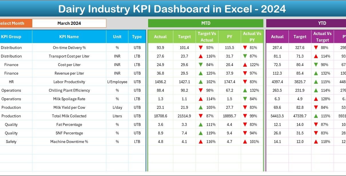
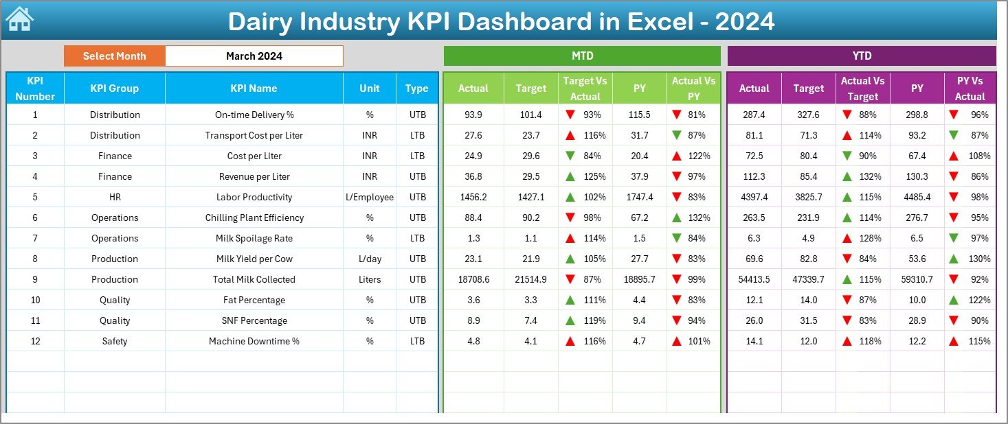
Dashboard Sheet – Complete KPI Overview
The Dashboard sheet contains all important insights in one place. It is the heart of the Dairy KPI Dashboard.
Key Highlights:
- A Month drop-down selector on cell D3
- Automatic update of all dashboard numbers based on selected month
- Sections for MTD (Month-to-Date) and YTD (Year-to-Date) performance
- Easy comparison between:
- Actual vs Target
- Actual vs Previous Year (PY)
Conditional Formatting for Quick Decisions
The dashboard uses up and down arrows to show performance trends:
- Green arrow indicates improvement
- Red arrow indicates decline
This makes it easy for dairy managers to identify which KPI needs attention.
What You Can Track Here
You can monitor KPIs related to:
- Milk procurement
- Production efficiency
- Quality control
- Wastage and spoilage
- Distribution performance
- Sales and revenue
- Operational costs
Because data changes with month selection, you get instant visibility for monthly reviews, management meetings, or daily decision-making.
Click to buy Dairy Industry KPI Dashboard in Excel
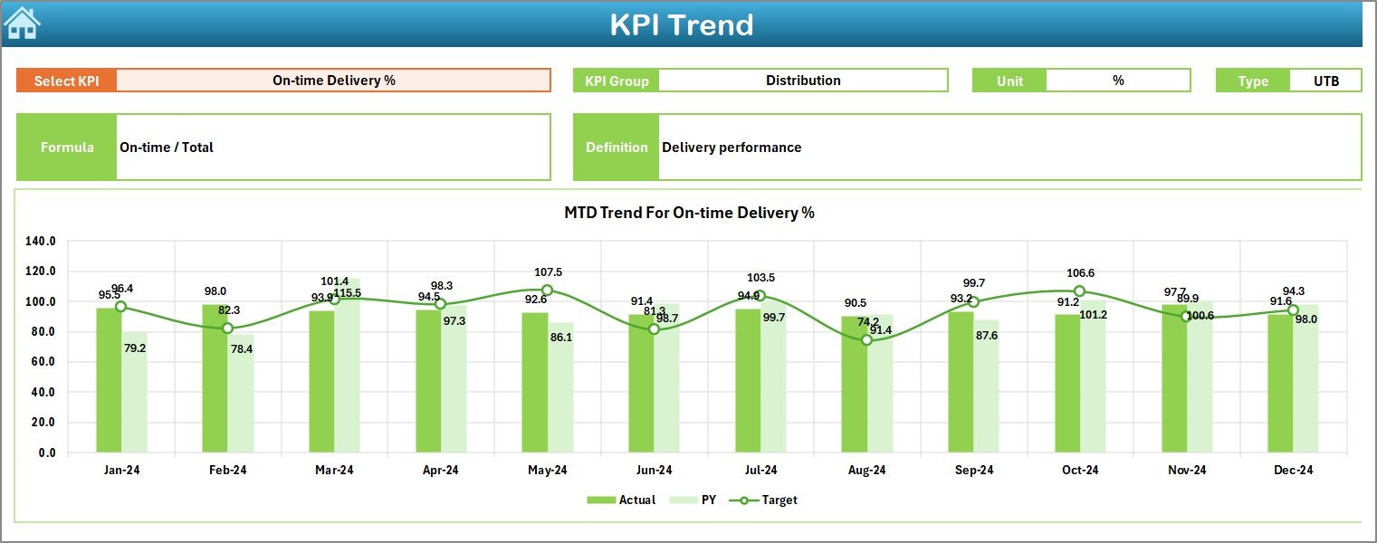
Trend Sheet – KPI-Wise Monthly and Yearly Trends
The Trend sheet provides a detailed analysis for each KPI.
Features:
- KPI Name drop-down selector on C3
- Auto-display of:
- KPI Group
- Unit
- KPI Type (Lower the Better or Upper the Better)
- KPI Formula
- KPI Definition
- Trend Charts for Better Analysis
The sheet showcases MTD and YTD trend charts, including:
- Actual values
- Target values
- Previous Year values
With this, dairy teams can spot:
- Rising trends
- Seasonal variations
- Sudden changes
- Long-term performance shifts
This helps leaders plan their procurement, scheduling, quality controls, and distribution with better clarity.
Click to buy Dairy Industry KPI Dashboard in Excel
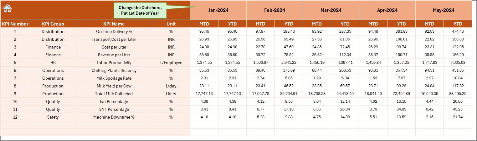
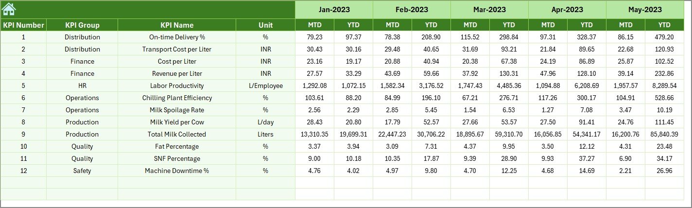
Actual Numbers Input Sheet – Enter Actual MTD & YTD Data
This sheet is designed for smooth data entry.
How to Use It
- Enter monthly Actual values for each KPI
- Update MTD and YTD numbers
- Select the starting month in E1
Once you update the first month, Excel recalculates the entire year automatically.
This helps dairy teams maintain monthly accuracy without re-entering formulas.
Click to buy Dairy Industry KPI Dashboard in Excel
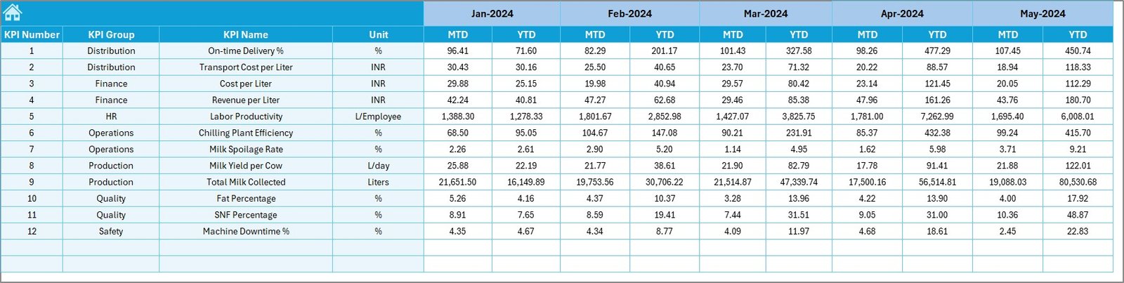
Target Sheet – Enter Monthly KPI Targets
In this sheet, you can enter:
- Monthly Target values for each KPI
- MTD Targets
- YTD Targets
Because targets remain constant for planning periods, teams update this sheet only once at the beginning of the year.
Click to buy Dairy Industry KPI Dashboard in Excel
Previous Year Numbers Sheet – Enter Historical Data
This sheet helps you compare performance against last year. You need to enter:
- Last year’s MTD numbers
- Last year’s YTD numbers
Once entered, the dashboard shows PY vs Actual comparisons with arrows.
This provides a strong view of improvement or decline throughout the dairy operation.
Click to buy Dairy Industry KPI Dashboard in Excel
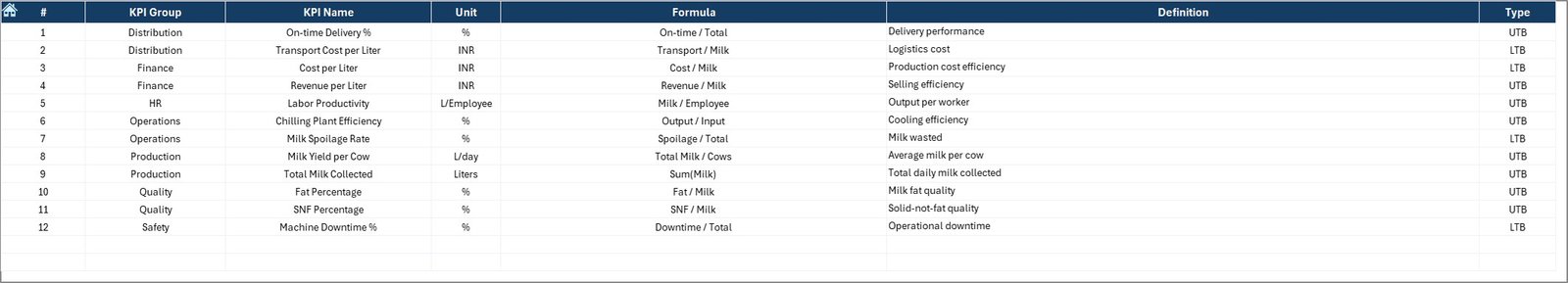
KPI Definition Sheet – Define Each KPI Clearly
This sheet stores detailed information about every KPI.
It includes:
- KPI Name
- KPI Group
- Unit
- Formula
- Definition
With this, new employees and management users understand exactly how each KPI works and why it matters.
Why Dairy Companies Need a KPI Dashboard in Excel
The dairy industry is fast-moving and highly sensitive. Every hour matters, and every variation affects cost, quality, and customer satisfaction. Because of this, dairy organizations cannot rely on manual reporting.
A Dairy KPI Dashboard in Excel provides instant clarity, stronger control, and faster reporting. It also reduces the time spent on manual consolidation and supports better planning.
Advantages of the Dairy Industry KPI Dashboard in Excel
Below are the most important benefits of using this dashboard in dairy operations:
Faster Decision-Making
Managers get instant numbers for MTD, YTD, Target, and Previous Year comparisons. This eliminates waiting time and speeds up approvals and planning.
Clear Visibility of the Entire Dairy Operation
Every team—procurement, production, quality, warehouse, sales—can monitor their performance in one place. This improves alignment across departments.
Improved Quality and Production Efficiency
KPIs related to fat %, SNF %, wastage, spoilage rate, and production efficiency help managers maintain high-quality standards.
Better Cost Control
Tracking energy consumption, packaging cost, conversion cost, or wastage reduction helps in identifying cost-saving opportunities.
Automated Reporting
With drop-downs, formulas, and conditional formatting, the dashboard reduces manual work. It also ensures accuracy in monthly and yearly reports.
Easy Comparisons With Previous Year
The PY sheet allows users to check long-term improvements or gaps. This supports annual planning and performance reviews.
Trend Charts for Deeper Insights
Visual trends help discover patterns that raw numbers cannot show. This makes the dashboard ideal for top management reviews.
Easy to Customize
You can add more KPIs, change formulas, modify units, or add new visuals anytime. This makes the dashboard highly flexible.
Ideal for All Dairy Departments
Whether you handle milk procurement, plant operations, finance, logistics, or quality control, the dashboard fits every department.
How to Use the Dairy Industry KPI Dashboard in Excel
Follow these simple steps to use the dashboard effectively:
Step 1: Update Actual Data
Enter MTD and YTD values for every KPI in the Actual Numbers Input Sheet.
Step 2: Enter Monthly Targets
Input planning numbers in the Target Sheet.
Step 3: Enter Previous Year Data
Fill in last year’s numbers in the Previous Year Sheet.
Step 4: Select the Month on the Dashboard
Go to the Dashboard Sheet and change the month in D3.
All charts and KPI cards update automatically.
Step 5: Analyze Trends Using Trend Sheet
Choose any KPI in C3 to see detailed trends.
Step 6: Review KPI Definitions
Use the KPI Definition Sheet to understand formulas and meaning.
Best Practices for the Dairy KPI Dashboard in Excel
Use the following recommendations for smooth and accurate performance tracking:
- Keep KPI Names Short and Clear
This prevents confusion and helps everyone understand the metrics.
- Update the Data Every Month Without Delay
Timely updates ensure accurate YTD and MTD numbers.
- Use Consistent Units Across All Sheets
Avoid mixing liters with kilograms or percentages with numbers.
- Review Conditional Formatting Regularly
Ensure arrows display correct logic based on KPI type (UTB or LTB).
- Validate Your Trends Before Making Decisions
Always review MTD and YTD charts before taking action.
- Train Your Team to Use the Navigation Buttons
This increases their speed and independence.
- Add New KPIs Only When Required
Avoid excessive KPIs, which may confuse users.
- Back Up Your Dashboard Every Month
Keep a safe copy in case any accidental modification occurs.
Conclusion
A Dairy Industry KPI Dashboard in Excel transforms complex dairy operations into simple, visual, and data-driven insights. It helps managers track all KPIs in seconds, identify issues quickly, and take timely actions. With trend analysis, monthly comparisons, target tracking, and PY versus Actual evaluation, this dashboard becomes the ideal tool for dairy plants, distribution centres, procurement teams, finance managers, and management leadership.
Because of its simplicity, flexibility, and clarity, this dashboard is a powerful solution for any dairy business looking to improve performance and operational excellence.
Frequently Asked Questions (FAQs)
- What is a Dairy Industry KPI Dashboard in Excel?
It is a ready-made performance monitoring tool that tracks milk procurement, production efficiency, quality scores, wastage, revenue, logistics performance, and operational KPIs.
- Who can use this dairy KPI dashboard?
Procurement teams, plant managers, quality control teams, sales managers, finance departments, logistics teams, and top management can use it easily.
- Do I need advanced Excel skills to use this dashboard?
No. The dashboard works with simple drop-downs and formulas. Basic Excel knowledge is enough.
- Can I add new KPIs to this dashboard?
Yes, you can add new KPIs anytime by updating the KPI Definition and Data Input sheets.
- How often should I update the dashboard?
Update MTD and YTD actual numbers every month to keep the dashboard accurate.
- Does the dashboard show trends?
Yes. The Trend sheet displays charts for Actual, Target, and Previous Year numbers.
- Can I use the dashboard for monthly review meetings?
Yes, the dashboard is designed to support management reviews, operational reviews, and strategic planning discussions.
- What data do I need to start?
You need Actual, Target, and Previous Year numbers for each KPI.
Visit our YouTube channel to learn step-by-step video tutorials
Click to buy Dairy Industry KPI Dashboard in Excel