The grocery delivery industry continues to grow every year. Customers now expect fast delivery, fresh products, flexible payment options, and excellent service. Because competition increases daily, companies need strong insight into performance to stay ahead. A Grocery Delivery Services Dashboard in Power BI provides that insight with clarity.
This dashboard helps grocery delivery companies track order value, profit, delivery times, customer satisfaction, delivery partners, regions, and payment modes. It also highlights monthly trends to support smarter decisions. In this detailed guide, you will learn how this dashboard works, how each page supports better operations, and why it matters for business growth.
Click to Purchases Grocery Delivery Services Dashboard in Power BI
What Is a Grocery Delivery Services Dashboard in Power BI?
A Grocery Delivery Services Dashboard in Power BI is a ready-to-use analytical tool that organizes all delivery KPIs into a clean and interactive layout. It gives teams instant visibility into performance and shows how well deliveries, partners, payments, and regions perform.
Because Power BI updates visuals automatically, companies understand their delivery ecosystem within seconds. They see what works, where delays occur, and how customer satisfaction changes across months. Since the dashboard uses slicers, cards, KPI visuals, and charts, it becomes simple for both beginners and advanced users.
Why Grocery Delivery Companies Need This Dashboard
Grocery delivery businesses deal with important challenges such as:
-
Delivery delays
-
Low profit margins
-
Payment failures
-
Unpredictable customer satisfaction
-
Regional performance differences
-
Partner delivery issues
-
Operational bottlenecks
A dashboard helps companies solve these challenges because:
-
It captures performance from all angles
-
It displays clean visuals to highlight patterns
-
It updates instantly based on filters
-
It improves decision-making speed
-
It reduces reporting time
-
It helps departments work together
-
It highlights improvement areas
With Power BI, teams no longer rely on scattered reports. Instead, they use one unified view to monitor business performance.
Click to Purchases Grocery Delivery Services Dashboard in Power BI
Key Features of the Grocery Delivery Services Dashboard in Power BI
This dashboard includes five powerful pages, each focused on a different area of delivery operations. Below is a complete explanation of each page.
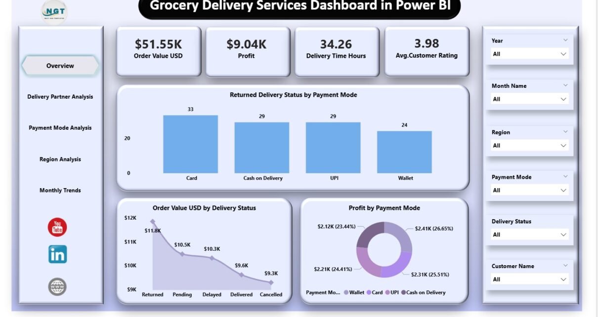
1. Overview Page – The Main Dashboard View
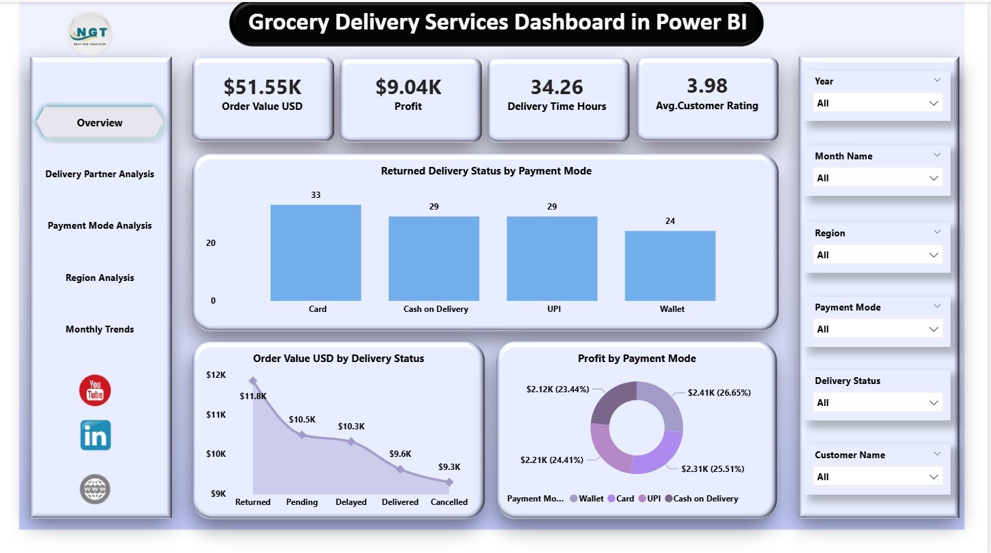
The Overview Page shows a complete summary of the business. It includes KPI cards and core charts that display the most important metrics.
KPI Cards
The page includes five key cards, which show:
-
Order Value (USD)
-
Profit
-
Delivery Time (Hours)
-
Average Satisfaction Rating
These metrics give you a quick snapshot of the delivery business’s performance.
Core Charts
The three charts on this page include:
-
Returned Delivery Status by Payment Mode
-
Order Value (USD) by Delivery Status
-
Profit by Payment Mode
These visuals help teams understand how payments, profits, and delivery outcomes connect. For example, they can identify which payment modes link with higher returns or which delivery statuses drive better revenue.
This page gives a complete high-level view and helps leadership take quick decisions.
2. Delivery Partner Analysis – Evaluate Partner Performance
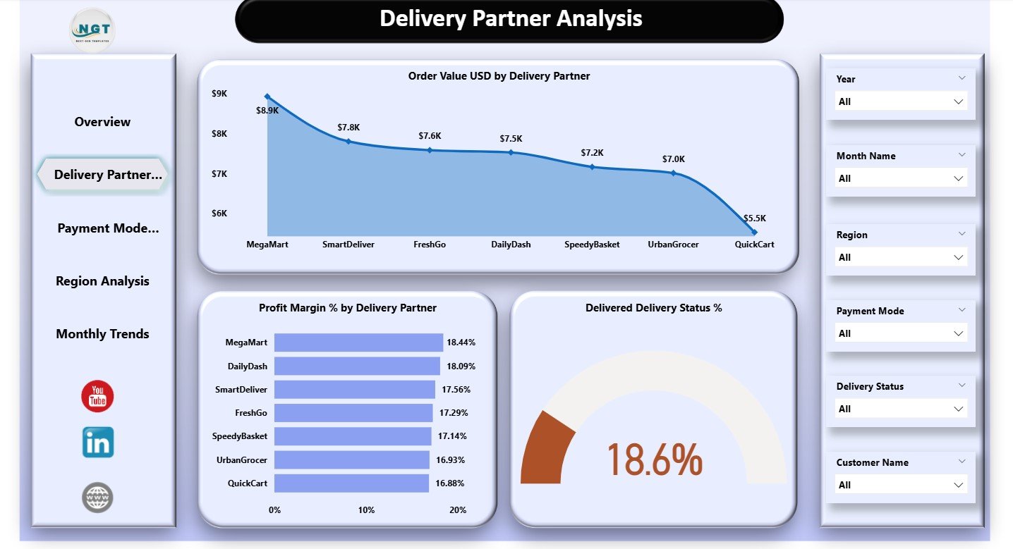
Delivery partners play a huge role in grocery delivery operations. They determine the speed, accuracy, and quality of deliveries. This page highlights partner-wise performance.
Charts Included
-
Order Value (USD) by Delivery Partner
-
Profit Margin % by Delivery Partner
-
Delivered Delivery Status %
These insights answer essential questions:
-
Which partner brings the most revenue?
-
Which partner delivers faster or more reliably?
-
Which partner creates higher costs or delays?
-
How do partners impact profit margins?
Because delivery partners vary in performance, companies use this page to optimize contracts, improve training, and set clear Service Level Agreements (SLAs).
3. Payment Mode Analysis – Understand Customer Payment Behavior
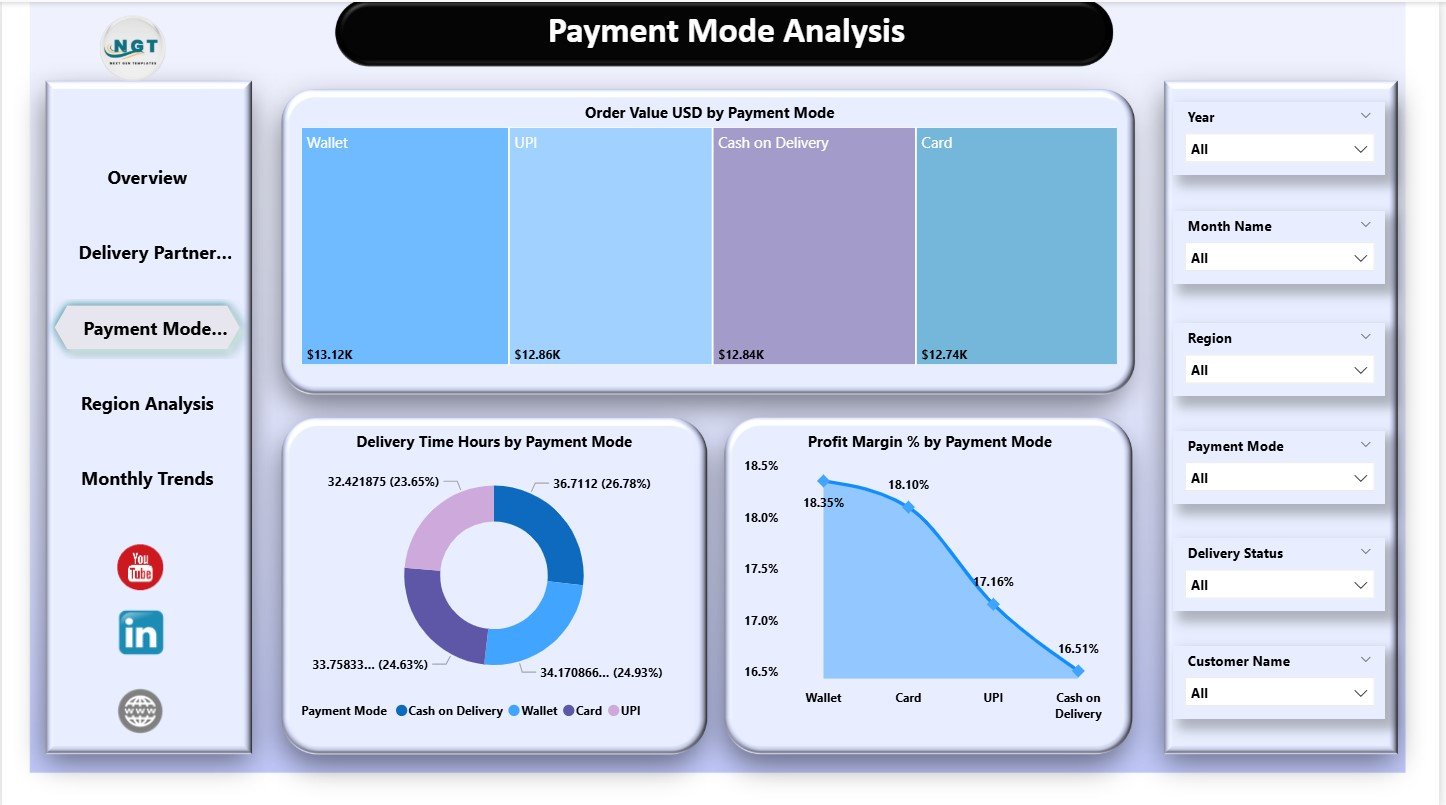
Payment modes provide important insight into customer behavior. Customers may choose cash, digital wallets, credit cards, or online banking. Each mode influences delivery success and profit.
Charts Included
-
Order Value (USD) by Payment Mode
-
Delivery Time (Hours) by Payment Mode
-
Profit Margin % by Payment Mode
These visuals help answer:
-
Which payment mode brings higher revenue?
-
Does delivery time change based on payment method?
-
Which payment method delivers higher profits?
-
Are there more failures or delays in any payment mode?
Companies use this page to identify payment risks, improve customer experience, and offer better payment flexibility.
Click to Purchases Grocery Delivery Services Dashboard in Power BI
4. Region Analysis – Discover Regional Delivery Patterns
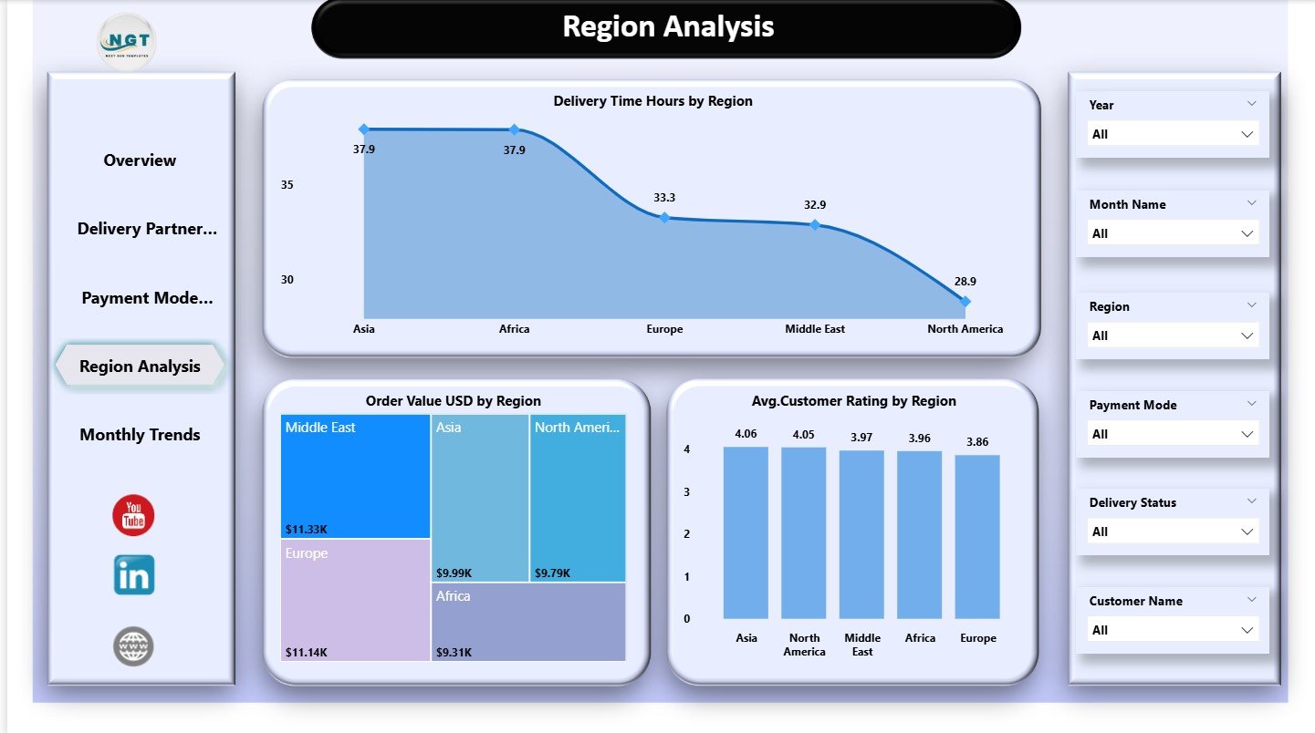
Different regions perform differently depending on delivery speed, population density, traffic, and customer satisfaction. The Region Analysis Page focuses on this area.
Charts Included
-
Delivery Time Hours by Region
-
Order Value (USD) by Region
-
Average Satisfaction Rating by Region
These visuals help companies understand:
-
Which regions deliver faster
-
Which regions contribute more revenue
-
Where satisfaction levels stay high or low
-
How delivery challenges vary by location
Companies use this insight to improve route planning, allocate resources better, and strengthen regional teams.
5. Monthly Trends – Track Performance Over Time
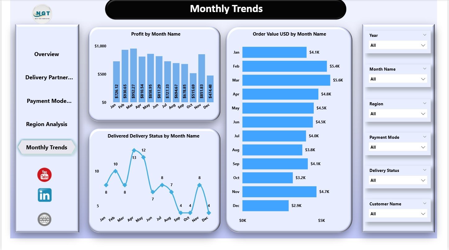
Seasonal behavior is an important part of grocery delivery analytics. Some months show more orders because of holidays or special events. Other months show slower activity.
This page displays three trends:
-
Profit by Month Name
-
Order Value (USD) by Month Name
-
Delivered Delivery Status by Month Name
These insights show rising or falling patterns. Teams understand how the business moves month by month and adjust hiring, staffing, and resource management accordingly.
Benefits of Using a Grocery Delivery Services Dashboard
1. Real-Time Insights
Teams see updated KPIs instantly without waiting for manual reports.
2. Accurate Delivery Performance Tracking
Delivery time, status, and partner performance stay visible at all times.
3. Better Customer Satisfaction Monitoring
The dashboard shows where ratings improve and where issues arise.
4. Strong Financial Visibility
Companies track revenue, costs, and profit in a structured format.
5. Faster Decision-Making
Teams identify problems and fix them quickly before they grow.
6. Improved Delivery Partner Management
Partner-level analysis helps build stronger relationships and better contracts.
7. Clean Monthly Trends
Monthly visuals highlight seasonal behavior and forecasting opportunities.
8. Seamless Decision Alignment
All departments use the same data to create better strategies.
Advantages of a Grocery Delivery Services Dashboard in Power BI
1. Interactive Visuals
Charts, slicers, and cards update instantly and make analysis easy.
2. Strong Comparison Logic
Comparisons across partner, region, mode, and month offer deep clarity.
3. Data Integration Flexibility
Power BI handles Excel, databases, cloud apps, and APIs easily.
4. Professional Layout
The dashboard’s clean design improves readability and decision-making.
5. Easy Scalability
Companies can add more KPIs and charts as delivery operations grow.
Click to Purchases Grocery Delivery Services Dashboard in Power BI
Best Practices for Using This Dashboard
1. Update Data Regularly
Daily or weekly updates ensure accuracy.
2. Check Delivery Partner Patterns
Investigate partners with low delivery success or high delays.
3. Review Payment Mode Behavior
Identify risk areas in payment-related returns or delays.
4. Analyze Regions Separately
Region-specific insights guide regional marketing and operations.
5. Compare Monthly Trends
Forecast demand based on historical patterns.
6. Track Customer Satisfaction Weekly
Improving satisfaction strengthens customer loyalty.
7. Reduce Delivery Time
Shorter delivery windows increase repeat orders and revenue.
8. Use Data to Improve SLAs
Set clear expectations for partners and internal teams.
How This Dashboard Helps Grocery Delivery Teams
This dashboard becomes a core tool for delivery operations, leadership, marketing, and customer support teams. It provides clarity about every step in the delivery journey—from order placement to partner assignment to final delivery.
Teams use it to:
-
Improve customer satisfaction
-
Reduce delivery delays
-
Optimize partner performance
-
Increase profit margins
-
Improve routing strategies
-
Strengthen customer retention
-
Reduce operational waste
With consistent use, the dashboard helps companies grow faster and deliver better customer experiences every day.
Conclusion
A Grocery Delivery Services Dashboard in Power BI transforms raw data into a powerful decision-making tool. It helps companies understand delivery behavior, customer satisfaction, payment patterns, monthly trends, and partner performance in one place. Because the dashboard includes structured pages, clean visuals, and smart metrics, it supports world-class delivery performance and customer experience.
When companies use this dashboard daily, they create a strong data-driven culture that improves reliability, satisfaction, and financial success.
Click to Purchases Grocery Delivery Services Dashboard in Power BI
Frequently Asked Questions (FAQs)
1. What does this dashboard track?
It tracks order value, delivery time, profit, customer satisfaction, partner performance, payment modes, regions, and monthly trends.
2. Who should use this dashboard?
Operations teams, delivery managers, customer experience teams, analysts, finance leaders, and business owners.
3. Can beginners use Power BI for this dashboard?
Yes. Power BI visuals stay simple and easy to understand.
4. Can I add more KPIs?
Yes. Power BI allows unlimited KPI additions based on your dataset.
5. How often should I update the data?
Daily updates help teams make fast decisions.
6. Does it support deep partner analytics?
Yes. The Delivery Partner Analysis page shows detailed metrics.
7. Can I analyze seasonality?
Yes. The Monthly Trends page shows performance patterns across months.
8. Does this dashboard support real-time data?
Yes, if connected to a real-time data source.
Click to Purchases Grocery Delivery Services Dashboard in Power BI
Visit our YouTube channel to learn step-by-step video tutorials