Managing oncology services requires absolute clarity, accuracy, and speed in decision-making. Because patient outcomes, treatment quality, and operational efficiency depend on data, healthcare leaders must track performance continuously. However, scattered Excel files, manual reports, and delayed insights often slow teams down. That is exactly where an Oncology Services KPI Dashboard in Power BI becomes essential.
This article explains what an Oncology Services KPI Dashboard in Power BI is, why it matters, how it works, and how organizations can use it to improve oncology performance. Moreover, you will learn about its features, advantages, best practices, and frequently asked questions, all explained in simple and clear language.
Click to Purchases Oncology Services KPI Dashboard in Power BI
What Is an Oncology Services KPI Dashboard in Power BI?
An Oncology Services KPI Dashboard in Power BI is a ready-to-use analytical solution designed to monitor, track, and compare oncology-related key performance indicators (KPIs). Instead of relying on static spreadsheets, this dashboard converts raw oncology data into clear visuals, trends, and performance indicators.
Moreover, this dashboard uses Excel as the data source and Power BI Desktop for visualization, which makes it both flexible and powerful. Because oncology services involve complex processes such as diagnosis, treatment cycles, patient outcomes, and operational targets, this dashboard provides a structured way to track everything in one place.
In addition, the dashboard supports MTD (Month-to-Date) and YTD (Year-to-Date) analysis, which helps healthcare leaders monitor short-term progress and long-term performance together.
Why Do Oncology Departments Need KPI Dashboards?
Oncology departments manage high-stakes operations every single day. Therefore, leaders must track performance continuously and act quickly. Without dashboards, teams often face several challenges, such as:
-
Delayed performance reporting
-
Difficulty tracking targets versus actuals
-
Limited visibility into trends
-
Manual errors in Excel calculations
-
Lack of standard KPI definitions
However, when organizations use an Oncology Services KPI Dashboard in Power BI, they can overcome all these challenges. The dashboard centralizes KPI tracking, improves transparency, and supports data-driven decisions across clinical and operational teams.
How Does the Oncology Services KPI Dashboard in Power BI Work?
This dashboard follows a simple yet powerful structure, which ensures ease of use and accuracy. The workflow includes data entry in Excel and dynamic reporting in Power BI.
Step 1: Data Collection in Excel
Users enter actual values, target values, and KPI definitions in structured Excel sheets.
Step 2: Power BI Data Model
Power BI connects directly to the Excel file and applies calculations, comparisons, and visual logic.
Step 3: Interactive Analysis
Users explore performance using slicers, drill-through options, icons, and charts.
Because this structure keeps data entry separate from reporting, it reduces errors and improves reliability.
Click to Purchases Oncology Services KPI Dashboard in Power BI
What Are the Key Features of the Oncology Services KPI Dashboard in Power BI?
This dashboard includes multiple advanced features designed specifically for oncology performance monitoring.
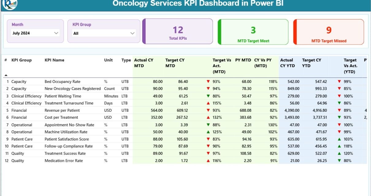
How Does the Summary Page Help Decision-Makers?
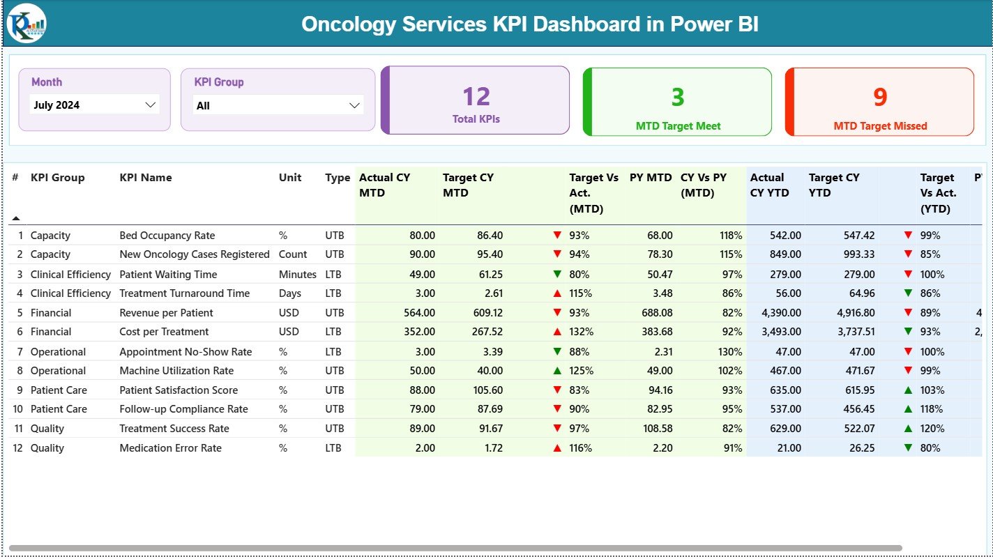
The Summary Page serves as the primary control panel of the dashboard. It gives instant visibility into overall oncology performance.
Key Elements of the Summary Page
Slicers at the Top
-
Month selector
-
KPI Group selector
These slicers allow users to filter KPIs instantly and focus on a specific period or category.
KPI Cards
-
Total KPIs Count
-
MTD Target Met Count
-
MTD Target Missed Count
Because these cards update dynamically, leaders can spot performance gaps at a glance.
Why Is the Detailed KPI Table So Important?
The detailed table on the Summary Page provides granular information for every KPI.
Fields Included in the Table
-
KPI Number – Unique sequence identifier
-
KPI Group – Category or group of the KPI
-
KPI Name – Clear name of the KPI
-
Unit – Measurement unit (%, days, count, etc.)
-
Type – LTB (Lower the Better) or UTB (Upper the Better)
How Are MTD KPI Metrics Presented?
The dashboard clearly displays Month-to-Date performance to help teams act quickly.
-
Actual CY MTD – Current year actual MTD value
-
Target CY MTD – Current year target MTD value
-
MTD Icon –
-
▲ Green arrow for target met
-
▼ Red arrow for target missed
-
-
Target vs Actual (MTD) – Percentage calculated as:
Actual MTD / Target MTD -
PY MTD – Previous year MTD value
-
CY vs PY (MTD) – Percentage comparison between current and previous year
Because these metrics appear together, users can easily understand performance direction.
How Does the Dashboard Track YTD Performance?
Year-to-Date tracking helps leaders monitor cumulative performance across the year.
-
Actual CY YTD – Current year actual YTD
-
Target CY YTD – Current year target YTD
-
YTD Icon – Visual indicator of target achievement
-
Target vs Actual (YTD) –
Actual YTD / Target YTD -
PY YTD – Previous year YTD value
-
CY vs PY (YTD) – Growth or decline percentage
As a result, oncology leaders can track yearly progress without waiting for annual reports.
Click to Purchases Oncology Services KPI Dashboard in Power BI
What Does the KPI Trend Page Show?
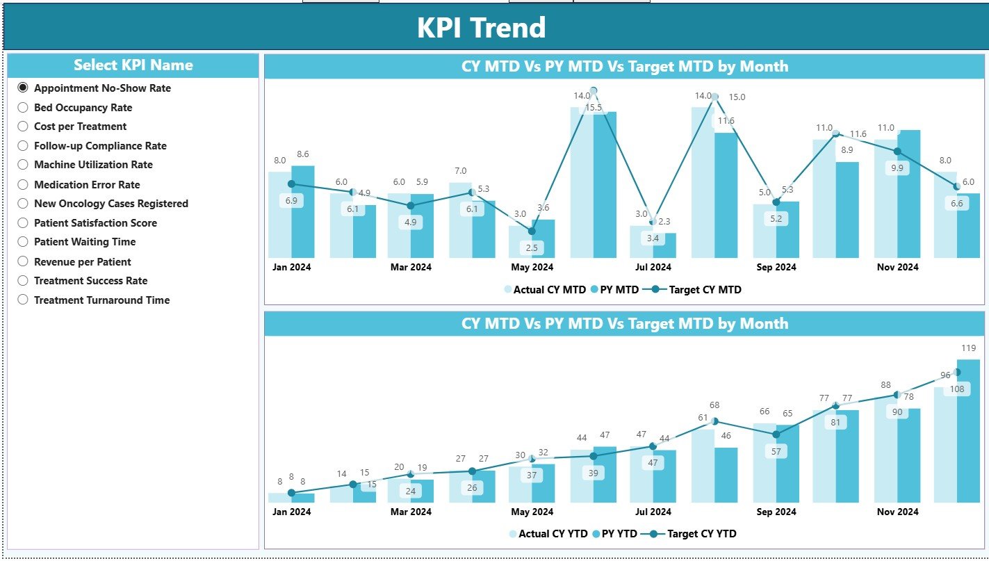
The KPI Trend Page focuses entirely on trend analysis. Instead of only looking at current values, users can study performance patterns over time.
Key Highlights of the KPI Trend Page
-
Two combo charts
-
Comparison of:
-
Current Year Actuals
-
Previous Year Actuals
-
Targets
-
-
Separate views for:
-
MTD trends
-
YTD trends
-
A slicer on the left allows users to select a specific KPI. Therefore, trend analysis becomes focused and actionable.
Why Is Trend Analysis Critical in Oncology Services?
Trend analysis helps oncology teams:
-
Identify early performance issues
-
Monitor improvement initiatives
-
Compare outcomes with historical patterns
-
Adjust targets and strategies
Without trends, teams only see snapshots. However, with trends, they understand the full story.
What Is the KPI Definition Page and Why Is It Hidden?
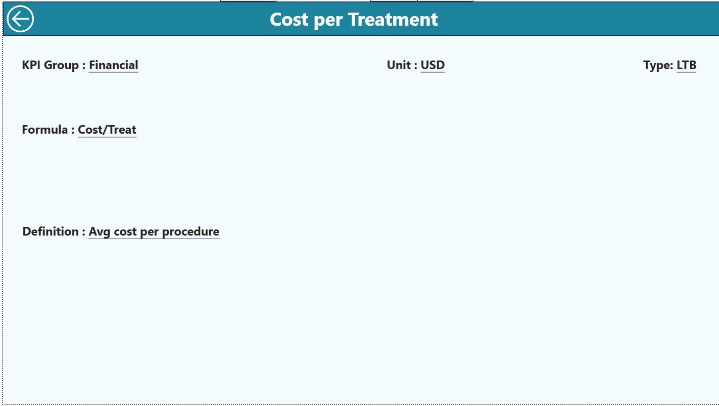
The KPI Definition Page acts as a drill-through reference page. It remains hidden to keep the dashboard clean and user-friendly.
What Can Users See on This Page?
-
KPI Formula
-
Detailed KPI Definition
-
Measurement unit and logic
Users can drill through from the Summary Page for deeper understanding. Moreover, a Back button on the top-left corner ensures smooth navigation.
How Is Excel Used as the Data Source?
The dashboard uses Excel as the backend data source, which simplifies data management.
1) Input_Actual Sheet
Users enter:
-
KPI Name
-
Month (first date of the month)
-
Actual MTD value
-
Actual YTD value
This sheet captures real performance data.
2) Input_Target Sheet
Users enter:
-
KPI Name
-
Month
-
Target MTD value
-
Target YTD value
This structure ensures consistent target tracking.
3) KPI Definition Sheet
Users define:
-
KPI Number
-
KPI Group
-
KPI Name
-
Unit
-
Formula
-
Definition
-
Type (LTB or UTB)
Because definitions remain centralized, teams avoid confusion and misinterpretation.
Advantages of Oncology Services KPI Dashboard in Power BI
An Oncology Services KPI Dashboard in Power BI offers several powerful advantages.
✅ Centralized KPI monitoring
✅ Real-time performance tracking
✅ Clear MTD and YTD insights
✅ Visual indicators for quick decisions
✅ Strong trend analysis capabilities
✅ Standardized KPI definitions
✅ Reduced manual reporting effort
✅ Improved data accuracy
✅ Faster management reviews
Because of these advantages, oncology departments can focus more on patient outcomes rather than reporting work.
How Does This Dashboard Improve Decision-Making?
This dashboard supports decision-making by:
-
Highlighting underperforming KPIs instantly
-
Showing performance gaps against targets
-
Comparing current and past performance
-
Providing consistent data across teams
As a result, oncology leaders can act faster and with confidence.
Click to Purchases Oncology Services KPI Dashboard in Power BI
Best Practices for the Oncology Services KPI Dashboard in Power BI
To get the maximum value, organizations should follow these best practices.
Maintain Clean and Consistent Data
Always ensure correct KPI names, dates, and units in Excel.
Update Data Regularly
Update MTD and YTD values monthly to keep insights accurate.
Standardize KPI Definitions
Use clear and agreed-upon definitions in the KPI Definition sheet.
Limit KPI Overload
Focus on relevant oncology KPIs instead of tracking too many metrics.
Use Trend Analysis Actively
Review trends regularly instead of only checking summary numbers.
Train Users
Ensure key users understand slicers, drill-through features, and icons.
Who Can Benefit from This Dashboard?
This Oncology Services KPI Dashboard in Power BI benefits:
-
Oncology department heads
-
Hospital administrators
-
Quality and performance teams
-
Clinical operations managers
-
Healthcare executives
Because the dashboard remains flexible, organizations can adapt it for different oncology units or regions.
Conclusion
An Oncology Services KPI Dashboard in Power BI transforms how oncology performance gets tracked and managed. Instead of static reports, organizations gain dynamic insights, visual clarity, and faster decisions. Moreover, Excel-based inputs make data entry simple, while Power BI delivers enterprise-level analytics.
When oncology services rely on accurate and timely data, outcomes improve. Therefore, this dashboard becomes a critical tool for modern, data-driven healthcare management.
Click to Purchases Oncology Services KPI Dashboard in Power BI
Frequently Asked Questions (FAQs)
What is an Oncology Services KPI Dashboard in Power BI?
It is a Power BI dashboard that tracks oncology performance using KPIs, targets, actuals, icons, and trends with Excel as the data source.
Does this dashboard require Power BI Service?
No. The dashboard runs in Power BI Desktop and connects to Excel.
Can users customize KPIs?
Yes. Users can add, modify, or remove KPIs through the Excel data sheets.
What does LTB and UTB mean?
LTB means Lower the Better, while UTB means Upper the Better.
How often should the data be updated?
Ideally, teams should update data monthly for accurate MTD and YTD reporting.
Can this dashboard support multiple KPI groups?
Yes. KPI Group slicers allow flexible grouping and analysis.
Is this dashboard suitable for non-technical users?
Yes. The interface is simple, and Excel handles all data entry.
Click to Purchases Oncology Services KPI Dashboard in Power BI
Visit our YouTube channel to learn step-by-step video tutorials